Lab 5-606, Part 2: Foundations for statistical inference - Confidence intervals
Sangeetha Sasikumar
10/13/2022
library(tidyverse)## ── Attaching packages ─────────────────────────────────────── tidyverse 1.3.2 ──
## ✔ ggplot2 3.3.6 ✔ purrr 0.3.4
## ✔ tibble 3.1.8 ✔ dplyr 1.0.9
## ✔ tidyr 1.2.0 ✔ stringr 1.4.1
## ✔ readr 2.1.2 ✔ forcats 0.5.2
## ── Conflicts ────────────────────────────────────────── tidyverse_conflicts() ──
## ✖ dplyr::filter() masks stats::filter()
## ✖ dplyr::lag() masks stats::lag()library(openintro)## Loading required package: airports
## Loading required package: cherryblossom
## Loading required package: usdatalibrary(shiny)
library(infer)##
## Attaching package: 'infer'
##
## The following object is masked from 'package:shiny':
##
## observeset.seed(3000) #set. seed() function in R is used to create reproducible results when writing code that involves creating variables that take on random values. By using the set. seed() function, you guarantee that the same random values are produced each time you run the code.us_adults <- tibble(
climate_change_affects = c(rep("Yes", 62000), rep("No", 38000))
)
ggplot(us_adults, aes(x = climate_change_affects)) +
geom_bar() +
labs(
x = "", y = "",
title = "Do you think climate change is affecting your local community?"
) +
coord_flip() 
us_adults %>%
  count(climate_change_affects) %>%
  mutate(p = n /sum(n))
## # A tibble: 2 × 3
## climate_change_affects n p
## <chr> <int> <dbl>
## 1 No 38000 0.38
## 2 Yes 62000 0.62 #n, stands for the number of times the experiment runs. The second variable, p, represents the probability of one specific outcome.
n <- 60
samp <- us_adults %>%
sample_n(size = n)Exercise 1: What percent of the adults in your sample think climate change affects their local community? Hint: Just like we did with the population, we can calculate the proportion of those in this sample who think climate change affects their local community.
62% of the population believe this according to the tibble above.
Exercise 2: Would you expect another student’s sample proportion to be identical to yours? Would you expect it to be similar? Why or why not?
I would expect another student's sample proportion to be similar but not the same. The set seed is used to create reproducible results when writing code that involves creating variables that take on random values. By using the set. seed() function, you guarantee that the same random values are produced each time you run the code, but this does not mean someone else will get my same exact values.
#This code will find the 95 percent confidence interval for proportion of US adults who think climate change affects their local community.
samp %>%
  specify(response = climate_change_affects, success = "Yes") %>%
  generate(reps = 1000, type = "bootstrap") %>%
  calculate(stat = "prop") %>%
  get_ci(level = 0.95)
## # A tibble: 1 × 2
## lower_ci upper_ci
## <dbl> <dbl>
## 1 0.500 0.75Exercise 3: In the interpretation above, we used the phrase “95% confident”. What does “95% confidence” mean?
The 95 percent confidence interval means you have a 5 percent chance of being wrong.
Exercise 4: Does your confidence interval capture the true population proportion of US adults who think climate change affects their local community? If you are working on this lab in a classroom, does your neighbor’s interval capture this value?
No, it does not because it does not account for the actual full population, and it would be the same for a neighbor/classmate.
Exercise 5: Each student should have gotten a slightly different confidence interval. What proportion of those intervals would you expect to capture the true population mean? Why?
95% confidence mean 95% confident that the population mean lies within the interval between a lower bound and an upper bound. A confidence interval only provides a plausible range of values.
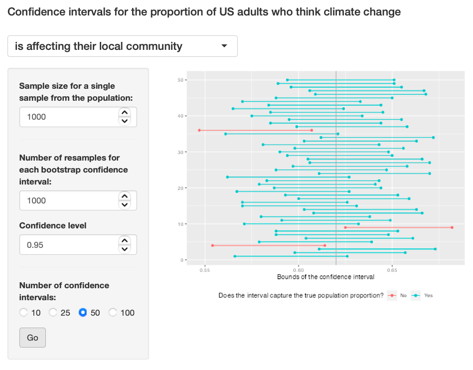
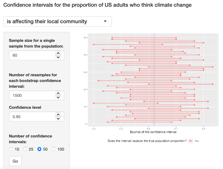
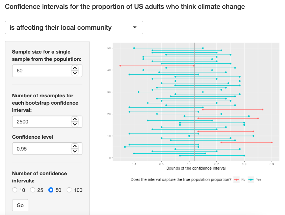
Exercise 6: Given a sample size of 60, 1000 bootstrap samples for each interval, and 50 confidence intervals constructed (the default values for the above app), what proportion of your confidence intervals include the true population proportion? Is this proportion exactly equal to the confidence level? If not, explain why. Make sure to include your plot in your answer.
The true population proportion is close to 0.9, it is somehow close to the 95% confidence level, but still the sample size is to small to see the true distribution. Exercise 6
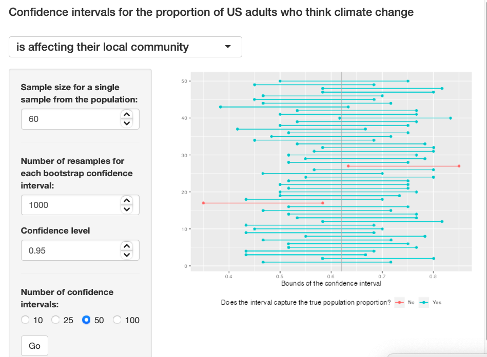
Note: This Shiny App was taken from the template on the 606 class page.
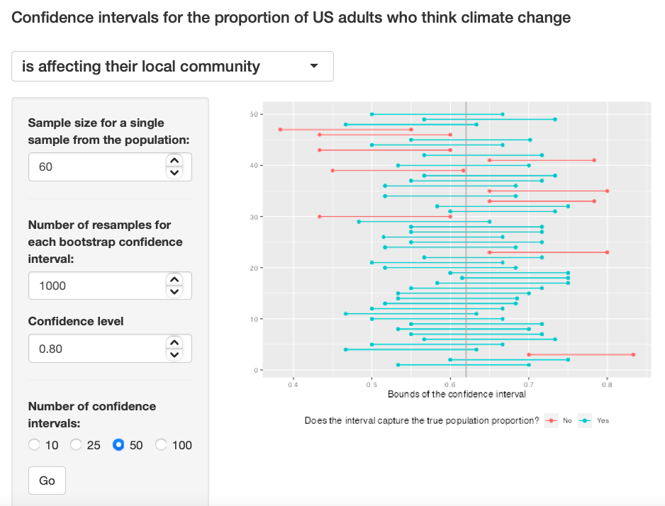
Exercise 7: Choose a different confidence level than 95%. Would you expect a confidence interval at this level to me wider or narrower than the confidence interval you calculated at the 95% confidence level? Explain your reasoning.
I think the graph will be narrower because as the confidence interval decreases, the length of interval decreases. I used 0.80 as the confidence interval.
Exercise 7
Exercise 8: Using code from the infer package and data from the one sample you have (samp), find a confidence interval for the proportion of US Adults who think climate change is affecting their local community with a confidence level of your choosing (other than 95%) and interpret it.
samp %>%
  specify(response = climate_change_affects, success = "Yes") %>%
  generate(reps = 1000, type = "bootstrap") %>%
  calculate(stat = "prop") %>%
  get_ci(level = 0.5)
## # A tibble: 1 × 2
## lower_ci upper_ci
## <dbl> <dbl>
## 1 0.583 0.667The lower confidence interval is 0.67 and the upper confidence interval is 0.73
Exercise 9: Using the app, calculate 50 confidence intervals at the confidence level you chose in the previous question, and plot all intervals on one plot, and calculate the proportion of intervals that include the true population proportion. How does this percentage compare to the confidence level selected for the intervals?
The graph is very narrow because the confidence interval is 50 and the confidence level is 0.5. Exercise 9
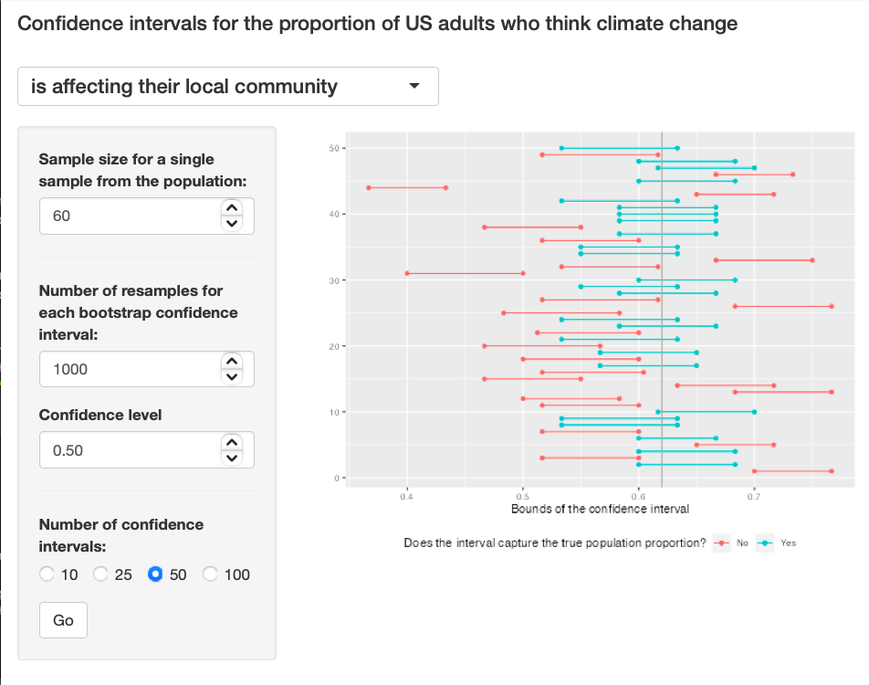
Exercise 10: Lastly, try one more (different) confidence level. First, state how you expect the width of this interval to compare to previous ones you calculated. Then, calculate the bounds of the interval using the infer package and data from samp and interpret it. Finally, use the app to generate many intervals and calculate the proportion of intervals that are capture the true population proportion.
I predict the graph's width to be very thin because I am using a confidence interval of 0.1. Exercise 10
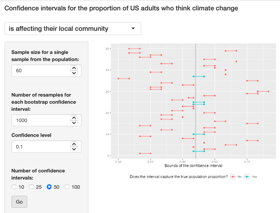
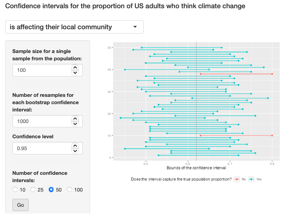
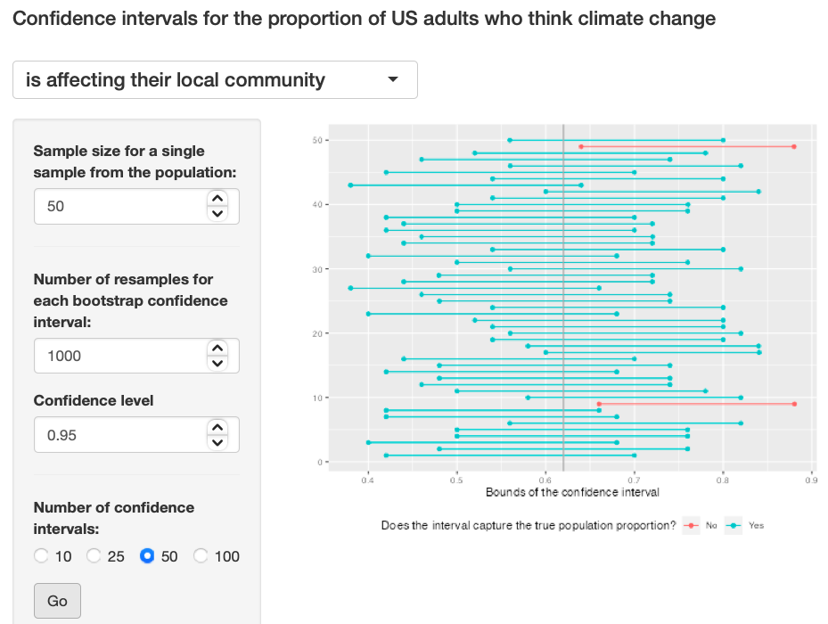
Exercise 11: Using the app, experiment with different sample sizes and comment on how the widths of intervals change as sample size changes (increases and decreases).
I feel using different sample sizes (large and small) had no effect on the width of the graphs. Exercise 11: Pic 1, Exercise 11: Pic 2, Exercise 11: Pic 2
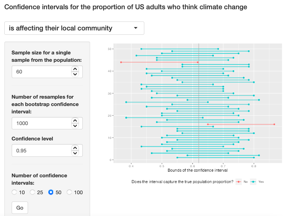
Exercise 12: Finally, given a sample size (say, 60), how does the width of the interval change as you increase the number of bootstrap samples. Hint: Does changing the number of bootstrap samples affect the standard error?
I am not sure about the answer to this, the width looks similar to all for me. I don't fully understand it. Exercise 12: Pic 1, Exercise 12: Pic 2, Exercise 12: Pic 3