Assignment 2 - Data Visualisation Critique
Deconstruct, Reconstruct Web Report
Pratibha Gangavarapu (s3957851)
Original

 ,https://www.visualcapitalist.com/wp-content/uploads/2017/10/world-debt-2017.png
Objective
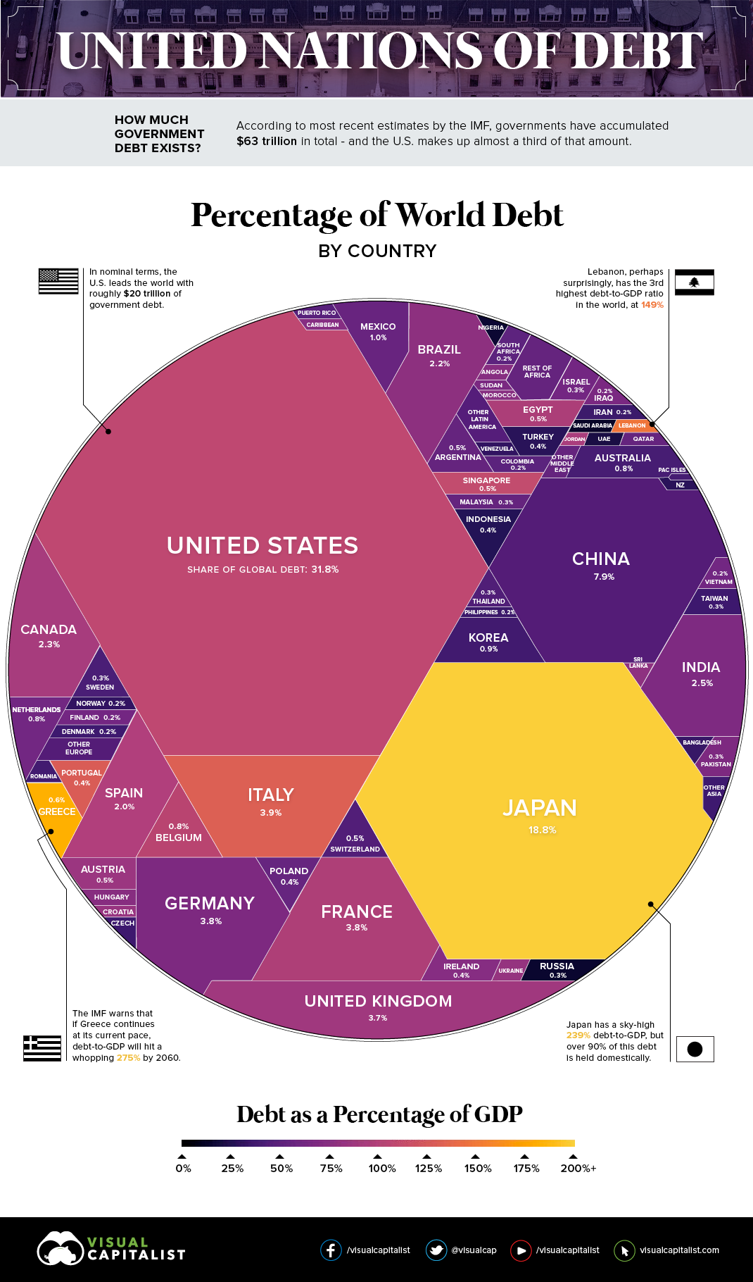
The original visualisation aimed to showcase each country’s debt in percentage compared to the total World Debt in one infographic visualisation. Governments borrow debt in short term to cover the short-term deficits or finance critical projects. However countries such as the USA are known to have ‘debt creep’ where in there has been no surplus annual budget for number of years to cover the debt taken and has been balloning each year.
The visualisation chosen had the following three main issues:
Issue 1 - Failure to answer a practical question - If the aim of the visualisation is to answer the question - what is the percentage of world debt by country, then the visualisation fails to address it as the different countries represented in various and inconsistent shapes, which makes it hard to read and understand the answer to the said question.
Issue 2 - Perceptual or colour issues - The colour gradient used to create the visualisation makes it very difficult for a person with colour blindness to perceive and interpret the data accurately.
Issue 3 - Perceptual or colour issues - Information available in the infographic visualisation is not easy to locate. If we were to look at the graph to understand the percentage of debt of a particular country then it would be difficult for many small countries represented in it. Also the various countries depicted are adding to the “noise”, making it rather busy and harder to understand perceive clear insights for any sort of a target audience.
Reference
Rigorous Themes. (2021). 15 Bad Data Visualization Examples. [online] Available at: https://rigorousthemes.com/blog/bad-data-visualization-examples/.
Desjardins, J. (2019). $63 Trillion of World Debt in One Visualization. [online] Visual Capitalist. Available at: https://www.visualcapitalist.com/63-trillion-world-debt-one-visualization/.
Code
The following code was used to fix the issues identified in the original.
library(readr) ### to import the csv data

### Read the csv file

world_debt_2017 <- read.csv("C:/Assignment 2/Data for Assignment 2.csv")

### Create a subset of the data and convert it to a dataframe to allow for simpler visualisation
world_debt1 <- world_debt_2017[1:30,]

world_debt2 <- data.frame(world_debt1)

### Use ggplot to recreate the visualisation

library(ggplot2)

wdp1 <- ggplot(world_debt2, aes(x=Country_Region, y=Percentage_of_Debt, fill=Country_Region))

wdp1 <- wdp1 + geom_bar(stat = "identity",fill = "#ff581a") + theme(axis.text.x =element_text(angle=45,hjust = 1)) +
  labs(title ="World Debt 2017",
       x = "Country",
       y = "Percentage of debt") +theme(plot.title = element_text(hjust = 0.2)) + geom_text(aes(label=round(Percentage_of_GDP,4)), vjust = -.06,size = 2)
Data Reference
- Wikipedia Contributors (2019). List of countries by external debt. [online] Wikipedia. Available at: https://en.wikipedia.org/wiki/List_of_countries_by_external_debt.
Reconstruction
The following plot fixes the main issues in the original.
