Assignment 2
Deconstruct, Reconstruct Web Report
Arun Kumar Mudaliar (Student Number/s3933052)
Click the Original, Code and Reconstruction tabs to read about the issues and how they were fixed.
Original

Source: ACMA Research and Analysis Section (2015).
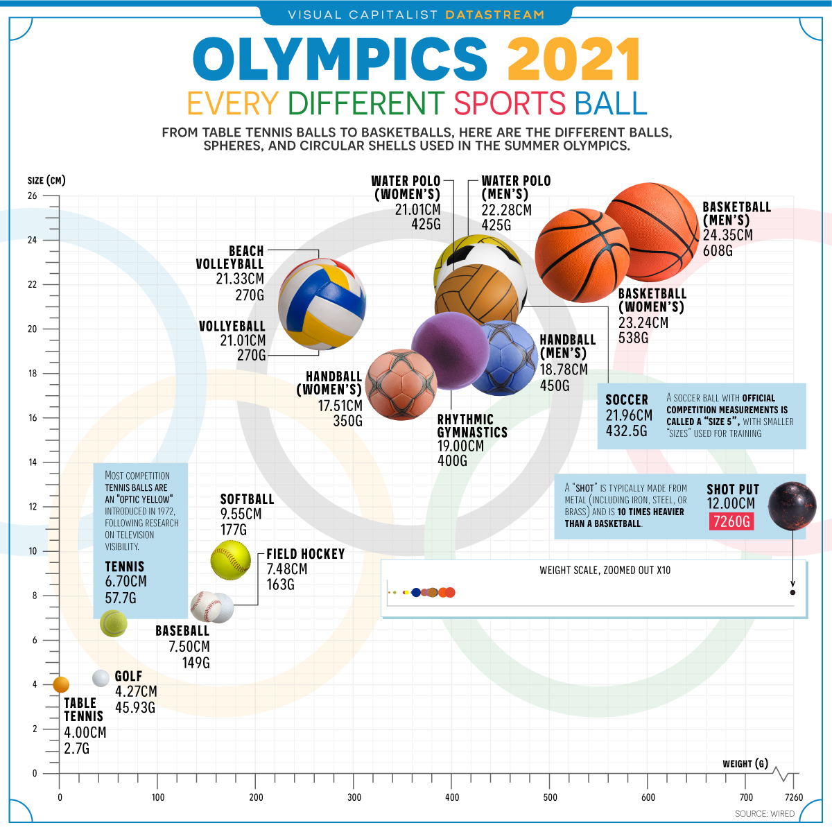
Objective
The target audience are physical education teachers, sports coach and parents involved in sports training. It is a simple data to understand the size and weight of balls used in various sports by visualisation.
- Sport (Data type Categorical, Nominal)
- Weight in gm( Data type: Numeric, Continuous)
- Diameter, in centimeters (Data type: Numeric, Continuous)
The main 3 key issues in current visualisation:
In ability to provide actual answers to deliver: The image simple maps all the balls in same shape showing their size by diameter and weight. Not much attention on design choices made.
In accuracy in terms of data points plotted: I believe scatter plot is advisable to the data provided. The scales used on “X” and “Y” axis doesn’t make sense size overlooks weight. “According to Kaisers Trifecta check-up, there are eight possible critiques for a data visualisation” https://dark-star-161610.appspot.com/secured/_book/design-and-integrity.html#failing-the-trifecta
Too much of information: Even though the image looks good from far for an audience. Most of the background are more imagery, too much of commentary which may end up in unnecessary take up for the audience.
Reference
Code
The following code was used to fix the issues identified in the original.
library(ggplot2)
library(readr)
library(dplyr)
library(stringr)
library(tidyverse)
library(lubridate)

SportsBallData <- read_csv("SportsBallData.csv")
View(SportsBallData)

#remove measurement units and delimeters from columns
SportsBallData <-SportsBallData %>% mutate_at("Diameter", str_replace, "cm", "")
SportsBallData <-SportsBallData %>% mutate_at("Weight", str_replace, "g", "")
SportsBallData <-SportsBallData %>% mutate_at("Weight", str_replace, ",", "")

View(SportsBallData)

#convert data types
SportsBallData$Sport <- as.factor(SportsBallData$Sport)
SportsBallData$Diameter <- as.numeric(SportsBallData$Diameter, digits = 4)
SportsBallData$Weight <- as.numeric(SportsBallData$Weight, digits = 4)

#filter out key findings
shotput <- filter(SportsBallData, Sport == "Shot Put")
tabletennis <- filter(SportsBallData, Sport == "Table Tennis")
basketball <- filter(SportsBallData, Diameter == 24.35)

#create data visualisation
p1 <- ggplot(data=SportsBallData, aes(x = Diameter, y = Weight))
p1 <- p1 + geom_point() +
  geom_point(data=shotput, aes(x = Diameter, y = Weight), colour='red') +
  geom_text(data = shotput, aes(label="Shot put", hjust=-0.3, vjust=0)) +
  geom_point(data=tabletennis, aes(x = Diameter, y = Weight), colour='red') +
  geom_text(data = tabletennis, aes(label="Table tennis", hjust=1, vjust=-1.2)) +
  geom_point(data=basketball, aes(x = Diameter, y = Weight), colour='red') +
  geom_text(data = basketball, aes(label="Basketball", hjust=0.5, vjust=-1.5)) +
  labs(title = "Don't judge a sport by the size of its ball", subtitle = "Official size and weight specifications for the 2021 Olympics", x = "Diameter in cm", y = "Weight in grams") +
  scale_x_continuous(name = "Diameter (cm)", limits = c(0, 25)) + scale_y_continuous(name = "Weight (grams)", limits = c(0, 7500)) +
  theme_classic()
Data Reference
- Olympic 2021 Comparing Every Sports Ball Played competition website: https://www.visualcapitalist.com/olympics-2021-comparing-every-sports-ball/
Reconstruction
The visualisation was presented again as a scatterplot to get better understanding of the data for Physical Education teachers and students

Overall changes: •
- Changed the imagery visualisation to graphical visualisation with proper X and Y axis.
- Balls are called out by looking to small to bigger balls in the competition used for various sports, by differential in colours of the called-out sport.
- X and y axis have been rearranged to support data while upholding accurate distance between the outlier and remaining data points, -Findings & areas of improvement: -Data was not clean, need to use additional work to clean up the data with feasible data type required to do the analysis. E.g. Space in the cells, values are gender based as well, which require further analysis for an individual sport. Data is numerical and categorical are mixed up as well, which needed extra work to clean up. In general, better data will provide very good presentation or visualization. Findings:
- table tennis has the smallest ball used in the Tokyo Olympics at just 4cm in diameter and 2.7g in weight.
- the biggest ball in size is the basketball at 24.35cm in diameter, but • the shot put is more than 10 times heavier at 7260g (or 7.26kg).
References -https://www.youtube.com/watch?v=jur8_iFr5_M\The Recipe for Powerful Data Visualization | Google Data Analytics Certificate -http://jordaninstituteforfamilies.org/wp-content/uploads/2018/06/Audrey_Todd.pdf. -https://stephanieevergreen.com/wp-content/uploads/2016/10/DataVizChecklist_May2016.pdf -https://www.visualcapitalist.com/olympics-2021-comparing-every-sports-ball