Under One Flag: Visual Communication in
International Relations
Raquel Mac Donald
2022-06-23
Introduction
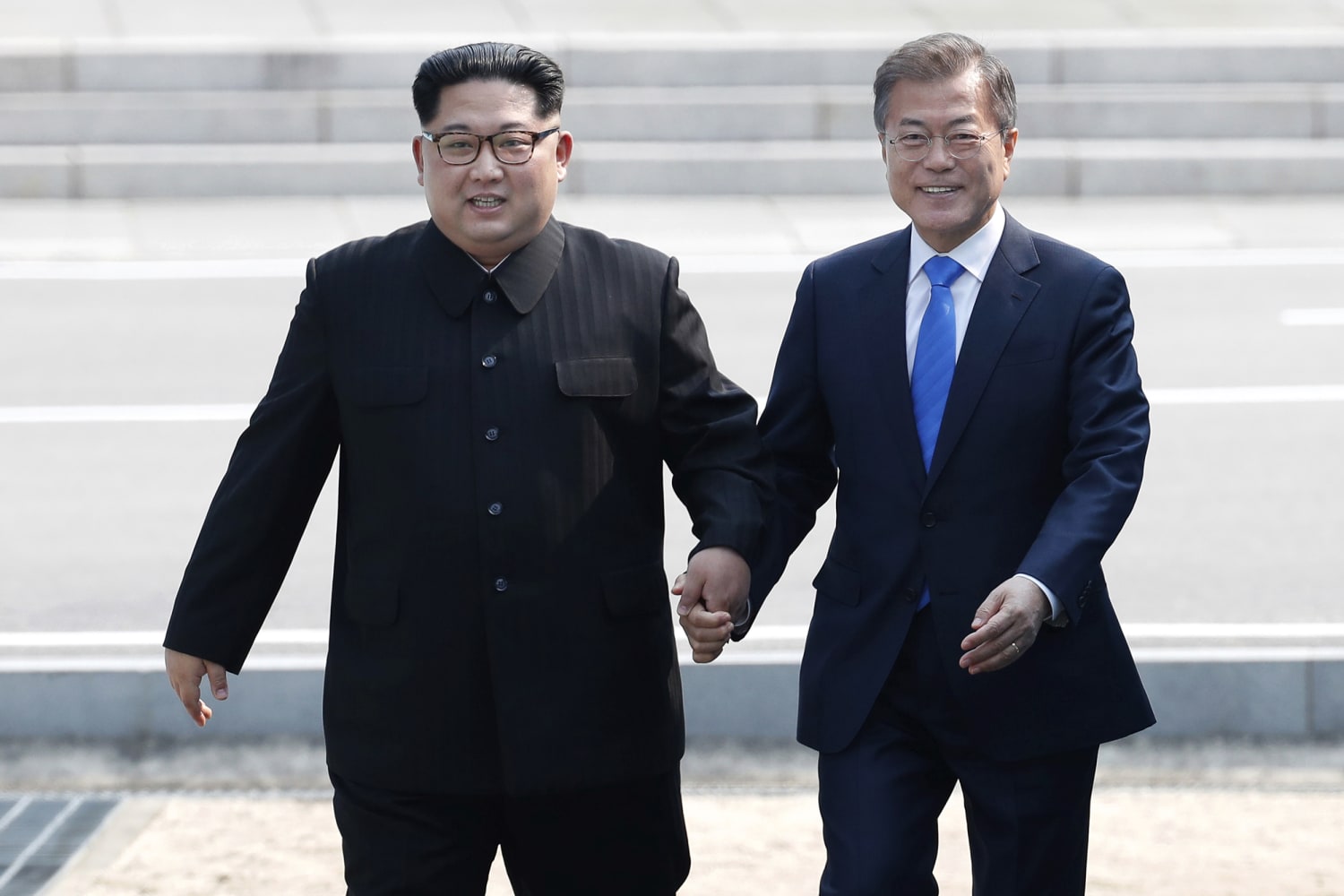
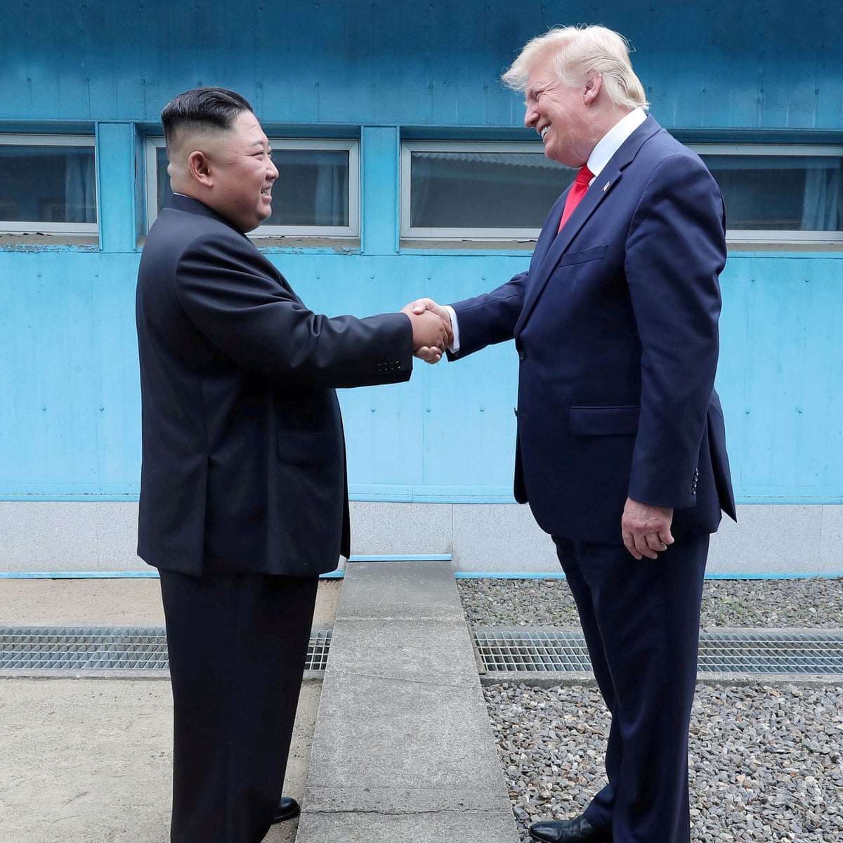
How do images like the ones above influence our perception of the
relationship between the two Koreas? If one was exposed to limited
information about the inter-Korean relationship, what conclusions might
they draw? In 2018, the Democratic People’s Republic of
Korea and the Republic of Korea walked together under one flag at the
Winter Olympics held in Pyeongchang, Republic of Korea. They walked
under a white flag with a blue depiction of the Korean peninsula,
unified, as both countries hope, in different ways, to be one day. The
picture above seems to hide the years of war, failed diplomatic talks,
and the lack of resolution on the Korean peninsula about their identity
as a singular or separate nations. Instead, it demonstrates a rare
moment of joy, of unity, however manufactured, along with a majority
white flag, traditionally representative of peace. This gap between the
picture’s direct message and the true nature of the scenario reflects an
age-old problem in visual communication of international relations: the
gap between the representation (in this case, this image) and the
represented (the Koreans of both nations).
Within this difference between the representation and the
represented, there are other issues at play. First and foremost, there
is frequently a power difference between the messenger and the subject
of the message. Foreign aid and disaster relief visual messaging are
frequent victims of this. Beyond this perhaps unintentional exercise of
power, there is also the purposeful exercise of power;
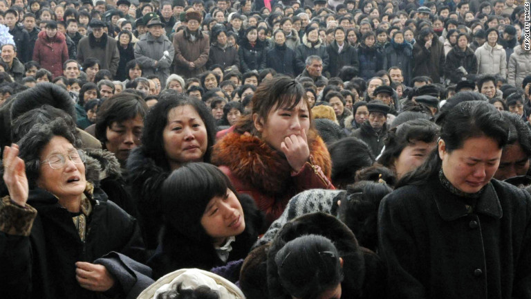
What does this image of North Korean citizens mourning Kim Jong Il
communicate? How might they object to the way they were portrayed
outside of North Korea, and was there a full understanding of the
circumstances under which their image would be published?
countries regularly employ visual messaging as a tactic for soft power,
whether for tourism or for international political purposes. Finally, it
is important to employ an emerging ideology, that this ‘gap’ between
reality and the displayed isn’t always a negative, and can be instead
used to assist in alternative methods of learning about the politics at
play between nations. For example, perhaps the unusual flag in the
display causes an interested person to spend some time researching the
situation between the two nations, or causes them to consider a reality
in which the Koreas were unified. These three notions, power difference,
power usage, and alternative methods of knowing will be explored further
in this project.
Power Difference
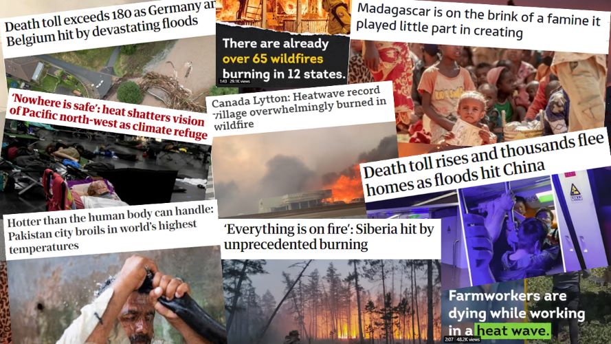
Being
able to access all this information about the worst parts of our world
requires investigation into how we are communicating and receiving this
information, especially visually.In one of the most famous articles in the
political science visual communication field, Bleiker’s “The
Aesthetic Turn in International Political Theory” (2005), the
transition from a mimetic to an aesthetic interpretation of visuals in
international politics is discussed. Mimetic views these images as
direct reflections of the reality, with no necessity for interpretation,
while aesthetic argues the necessity of interpretation, as there is a
gap that exists between the representation and the represented that
needs to be acknowledged and processed. Bleiker calls this using the
“full register of human intelligence” (Bleiker, 2005, p. 529). When
confronted with visual representations of political happenings, it is
important to ask what the narrative is that underlies the visual, and
how it may have been manipulated to benefit the producer. It is
especially important as the abundance of visual news sources,
newspapers, televisions, social media, magazines, only increases and the
average person experiences an overload of negative news, numbing them to
the messages they were intended to deliver.
The most clear example of the importance of identifying the gap comes
when a power difference exists not only between the representation and
the represented, but also the receiver and the represented. Key areas
where power is perhaps obfuscated are in disaster and aid messaging.
These visuals are frequently captured by those who are not part of the
affected community, and when they are, they can still be employed in
ways that alter the message the community hopes to extend. When these
visuals are displayed to the receptive audience, usually in a country
that is not the visualized country, the message may be very different
from what the visualized audience is truly experiencing (Jhala, 2004).
There are important questions to ask when confronted with images like
this. Is this the story this woman wanted told about her? How does the
power difference between the photographer and the subject play a role in
this image? How does the power difference between the audience of the
photograph and the subject affect how its interpreted? In
this sense, a power imbalance exists between the consumer of the media
and those displayed in the media. This is thoroughly discussed in the
article “Visual Methodologies : Theorizing Disasters and International
Relations” (Jauhola, 2022). The article discusses ‘photo-elicitation’,
the use of photos to start conversations, and also the ethical dilemma
that arises from this practice: the use of images of others’ pain for
gain. There is also the practice described in Jhala (2004) as the
‘television method’, where victims of disasters act a certain way, a way
they have seen reflected in tragedies before them, in order to elicit
the correct emotions from the viewing audience, and perhaps elicit the
correct monetary response.
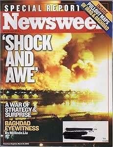
What message is/was the American public
receiving about the Iraq War? Another similar message is
found in war messaging. There is a power imbalance between parties of
war. One party will, by nature, always be at a disadvantage in the
others’ media. The visual messaging of each country will also deliver a
specific ideological message, whether to support the war, whose stories
are important, which sources should be trusted. This is clear in
messaging in the United States produced during the time shortly after
the Iraq War. In “Visually Framing the Invasion and Occupation of Iraq
in TIME, Newsweek, and U.S. News & World Report” (Schwalbe, 2013),
they conclude that the visual narrative in the United States focused on
the conflict, politicians, and human interest pieces. Notably, women and
children, of either nationality, were not present in the dominant
narratives. The injured and the dead were also excluded, as were any
narratives that could be deemed anti-war. This visual narrative gave a
very specific message to the American people, but also erased the Iraqi
citizens’ perspective (Schwalbe, 2013).
Power Usage
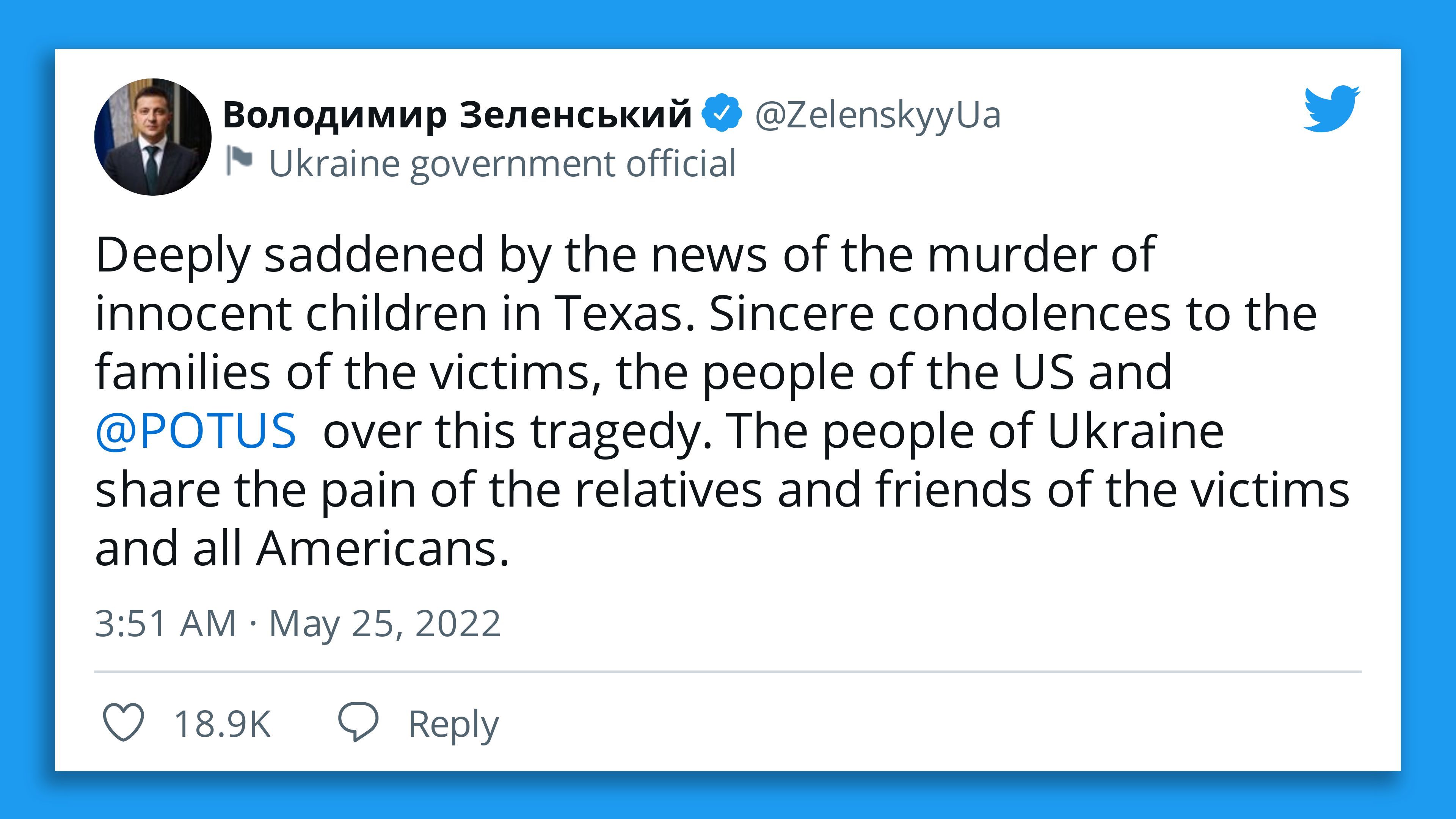
President Zelensky (of Ukraine) tweets a
message of solidarity for the victims of the school shooting in Ulvade,
Texas, despite being actively at war.
Images like these were spread far and wide after the shooting in Paris,
France in 2015. UN’s poster for International Day Against
Homophobia, Biphobia, & Transphobia
As we enter into the digital age,
countries have adapted their visual communication as a result. Social
media has been a driving force in visual communication, with countries
using their presence to impart a specific message on the global
audience, in a way that is much easier than it was before. The article
“Visual narratives of global politics in the digital age: an
introduction” (Crilley, Manor & Bjola, 2020) starts with a striking
example of the American social media presence manipulating a narrative
of China’s absence at a New Start meeting (see screenshot of the tweet
on the right). These New Start talks were bilateral between the United
States and Russia, China played no role in these talks. However, anyone
who followed Special Envoy Billingslea and no one else (the Chinese
Director General of the Department of Arms Control later tweeted his
shock about incident) may be under the impression that China had decided
to abandon these nuclear arms talks, as the United States envoy set up
Chinese flags and empty chairs to signal an absence (Crilley, Manor
& Bjola, 2020).
Social media has presented countries with the opportunity to give
wide audiences a narrative they are in control of. Twitter diplomacy, as
it has become known, is a convenient method for countries to respond to
either their allies or their rivals at a rapid pace. Cilley, Manor &
Bjola (2020) explain that diplomatic social media presences “narrate
global events, explain their countries’ foreign policies, engage with a
globally connected public sphere, and to challenge misinformation and
propaganda” (p. 632). Ninety-eight percent of countries have some sort
of social media presence, and so do a lot of non-state actors, including
terror groups like ISIS. Fear is spread by these state and non-state
actors, but solidarity is also spread through these channels. State and
non-state actors, including private citizens, use social media to extend
sympathy when tragedies occur. They also help movements form
internationally, such as the #MeToo movement, and Black Lives Matter
(Cilley, Manor & Bjola, 2020).
International organizations use social media similarly. They employ
it “to rally global public support for policies…to secure funding and to
disseminate a shared and coherent foreign policy” (Cilley, Manor &
Bjola, 2020, p. 632). They use the platforms to interact with their
audience, with the messaging having a new dimension in comparison to old
one-way communication. The audience can immediately interact with the
messaging, provide feedback, and the organization can adjust if need be.
In this sense, visual communication in this new age has a two-fold
usefulness, one for communicating their message to the audience and one
for receiving immediate feedback for the organization.
Alternative Ways of Knowing
During the pandemic, false information
regarding COVID-19 spread faster than many social media websites
anticipated. Meta, like many other social media sites, now has controls
against mis/disinformation, although their efficacy is
questionable.There is one more
benefit to the age of social media, democratizing the power of
visuals. Every person with internet access can create and communicate a
visual narrative of their choosing, meaning that not only those in power
control the narrative any longer. It reduces the power imbalance between
the audience and those captured in the media. Social media allowed
citizens of countries experiencing the Arab Spring to give the
international audience a visual to the situation in country. Countries
therefore feel the threat of social media; it is frequently the first to
go when democracy is cracked down on, for example in Sri Lanka recently
(Kapur, 2022). There is a drawback to this though, as misinformation
spreads just as quickly as the truth. The power has shifted, but similar
problems exist, as those with knowledge are treated the same as those
without.
Crow: The Legend is a Disney movie that is
inspired by the Cherokee legend of the First Fire, and the Lenape legend
of the Rainbow Crow (although the latter legend’s origin is disputed by
the tribe itself). Scholars in the political science
visual communication field have introduced alternative ways of knowing
as a bridge between the old style of international relations
communication, which was highly driven by powerful actors, and the new,
much more democratized style of communication. This idea suggests that
the visual communication field is perhaps due for some democratization
of its own, and those who have historically lacked power in the field be
invited to the table to introduce their ideas on communicating ideas or
messages visually. In the Americas, this looks like inviting Native
Americans in, and learning from their historical and cultural methods of
communication, which frequently relies on story-telling that leaves room
for the unsaid (Jauhola, 2022).
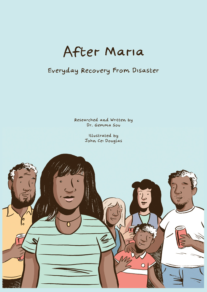
After Maria: Everyday Recovery from
Disaster is a prime example of an alternative way of visual
communicating political science. Another alternative is
integrating more forms of visuals into international relations and
political science communication. Beyond academic papers and political
imagery, there is space for other visuals to grow. Most notable might be
the usage of comic books and graphic novels in this pursuit. After
Maria: Everyday Recovery from Disaster (Sou & Douglas, 2019)
communicates research on low-income victims of Hurricane Maria and their
lives following the aftermath of the disaster. This book communicates
real research, but employs a non-standard method of communicating it,
opening the field to a larger variety of possibilities going forward,
but also expanding the audience beyond academics and into the general
public.
Conclusion
There are very good reasons for
exploring visual communication in the political science/international
relations field. As hinted at previously, the ease in spread of
information also eases the spread of disinformation. Media literacy is
hence essential for all those consuming visual media, but of interest
and concern here are those consuming media that has a political
objective. Without an ability to discern these messages, those who were
granted access into the visual messaging world through the
democratization driven by social media are and will continue to be
influenced by those in power or those looking to wield it. This
cross-section of visual communication studies and political science is
thankfully a field that is experiencing active growth, and hopefully
will continue to in the future, especially as social media (and access
to it) is becoming a decisive factor in the manners that people execute
political power, both domestically and internationally.
References
Papers: Bleiker, R. (2001). The aesthetic turn in
international political theory. Millennium: Journal of International
Studies, 30(3), 509–533. https://doi.org/10.1177/03058298010300031001
Crilley, R., Manor, I., & Bjola, C. (2020). Visual narratives of
global politics in the digital age: An introduction. Cambridge Review of
International Affairs, 33(5), 628–637. https://doi.org/10.1080/09557571.2020.1813465
Dhanesh, G. S., & Rahman, N. (2021). Visual communication and
public relations: Visual frame building strategies in war and conflict
stories. Public Relations Review, 47(1), 102003. https://doi.org/10.1016/j.pubrev.2020.102003
Farkas, X., Jackson, D., Baranowski, P., Bene, M., Russmann, U.,
& Veneti, A. (2022). Strikingly similar: Comparing visual political
communication of populist and non-populist parties across 28 countries.
European Journal of Communication, 026732312210822. https://doi.org/10.1177/02673231221082238
Jauhola, M. (2022). Visual methodologies: Theorizing disasters and
international relations. In M. Jauhola, Oxford Research Encyclopedia of
International Studies. Oxford University Press. https://doi.org/10.1093/acrefore/9780190846626.013.621
Nagel, F., Maurer, M., & Reinemann, C. (2012). Is there a visual
dominance in political communication? How verbal, visual, and vocal
communication shape viewers’ impressions of political candidates: visual
dominance in political communication. Journal of Communication, 62(5),
833–850. https://doi.org/10.1111/j.1460-2466.2012.01670.x
Obradovic-Wochnik, J., & Hayes, S. (2017). Re-visualising
international relations: Audio-visual projects and direct encounters
with the political in security studies. European Political Science,
16(3), 415–429. https://doi.org/10.1057/eps.2016.21
Pfonner, M. R., & James, P. (2020). The visual international
relations project. International Studies Review, 22(2), 192–213. https://doi.org/10.1093/isr/viaa014
Schill, D. (2012). The visual image and the political image: A review
of visual communication research in the field of political
communication. Review of Communication, 12(2), 118–142. https://doi.org/10.1080/15358593.2011.653504
Schwalbe, C. (2013). Visually framing the invasion and occupation of
Iraq in TIME, Newsweek, and U.S. News & World Report. International
Journal of Communication, 7, 239–262.


 How do images like the ones above influence our perception of the
relationship between the two Koreas? If one was exposed to limited
information about the inter-Korean relationship, what conclusions might
they draw? In 2018, the Democratic People’s Republic of
Korea and the Republic of Korea walked together under one flag at the
Winter Olympics held in Pyeongchang, Republic of Korea. They walked
under a white flag with a blue depiction of the Korean peninsula,
unified, as both countries hope, in different ways, to be one day. The
picture above seems to hide the years of war, failed diplomatic talks,
and the lack of resolution on the Korean peninsula about their identity
as a singular or separate nations. Instead, it demonstrates a rare
moment of joy, of unity, however manufactured, along with a majority
white flag, traditionally representative of peace. This gap between the
picture’s direct message and the true nature of the scenario reflects an
age-old problem in visual communication of international relations: the
gap between the representation (in this case, this image) and the
represented (the Koreans of both nations).
How do images like the ones above influence our perception of the
relationship between the two Koreas? If one was exposed to limited
information about the inter-Korean relationship, what conclusions might
they draw? In 2018, the Democratic People’s Republic of
Korea and the Republic of Korea walked together under one flag at the
Winter Olympics held in Pyeongchang, Republic of Korea. They walked
under a white flag with a blue depiction of the Korean peninsula,
unified, as both countries hope, in different ways, to be one day. The
picture above seems to hide the years of war, failed diplomatic talks,
and the lack of resolution on the Korean peninsula about their identity
as a singular or separate nations. Instead, it demonstrates a rare
moment of joy, of unity, however manufactured, along with a majority
white flag, traditionally representative of peace. This gap between the
picture’s direct message and the true nature of the scenario reflects an
age-old problem in visual communication of international relations: the
gap between the representation (in this case, this image) and the
represented (the Koreans of both nations).  What does this image of North Korean citizens mourning Kim Jong Il
communicate? How might they object to the way they were portrayed
outside of North Korea, and was there a full understanding of the
circumstances under which their image would be published?
countries regularly employ visual messaging as a tactic for soft power,
whether for tourism or for international political purposes. Finally, it
is important to employ an emerging ideology, that this ‘gap’ between
reality and the displayed isn’t always a negative, and can be instead
used to assist in alternative methods of learning about the politics at
play between nations. For example, perhaps the unusual flag in the
display causes an interested person to spend some time researching the
situation between the two nations, or causes them to consider a reality
in which the Koreas were unified. These three notions, power difference,
power usage, and alternative methods of knowing will be explored further
in this project.
What does this image of North Korean citizens mourning Kim Jong Il
communicate? How might they object to the way they were portrayed
outside of North Korea, and was there a full understanding of the
circumstances under which their image would be published?
countries regularly employ visual messaging as a tactic for soft power,
whether for tourism or for international political purposes. Finally, it
is important to employ an emerging ideology, that this ‘gap’ between
reality and the displayed isn’t always a negative, and can be instead
used to assist in alternative methods of learning about the politics at
play between nations. For example, perhaps the unusual flag in the
display causes an interested person to spend some time researching the
situation between the two nations, or causes them to consider a reality
in which the Koreas were unified. These three notions, power difference,
power usage, and alternative methods of knowing will be explored further
in this project.
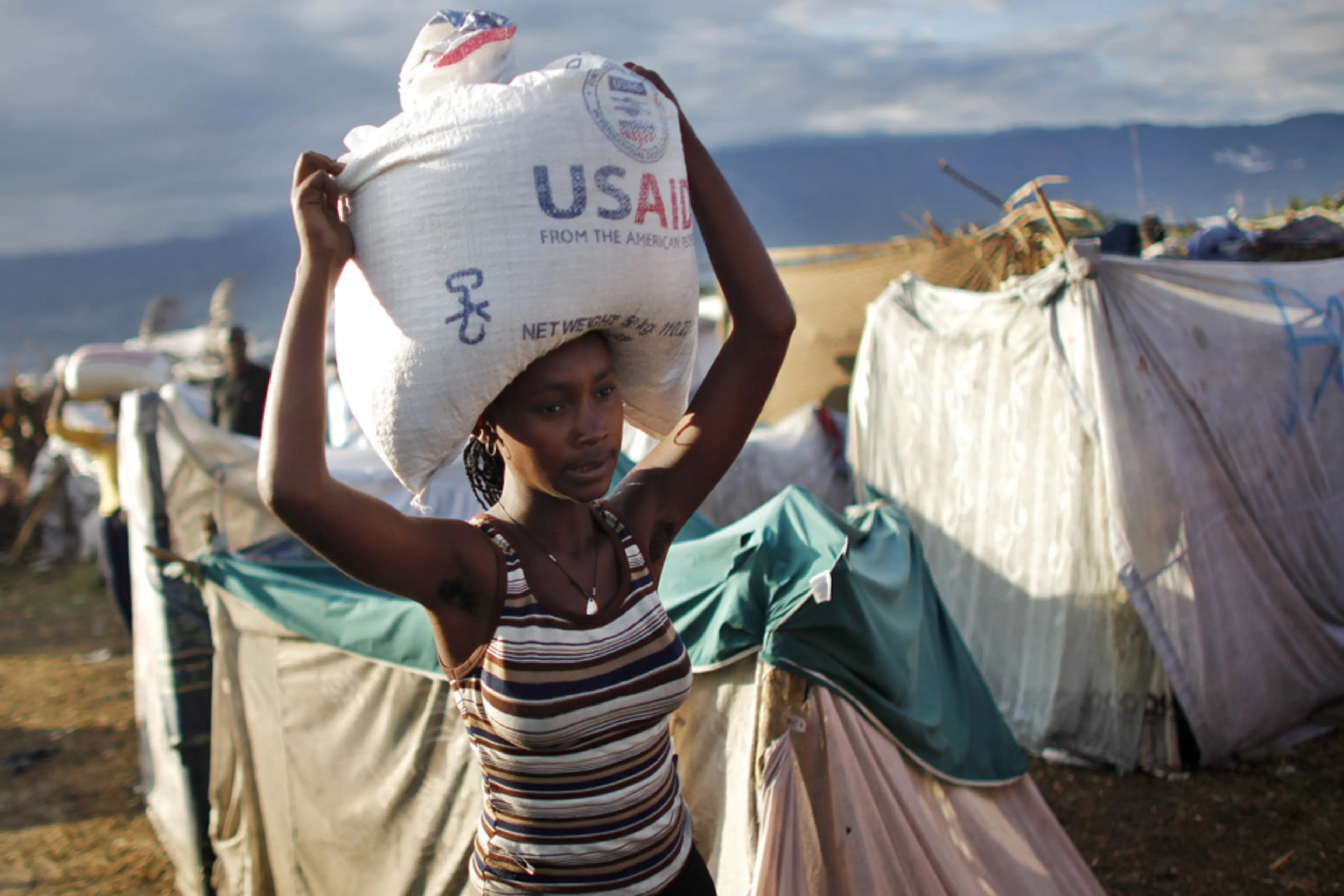
 Being
able to access all this information about the worst parts of our world
requires investigation into how we are communicating and receiving this
information, especially visually.
Being
able to access all this information about the worst parts of our world
requires investigation into how we are communicating and receiving this
information, especially visually. There are important questions to ask when confronted with images like
this. Is this the story this woman wanted told about her? How does the
power difference between the photographer and the subject play a role in
this image? How does the power difference between the audience of the
photograph and the subject affect how its interpreted?
There are important questions to ask when confronted with images like
this. Is this the story this woman wanted told about her? How does the
power difference between the photographer and the subject play a role in
this image? How does the power difference between the audience of the
photograph and the subject affect how its interpreted?


 Images like these were spread far and wide after the shooting in Paris,
France in 2015.
Images like these were spread far and wide after the shooting in Paris,
France in 2015. 


