Penguin ggplot Demo
Professor Selden
21 April, 2022
Do male and females differ in body mass in the same way across species
summ_penguin <- penguins %>%
  group_by(sex, spp) %>%
  summarize(mean_mass=mean(body_mass_g, na.rm=T),
            sd_mass=sd(body_mass_g, na.rm=T),
            n_penguin=n())%>%
  mutate(se_mass=sd_mass/sqrt(n_penguin))

summ_penguin
## # A tibble: 6 x 6
## # Groups: sex [2]
## sex spp mean_mass sd_mass n_penguin se_mass
## <chr> <chr> <dbl> <dbl> <int> <dbl>
## 1 FEMALE adelie 3369. 269. 73 31.5
## 2 FEMALE chinstrap 3527. 285. 34 48.9
## 3 FEMALE gentoo 4680. 282. 58 37.0
## 4 MALE adelie 4043. 347. 73 40.6
## 5 MALE chinstrap 3939. 362. 34 62.1
## 6 MALE gentoo 5485. 313. 61 40.1Basic panel plot with facet_wrap
ggplot(penguins)+
  geom_jitter(aes(x=sex, y=body_mass_g), width=0.1)+
  geom_point(data=summ_penguin, aes(x=sex, y=mean_mass), col="red")+
  geom_errorbar(data=summ_penguin, aes(x=sex, ymin=mean_mass - se_mass, ymax=mean_mass + se_mass), col="red", width=0.1)+
  facet_wrap(~spp)
Two dimensional facets
Examine these by another factor, in this case island. The means and error bars are for the species irrespective of island, so you can see how the data on each island compare to the overall mean for adelie
ggplot(penguins)+
  geom_jitter(aes(x=sex, y=body_mass_g), width=0.1)+
  geom_point(data=summ_penguin, aes(x=sex, y=mean_mass), col="red")+
  geom_errorbar(data=summ_penguin, aes(x=sex, ymin=mean_mass - se_mass, ymax=mean_mass + se_mass), col="red", width=0.1)+
  facet_grid(spp~island)
Make the raw data points transparent
Add alpha=XX to geom_jitter()
ggplot(penguins)+
  geom_jitter(aes(x=sex, y=body_mass_g), width=0.1, alpha=0.25)+
  geom_point(data=summ_penguin, aes(x=sex, y=mean_mass), col="red")+
  geom_errorbar(data=summ_penguin, aes(x=sex, ymin=mean_mass - se_mass, ymax=mean_mass + se_mass), col="red", width=0.1)+
  facet_wrap(~spp)
Get rid of gray background
For who knows why, the default theme for ggplot is theme_gray() Use a theme Options: - theme_bw
- theme_linedraw
- theme_classic A nice one with no gridlines, but doesn’t look as nice with a faceted graph
ggplot(penguins)+
  geom_jitter(aes(x=sex, y=body_mass_g), width=0.1, alpha=0.25)+
  geom_point(data=summ_penguin, aes(x=sex, y=mean_mass), col="red")+
  geom_errorbar(data=summ_penguin, aes(x=sex, ymin=mean_mass - se_mass, ymax=mean_mass + se_mass), col="red", width=0.1)+
  facet_wrap(~spp)+
  theme_bw()
ggplot(penguins)+
  geom_jitter(aes(x=sex, y=body_mass_g), width=0.1, alpha=0.25)+
  geom_point(data=summ_penguin, aes(x=sex, y=mean_mass), col="red")+
  geom_errorbar(data=summ_penguin, aes(x=sex, ymin=mean_mass - se_mass, ymax=mean_mass + se_mass), col="red", width=0.1)+
  facet_wrap(~spp)+
  theme_linedraw()
ggplot(penguins)+
  geom_jitter(aes(x=sex, y=body_mass_g), width=0.1, alpha=0.25)+
  geom_point(data=summ_penguin, aes(x=sex, y=mean_mass), col="red")+
  geom_errorbar(data=summ_penguin, aes(x=sex, ymin=mean_mass - se_mass, ymax=mean_mass + se_mass), col="red", width=0.1)+
  facet_wrap(~spp)+
  theme_classic()
Changing axis labels
Use xlab() and ylab()
ggplot(penguins)+
  geom_jitter(aes(x=sex, y=body_mass_g), width=0.1, alpha=0.25)+
  geom_point(data=summ_penguin, aes(x=sex, y=mean_mass), col="red")+
  geom_errorbar(data=summ_penguin, aes(x=sex, ymin=mean_mass - se_mass, ymax=mean_mass + se_mass), col="red", width=0.1)+
  facet_wrap(~spp)+
  theme_linedraw()+
  xlab("Penguin Sex")+
  ylab("Body Mass (g)")
Changing color scheme
If specifying color based on a factor, ggplot will choose the colors for you based on the number of categories.
ggplot(penguins)+
  geom_jitter(aes(x=sex, y=body_mass_g, col=sex), width=0.1, alpha=0.25)+
  geom_point(data=summ_penguin, aes(x=sex, y=mean_mass), col="red")+
  geom_errorbar(data=summ_penguin, aes(x=sex, ymin=mean_mass - se_mass, ymax=mean_mass + se_mass), col="red", width=0.1)+
  facet_wrap(~spp)+
  theme_linedraw()+
  xlab("Penguin Sex")+
  ylab("Body Mass (g)")
If you’d like it to use a different palette you can specify that with the following:
- scale_color_manual() or scale_color_brewer() for point colors
- scale_fill_manual() or scale_fill_brewer() for barplot fills
See http://applied-r.com/rcolorbrewer-palettes/ for palette choices
ggplot(penguins)+
  geom_jitter(aes(x=sex, y=body_mass_g, col=sex), width=0.1, alpha=0.75)+
  geom_point(data=summ_penguin, aes(x=sex, y=mean_mass), col="red")+
  geom_errorbar(data=summ_penguin, aes(x=sex, ymin=mean_mass - se_mass, ymax=mean_mass + se_mass), col="red", width=0.1)+
  facet_wrap(~spp)+
  theme_linedraw()+
  xlab("Penguin Sex")+
  ylab("Body Mass (g)")+
  scale_color_brewer(palette="Accent")
Changing aspects of the legend
Lots of options described here https://www.datanovia.com/en/blog/ggplot-legend-title-position-and-labels/
Changing legend labels and position with a coordinate flip of graph
- Flipping X and Y using
coord_flip()
- Reverse the order of the legend with
guide = guide_legend(reverse=TRUE).
Reversing the order of the legend is often helpful when you have flipped the coordinates so that they appear in the same order in the legend.
ggplot(penguins)+
  geom_jitter(aes(x=sex, y=body_mass_g, col=sex), width=0.1, alpha=0.75)+
  geom_point(data=summ_penguin, aes(x=sex, y=mean_mass), col="red")+
  geom_errorbar(data=summ_penguin, aes(x=sex, ymin=mean_mass - se_mass, ymax=mean_mass + se_mass), col="red", width=0.1)+
  facet_wrap(~spp)+
  theme_linedraw()+
  xlab("Penguin Sex")+
  ylab("Body Mass (g)")+
  coord_flip()+
  scale_color_brewer(palette="Accent", guide = guide_legend(reverse=TRUE))
Changing legend position
You can change the position of the legend with theme(legend.position=X) - “top” for the top of the plot - “none” for no legend
ggplot(penguins)+
  geom_jitter(aes(x=sex, y=body_mass_g, col=sex), width=0.1, alpha=0.75)+
  geom_point(data=summ_penguin, aes(x=sex, y=mean_mass), col="red")+
  geom_errorbar(data=summ_penguin, aes(x=sex, ymin=mean_mass - se_mass, ymax=mean_mass + se_mass), col="red", width=0.1)+
  facet_wrap(~spp)+
  theme_linedraw()+
  xlab("Penguin Sex")+
  ylab("Body Mass (g)")+
  scale_color_brewer(palette="Accent")+
  theme(legend.position = "top")
Changing plot symbols
Changing the size of the symbols with cex=number
Here I am changing the size of the symbol for the mean to be larger. The default is cex=1.
ggplot(penguins)+
  geom_jitter(aes(x=sex, y=body_mass_g, col=sex), width=0.1, alpha=0.75)+
  geom_point(data=summ_penguin, aes(x=sex, y=mean_mass), col="darkred",  cex=3)+
  geom_errorbar(data=summ_penguin, aes(x=sex, ymin=mean_mass - se_mass, ymax=mean_mass + se_mass), col="black", width=0.1)+
  facet_wrap(~spp)+
  theme_linedraw()+
  xlab("Penguin Sex")+
  ylab("Body Mass (g)")+
  scale_color_brewer(palette="Accent")+
  theme(legend.position = "top")
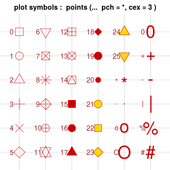
Changing the shape with pch=number and designate border color
Here’s the list of symbol types in R.
[http://www.cookbook-r.com/Graphs/Shapes_and_line_types/figure/unnamed-chunk-2-1.png]
Here I switch the shape=22, which is a square with a different color border and fill. I can specify the border with col="color" and the fill with fill="color2". I’ve removed the error bars so you can see the change more easily.
ggplot(penguins)+
  geom_jitter(aes(x=sex, y=body_mass_g, col=sex), width=0.1, alpha=0.75)+
  geom_point(data=summ_penguin, aes(x=sex, y=mean_mass), col="red",  cex=3, shape=22, fill="darkred")+
  facet_wrap(~spp)+
  theme_linedraw()+
  xlab("Penguin Sex")+
  ylab("Body Mass (g)")+
  scale_color_brewer(palette="Accent")+
  theme(legend.position = "top")
Combining plots
Vignette introducing cowplot package https://cran.r-project.org/web/packages/cowplot/vignettes/introduction.html Vignette describing combininb plots with gridExtra package https://cran.r-project.org/web/packages/cowplot/vignettes/introduction.html
plot_bodymass <- ggplot(penguins)+
  geom_jitter(aes(x=sex, y=body_mass_g, col=sex), width=0.1, alpha=0.75)+
  geom_point(data=summ_penguin, aes(x=sex, y=mean_mass), col="red")+
  geom_errorbar(data=summ_penguin, aes(x=sex, ymin=mean_mass - se_mass, ymax=mean_mass + se_mass), col="red", width=0.1)+
  facet_wrap(~spp)+
  theme_linedraw()+
  xlab("Penguin Sex")+
  ylab("Body Mass (g)")+
  scale_color_brewer(palette="Accent")+
  theme(legend.position = "none")
Create a second plot for body mass as a function of flipper length by species
plot_flipper_mass <- ggplot(penguins)+
  geom_point(aes(x=flipper_length_mm, y=body_mass_g, col=spp), alpha=0.75)+
  scale_color_brewer(palette="Set2")+
  xlab("Flipper Length (mm)")+
  ylab("Body Mass (g)")+
  theme(legend.position = "right")
plot_flipper_mass
You can see from the above plot that one hidden benefit of loading cowplot is that it changes the default theme to be
 theme_cowplot() which by my view is better than the default theme_gray() used by ggplot. But you can over-ride to whatever you prefer with theme() as I have still in the code for the first plot to use theme_linedraw().
Arrange plots
plot_grid(plot_bodymass, plot_flipper_mass, labels=c("A", "B"), ncol = 2, nrow = 1) #### Change relative widths and set figure dimensions in chunk Specify the figure dimensions within the chunk
 {r some text, fig.height=desired_height, fig.width=desired.width}
plot_grid(plot_bodymass, plot_flipper_mass, labels=c("A", "B"), ncol = 2, nrow = 1,
          rel_widths=c(1,1.5)) # make the right plot 1.5x width of the left plot
More details on options with
 gridExtra and cowplot packages here: http://www.sthda.com/english/wiki/wiki.php?id_contents=7930
Saving plots
You can save your plots automatically with the chunk name that created it by adding cache=T into the code chunk. If you wanted to do this to all of the figures you made in the whole .Rmd you could do this by specifying the YAML options up in the top to keep the Markdown (md):
output:
html_document:
keep_md: true
combo_plot <- plot_grid(plot_bodymass, plot_flipper_mass, labels=c("A", "B"), ncol = 2, nrow = 1,
          rel_widths=c(1,1.5)) # make the right plot 1.5x width of the left plot
combo_plot
By saving with ggsave or save_plot
If you want to save any single plot generated you can use ggsave(filename, plot). You can specify the plot you want to save. It will default to the last plot created. You need to specify the format with the extension in the filename (.png, .jpg, .tiff), and other parameters like height=X, width=Y, units="in" or "px", dpi=resolution
ggsave(filename="lastplotdemo.png", height=4, width=9, units="in", dpi=300)To save a particular plot that might not be the last one you made, you’ll have needed to name the plot. We named one of our plots above plot_flipper_mass so I can save that one here by including the plot name.
ggsave(filename="namedplotdemo.png", plot=plot_flipper_mass, height=3, width=5, units="in", dpi=300)Cowplot also tells us that save_plot() works better for multipanel plots.
save_plot(filename="save_plot_demo.png", plot=combo_plot,
          ncol=1, nrow=1,
          base_height=4, base_width=9)
Too my eye lastplotdemo.png and save_plot_demo.png are identical, so perhaps this would be true if the multipanel plots were more complicated.