A tutorial on writing evidence gap map
Arindam Basu
22/04/2021
What are evidence gap maps
Evidence gap maps are visual documents where a set of interventions are
plotted on the y axis and a set of outcomes are plotted on the x axis,
and for each cell that each intervention and outcome define, a set of
available evidence in the form of the number of impact evaluation or
primary studies such as randomised controlled trials or other forms of
observational studies or systematic reviews or meta analyses are posted.
Each meta-analysis, systematic review, and primary study is also
described in terms of who were studied, what specific intervention was
studied, how many were in each arm of the study, what were the results,
and how different biases were addressed so that their overall quality
scores are also made available. For each meta-analysis or systematic
review, how each of the studies included in the meta-analysis or
systematic review was identified is posted, a description of the main
hypothesis and key findings are provided and a summary of the quality
appraisal of such meta-analysis and systematic review is provided. In
final tally, there will be a number of boxes or cells that will remain
unfilled or gaps might exist in such a matrix. These gaps present the
evidence gap and is presented in the form of a map.
Why would anyone consider to conduct an EGM? These are mainly conducted
to address gaps in research and synthesis of data that are relevant to
policy making, but we can argue that such processes can be used anywhere
or in any situation where we want to identify a gap in evidence.
Snilstveit and colleagues, who produced a documentation on creating
evidence gap maps, contend two areas that are relevant for producing
evidence gap maps:
- Where “absolute gaps” exist - these include no primary studies or
few primary studies exist on an intervention or exposure and outcome
combination. For example, imagine that you are planning to study
what interventions exist to address institutional bullying. But you
find no randomised controlled trial is conducted by anyone to
address what intervention might be useful for addressing
organisational bullying. Then, such a gap is referred to as an
absolute gap. Or for another example, say you want to find out what
primary studies exist about interventions to mitigate poverty that
occurs due to climate change related water level rise in endangered
communities and find only a handful of primary studies but they are
not of good quality of evidence. This is also a form of absolute gap
where you want to draw attention to the fact that few studies exist
but more studies need to be conducted.
- The second rationale is where “synthesis gaps” exist – here,
primary studies do exist, but these studies are not “synthesised” in
the form of systematic reviews or meta-analyses. Hence, these are
opportunities where you can conduct evidence gap map to see how new
syntheses can be conducted.
In any case, evidence gap maps are useful in laying out the “landscape”
to make it clear as to what evidence exists and what is the quality of
evidence that can then drive future research and investment efforts. In
some sense, evidence gap maps are superior to systematic reviews alone
for such purposes.
Evidence gap maps (“EGM”) according to [@Snilstveit2016] are superior to
systematic reviews (“SR”) on several counts: these are visual and
simple, providing people an easy access to key information. EGMs are
fast and rapidly compiled while SRs are time consuming. Finally, SRs are
of varied quality and are widely scattered all over the place. On the
other hand, EGMs can incorporate both SRs and primary studies and in
each case, they are described and critically appraised for the reader to
make best judgment.
Step by step
Snilstveit and colleagues (Snilstveit et al. 2016) have provided a six-step
approach for constructing gap maps as follows (See Figure 1)

Figure 1. Steps of constructing an evidence gap map, from: Snitstveit et al article
Let’s construct this step by step:
Step 1: First decide on a framework of interventions and outcomes and construct an empty shell of a table. Let’s say we are interested in finding out what evidence and evidence gap exists for interventions aimed at health effects due to climate change and their mitigation. The first stepping stone for such a process will be to search for journal article or scholarly articles that have already explored this issue to some extent and understand what interventions and what outcomes have been conducted. Say we conduct a preliminary search on Google Scholar and identify a paper by Walker et al (Walker et al. 2011) where they conducted a literature review of health promotion interventions for mitigation of health effects due to climate change. This is a good stepping stone for identifying further papers and initiatives. Other sources might be to search for dedicated and targeted literature databases to find out specific information about your own topic. Then, based on such reading of the literature and our web searches, we may set up a matrix like this:
| Outcomes | ||||
| Interventions | Respiratory Infection | Foodborne Infection | Active transport | Increased fruits and vegetable consumption |
| Social marketing and media advocacy | ||||
| Health Education | ||||
| Skill development | ||||
| Individual risk factor assessment |
As you can see, the matrix consists of rows and columns. Each row is one intervention, and each column is one outcome that we will consider for this evidence gap map.
Step 2: Set the inclusion and exclusion criteria for selecting your studies
This step is important as this will set the scene pretty much. We can set inclusion criteria to include certain range of years or more specifically dd/mm/yyyy. For example, you can decide that you will only include studies that are as follows:
- Studies published in English language only
- Studies published in peer-reviewed journals
- Studies that are ONLY systematic reviews (meta-analyses are included in this) or a mix of Systematic Reviews, and randomised controlled trials or impact evaluations
- Studies published in the last five years (hence the range will be between 01/01/2015 - 31/12/2020)
- Studies must study the specific intervention and outcomes in the table
You will include only such studies as would satisfy such criteria, and you will exclude all other studies. Snitsveit et al recommend that you make this decision as to what type of studies will be included based on what you want to do.
- If your goal is to inform policy decisions, then aim to conduct a evidence gap map on the basis of SRs,
- If your goal is to inform what primary study can be conducted to mitigate the information gap, focus on primary studies and SRs as both will be useful.
Step 3: Search literature.
Here, select a relevant set of databases and conduct your search. Before you conduct the search, it is useful to set up what we often refer to as PICO (population-intervention or exposure - comparator- outcome) frameworked search terms. It is always a good idea to work along with a librarian or information retrieval expert. Table 2 provides a sample PICO table for
| PICO Terms | Explanations |
|---|---|
| P (Participants) | Men and women, all age groups and ethnicity, all countries at risk of climate change |
| I (Intervention) | Media advocacy or social marketing |
| C (Comparison) | Standard approach or no approach |
| O (Outcomes) | climate change related pneumonia or respiratory infections, mortality, or illness |
Table 3 provides a listing of various terms that one can use to search Pubmed to identify randomised controlled trials and systematic reviews and meta analyses covering these terms (additonal restrictions would include Human studies only, English language, published in the last five years)
library(tidyverse)## ── Attaching packages ─────────────────────────────────────── tidyverse 1.3.1 ──## ✓ ggplot2 3.3.3 ✓ purrr 0.3.4
## ✓ tibble 3.1.1 ✓ dplyr 1.0.5
## ✓ tidyr 1.1.3 ✓ stringr 1.4.0
## ✓ readr 1.4.0 ✓ forcats 0.5.1## ── Conflicts ────────────────────────────────────────── tidyverse_conflicts() ──
## x dplyr::filter() masks stats::filter()
## x dplyr::lag() masks stats::lag()library(knitr)
table3 <- read_csv("pubmed_search.csv")##
## ── Column specification ────────────────────────────────────────────────────────
## cols(
## `Search number` = col_double(),
## Query = col_character(),
## `Sort By` = col_logical(),
## Filters = col_logical(),
## `Search Details` = col_character(),
## Results = col_number(),
## Time = col_time(format = "")
## )table4 <- table3 %>%
select(-`Sort By`, -Filters, -Time)
kable(table4)| Search number | Query | Search Details | Results |
|---|---|---|---|
| 13 | #3 AND #12 | (“social marketing”[Title/Abstract] OR “media advocacy”[Title/Abstract]) AND (“pneumonia”[Title/Abstract] OR “respiratory infection”[Title/Abstract]) | 2 |
| 12 | #5 OR #7 | “pneumonia”[Title/Abstract] OR “respiratory infection”[Title/Abstract] | 138669 |
| 11 | #1 AND #9 | “social marketing”[Title/Abstract] AND ((“climate change”[Title/Abstract] AND “pneumonia”[Title/Abstract]) OR (“climate change”[Title/Abstract] AND “respiratory infection”[Title/Abstract])) | 0 |
| 10 | #3 AND #9 | (“social marketing”[Title/Abstract] OR “media advocacy”[Title/Abstract]) AND ((“climate change”[Title/Abstract] AND “pneumonia”[Title/Abstract]) OR (“climate change”[Title/Abstract] AND “respiratory infection”[Title/Abstract])) | 0 |
| 9 | #6 OR #8 | (“climate change”[Title/Abstract] AND “pneumonia”[Title/Abstract]) OR (“climate change”[Title/Abstract] AND “respiratory infection”[Title/Abstract]) | 42 |
| 8 | #4 AND #7 | “climate change”[Title/Abstract] AND “respiratory infection”[Title/Abstract] | 9 |
| 7 | respiratory infection[Title/Abstract] | “respiratory infection”[Title/Abstract] | 10493 |
| 6 | #4 AND #5 | “climate change”[Title/Abstract] AND “pneumonia”[Title/Abstract] | 33 |
| 5 | pneumonia[Title/Abstract] | “pneumonia”[Title/Abstract] | 129934 |
| 4 | climate change[Title/Abstract] | “climate change”[Title/Abstract] | 39610 |
| 3 | #1 OR #2 | “social marketing”[Title/Abstract] OR “media advocacy”[Title/Abstract] | 2274 |
| 2 | media advocacy[Title/Abstract] | “media advocacy”[Title/Abstract] | 177 |
| 1 | social marketing[Title/Abstract] | “social marketing”[Title/Abstract] | 2106 |
As can be seen in the above table, no study was identified that had respiratory infection related illness outcomes (pneumonia, or other respiratory illnesses) that were relevant for climate change and that also were addressed with social market or media advocacy. However, several thousand studies were available for climate change and respiratory illnesses and pneumonia, and only a couple of studies looked into respiratory illnesses or pneumonia and media advocacy or social marketing. Hence, we have not identified any study worth reporting here, and this is an evidence gap at this stage.
Step 4: Extract data from individual studies, write user friendly summaries
- Extract descriptive information from individual studies. – This includes the title of the study, the first author, the year of publication, the type of study, the population studied, the intervention, the main outcome, the outcome measures, the results, and the conclusion.
- Write in brief a brief background of the problem, the methods used, and the main findings of the study. You can optionally write a critical review of the study itself. However, as you may find yourself working with hundreds of studies, a thorough critical appraisal may be beyond the scope of this work.
In Table 4, we provide an example of extraction of information from a study that can be included in an evidence map. For this study, let’s say we have identified an article by Dimitrova (Dimitrova et al. 2021) and we want to extract information from such an article. The extracted table may look like as follows:
| Study title | Year | Publication type | Population | Intervention or Exposure | Outcome | Measure | Results |
|---|---|---|---|---|---|---|---|
| Association between ambient temperature and heat waves with mortality in South Asia | 2020 | SR | South Asian population | Ambient Temperature and heat waves | All cause deaths | Mortality increases in percentage per unit degree centigrade increase in temperature | 0.2% to 3.2% increase in death rates per unit increase in temperature |
Summary of this paper
Climate change is associated with increased global temperature. Increased temperature in turn is associated with increased risk of death. Heat waves are episodes of increased temperature and are known to be associated with increased risk of deaths worldwide; however, the authors argued a lack of summary estimate of such associations between heat waves and rising temperature and deaths from South Asia. Hence they conducted a systematic review of the literature to study the association between rising temperature and heat waves with risk of death. They found that per unit increase in the ambient temperature, the risk of deaths from all causes among adults increased anywhere between 0.2 percent to 3 percent in South Asia.
Step 5: Present a visual overview of the evidence by creating marks in the table you created in Step 1. There may be several different ways of creating these visual summaries. If you use both systematic reviews and primary studies for your evidence mapping, then, use different coloured circles for your systematic reviews and primary studies. You can alternatively used different shapes for representing your study types, such as circles for systematic reviews and squares for primary studies. Further, depending on the number of each study type you can alter the size of such circles and squares. If you choose to include quality appraisal indicators, you can additionally colour the border of such studies with high quality studies as “green,” medium quality studies as “blue” and poor quality studies as “red” borders. At the least, you can indicate how many of each study type you identified in the evidence mapping exercise. If no study was identified or if no study was found that met your criteria, then you can leave the cell blank in the table. Otherwise, at the simplest you can fill them with various numbers pertaining to each study type. In Figure 2, we provide an example of a completed evidence gap map for your review.
Following the presentation of the evidence gap map visual table, write a brief summary of the implications of such a map and what are the policy or research implications might be. For example, imagine that you are planning to develop an evidence gap map for what needs to be done policy wise to improve cognitive ability of children in primary schools and you have identified research or evaluation gaps. Then write about the presence of such gaps and the research needs. in the report, describe the methods you used to develop the gap map, and mention or indicate the kind of studies you obtained and have used in constructing the gap map.
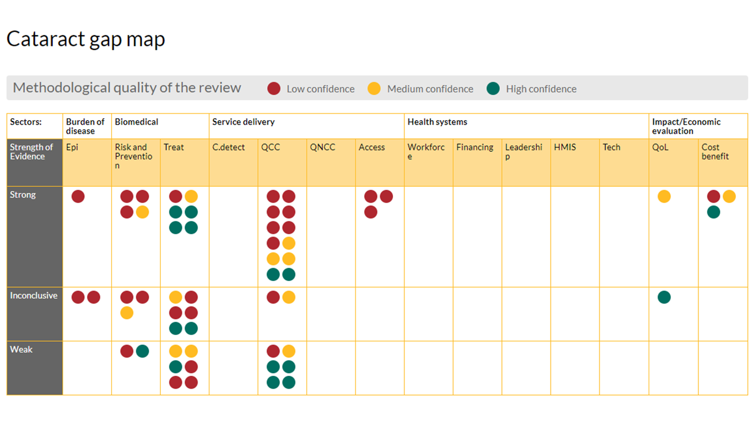
In this map, as you can see, instead of interventions, they used “strength of evidence,” and the columns were organised according to their choice of variables such as “burden of disease,” “service delivery” and “health systems performance” and so on. This is an indication that an evidence gap map can be variously used and configured.
Summary
An evidence gap map is a powerful visualisation tool to identify the extant knowledge and gaps that exist in the literature. Such maps help the policymakers and researchers themselves to understand where lack of knowledge in their respective fields and approaches exist and ways to remedy such gaps. The steps are similar to constructing systematic reviews except that in gap map construction, a formal synthesis of study results is not necessary, and often, because of time constraints, researchers do not have to critically appraise individual studies. However, critical appraisal of included studies is likely to improve the quality of evidence gap maps as well. Finally, such maps can be living documents that can be updated as needed to explore and remedy absolute versus synthesis gaps.