Assignment 2
Deconstruct, Reconstruct Web Report
Joheb Shaikh(s3823492)
Click the Original, Code and Reconstruction tabs to read about the issues and how they were fixed.
Original

Objective
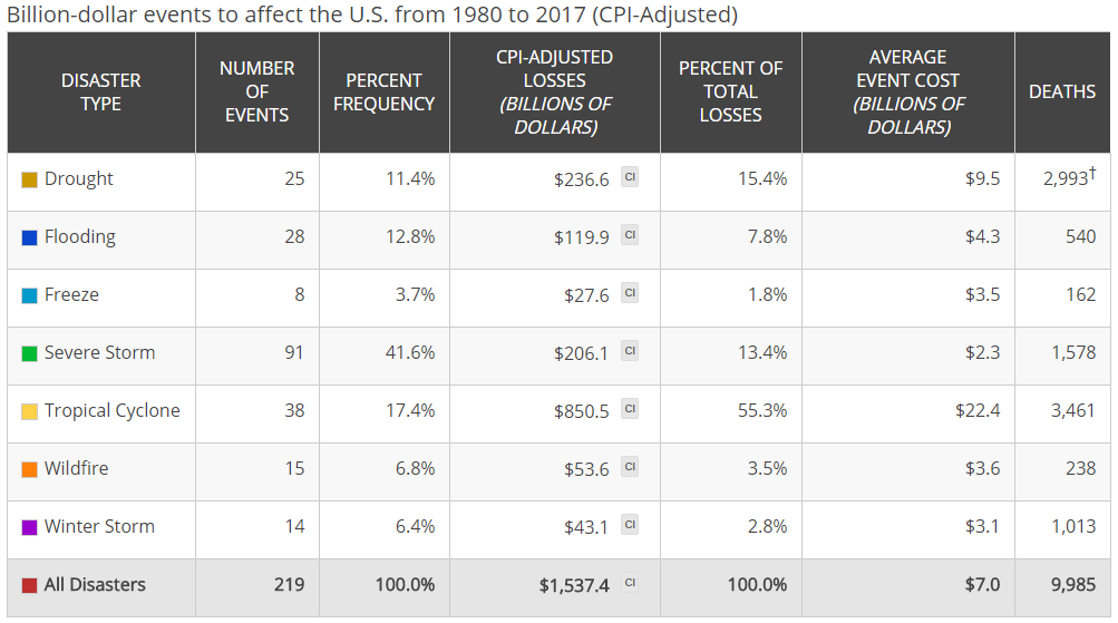
The USA being the world’s largest economy at more than $20 trillion has seen some major environmental impacts on their economy from past 4 decades. The following pie chart shows us some of the most expensive natural disasters in American history along with the cost of these damages. The objective of this data visualisation is to show how these environmental disasters have played a spoilsport in the lives of the people living in the US and its major impact on the US government to sustain these financial losses. The graph also highlights which natural disasters majorly occur in USA and are a threat to the people and government in terms of financial losses and lives.
The target audience is naturally the people of United States, the US government and federal agencies who need to take into account these disasters coming their way at any given point of time, by being better prepared for such natural calamities. The graph shows the amount of losses incurred by the country and its people and hence how they need to be tackle these situations aggressively.
We can observe the following three significant issues in the graph:
- Improper choice of graph: The usage of pie chart in the data visualisation lacks visual accuracy as it is difficult to gauge the losses due to the natural disasters by just looking at the graph sans (without) the numbers. For example, the losses due to the winter storm and freeze are confusing to understand without the numerical values. This leads to visual deception for the viewer who may find it difficult to understand the graph by having a look at it.
- Visual Bombardment: The graph uses too many visual elements which take the focus away from its objective. For example, the icons incorporated in the graph for each natural calamity distract the viewer from observing key elements of the graph viz. the disaster type and its subsequent loss. Another major issue, is that the values are provided in terms of USD (currency) as well as percentage (%) which creates a sense of confusion leading to deceiving the viewer.
- Incorrect use of colour scheme: The colours used in the graph are not in the appropriate colour scheme/colour palette as icons and colour used for every category are haywire. For example, if graph wanted to show the icon to relate the corresponding disaster, then for wildfire they should’ve used a colour like green or orange to signify forests or fire. Overall, the colour scheme used is quite poor as it fails to create a visual impact. The original colour scheme is not blindly safe especially for people with Tritanomaly, Protanopia, Deuteranopia, Tritanopia or Monochromacy and can be enhanced further.
Blindness Check
Original

Tritanomaly

Protanopia

Deuteranopia

Tritanopia

Monochromacy

Reference
*The Economic Cost of Mother Nature’s Destructive Fury in U.S. Retrieved from howmuch.net website:https://howmuch.net/articles/the-cost-of-natural-disaster-in-the-united-states
Code
The following code was used to fix the issues identified in the original.
library(ggplot2)
library(ggpubr)
library(dplyr)
library(cowplot)
library(gridExtra)


#### Creating a Data Frame ####


Cost_of_NaturalDisaster_in_US<- data.frame(
  Cost_of_events=c(850.5,236.6,206.1,119.9,53.6,43.1,27.6), Disaster_Type= factor(c('Tropical Cyclone','Drought','Severe Strom','Flooding','Wildfire','Winter Strom','Freeze'), levels = c('Tropical Cyclone','Drought','Severe Strom','Flooding','Wildfire','Winter Strom','Freeze'),ordered = FALSE) )

Cost_of_NaturalDisaster_in_US<-Cost_of_NaturalDisaster_in_US %>% mutate(Percentage = Cost_of_events/1537.4*100, Proportion = '')

#### Plot-1#####

p_1<-ggplot(data = Cost_of_NaturalDisaster_in_US,aes(x =reorder(Disaster_Type,Cost_of_events), y = Cost_of_events, fill = Disaster_Type))+
  coord_cartesian(xlim = c(0,1000))+
  coord_flip()+
  labs(title = "The Cost of Natural Disasters in the United States",subtitle = "Billion-dollar Events from 1980 to 2017", fill = 'Disaster Type', x= '', y='Cost of Events( USD billions)' ) +
  theme_classic()+
  geom_bar(stat = "identity",colour = "black", width = .8)+
  scale_fill_manual(values =rev(c('#eff3ff','#c6dbef','#9ecae1','#6baed6','#4292c6','#2171b5','#084594')))+
  geom_text(aes(label=paste0(Cost_of_events,'B'), x= Disaster_Type),position =position_dodge(width = 0.4), hjust = -0.1, color='black',,family="Times New Roman",size = 2.6, facefont='bold')

#### Plot-1a(for proportion) #####

p_2<-ggplot(Cost_of_NaturalDisaster_in_US, aes(x = Proportion, y = Cost_of_events, fill = Disaster_Type)) +
  geom_col(width = 0.2)+
  coord_flip() +
  labs( caption = "Source: https://www.climate.gov", x='Proportion of Group',y='Cost of Events Hold (USD Billions)' ) +
  geom_text(aes(label = paste0(round(Percentage,digits = 1),'%') ), position = position_stack(vjust=0.8), vjust=-5, colour='black',size=2.6) +
  geom_text(aes(label = paste0(Cost_of_events,'B')), position = position_stack(vjust=0.8), vjust=6, colour='black', size=2)+
  scale_fill_brewer(palette = "Set2") +
  scale_fill_manual(values =rev(c('#eff3ff','#c6dbef','#9ecae1','#6baed6','#4292c6','#2171b5','#084594')))+
  theme_minimal() +
  theme(legend.position = "none")
Data Reference
The numbers for our visualisation were found from the National Oceanic and Atmospheric Administration (NOAA).Retrieved from website: https://www.climate.gov/sites/default/files/billions-2017-fig5-fullsize.png
Reconstruction
The following plot fixes the main issues of the original plot as the data is now presented in a horizontal bar graph as well as a singular stacked horizontal bar. As the original data visualisation used area-angle (pie chart) method to distinguish between the losses incurred by each disaster which made it visually difficult to differentiate, the reconstructed plot is simple and easy to observe the impact of every natural disaster in the USA. The colour scheme used is also followed using the colour blindness check.
