Midterm 1 Framework, Example Dataset with Questions
Here is an example of a dataset with some questions to help guide your preparation for the midterm. To be clear, your questions will differ depending on your data set, but you should expect the style of questions to be very similar. If you need some guidance on how any part of this might go for your data set, I’m happy to meet and walk you through some steps.
Task 0: (2 weeks before the exam) Schedule your exam, choose a dataset, and give two questions that you’d like to answer using this data
My goal for this midterm is to assess your ability to use RStudio to analyze data and extract information. There are two core skills being assessed here: summarizing or visualizing data with R, and thinking critically about these summaries and observations. We’ve done some of each type of work in class, so now I’ll be asking you to do the same in each type of exam.
In essence, the task is simple to say. Before the exam, you’ll choose a dataset you’re interested in and come up with a few questions you have about it. During the exam, you’ll show me you can manipulate this dataset in R and give preliminary answers to those questions.
I’ll put a Google Form on the class Moodle page which will ask you for the following information, due 2 weeks before exam week. You’ll put in 3 possible dates/times when you’d like to take your exam, upload the dataset you’d like to work with, and write 3 questions you have which the dataset might be able to answer.
To start you off, here are some websites with freely available data coming from a wide range of sources. The datasets below come from all kinds of different sources. Some are in formats different from the .csv files we’ve used in class, others will be far too large for us to deal with, and still others will be too small to contain anything interesting. I’m available to help you find a suitable dataset and load it into RStudio before your exam. I’m confident that whatever your interests are, you can find something relevant to you.
Jester: ratings of films, jokes, and movies
MovieLens: movie ratings with year and genres
Sports-reference: statistics for baseball, basketball, football, hockey at pro and college levels
Kaggle.com: great source of introductory and interesting datasets
Task 1: (Right before the exam) Make sure the tidyverse is loaded in your workspace
Before the exam begins, I will require that you already have ‘tidyverse’ loaded and ready to go. This will make sure that during your exam we’ll have as much time as possible to work! There will only be 15 minutes per exam, and running out the clock is not encouraged. If we don’t get to all the required questions in the time we have, you will not receive credit for them. Remember, the commands are
install.packages("tidyverse", repos = "http://cran.us.r-project.org")##
## The downloaded binary packages are in
## /var/folders/nf/brwcsr2n5ld2lrkdcrch32xw0000gp/T//RtmpccboSv/downloaded_packageslibrary(tidyverse)## ── Attaching packages ───────────────────────────────────────────────────── tidyverse 1.3.0 ──## ✓ ggplot2 3.3.2 ✓ purrr 0.3.4
## ✓ tibble 3.0.3 ✓ dplyr 1.0.1
## ✓ tidyr 1.1.1 ✓ stringr 1.4.0
## ✓ readr 1.3.1 ✓ forcats 0.5.0## ── Conflicts ──────────────────────────────────────────────────────── tidyverse_conflicts() ──
## x dplyr::filter() masks stats::filter()
## x dplyr::lag() masks stats::lag()Task 2: Load in your data set
I’ll ask you to start by uploading the data you intend to work with. Using read_csv or whatever command you might need, the end result should be a tibble containing your dataset. In this case our data file is shapes.csv, so we upload the file into our workspace and run the command
shapes <- read_csv("shapes.csv")## Parsed with column specification:
## cols(
## shape = col_character(),
## color = col_character(),
## area = col_double()
## )Task 3: Identify variables and observations
Next, I’ll want you to go through the variables in your data set and explain briefly what they represent and whether they are categorical or numerical. If there are a lot of variables, it’s ok to just explain those you think are interesting.
shapes## # A tibble: 1,000 x 3
## shape color area
## <chr> <chr> <dbl>
## 1 square yellow 9409
## 2 circle yellow 4072.
## 3 triangle blue 2028
## 4 square blue 3025
## 5 square blue 9216
## 6 square yellow 4356
## 7 circle yellow 78.5
## 8 triangle red 4563
## 9 square yellow 1156
## 10 triangle red 5043
## # … with 990 more rowsIt may also help to list all the variables at once, without any observations. You can do this with following command.
names(shapes)## [1] "shape" "color" "area"In this case, we have 3 variables: shape, color, and area. The first two are categorical, while the third is numerical and continuous.
Task 3: Exploratory Data Analysis (Summary Statistics)
This is where questions will begin to differ based on your individual data sets. I will ask you 1-2 questions like this to get a sense of how well you can manipulate your dataset and extract information. I’ve given a lot of example questions below to guide your preparation.
Summary Statistics Sample Questions
- In this case, we only have one numerical variable, but it would be natural to ask for some summary statistics: the maximum, minimum, mean, median, and standard deviation.
shapes %>% summarize( maxarea=max(area), minarea=min(area), meanarea=mean(area), medianarea=median(area), sdarea=sd(area))## # A tibble: 1 x 5
## maxarea minarea meanarea medianarea sdarea
## <dbl> <dbl> <dbl> <dbl> <dbl>
## 1 31416. 0.8 3945. 2611. 4754.I would also want you to interpret these in the context of your dataset. For example, if your dataset has to do with cooking, I’d ask what these numbers would be saying about that. There isn’t much to go on here because these are just shapes, but presumably your example will have more interesting context.
- Now, since we have some categorical variables in play, it makes sense to group by those results and understand the breakdowns of summary statistics for each color.
shapes %>% group_by(color) %>% summarize( maxarea=max(area), minarea=min(area), meanarea=mean(area), medianarea=median(area), sdarea=sd(area))## `summarise()` ungrouping output (override with `.groups` argument)## # A tibble: 4 x 6
## color maxarea minarea meanarea medianarea sdarea
## <chr> <dbl> <dbl> <dbl> <dbl> <dbl>
## 1 blue 21642. 0.8 3208. 2500 3039.
## 2 green 27759. 1 5761. 3844 6695.
## 3 red 31416. 0.8 3816. 2437. 5093.
## 4 yellow 31416. 1 4538. 2818. 5352.Obtaining a breakdown by shape is very similar.
shapes %>% group_by(shape) %>% summarize( maxarea=max(area), minarea=min(area), meanarea=mean(area), medianarea=median(area), sdarea=sd(area))## `summarise()` ungrouping output (override with `.groups` argument)## # A tibble: 3 x 6
## shape maxarea minarea meanarea medianarea sdarea
## <chr> <dbl> <dbl> <dbl> <dbl> <dbl>
## 1 circle 31416. 28.3 10703. 7857. 9245.
## 2 square 9801 1 3411. 2500 2949.
## 3 triangle 7351. 0.8 2565. 2107. 2166.- We can also combine these questions: what is the average area of a yellow square?
shapes %>% filter(color=="yellow", shape=="square") %>% summarize(meangreenarea=mean(area))## # A tibble: 1 x 1
## meangreenarea
## <dbl>
## 1 3333.- (Not on your exam) If you know an object is red, with area larger than 3,000, what percentage of these are squares? triangles? circles? We can filter out only those objects that satisfy the conditions, group by shape, and count using n() how many there are of each shape. It looks like there are 84 red triangles with area at least 3000, and this is more than any other shape.
shapes %>% filter(color=="red", area>3000) %>% group_by(shape) %>% summarize(count=n())## `summarise()` ungrouping output (override with `.groups` argument)## # A tibble: 3 x 2
## shape count
## <chr> <int>
## 1 circle 20
## 2 square 21
## 3 triangle 84- (Not on your exam) Which shape is most likely to be green? It turns out the groupby can do its magic twice; grouping for one variable, then another.
shapes %>% group_by(shape, color) %>% summarize(colorshapetotal=n())## `summarise()` regrouping output by 'shape' (override with `.groups` argument)## # A tibble: 10 x 3
## # Groups: shape [3]
## shape color colorshapetotal
## <chr> <chr> <int>
## 1 circle blue 9
## 2 circle green 31
## 3 circle red 30
## 4 circle yellow 50
## 5 square blue 152
## 6 square green 47
## 7 square red 56
## 8 square yellow 222
## 9 triangle blue 199
## 10 triangle red 204At this point you could calculate by hand if you want. A computer is already good at these things, so a quick way is shown below with the count() function, which we haven’t talked about.
shapes %>% group_by(shape) %>% count(color) %>% mutate(percentage=n/sum(n))## # A tibble: 10 x 4
## # Groups: shape [3]
## shape color n percentage
## <chr> <chr> <int> <dbl>
## 1 circle blue 9 0.075
## 2 circle green 31 0.258
## 3 circle red 30 0.25
## 4 circle yellow 50 0.417
## 5 square blue 152 0.319
## 6 square green 47 0.0985
## 7 square red 56 0.117
## 8 square yellow 222 0.465
## 9 triangle blue 199 0.494
## 10 triangle red 204 0.506Task 4: Exploratory Data Analysis (Visualization)
Now we will use ggplot to visualize some of this data. There is more than enough to cover with just the 5NG (boxplots, scatterplots, histograms, bar plots, line graphs).
Visualization Sample Questions
- In parallel with the summary statistics questions, we can visualize the center and spread of the area variable with a histogram.
ggplot(shapes, mapping=aes(x=area))+geom_histogram()## `stat_bin()` using `bins = 30`. Pick better value with `binwidth`.
This distribution is skewed right (to the side of the long tail), with center close to 0.
- It’s also natural to see how area splits up along different shapes and colors. Since we’re comparing how a numerical variable splits along a categorical variable, it makes sense to use a set of boxplots.
ggplot(shapes, mapping=aes(x=shape,y=area))+geom_boxplot()
ggplot(shapes, mapping=aes(x=color,y=area))+geom_boxplot()
- To compare the two categorical variables of shape and color, we can make a stacked barplot that shows the distribution of each color within each shape.
ggplot(shapes, mapping=aes(x=shape, fill=color))+geom_bar()
(Not on your exam) Notice that the default colors make no sense. We can change these manually to whatever we like.
ggplot(shapes, mapping=aes(x=shape, fill=color))+geom_bar()+scale_fill_manual("legend", values = c("blue" = "blue", "green" = "green", "red" = "red", "yellow"="yellow"))
I personally think those colors are hard on the eyes, so here are some other choices. A full list of colors is available here.
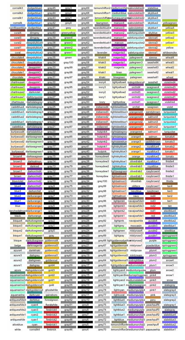
ggplot(shapes, mapping=aes(x=shape, fill=color))+geom_bar()+scale_fill_manual("legend", values = c("blue" = "dodgerblue", "green" = "seagreen", "red" = "lightcoral", "yellow"="khaki"))
Your dataset will likely have many more variables. If this dataset included at least two numerical variables it would have made sense to show the two other named graphs (a scatterplot or a line graph). However, in this case, we didn’t need those. This may also be true in your data set! When you are preparing ahead of time, you can decide which graphs are most appropriate for your question.
Conclusion: Questions and answers
After showing you can use some basic data manipulation and visualization tools, we’ll come back to the questions you proposed when you chose this dataset. You may or may not have definitively answered them, and this is fine. What I’m looking for are some of your thoughts, questions, and insights on the data. Here is your chance to shine - tell me what interests you about the dataset you chose! Here are some prompts to help frame this discussion.
Were you able to answer your questions with the dataset you chose? If not, why not? If so, what summary statistics or visualization helped you answer this question?
Show me a summary statistic or visualization from the data which confirms something you thought would be true. Why did you expect to see this?
Show me a summary statistic or visualization from the data that you did not expect to see or were surprised to see. Why was this surprising?