Assignment 2
Deconstruct, Reconstruct Web Report
Sistla Mehar Srinivas Shouri(S3796469)
Click the Original, Code and Reconstruction tabs to read about the issues and how they were fixed.
Original
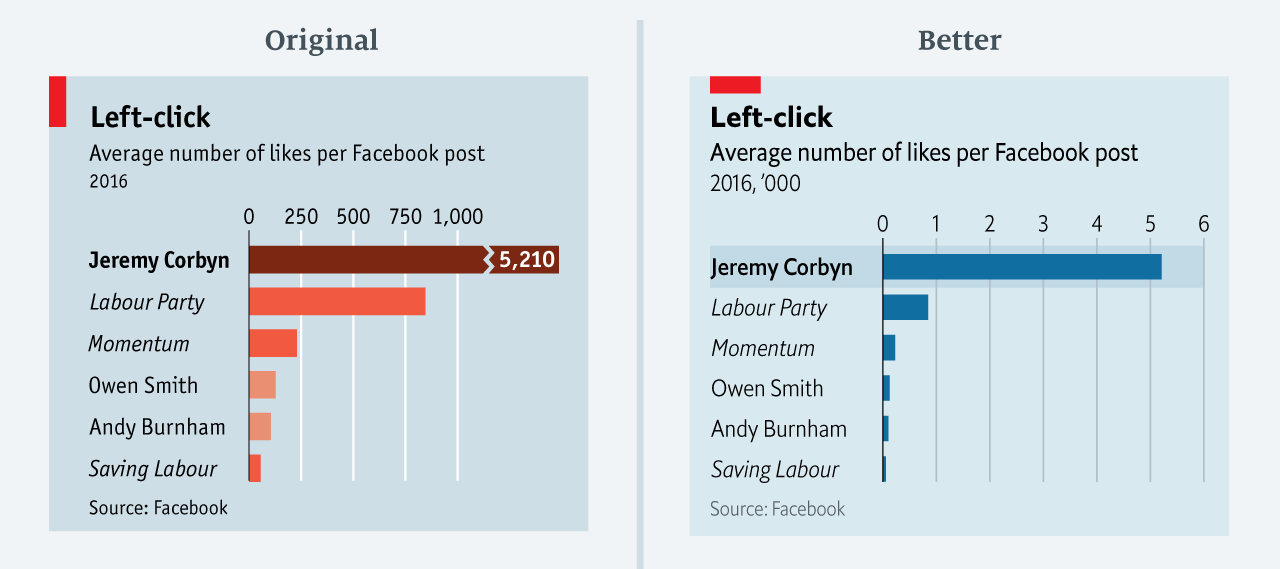
This visualisation shows the average number of Facebook likes on posts by pages of the political left. The point of this chart was to show the disparity between Mr Corbyn’s posts and others.
https://miro.medium.com/max/1400/1*9QE_yL3boSLqopJkSBfL5A.png
Objective
This visualisation shows the average number of Facebook likes on posts by pages of the political left. The point of this chart was to show the disparity between Mr Corbyn’s posts and others..
The visualisation chosen had the following three main issues:
- The original chart not only downplays the number of Mr Corbyn’s likes but also exaggerates those on other posts.
*Use of Colors - Some of the representative colors for certain countries look similar and some of the lighter saturated colors tend to deceive the viewer. Consequently, visualization does not alllow viewers to observe the data for longer period with comparison..
- The labels are not appropriately marked as it would be difficult to understand the graph without proper detailing
Reference
- Average_number_of_likes_per_Facebook_post_2016, Available at:https://medium.economist.com/mistakes-weve-drawn-a-few-8cdd8a42d368
Code
The following code was used to fix the issues identified in the original.
library(readr)
library(magrittr)
library(dplyr)
library(tidyr)
library(ggplot2)
library(scales)
Data <- read_csv("C:/Users/sistl/Downloads/Economist_corbyn.csv")
View(Data) #The data from the website is already very small. So didn't have to perform any steps to tify the data

#Visualization
plot <- ggplot(Data, aes(x=  Facebook_page_holder , y=Average_number_of_likes_per_Facebook_post_2016)) + geom_bar(stat = "identity", width=0.7, color="steelblue", fill="steelblue")+geom_text(aes(label=Average_number_of_likes_per_Facebook_post_2016),vjust=-0.5,color="Black",size=3.5)+theme_minimal()
Data Reference
- Visualizing the “Average likes per post in 2016” retrived from “https://medium.economist.com/mistakes-weve-drawn-a-few-8cdd8a42d368”
Reconstruction
In my final visualization I decided to simplify the plots andredign the original plot. Simplifying and plotting using ggplot2 helps us asnwer main questions just by looking the visualization.
The following plot fixes the main issues in the original.
