Assignment 2 - Data Visualization
Deconstruct, Reconstruct Web Report
Thimira Dulshan Gunathilaka Mastiyage Don (s3758709)
Click the Original, Code and Reconstruction tabs to read about the issues and how they were fixed.
Original

Objective
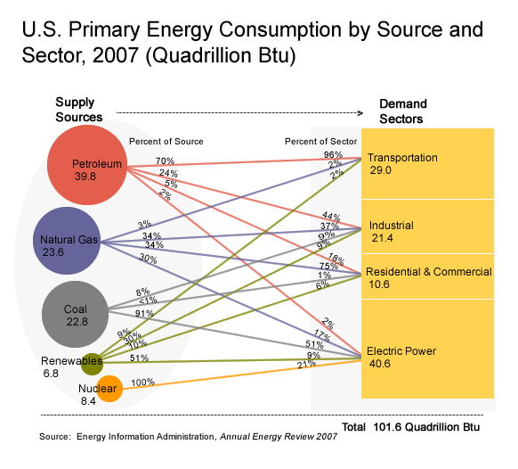
The objective of the original data visualization is to visualise the consumption of Energy by considering the main energy sources and the main sectors that these energy units are used. The targeted audience can be taken as general public but however more focused towards people in the Energy or Power industry.
The visualisation chosen had the following three main issues:
Issue 1: Accuracy Issues were found as if we take the very first source petroleum and it’s distribution to the respective sectors, the percentages don’t add up to 100% instead 101%. Also after visiting the original source, the data seemed to be obtained from multiple tables and some figures are slightly different. (For example sometimes the total btu units may not be equal to the addition of the btus of the sectors as there can be conversion errors and energy llosses as per the source, the author of the visualization has some mismatched information.)
Issue 2: Perception issue as it’s difficult to follow the lines that joins the source with the sector or vice versa. Not very clear to the audience and have to make an effort to understand which goes where.
Issue 3: Areas does not correspond properly the actual values and it would have been better if the main sectors were implemented in different colors. Seems like it was manually drawn without considering proper proportions.
Reference
- U.S. Primary Energy Consumption by Source and Sector 2007. Retrieved May 4, 2020, from: https://www.oilandgaslawyerblog.com/files/2015/02/U.S.-Primary-Energy-consumption-by-source-and-sector-2007.jpg?fbclid=IwAR2aarzHCiCi08BjSskpVRjiy7RODCn1EYMuzaHBUBxXbkfUh52KIGHvTKU
Code
The following code was used to fix the issues identified in the original. The following datasets were manually made, after manually extracting the data from the source. (Tables 2.1b, 2.1c , 2.1d 2.1e and Table 2.1f) Since the datasource treated Residential and Commercial as two seperate sectors, I have treated them as seperate as well unlike in the original data visualization.
library(readr)
library(ggplot2)
library(plotly)

Energy_sources <- read_csv("energy.csv")
Energy_sectors <- read_csv("Energy_Source.csv")

Energy_sources$Source <- factor(Energy_sources$Source,levels = c("Nuclear","Coal","Renewable","Petroleum","Natural Gas"))

p <- ggplot(Energy_sources, aes(fill=factor(Source), y=Value, x=Sectors)) +
  geom_bar(position="dodge", stat="identity",width=0.7)+labs(title = "Energy Consumption for Sectors",fill="Source", y="Consumption (Quadtrillion BTU)")

P <- p+scale_fill_manual(values=c( "#ED8141","bisque4", "darkolivegreen3","coral3", "#9590FF"))
fig1 <- ggplotly((P))


Energy_sources$Sectors <- factor(Energy_sources$Sectors,levels = c("Transportation","Residential","Commercial","Industrial","Electric Power"))
s <- ggplot(Energy_sectors, aes(fill=factor(Sector), y=Value, x=Sources)) +
  geom_bar(position="stack", stat="identity",width=0.7)+labs(title = "Energy Consumption by Source",fill="Sector",y="Consumption (Quadtrillion BTU)")

S <- s+scale_fill_manual(values=c( "#F87668","deepskyblue4", "#00BE6C","palevioletred4", "chocolate2"))
fig2 <- ggplotly((S))
Data Reference
- Annual Energy Review 2007. Retrieved May 4, 2020, from the following: https://www.eia.gov/totalenergy/data/annual/archive/038407.pdf?fbclid=IwAR1ZYDIsvNAnwLsLVwJ0ECf2IWuHWxI_sbo87EDQR9m4lWAikYW1cwtDPhw
Reconstruction
The following plot fixes the main issues in the original. Since it is difficult to represent the Sources’ contribution towards Sectors as well as the proportion of the consumption obtained from different Sources by the Sectors, two plots were obtained. The barplots make it easier to judge the proportions on the very first glance.
Hover over the plots too see the actual values for ease of use.