Cluster analysis involves splitting multivariate datasets into subgroups ('clusters') sharing similar characteristics.
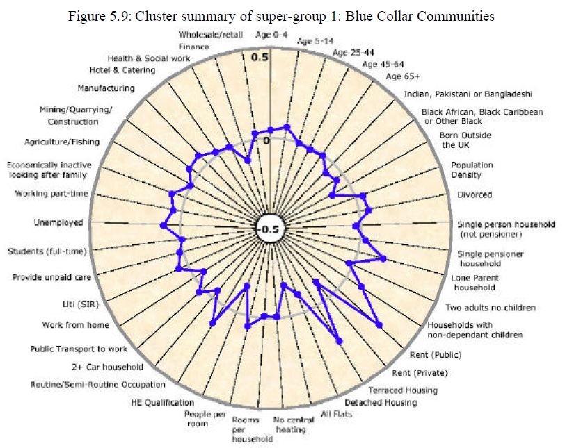
Radar plots can help to visually profile the resulting subgroups. For example, this graph, from Vickers (2006), shows the profile of one of the clusters from an area classification published by the UK Office for National Statistics:
The blue plot line compares the cluster average relative to the national average (0) across all of the 41 range-standardised dimensions used as inputs to the clustering process.
The purpose of this post is to report on a function I have developed that produces plots similar to that above using gpplot2. The full R code for this function can be found here.
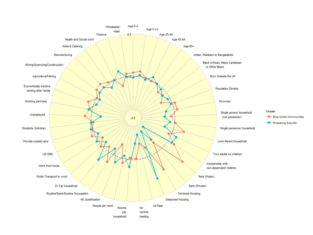
An example of the output is:
Good question. My intial attempt to solve this problem using ggplot2 was as follows:
# (1) Define the data building blocks required for plotting purposes [uses
# a subset of the OAC results plotted above]

var.names <- c("All Flats", "No central heating", "Rooms per\nhousehold", "People per room",
    "HE Qualification", "Routine/Semi-Routine\nOccupation", "2+ Car household",
    "Public Transport\nto work", "Work from home")
var.order = seq(1:9)
values.a <- c(-0.1145725, -0.1824095, -0.01153078, -0.0202474, 0.05138737, -0.1557234,
    0.1099018, -0.05310315, 0.0182626)
values.b <- c(0.2808439, -0.2936949, -0.1925846, 0.08910815, -0.03468011, 0.07385727,
    -0.07228813, 0.1501105, -0.06800127)
values.c <- rep(0, 9)
group.names <- c("Blue Collar Communities", "Prospering Suburbs", "National Average")


# (2) Create df1: a plotting data frame in the format required for ggplot2

df1.a <- data.frame(matrix(c(rep(group.names[1], 9), var.names), nrow = 9, ncol = 2),
    var.order = var.order, value = values.a)
df1.b <- data.frame(matrix(c(rep(group.names[2], 9), var.names), nrow = 9, ncol = 2),
    var.order = var.order, value = values.b)
df1.c <- data.frame(matrix(c(rep(group.names[3], 9), var.names), nrow = 9, ncol = 2),
    var.order = var.order, value = values.c)
df1 <- rbind(df1.a, df1.b, df1.c)
colnames(df1) <- c("group", "variable.name", "variable.order", "variable.value")
df1
##                      group                    variable.name variable.order
## 1  Blue Collar Communities                        All Flats              1
## 2  Blue Collar Communities               No central heating              2
## 3  Blue Collar Communities             Rooms per\nhousehold              3
## 4  Blue Collar Communities                  People per room              4
## 5  Blue Collar Communities                 HE Qualification              5
## 6  Blue Collar Communities Routine/Semi-Routine\nOccupation              6
## 7  Blue Collar Communities                 2+ Car household              7
## 8  Blue Collar Communities        Public Transport\nto work              8
## 9  Blue Collar Communities                   Work from home              9
## 10      Prospering Suburbs                        All Flats              1
## 11      Prospering Suburbs               No central heating              2
## 12      Prospering Suburbs             Rooms per\nhousehold              3
## 13      Prospering Suburbs                  People per room              4
## 14      Prospering Suburbs                 HE Qualification              5
## 15      Prospering Suburbs Routine/Semi-Routine\nOccupation              6
## 16      Prospering Suburbs                 2+ Car household              7
## 17      Prospering Suburbs        Public Transport\nto work              8
## 18      Prospering Suburbs                   Work from home              9
## 19        National Average                        All Flats              1
## 20        National Average               No central heating              2
## 21        National Average             Rooms per\nhousehold              3
## 22        National Average                  People per room              4
## 23        National Average                 HE Qualification              5
## 24        National Average Routine/Semi-Routine\nOccupation              6
## 25        National Average                 2+ Car household              7
## 26        National Average        Public Transport\nto work              8
## 27        National Average                   Work from home              9
##    variable.value
## 1        -0.11457
## 2        -0.18241
## 3        -0.01153
## 4        -0.02025
## 5         0.05139
## 6        -0.15572
## 7         0.10990
## 8        -0.05310
## 9         0.01826
## 10        0.28084
## 11       -0.29369
## 12       -0.19258
## 13        0.08911
## 14       -0.03468
## 15        0.07386
## 16       -0.07229
## 17        0.15011
## 18       -0.06800
## 19        0.00000
## 20        0.00000
## 21        0.00000
## 22        0.00000
## 23        0.00000
## 24        0.00000
## 25        0.00000
## 26        0.00000
## 27        0.00000
# (3) Create a radial plot using ggplot2
library(ggplot2)
ggplot(df1, aes(y = variable.value, x = reorder(variable.name, variable.order),
    group = group, colour = group)) + coord_polar() + geom_point() + geom_path() +
    labs(x = NULL)

The main problems with this graph are:
In addition there there are a number of other properties of the plot that pose potential challenges, at least to my novice usage of gpplot2:
Finally, there are a number of relatively trivial issues that also need resolving:
Non ggplot2 solutions to this problem may already exist, but I want to minimise the number of flavours of R graphics that I have to get my head round. Hence, for better or worse, I took the decision to create a function capable of producing the required plots via ggplot, armed, as a minimum, with only:
# (4) Create df2: a plotting data frame in the format required for
# funcRadialPlot

m2 <- matrix(c(values.a, values.b), nrow = 2, ncol = 9, byrow = TRUE)
group.names <- c(group.names[1:2])
df2 <- data.frame(group = group.names, m2)
colnames(df2)[2:10] <- var.names
print(df2)
##                     group All Flats No central heating
## 1 Blue Collar Communities   -0.1146            -0.1824
## 2      Prospering Suburbs    0.2808            -0.2937
##   Rooms per\nhousehold People per room HE Qualification
## 1             -0.01153        -0.02025          0.05139
## 2             -0.19258         0.08911         -0.03468
##   Routine/Semi-Routine\nOccupation 2+ Car household
## 1                         -0.15572          0.10990
## 2                          0.07386         -0.07229
##   Public Transport\nto work Work from home
## 1                   -0.0531        0.01826
## 2                    0.1501       -0.06800
# (5) Create a radial plot using the function CreateRadialPlot
source("http://pcwww.liv.ac.uk/~william/Geodemographic%20Classifiability/func%20CreateRadialPlot.r")
CreateRadialPlot(df2, plot.extent.x = 1.5)  #Default plot.extent amended to include all of axis label text

…or, to plot the mininum 'y-axis' value at the centre…
# (6) Create a radial plot using the function CreateRadialPlot, with min
# y-value in center of plot
CreateRadialPlot(df2, plot.extent.x = 1.5, grid.min = -0.4, centre.y = -0.5,
    label.centre.y = TRUE, label.gridline.min = FALSE)

The function has been heavily paramterised, as detailed below, to allow the user to closely manage most aspects of the resulting plot.
The one aspect of plot appearance that I have been unable to control satisfactorily is the colour assigned to each plot path. All suggestions welcome.
Input data
plot.data - dataframe comprising one row per group (cluster); col1 = group name; cols 2-n = variable values
axis.labels - names of axis labels if other than column names supplied via plot.data [Default = colnames(plot.data)[-1]
Grid lines
grid.min - value at which mininum grid line is plotted [Default = -0.5]
grid.mid - value at which 'average' grid line is plotted [Default = 0]
grid.max - value at which 'average' grid line is plotted [Default = 0.5]
Plot centre
centre.y - value of y at centre of plot [default < grid.min]
label.centre.y - whether value of y at centre of plot should be labelled [Default=FALSE]
Plot extent
#Parameters to rescale the extent of the plot vertically and horizontally, in order to
#allow for ggplot default settings placing parts of axis text labels outside of plot area.
#Scaling factor is defined relative to the circle diameter (grid.max-centre.y).
plot.extent.x.sf - controls relative size of plot horizontally [Default 1.2]
plot.extent.y.sf - controls relative size of plot vertically [Default 1.2]
Grid lines
#includes separate controls for the appearance of some aspects the 'minimum', 'average' and 'maximum' grid lines.
grid.line.width [Default=0.5]
gridline.min.linetype [Default=“longdash”]
gridline.mid.linetype [Default=“longdash”]
gridline.max.linetype [Default=“longdash”]
gridline.min.colour [Default=“grey”]
gridline.mid.colour [Default=“blue”]
gridline.max.colour [Default=“grey”]
Grid labels
grid.label.size - text size [Default=4]
gridline.label.offset - displacement to left/right of central vertical axis [Default=-0.02(grid.max-centre.y)]
*label.gridline.min - whether or not to label the mininum gridline [Default=TRUE]
Axis and Axis label
axis.line.colour - line colour [Default=“grey”]
axis.label.size - text size [Default=3]
axis.label.offset - vertical displacement of axis labels from maximum grid line, measured relative to circle diameter [Default=1.15]
x.centre.range - controls axis label alignment. Default behaviour is to left-align axis labels on left hand side of
plot (x < -x.centre.range); right-align labels on right hand side of plot (x > +x.centre.range); and centre align
those labels for which -x.centre.range < x < +x.centre.range
Cluster plot lines
group.line.width [Default=1]
group.point.size [Default=4]
Background circle
background.circle.colour [Default=“yellow”]
background.circle.transparency [Default=0.2]
Plot legend
plot.legend - whether to include a plot legend [Default = FALSE for one cluster; TRUE for 2+ clusters]
legend.title [Default=“Cluster”]
legend.text.size [Default=grid.label.size=4]
References
Vickers D W (2006) 'Multi-Level Integrated Classifications Based on the 2001 Census', PhD Thesis, School of Geography, The University of Leeds