Building the normal distribution from a simple exponential function
Nayef Ahmad
2019-10-07
At first glance, the probability density function (pdf) of the normal distribution seems like it has a lot going on. At its heart, though, is a fairly simple function: \(e^{(-x^2)}\)
Let’s see how we can go from this simple building block to something closer to the actual normal distribution.
The “proto-normal” distribution: exp(-(x^2))
Define the function:
exp_fun <- function(x){
  exp(-(x^2))
}
Plot it with ggplot + stat_function
data.frame(x = c(-5, 5)) %>%
  ggplot(aes(x = x)) +
  stat_function(fun = exp_fun) +
  theme_light() +
  labs(title = "Graph of exp(-(x^2))",
       subtitle = "In a sense, this function is the basic building block of the normal distribution pdf") +
  theme(panel.grid.minor = element_line(colour = "grey95"),
        panel.grid.major = element_line(colour = "grey95"))
That looks pretty much exactly like a normal distribution, doesn’t it?
By default, the graph will be centered around zero, and will have a certain “natural” spread/“variance”.
Parametrizing the centre and spread of the graph
We’ll now make two simple changes that will allow us to vary the centre and the spread of the graph.
exp_fun_with_mean_var <- function(x, mu = 5, var = 1){
  exp(-((x-mu)^2/2*var^2))  # shift the graph with mu; squeeze/stretch with var
}
Let’s look at some graphs with the same centre and different spreads:
data.frame(x = c(0, 10)) %>%
  ggplot(aes(x = x)) +
  stat_function(fun = exp_fun_with_mean_var,
                args = list(mu = 5,
                            var = 1)) +
  stat_function(fun = exp_fun_with_mean_var,
                args = list(mu = 5,
                            var = 2)) +
  stat_function(fun = exp_fun_with_mean_var,
                args = list(mu = 5,
                            var = 3)) +
  labs(title = "Graph of exp(-((x-mu)^2/2*var^2))",
       subtitle = "Parameters \"mu\" and \"var\" allow us to control the center and the spread \nProperly scaling these graphs will give the actual normal pdf") +
  theme_light() +
  theme(panel.grid.minor = element_line(colour = "grey95"),
        panel.grid.major = element_line(colour = "grey95"))
Note that the curve with maximum spread is an envelope around all the other curves. This is not how actual normal distributions behave - see below or this page for example. The areas under all of these curves cannot all be equal (and hence they can’t all be 1.0). Thus, these don’t work as probability density functions.
This is a hint that this simple exponential has to be scaled somehow in order to impose the structure we want.
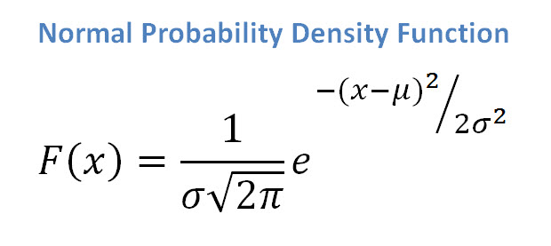
This scaling is achieved by placing a factor of \(1/\sqrt{2\pi\sigma^2}\) in front of the exponential function we just looked at. Putting it all together, we have the pdf of the univariate normal distribution!
The actual normal pdf
For comparison, here are the normal distributions with those parameters:
data.frame(x = c(0, 10)) %>%
  ggplot(aes(x = x)) +
  stat_function(fun = dnorm,
                args = list(mean = 5,
                            sd = 1)) +  # sd is the +ve square root of variance
  stat_function(fun = dnorm,
                args = list(mean = 5,
                            sd = sqrt(3))) +
  stat_function(fun = dnorm,
                args = list(mean = 5,
                            sd = sqrt(5))) +
  theme_light() +
  labs(title = "Graphs of the actual normal distribution",
       subtitle = "All curves have mean of 5 \nVariances are 1, 3, and 5") +
  theme(panel.grid.minor = element_line(colour = "grey95"),
        panel.grid.major = element_line(colour = "grey95"))