ENG330 - Hydrology for Engineers ebook
Dr Helen Fairweather, University of the Sunshine Coast
30 August, 2019
- 1 Preamble
- 2 Referencing Your Work in Knitr
- 3 Getting started with R
- 4 An introduction to using R
- 5 Beyond the R basics
- 6 Matrix arithmetic in R
- 7 Where to now?
- 8 Tutorial 1 - Hydrologic Data in R
- 9 Theme 1 Module 1: The hydrologic cycle
- 10 Tutorial 2: Creating a water balance
- 11 Theme 1, Topic 3: Statistics for Hydrology
- 12 Topic 4: Flood Frequency Analysis
- 13 Tutorial 4: Flow Duration Curves
- 14 Theme 2, Topic 1: RAINFALL and IFD data
- 15 Tutorial 5: IFD curves in R
- 16 Topic 1 - Flood Hydrographs
- 17 Topic 2 - Flood Routing Concepts and Models
- 18 Tutorial 6: Runoff routing
- 19 Tutorial 7: Find the area, mainstream length and equal area slope of the Coochin Creek catchment.
- 20 References
1 Preamble
This document was developed as part of a Learning and Teaching project, funded by the University of the Sunshine Coast. The project’s formal title is “Develop your own Lifelong Learning Resource: Learners as Active Collaborators”, but the shortened title is “Write your own…”
The R programming language is being used to develop this resource enabling students to build an e-portfolio of text with the R code required to run the various hydrological methods embedded within the resource. Using the Knitr library, students are able to re-run the code for different datasets and locations and update methods as they change. The intent is to develop a life-long learning resource that can be developed for any subject or endeavour.
Throughout the course students are provided with a series of templates with the .Rmd extension. These are knitted together by this Master Document. In any of the templates, wherever a directory appears, you will need to point to the relevant directory on your computer.
To create the linked Table of Contents in the left-hand frame you will need to follow these instructions. Each module is embedded into this main document by adding a ‘chunk’ and include in the r argument list: child=“module1.Rmd”, replacing the module1 with the appropriate file name.
2 Referencing Your Work in Knitr
Referencing (or citations) in Knitr are surprisingly easy using the knitcitations package, once you have figured out how to do it! The learning path is steep, so I am providing you with some tips, so that hopefully it will work for you first time. However, this may not be the best way to do it, so if you do come up with a better method, can you please let myself and everyone else know on the discussion board.
Most modern references include a DOI (or Digital Object Identifier), which makes it very easy to reference documents in your .Rmd file.
To install the knitcitations module you need to implement the following code:
library(devtools)
install_github("knitcitations", "cboettig")
library("knitcitations")
library("RefManageR")
cleanbib()
#You need to put your directory into the following code (shown in red):
bib <- read.bibtex("~/OneDrive - University of the Sunshine Coast/Courses/ENG330/ENG330_ebook/references.bib")For example, a relevant paper on IFD Temporal Patterns is from French and Jones (2012), and this reference is created using the citet (or citep) functions. Experiment with the use of these two functions (one puts the whole reference in parenthesis and the other just the year).
There are of course files that you will need to reference that do not have a DOI, and in this case you will need to input the relevant fields into a ‘.bib’ file. The format for inputting these ‘old’ references is surprisingly simple. For example, the Hill and Mein (1996) is a reference, the details for which I have copied from the article itself (see below). These details can be entered into a text file within the RStudio environment.
After the identifier @article, the first entry is a ‘key’ to make it easier to reference. The code to enter the Hill and Mein (1996) reference is “r citet(bib[[“Hill1996”]])”, (or citep, depending on how you want the parenthesis configured), where “Hill1996”" is the ‘key’.
@article{Hill1996,
abstract = {Anomalies in design flood estimates can arise from the design temporal patterns and losses. This study shows the effect that intense bursts within longer duration design storms can have on flood estimates, and recommends filtering of the temporal patterns. It also presents the results of a pilot study in which losses are derived to be consistent with the nature of design rainfalls; the result was a significant improvement in design flood accuracy.},
author = {Hill, P. J. and Mein, R. G.},
journal = {23rd Hydrology and Water Resources Symposium Hobart Australia 21-24 May 1996},
month = may,
number = {5},
pages = {445--51},
title = {{Incompatibilities between Storm Temporal Patterns and Losses for Design Flood Estimation.}},
year = {1996}
}
To generate a bibliography the following code is entered (with echo=FALSE included if you do not want the code block to print).
You should also reference the packages you have used in producing your document, as well as RStudio itself. Fortunately Boettiger (2017) has made this possible also. Your bibliography will also include these citations.
This page was created in Rstudio: #r citet(citation("rstudio")) , with the packages knitr: Xie (2019); Xie (2015); Xie (2014), knitcitations: Boettiger (2017), and RefManageR: McLean (2017); McLean (2014).
bibliography()[1] C. Boettiger. knitcitations: Citations for ‘Knitr’ Markdown Files. R package version 1.0.8. 2017. <URL: https://CRAN.R-project.org/package=knitcitations>.
FALSE No encoding supplied: defaulting to UTF-8.[1] P. J. Hill and R. G. Mein. “Incompatibilities between Storm Temporal Patterns and Losses for Design Flood Estimation.”. In: 23rd Hydrology and Water Resources Symposium Hobart Australia 21-24 May 1996 (May. 1996), pp. 445-51.
FALSE No encoding supplied: defaulting to UTF-8.[1] M. W. McLean. Straightforward Bibliography Management in R Using the RefManager Package. arXiv: 1403.2036 [cs.DL]. 2014. <URL: https://arxiv.org/abs/1403.2036>. [1] Y. Xie. Dynamic Documents with R and knitr. 2nd. ISBN 978-1498716963. Boca Raton, Florida: Chapman and Hall/CRC, 2015. <URL: https://yihui.name/knitr/>. [1] Y. Xie. “knitr: A Comprehensive Tool for Reproducible Research in R”. In: Implementing Reproducible Computational Research. Ed. by V. Stodden, F. Leisch and R. D. Peng. ISBN 978-1466561595. Chapman and Hall/CRC, 2014. <URL: http://www.crcpress.com/product/isbn/9781466561595>. [1] Y. Xie. knitr: A General-Purpose Package for Dynamic Report Generation in R. R package version 1.23. 2019. <URL: https://yihui.name/knitr/>.
3 Getting started with R
3.1 About R
R is a powerful and convenient environment for analysis of data, especially statistical analysis of data.
R is not a menu-driven statistical package, but uses a command line.
R is a powerful environment for statistically and graphically analyzing data.
3.2 Getting and installing R
R can be downloaded from http://cran.r-project.org/mirrors.html (the Comprehensive R Archive Network, or CRAN). First select an Australian mirror from this link, then click on ‘Download and Install R’, then download the pre-compiled binaries for your operating system. Then install these pre-compiled binaries in the usual way for your operating system.
Another useful website is http://www.r-project.org/ (the R Homepage).
4 An introduction to using R
4.1 Basic use of R as a calculator
After starting R, a command line is presented indicating that R is waiting for the user to enter commands. This command line usually looks like this:
>Instruct R to perform basic arithmetic by issuing commands at the command line, and pressing the Enter or Return key. To try it out, start R, enter the following command and then press Enter:
9 * (1 - 3) + (8/4)## [1] -16Note that * indicates multiplication, and / indicates division.
After giving the answer, R then awaits your next instruction. Note that the answer here is preceded by [1], which indicates the first item of output, and is of little use here where the output consists of one number. But sometimes R produces many numbers as output, when the [1] proves useful. Other examples of the basic use of R:
2 * pi # pi means 3.14159265...## [1] 6.283185-8 + ( 2^3 ) # ^ means to raise to the power## [1] 010/4000000 # The answer is in scientific notation## [1] 2.5e-06Note the use of #: the # character is a comment character, so that # and all text after it is ignored by R. The output from the final expression 2.5e-06 is R’s way of displaying \(2.5\times 10^{-6}\). Very large or very small numbers can be entered using this notation also:
6.02e23 # Avogadro constant## [1] 6.02e+23Standard mathematical functions are also defined in R:
log( 10 ) # Notice that log is the natural log to base e = 2.71828...## [1] 2.302585log10(10) #This is log to base 10## [1] 1sin( pi ) # The result is zero to computer precision ## [1] 1.224647e-16sqrt( 45 ) # The square root## [1] 6.708204Issuing incomplete R commands forces R to wait for the command to be completed. So, for example, if you type:
cos( 2*and press Enter, R will wait for you to finish the command. The command prompt then changes to a plus sign:
+4.2 Quitting R
To finish using R, enter
q()at the command prompt (and yes, the brackets are necessary). R usually asks you if you wish to save your workspace; that is, whether or not you want R to save all your data and variables that you have defined. Unless you really need this, say No, because you can quickly end up with far too many variables saved.
4.3 Variable names in R
Importantly, answers computed by R can be assigned to variables using the two-character combination <-:
radius <- 0.605
area <- pi * radius^2
area
## [1] 1.149901Notice that when <- is used, the answer is not displayed unless the name of a variable is entered as its own command. The equal sign = can be used in place of <- to make assignments but is not as commonly used:
radius = 0.605In fact, not only can you use <- but you can also use ->:
2 -> x; x## [1] 2You can even use <- and -> together:
y <- 4 -> z
y; z
## [1] 4## [1] 4As shown, commands can be issued together on one line if separated by a ; (a semi-colon).
You do need to be careful when you use <- however. For example, what does this mean: x<-4? It could mean to assign x the value of 4:
x <- 4
x
## [1] 4Or it could mean a logical comparison, asking if the value of x is less than -4:
x < (-4)## [1] FALSEBecause of this, using spaces wisely is important. Spaces in the input are not important to R. All these commands mean the same to R, but the first is easiest to read, so is preferred:
area <- pi * radius^2
area         <-        pi    *radius^      2
area<-pi*radius^2
Variable names can consist of letters, digits, the underscore character, and the dot (period). Variable names cannot start with digits; names starting with dots should be avoided. Variable names are also case sensitive: HT, Ht and ht are different variables to R. Many possible variables names are already in use (reserved) by R, such as log as used above. Problems may result if these are used as variable names. Common variables names to avoid include:
t(used for transposing matrices),c(used for combining objects),q(used for quitting R),T(is a logical true, though usingTRUEis preferred),F(is a logical false, though usingFALSEis preferred), anddata(used to make data sets available to R).
These are all valid variables names:
plant.heightPatientAgeInitial_Dosedose2circuit.2.AM
These are not valid variables names:
Before-After(the-is illegal)2ndTrial(starts with a digit)
4.4 Working with vectors
R works especially well with a group of numbers, called a vector. Vectors are created by grouping items together using the function c() (for ‘combine’ or ‘concatenate’):
x <- c(1,2,3,4,5,6,7,8,9,10)
log(x)
## [1] 0.0000000 0.6931472 1.0986123 1.3862944 1.6094379 1.7917595 1.9459101
## [8] 2.0794415 2.1972246 2.3025851A long sequence of equally-spaced values is often useful, especially in plotting. Rather than the cumbersome approach adopted above, consider these simpler approaches:
seq(0, 10, by=1) # The values are separated by distance 1## [1] 0 1 2 3 4 5 6 7 8 9 100:10 # Same as above## [1] 0 1 2 3 4 5 6 7 8 9 10seq(0, 10, length=29) # The result has length 29## [1] 0.0000000 0.3571429 0.7142857 1.0714286 1.4285714 1.7857143
## [7] 2.1428571 2.5000000 2.8571429 3.2142857 3.5714286 3.9285714
## [13] 4.2857143 4.6428571 5.0000000 5.3571429 5.7142857 6.0714286
## [19] 6.4285714 6.7857143 7.1428571 7.5000000 7.8571429 8.2142857
## [25] 8.5714286 8.9285714 9.2857143 9.6428571 10.0000000Notice that the output is long, so R identifies which element numbers starts each row of output.
Variables do not have to be numerical; text and logical variables can also be used:
day         <- c("Sun", "Mon", "Tues", "Wed", "Thurs", "Fri", "Sat")
hours.work  <- c(0,  8, 11.5, 9.5, 8, 8, 3)
hours.sleep <- c(8,  8,    9, 8.5, 6, 7, 8)
do.exercise <- c(TRUE, TRUE, TRUE, FALSE, TRUE, FALSE, TRUE)
hours.play  <- 24 - hours.work - hours.sleep
hours.awake <- hours.work + hours.play
Single or double quotes are possible for defining text variables, though double quotes are preferred (which enables constructs like "O’Neil"). Specific elements of a vector are identified using square brackets:
hours.play[3]; hours.work[ 7 ]## [1] 3.5## [1] 3To find the value of hours.work on Fridays, consider the following:
day=="Fri" # A logic statement: == compares two objects to see if they are equal## [1] FALSE FALSE FALSE FALSE FALSE TRUE FALSEhours.work[ day=="Fri" ]## [1] 8hours.sleep[ day=="Fri" ]## [1] 7do.exercise[ day=="Thurs"]## [1] TRUENotice that == is used for logical comparisons. Other logical comparisons are also possible:
day[ hours.work > 8 ] # > means "greater than"## [1] "Tues" "Wed"day[ hours.sleep < 8 ] # < means "less than"## [1] "Thurs" "Fri"day[ hours.work >= 8 ] # >= means "greater than or equal to"## [1] "Mon" "Tues" "Wed" "Thurs" "Fri"day[ hours.work <= 8 ] # <= means "less than or equal to"## [1] "Sun" "Mon" "Thurs" "Fri" "Sat"day[ hours.work != 8 ] # != means "not equal"## [1] "Sun" "Tues" "Wed" "Sat"day[ do.exercise & hours.work>8 ] # & means "and"## [1] "Tues"day[ hours.play>9 | hours.sleep>9 ] # | means "or"## [1] "Sun" "Thurs" "Sat"5 Beyond the R basics
5.1 Using functions in R
Working with R requires using R functions. R contains a large number of functions, and the many additional packages add even more functions as needed. Many R functions have been used already, such as q(), seq() and log(). Input arguments to R functions are enclosed in round brackets (parentheses), as previously seen. All R functions must be followed by parentheses, even if they are empty. (For example, recall the function q() for quitting R.)
Many functions allow several input arguments. Inputs to R functions can be specified as positional or named, or even both in the one call. Positional specification means the function reads the inputs in the order in which function is defined to read them. For example, the R help for the function log() contains this information in the Usage section:
log(x, base = exp(1))The help file indicates that the first argument is always the number for which the logarithm is needed, and the second (if provided) is the base for the logarithm. Previously, log() was called with only one input, not two. If input arguments are not given, defaults are used when available. The above extract from the help file shows that the default base for the logarithm is \(e\approx2.71828\dots\) (that is, exp(1)) if the user does not specify any base explicitly. In contrast, there is no default value for x. This means that if log() is called with only one input argument, the result is a natural logarithm (since base=exp(1) is used by default). To specify a logarithm to a different base, say base 2, a second input argument is needed:
log(8, 2) # The log of 8 to base 2; the same as log2(8)This is an example of specifying the inputs by position. Alternatively, all or some of the arguments can be named. For example, all these commands are identical:
log(x=8, base=2)## [1] 3log(8, 2)## [1] 3log(base=2, x=8) # If the order is different than the function definition, inputs must be named## [1] 3log(8, base=2)## [1] 35.2 Using R Packages
R comes with many extra packages that extend the capabilities of R. If you go to one of the CRAN sites and select Packages, you will find a very long list of R packages that you can install. A very long list…
Some packages (such as MASS) come with R. Some packages must first be downloaded and installed:
- Installing: If you need to download and install an R package, go to CRAN and select the package to download.
- Sometimes you can use the R function
install.packages(). Sometimes, however, that doesn’t work.
To then use an R package, that package must be loaded before being used in any R session:
Loading: To load an installed package and so make the extra functionality available to R, type (for example)
library(MASS)at the R prompt.
(Note that packageMASScomes with R, and you do not have to first download it.)Using: After loading the package, the functions in the package can be used like any other function in R.
Obtaining help: To obtain help about a loaded package, type
library(help=MASS)at the R prompt. To obtain help about any particular function or dataset in the package, type (for example)?logat the R prompt after the package is loaded.
5.3 Loading data into R
In statistics, data are usually stored in computer files, which must be loaded into R. R requires data files to be arranged with variables in columns, and cases in rows. Columns may have headers containing variable names; rows may have headers containing case labels. In R, data are usually treated as a data frame, a set of variables (numeric, text, logical, or other types) grouped together. For the data entered in before, a single data frame named my.week could be constructed:
my.week <- data.frame(day, hours.work, hours.sleep,
                       do.exercise, hours.play, hours.awake)
my.week
## day hours.work hours.sleep do.exercise hours.play hours.awake
## 1 Sun 0.0 8.0 TRUE 16.0 16.0
## 2 Mon 8.0 8.0 TRUE 8.0 16.0
## 3 Tues 11.5 9.0 TRUE 3.5 15.0
## 4 Wed 9.5 8.5 FALSE 6.0 15.5
## 5 Thurs 8.0 6.0 TRUE 10.0 18.0
## 6 Fri 8.0 7.0 FALSE 9.0 17.0
## 7 Sat 3.0 8.0 TRUE 13.0 16.0Entering data directly into R is only feasible for small amounts of data Usually, other methods are used for loading data into R:
- If the dataset comes with R, load the data using the command
data(trees)(for example). This command loads thetreesdataset which comes with R. Typedata()at the R prompt to see a list of all the example data that comes with R. - If the data are in an installed R package, load the package, then use
data()to load the data. - If the data are stored as a text file (either on a disk or on the internet), R provides a set of functions for loading the data:
read.csv(): Reads comma-separated text files. In files where the comma is a decimal point and fields are separated by a semicolon, useread.csv2().read.delim(): Reads delimited text files, where fields are delimited by tabs by default. In files where the comma is a decimal point, useread.delim2().read.table(): Reads files where the data in each line is separated by one or more spaces, tabs, newlines or carriage returns.read.table()has numerous options for reading delimited files.read.fwf(): Reads data from files where the data are in a fixed width format (that is, the data are in fields of known widths in each line of the data file). Use these functions by typing, for example,mydata <- read.csv("filename.csv")
- For data stored in file formats from other software (such as SPSS, Stata, and so on), first load the package
foreign, then seelibrary(help=foreign). Not all functions in the foreign package load the data as data frames by default (such asread.spss()).
Many other inputs are also available for these functions (see the relevant help files). All these functions load the data into R as a data frame. These functions can be used to load data directly from a web page (providing you are connected to the internet) by providing the URL as the filename. For example, the data set twomodes.txt is available in tab-delimited format at the OzDASL webpage (http://www.statsci.org/data), with variable names in the first row (called a header):
modes <- read.delim("http://www.statsci.org/data/general/twomodes.txt",
                             header=TRUE)
5.4 Working with data frames
Data loaded from files (using read.csv() and similar functions) or using the data() command are loaded as a data frame. A data frame is a set of variables (numeric, text, or other types) grouped together, as previously explained. For example, the data frame cars comes with R. The help for the file can be read by typing
help(cars)or, more succinctly:
?carsThe data frame contains two variables: speed and dist, which can be seen from the names() command:
names(cars)## [1] "speed" "dist"Alternatively, you can look at the top of the data file as follows:
head(cars)## speed dist
## 1 4 2
## 2 4 10
## 3 7 4
## 4 7 22
## 5 8 16
## 6 9 10The data frame cars is visible to R, but the individual variables within this data frame are not visible; this code:
speedwill fail because R can see the cars data frame but not what variables are within this data frame. The objects that are visible to R are displayed using objects():
objects()## [1] "Apr" "area" "Aug" "bib"
## [5] "bits" "bmins" "brain" "c"
## [9] "ci" "cn" "cnames" "colvec"
## [13] "date_fin" "date_ind" "date_st" "datech"
## [17] "day" "dd" "ddtemp" "Dec"
## [21] "direc" "dirv" "do.exercise" "dt"
## [25] "dt_eventends" "dt_max_dur" "dur_hrs" "Feb"
## [29] "findate" "findt" "fn" "fname"
## [33] "hd" "hours.awake" "hours.play" "hours.sleep"
## [37] "hours.work" "i" "i930" "ifd"
## [41] "ifdl" "ifdp" "indevent" "iv"
## [45] "Jan" "Jul" "Jun" "labvec"
## [49] "M" "Mar" "max_dur" "May"
## [53] "mfd" "monv" "my.week" "ncol"
## [57] "Nov" "nv" "Oct" "radius"
## [61] "rrain" "rrv" "rrv_temp" "Sep"
## [65] "seq_v" "stdate" "stday" "stdt"
## [69] "sthr" "stmin" "stn" "sumv"
## [73] "timech" "timv" "tseq" "tt"
## [77] "varn" "x" "xlab" "y"
## [81] "ylab" "yv" "z" "zd"
## [85] "zdd" "zrain" "zz"To refer to individual variables in the data frame cars, use $ between the data frame name and the variable name, as follows:
cars$speed## [1] 4 4 7 7 8 9 10 10 10 11 11 12 12 12 12 13 13 13 13 14 14 14 14
## [24] 15 15 15 16 16 17 17 17 18 18 18 18 19 19 19 20 20 20 20 20 22 23 24
## [47] 24 24 24 25This construct can become tedious to use all the time. An alternative is to attach the data frame so that the individual variables are visible to R:
attach(cars); speed## [1] 4 4 7 7 8 9 10 10 10 11 11 12 12 12 12 13 13 13 13 14 14 14 14
## [24] 15 15 15 16 16 17 17 17 18 18 18 18 19 19 19 20 20 20 20 20 22 23 24
## [47] 24 24 24 25When finished using the data frame, detach it:
detach(cars)Another alternative is to use with(), by noting the data frame in which the command should executed:
with( cars, mean(speed))## [1] 15.45.5 Basic statistical functions
Basic statistical functions are part of R:
data(cars); attach(cars)
length( cars$speed )                   # The number of observations
## [1] 50sum(cars$speed) / length(cars$speed) # The mean, the long way## [1] 15.4mean( cars$speed) # The mean, the short way## [1] 15.4median( cars$speed ) # The median## [1] 15sd( cars$speed) # The standard deviation## [1] 5.287644A summary of the dataset can be found using summary():
summary(cars)## speed dist
## Min. : 4.0 Min. : 2.00
## 1st Qu.:12.0 1st Qu.: 26.00
## Median :15.0 Median : 36.00
## Mean :15.4 Mean : 42.98
## 3rd Qu.:19.0 3rd Qu.: 56.00
## Max. :25.0 Max. :120.005.6 Basic plotting in R
R has very rich and powerful mechanisms for producing graphics. Simple plots are easily produced, but very fine control over many graphical parameters is possible. Consider a simple plot for the cars data:
plot( cars$dist ~ cars$speed) # That is, plot( y ~ x)
The ~ command (~ is called a tilde) can be read as ‘is described by’. The variable on the left of the tilde appears on the vertical (or \(y\)) axis. An equivalent command to the above plot() is:
plot( dist ~ speed, data=cars )
Notice the axes are then labelled differently. As a general rule, R functions that use the formula interface (that is, constructs such as dist ~ speed) allow an input called data in which the data frame containing the variables is given. The plot() command can also be used without using a formula interface:
plot( speed, dist ) # That is, plot(x, y)
Using this approach, the variable appearing as the second input is plotted on the vertical axis.
These plots so far have all been simple, but R allows many details of the plot to be changed. Compare the result of the following code with the earlier code:
plot( dist ~ speed,
    data = cars,                            # The data frame containing the variables
    las=1,                                  # Makes the axis labels all horizontal
    pch=19,                                 # Plots with a filled circle; see ?points
    xlim=c(0, 25),                          # Set the x-axis limits to 0 and 25
    xlab="Speed (in miles per hour)",       # The label for the x-axis
    ylab="Stopping distance (in feet)",     # The label for the y-axis
    main="Stopping distance vs speed for cars\n(from Ezekiel (1930))") # Main title
5.7 More advanced plotting
Plots can be enhanced in many ways, and many other types of plots exist. Consider this plot which examines 32 cars from 1974:
data(mtcars)                    # Load the data.  Try  ?mtcars  for a description
summary(mtcars)
## mpg cyl disp hp
## Min. :10.40 Min. :4.000 Min. : 71.1 Min. : 52.0
## 1st Qu.:15.43 1st Qu.:4.000 1st Qu.:120.8 1st Qu.: 96.5
## Median :19.20 Median :6.000 Median :196.3 Median :123.0
## Mean :20.09 Mean :6.188 Mean :230.7 Mean :146.7
## 3rd Qu.:22.80 3rd Qu.:8.000 3rd Qu.:326.0 3rd Qu.:180.0
## Max. :33.90 Max. :8.000 Max. :472.0 Max. :335.0
## drat wt qsec vs
## Min. :2.760 Min. :1.513 Min. :14.50 Min. :0.0000
## 1st Qu.:3.080 1st Qu.:2.581 1st Qu.:16.89 1st Qu.:0.0000
## Median :3.695 Median :3.325 Median :17.71 Median :0.0000
## Mean :3.597 Mean :3.217 Mean :17.85 Mean :0.4375
## 3rd Qu.:3.920 3rd Qu.:3.610 3rd Qu.:18.90 3rd Qu.:1.0000
## Max. :4.930 Max. :5.424 Max. :22.90 Max. :1.0000
## am gear carb
## Min. :0.0000 Min. :3.000 Min. :1.000
## 1st Qu.:0.0000 1st Qu.:3.000 1st Qu.:2.000
## Median :0.0000 Median :4.000 Median :2.000
## Mean :0.4062 Mean :3.688 Mean :2.812
## 3rd Qu.:1.0000 3rd Qu.:4.000 3rd Qu.:4.000
## Max. :1.0000 Max. :5.000 Max. :8.000plot( mpg ~wt,
data = mtcars,
las=1, # Makes the axis labels all horizontal
type="n", # This doesn't do any plotting, but sets up the axes
xlab="Weight (in thousands of pounds)", # The label for the x-axis
ylab="Fuel economy (in miles per gallon)", # The label for the y-axis
main="Fuel economy vs weight of car\nfor 32 cars in 1970") # The main plot title
points( mpg ~ wt, data=mtcars, pch=15,
subset=(cyl==4), col="green" ) # points() adds points to the current plot
points( mpg ~ wt, data=mtcars, pch=17,
subset=(cyl==6), col="orange" ) # See ?points for what these plotting characters
points( mpg ~ wt, data=mtcars, pch=19, # show. For example, 15 is a filled square
subset=(cyl==8), col="red" )
legend("topright", pch=c(15, 17, 19), col=c("green", "orange", "red"),
legend=c("4 cylinders", "6 cylinders", "8 cylinders")) # Adds a legend
Here are some different plots. First, a boxplot:
boxplot( mpg ~ cyl, data=mtcars,
         xlab="Number of cylinders",
         ylab="Fuel economy (in miles per gallon)",
         las=1,
         main="Fuel economy for 4, 6 and 8 cylinder cars",
         col=c("green", "orange", "red"))
Now a barchart (in R this is called a barplot):
barplot( table(mtcars$cyl),
         col="wheat",
         las=1,
         xlab="Number of cylinders",
         ylab="Number of cars in the sample")
Here is an interesting one, adding a smoothing line to the plot:
scatter.smooth(mtcars$wt, mtcars$mpg,   # Adds a `smooth' line
    las=1,                              # Makes the axis lables all horizontal
    type="n",                           # This doesn't do any plotting, but sets up the axes
    xlab="Weight (in thousands of pounds)",         # The label for the x-axis
    ylab="Fuel economy (in miles per gallon)",      # The label for the y-axis
    main="Fuel economy vs weight of car\nfor 32 cars in 1970")  # The main plot title

points( mpg ~ wt, data=mtcars, pch=15, subset=(cyl==4), col="green" )
points( mpg ~ wt, data=mtcars, pch=17, subset=(cyl==6), col="orange" )
points( mpg ~ wt, data=mtcars, pch=19, subset=(cyl==8), col="red" )

legend("topright", pch=c(15, 17, 19), col=c("green", "orange", "red"),
      legend=c("4 cylinders", "6 cylinders", "8 cylinders"))
6 Matrix arithmetic in R
R performs matrix arithmetic using some special functions. A matrix is defined using matrix() where the matrix elements are given with the input data, the number of rows with nrow or columns with ncol (or both), and optionally whether to fill down columns (the default) or across rows (by setting byrow=TRUE):
Amat <- matrix( c(1, 2, -3, 4), ncol=2) # Fills by columns
Amat
## [,1] [,2]
## [1,] 1 -3
## [2,] 2 4Bmat <- matrix( c(1,2,-3, 10,-20,30), nrow=2, byrow=TRUE) # Fill by row
Bmat## [,1] [,2] [,3]
## [1,] 1 2 -3
## [2,] 10 -20 30Standard matrix operations can be performed:
dim( Amat ) # The dimensions of matrix Amat## [1] 2 2dim( Bmat ) # The dimensions of matrix Bmat## [1] 2 3t(Bmat) # The transpose of matrix Bmat## [,1] [,2]
## [1,] 1 10
## [2,] 2 -20
## [3,] -3 30-2 * Bmat # Multiply each element by ascalar## [,1] [,2] [,3]
## [1,] -2 -4 6
## [2,] -20 40 -60Multiplication of conformable matrices requires the special function %*%:
Cmat <- Amat %*% Bmat
Cmat
## [,1] [,2] [,3]
## [1,] -29 62 -93
## [2,] 42 -76 114Multiplying non-conformable matrices produces an error:
Bmat %*% Amat # This will fail!Powers of matrices are produced by repeatedly using %*%:
Amat^2 # Each *element* of Cmat is squared## [,1] [,2]
## [1,] 1 9
## [2,] 4 16Amat %*% Amat # Correct way to compute Cmat squared## [,1] [,2]
## [1,] -5 -15
## [2,] 10 10The usual multiplication operator used in R * is for multiplication of scalars, not matrices:
Amat * Bmat # FAILS!!The * operator can also be used for multiplying the corresponding elements of matrices of the same size:
Bmat * Cmat## [,1] [,2] [,3]
## [1,] -29 124 279
## [2,] 420 1520 3420The diagonal elements of matrices are extracted using diag():
diag(Cmat)## [1] -29 -76diag(Bmat) # diag even works for non-square matrices## [1] 1 -20diag() can also be used to create diagonal matrices:
diag( c(1,-1,2) )## [,1] [,2] [,3]
## [1,] 1 0 0
## [2,] 0 -1 0
## [3,] 0 0 2In addition, diag() can be used to create identity matrices easily, in two ways:
diag( 3 ) # Creates the 3x3 identity matrix## [,1] [,2] [,3]
## [1,] 1 0 0
## [2,] 0 1 0
## [3,] 0 0 1diag( nrow=3 ) # Creates the 3x3 identity matrix## [,1] [,2] [,3]
## [1,] 1 0 0
## [2,] 0 1 0
## [3,] 0 0 1To determine if a square matrix is singular or not, compute the determinant using det():
det(Amat)## [1] 10Dmat <- t(Bmat) %*% Bmat; Dmat## [,1] [,2] [,3]
## [1,] 101 -198 297
## [2,] -198 404 -606
## [3,] 297 -606 909det(Dmat) # Zero to computer precision## [1] 0Zero determinants indicate singular matrices without inverses. (Near-zero determinants indicate near-singular matrices for which inverses may be difficult to compute.) The inverse of a non-singular matrix is found using solve():
Amat.inv <- solve(Amat)
Amat.inv
## [,1] [,2]
## [1,] 0.4 0.3
## [2,] -0.2 0.1Amat.inv %*% Amat## [,1] [,2]
## [1,] 1 -2.220446e-16
## [2,] 0 1.000000e+00However, an error is returned if the matrix is singular:
solve(Dmat) # Not possible: Dmat is singularThe use of solve() to find the inverse is related to the use of solve() in solving matrix equations of the form \(\text{A}\vec{x} = \vec{b}\) where \(\text{A}\) is a square matrix, and the vector \(\vec{x}\) unknown. For example:
bvec <- matrix( c(1,-3), ncol=1); bvec## [,1]
## [1,] 1
## [2,] -3xvec <- solve(Amat, bvec); xvec # Amat plays the role of matrix A## [,1]
## [1,] -0.5
## [2,] -0.5To check the solution:
Amat %*% xvec## [,1]
## [1,] 1
## [2,] -3This use of solve() also works if bvec is defined without using matrix(). However, the the solution returned by solve() in that case is not a matrix either:
bvec <- c(1, -3); x.vec <- solve(Amat, bvec); x.vec## [1] -0.5 -0.5is.matrix(x.vec)## [1] FALSEis.vector(x.vec)## [1] TRUE7 Where to now?
There are plenty of books and website about R if you need more help. Here are some options:
- Dalgaard’s Introductory Statistics with R is an gentle introduction to using R for basic statistics.
- Maindonald & Braun’s Data Analysis and Graphics Using R introduces R and covers a variety of statistical techniques.
- Venables & Ripley’s Modern Applied Statistics with S is an authoritative book discussing the implementation of a variety of statistical techniques in R and the closely related commercial program S-Plus.
This section is intended to extend your knowledge of R. While the previous section had a brief overview of what R can do this section will have more in-depth tutorials for commands that are often used in R. It should be useful as a reference if you are ever stuck with anything in the R tutorials and course work.
7.1 Accessing a library
Typing library(package-name) will load the library so that you can use the functions within it (with package-name replaced with the actual name of the library). For example library(DAAG) will load the DAAG library, if it has been installed.
Some packages used in the knitr textbook are already installed, however, some may not be. If, for example, you type library(DAAG) and get the error message Error in library(DAAG) : there is no package called 'DAAG' then you need to install the library first with install.packages("DAAG"). Keep in mind that the name of the package must be in quotation marks for install.packages() unlike library() which doesn’t require them (but still works with them).
Once a library is loaded you can access all the functions within that library. This isn’t that useful if you don’t actually know what the functions in the library are and what they do. Typing help(DAAG) or ?DAAG will bring up a description of what DAAG does on the Help tab (bottom right hand pane of the RStudio interface). Typing library(help="DAAG") will bring up the documentation for the DAAG library in a table in the top left pane of the RStudio interface.
When using a new package the 3 steps are:
1. install.packages("name")
2. library(name)
3. help(name) or ?(name) and/or library(help="name")
Step 1 is not necessary if the library has already been installed on your computer from a previous R session and step 3 is not necessary if you know the name of the function you want to use is and how to use it.
7.2 Creating a data frame
A data frame is a collection of information such as numbers, factors and dates. Each column of a data frame contains the same type of information. It is helpful to imagine a data frame as an Excel spread sheet.
In the code chunk below (Table 1), a vector called name was constructed using the concatonate command, c. This vector contains the names of 5 people. A vector containing their gender and a vector containing their age was also created. These 3 variables were joined together using data.frame with each variable becoming a column of the data frame. The data frame was called info and can be printed by typing info into R.
Table 1: Example Data Entry
name <- c("John","Bob","Anne","Rob","Mary")
gender <- c("M","M","F","M","F")
age <- c(23,43,32,54,27)

info <- data.frame(name, gender, age)

info
## name gender age
## 1 John M 23
## 2 Bob M 43
## 3 Anne F 32
## 4 Rob M 54
## 5 Mary F 277.2.1 Accessing data in a data frame
Data can now be accessed from the data frame info. If you wanted all the ages you could get it by typing info$age or info[,3] into the command line. info$age indicates all entries from the age column and info[,3] indicates all rows (this is done by leaving it blank) from the third column. If only the first age was required it would be obtained withinfo$age[1] or info[1,3]. When using the second method to access information it is always the row number followed by the column number (dataframename[row,column]).
If you want to look at your data frame you can do it with the command View(info) (note the capital V in View). You will see that it displays the information in a format similar to Excel. You can also view your data frame in this format by finding the info variable in the global environment in the top right of RStudio and clicking on it.
7.2.2 Opening an excel document as a data frame
Data can also be entered into excel then opened in R. Enter the same data in excel then save as a .csv as shown in Figure 1.
 Figure 1: Data to enter into excel and saving as a .csv
The following code chunk is used to open the above csv file in R. Don’t forget to replace the directory name dirc with your directory location.
dirc <- "~/OneDrive - University of the Sunshine Coast/Courses/ENG330/ENG330_ebook"      #Replace with your directory
fname <- "dataframe.csv"      #Replace with your filename

csvinfo <- read.csv(paste(dirc,fname,sep="/"))
One thing to remember when creating an excel document is that all data in a column is the same type (number, string, date, etc.) For example, if you obtain data from a website it can have meta-data at the bottom. If this shares a column with numbers it will make R read the numbers as a string. It is usually best to delete this data before saving the spread sheet as a csv file. If there is text above the data, like the headings in the example, R will usually register this as the heading and will not change the data type. If R does not recognise the header, you can force it to by including the argument header = TRUE in the read.csv command.
7.2.3 Adding titles to a data frame
The data frame created at the beginning of this section used the names of the vectors as column names. This data frame is recreated below (Table 2) only without these vector names. It leads to some awkward titles.
Table 2: Example Data Frame
info2 <- data.frame(c("John","Bob","Anne","Rob","Mary"), c("M","M","F","M","F"), c(23,43,32,54,27))
info2
## c..John....Bob....Anne....Rob....Mary.. c..M....M....F....M....F..
## 1 John M
## 2 Bob M
## 3 Anne F
## 4 Rob M
## 5 Mary F
## c.23..43..32..54..27.
## 1 23
## 2 43
## 3 32
## 4 54
## 5 27Proper column names can be created using the names() function (Table 3).
Table 3: Incorporating Column Names
names(info2) <- c("Name", "Gender", "Age")
info2
## Name Gender Age
## 1 John M 23
## 2 Bob M 43
## 3 Anne F 32
## 4 Rob M 54
## 5 Mary F 277.2.4 Adding new columns to a data frame
We can add additional columns to a data frame. For example, the following code adds the grades of the people in the previous data frame.
grade <- c(68,78,74,59,70)

#All we need to do is assign the new values to the data frame with the <- operator
info2["Grade out of 100"] <- grade
As you can see this also lets us assign a title to the new column. It is important to do this as if we typed info2 <- grade without the name in square brackets we would overwrite the variable name containing the data frame.
7.3 Making a graph
The following code creates a data frame called hydrograph which contains flow rate (in cumecs) and time (in hours). To plot these data the plot(hydrograph) command is used (Figure 2).
time <- seq(0,114,6)      #Makes a sequence of 0 to 114 in steps of 6
flow <- c(0,21,256,831,1233,1016,502,182,71,31,15,8,5,3,2,1,1,1,0,0)
#these are the flow data for each time step
hydrograph <- data.frame(time, flow)
plot(hydrograph)
Figure 2: Plot Example
7.3.1 Adding labels
We have our graph but it isn’t very neat. To give the viewer more information we could add a title and axis labels (Figure 3).
plot(hydrograph, main="Hydrograph", xlab="Time (hours)", ylab="Flow (cumecs)")
Figure 3: Plot example with labels.
main= is used to add a title and xlab= and ylab= add a title to the x-axis and y axis respectively. These labels are strings and are therefore enclosed in double quotation marks.
7.3.2 Multiple graphs on one plot
Multiple data sets can be plotted on the same graph. Our current graph represents the inflow into a river over time during a storm. To plot the outflow on the river on the same graph, the points function is used (Figure 4).
#Creates a new data frame containing outflow data
plot(hydrograph)
out <- c(0,0,0.58,27.7,213.9,579.7,769.6,651,459.9,319.1,226.45,165.5,124.5,96,75.7,60.7,49.4,40.9,34.2,28.9)
outflow <- data.frame(time, out)
points(outflow)
Figure 4: Plot Example with Additional points.
Note that when running the above code through the command line, the inflow and outflow were not plotted at the same time, rather the inflow is plotted and the outflow is added to it. New data can be added to the last plot made.
7.3.3 Graph formatting
Now the graph contains both the inflow and outflow hydrograph. However, both have the same symbol and colour so it’s difficult to tell them apart. If we recreate the graph using lines instead of points we should be able to tell them apart (Figure 5). We can also make each line a different colour.
plot(hydrograph, type="l", col="red", main="Hydrograph", xlab="Time (hours)", ylab="Flow (cumecs)")

#Can't use plot(outflow) as that will create a new graph. lines(outflow) specifies that a line graph of outflow is to be added to the original graph

#type="l" indicates the plot will be a lines graph and col= controls the line colour
lines(outflow, col="blue")
Figure 5: Hydrograph with lines for inflow and outflow
The graph looks a lot better but there is still no way to know which line is inflow and outflow. Adding a legend is the solution to determine inflow from outflow (Figure 6)
plot(hydrograph, type="l", col="red", main="Hydrograph", xlab="Time (hours)", ylab="Flow (cumecs)")
lines(outflow, col="blue")
legend("topright", c("Inflow", "Outflow"), lty=c(1,1), col=c("red", "blue"), bty="n", cex=.75)
Figure 6: Hydrograph with a Legend
7.4 Logical operators
Logical operators test if a statement is true. They can then take an action based on whether the action is true or false. In R, = is similar to <-, it is used to assign something to a variable. R uses == to test if 2 things are equal.
x <- 1
x==1
## [1] TRUEx==2## [1] FALSEThe above comparisons print TRUE followed by FALSE. The same comparison can be done with a vector of numbers.
x==c(1,3,6,1)## [1] TRUE FALSE FALSE TRUEThere are other operators which are summarised here
7.4.1 if else
If we want to do something with our TRUE or FALSE result we can create an if statement. if statements usually take the form if(test_expression){ statement }
if (x==1){
  print("x = 1")
}
## [1] "x = 1"The following example uses an if statement to determine whether the mean of a set of numbers is greater than the median.
num <- c(1,5,3,8,3,7,5,8,2)
if (mean(num)>median(num)){
  print("The mean is greater than the median")
}
The above code didn’t print the message as the mean was not greater than the median. If we want an alternate message to be printed we can use an else statement.
if (mean(num)>median(num)){
  print("The mean is greater than the median")
} else {
  print("The mean is not greater than the median")
}
## [1] "The mean is not greater than the median"We can also create a statement with multiple results by combining ‘else’ and ‘if’.
if (mean(num)>median(num)){
  print("The mean is greater than the median")
} else if (mean(num)<median(num)){
  print("The mean is less than the median")
} else {
  print("the mean is equal to the median")
}
## [1] "The mean is less than the median"TRUE or FALSE can also be used to determine if values should be printed.
y <- 5
y[TRUE]
## [1] 5y[FALSE]## numeric(0)TorF <- num==3 #Assigns the TRUE and FALSE values from the logical test to the num vector (created in a previous chunk)
TorF## [1] FALSE FALSE TRUE FALSE TRUE FALSE FALSE FALSE FALSEnum[TorF] #This will print only the numbers in the vector with true (which should all be 3)## [1] 3 37.5 Creating a loop
Loops are useful when we need to perform the same operation multiple times. However, in R, loops can be avoided by the use of apply functions.
An example of the use of a loop is performing an operation for every row in the column of a data frame. The table below will be used to demonstrate the use of loops. It is a data frame called ifd and contains IFD data for Coochin (if you don’t know about IFDs yet don’t worry you will soon. This is just used here as a demonstration).
##    Dur (mins) 1 year 2 years 5 years 10 years 20 years 50 years 100 years
## 1           5 125.00  159.00  196.00   217.00   247.00   286.00     316.0
## 2           6 117.00  149.00  184.00   204.00   233.00   270.00     298.0
## 3          10  95.80  122.00  152.00   169.00   192.00   223.00     247.0
## 4          20  70.30   89.70  112.00   124.00   142.00   165.00     182.0
## 5          30  57.40   73.30   91.40   102.00   117.00   136.00     150.0
## 6          60  38.80   49.70   62.80    70.50    81.00    94.80     105.0
## 7         120  24.80   32.20   41.60    47.30    54.90    65.00      73.0
## 8         180  18.80   24.50   32.30    37.10    43.50    52.00      58.7
## 9         360  11.70   15.40   21.00    24.50    29.10    35.50      40.5
## 10        720   7.40    9.87   13.80    16.40    19.70    24.30      28.0
## 11       1440   4.92    6.58    9.30    11.10    13.40    16.60      19.2
## 12       2880   3.31    4.42    6.25     7.44     8.98    11.10      12.9
## 13       4320   2.51    3.37    4.79     5.72     6.93     8.62      10.0
If we want the rainfall depth for a duration of 180 minutes and an ARI of 5 years we can use a loop to find it.
ARI <- "5 years"
dur <- 180
First we want to determine which row in ifd matches our duration of 180 minutes. We could do this using if statements.
if (dur==ifd[1,1]){print(1)}
if (dur==ifd[2,1]){print(2)}
if (dur==ifd[3,1]){print(3)}
if (dur==ifd[4,1]){print(4)}
if (dur==ifd[5,1]){print(5)}
if (dur==ifd[6,1]){print(6)}
if (dur==ifd[7,1]){print(7)}
if (dur==ifd[8,1]){print(8)}
## [1] 8if (dur==ifd[9,1]){print(9)}
if (dur==ifd[10,1]){print(10)}
if (dur==ifd[11,1]){print(11)}
if (dur==ifd[12,1]){print(12)}
if (dur==ifd[13,1]){print(13)}The code above tests if the durations in each row matches the duration of 180 and then prints the row number if the duration matches (in this case row 8). However, it is impractical to do a logical test for each row. This is where the for loop comes in handy. The much smaller code below does the same thing as the code above.
for (i in 1:nrow(ifd)){
  if (dur==ifd[i,1]){rn_dur=i}
}
In the code i is a assigned a number that changes with each loop of the code. The in 1:nrow(ifd) code states that i will start at 1 and increase until it equals the number of rows (nrow(ifd)). Thus is will perform the if loop 13 times and print the row with the matching duration.
The second step is to get the ARI names which can be obtained with colnames(ifd) and find which column shares its name with the 5 year ARI.
names <- colnames(ifd)

for (i in 1:length(names)){
  if (ARI==names[i]){cn=i}
}
We now have the row and column number and can use them to get the rainfall.
ifd[rn_dur,cn]## [1] 32.3Like most things in R, the above can be simplified to just a couple of lines of code.
cn<-which(colnames(ifd)==ARI)
rn_dur<-which(ifd$`Dur (mins)`==dur)
ifd[rn_dur,cn]
## [1] 32.37.6 Handling dates in R
Dates and times are always a challenge in any programming language, because of the many different ways in which they can be formatted. In the following code, handling dates is explored.
The following code assigns four dates (entered as strings as they enclosed in quotation marks) to a vector date. It is worth noting that these technically aren’t dates yet but characters. This is determined by running the class command.
date <- c("16/3/2012", "17/3/2012", "18/3/2012", "19/3/2012")
class(date)
## [1] "character"The as.Date() function is used to turn the characters into dates. The format of the date is also required. In this example the first date "16/3/2012" is has the format of the day followed by the month followed by the year. In R, this format is represented by "%d/%m/%Y" with a lower-case d for day and m for month and an upper-case Y for year. The upper-case Y is used when the year is represented by four digits (I.e.. 2012). If only two digits are used (I.e.. 12) a lower case, y is used.
date <- as.Date(date, "%d/%m/%Y")
date
## [1] "2012-03-16" "2012-03-17" "2012-03-18" "2012-03-19"class(date)## [1] "Date"7.6.1 Dates with time
What if the dates also contain times? In the following code times are included with the previous dates.
date <- c("16/3/2012 10:00:00", "17/3/2012 10:00:00", "18/3/2012 10:00:00", "19/3/2012 10:00:00")The same date format used previously is used and the time format added: "%H:%M:%S". Note that the letters for hours, minutes and seconds are all upper-case. Also note that the characters are separated by : instead of /. It is important that the symbols in the format match the symbols in the date (if the date was 16-3-2012 then dashes would be used instead of forward slashes). The full formatting will look like "%d/%m/%Y H:%M:%S". as.Date can only work with dates not time. The functions as.POSIXct() or as.POSIXlt() are used when time is included.
date <- as.POSIXct(date, format="%d/%m/%Y %H:%M:%S")
date
## [1] "2012-03-16 10:00:00 AEST" "2012-03-17 10:00:00 AEST"
## [3] "2012-03-18 10:00:00 AEST" "2012-03-19 10:00:00 AEST"You might have noticed that a time zone has been added to the values. This can be set but if it isn’t it will default to the time zone of your system.
We now have four dates with time. Combining these dates with hypothetical rainfall values we can create a graph of rainfall over the four days (Figure 7).
rain <- c(12,35,8,0)
plot(date, rain)
Figure 7: Example plot of Rainfall data
We can also use the zoo() function to combine the rainfall values with the dates. This package is designed to create timeseries data and can multiple variables for one date.
This package will be covered in more detail in the section on flood frequency analysis.
library(zoo)
raindata <- zoo(rain, date)
7.6.2 Creating dates from sequences
If we have a start date and an end date and don’t want to enter all the other dates in between we can use the seq() function to produce a list of dates from the start to finish date.
#If we wanted all the dates from the 10th of March to the 25th of March we would use:
stdate <- as.Date("10/3/2012", "%d/%m/%Y")
enddate <- as.Date("25/3/2012", "%d/%m/%Y")
seq(stdate, enddate, by="day")
## [1] "2012-03-10" "2012-03-11" "2012-03-12" "2012-03-13" "2012-03-14"
## [6] "2012-03-15" "2012-03-16" "2012-03-17" "2012-03-18" "2012-03-19"
## [11] "2012-03-20" "2012-03-21" "2012-03-22" "2012-03-23" "2012-03-24"
## [16] "2012-03-25"#If we wanted every hour in the 10th of March we would use:
sttime <- as.POSIXct("10/3/2012 00:00:00", format="%d/%m/%Y %H:%M:%S")
endtime <- as.POSIXct("10/3/2012 23:00:00", format="%d/%m/%Y %H:%M:%S")
seq(sttime, endtime, by="hour")## [1] "2012-03-10 00:00:00 AEST" "2012-03-10 01:00:00 AEST"
## [3] "2012-03-10 02:00:00 AEST" "2012-03-10 03:00:00 AEST"
## [5] "2012-03-10 04:00:00 AEST" "2012-03-10 05:00:00 AEST"
## [7] "2012-03-10 06:00:00 AEST" "2012-03-10 07:00:00 AEST"
## [9] "2012-03-10 08:00:00 AEST" "2012-03-10 09:00:00 AEST"
## [11] "2012-03-10 10:00:00 AEST" "2012-03-10 11:00:00 AEST"
## [13] "2012-03-10 12:00:00 AEST" "2012-03-10 13:00:00 AEST"
## [15] "2012-03-10 14:00:00 AEST" "2012-03-10 15:00:00 AEST"
## [17] "2012-03-10 16:00:00 AEST" "2012-03-10 17:00:00 AEST"
## [19] "2012-03-10 18:00:00 AEST" "2012-03-10 19:00:00 AEST"
## [21] "2012-03-10 20:00:00 AEST" "2012-03-10 21:00:00 AEST"
## [23] "2012-03-10 22:00:00 AEST" "2012-03-10 23:00:00 AEST"7.6.3 Organising data into dates
Data we obtain from sites like the BoM are not always in the neat format of the data we have been working with so far. The following example demonstrates the case where the year is missing from the date, and the times are in a separate column.
##    dates times values
## 1   10/3 00:30     12
## 2   11/3 08:00     43
## 3   12/3 15:30     45
## 4   13/3 20:00     67
## 5   14/3 17:00    123
## 6   15/3 16:30    156
## 7   16/3 05:00    145
## 8   17/3 09:00    121
## 9   18/3 12:30     85
## 10  19/3 17:00     42
The data frame Data contains values for ten different times for the year 2016. We want to organise the dates and time into one string that we can convert to a date. The dates do not contain the year. We can add the year to the end by converting the data to a string. Below is an example using just the first date, followed by an example of a loop for all the dates.
date1 <- toString(Data[,1])
date1full <- paste(toString(Data[,1]), collapse="/2016")
date1full
## [1] "10/3, 11/3, 12/3, 13/3, 14/3, 15/3, 16/3, 17/3, 18/3, 19/3"#A loop will be created to do the same for all the dates
datefull <- c() #An empty list is created to store the combined dates
for (i in 1:nrow(Data)){
datefull <- c(datefull, paste(c(toString(Data[i,1]), "2016"), collapse="/"))
}
#We will now repeat the process above, adding the times from column 2 to the dates
for (i in 1:nrow(Data)){
datefull[i] <- paste(c(datefull[i], toString(Data[i,2])), collapse=" ")
}We now have a list of dates in the correct format. All that’s left to do is convert the characters to dates with as.POSIXct() and add it to the data frame.
#The dates don't contain minutes so '%H:%M' is used instead of '%H:%M:%S'
newdates <- as.POSIXct(datefull, format="%d/%m/%Y %H:%M")

Data["Date & time"] <- newdates
Data
## dates times values Date & time
## 1 10/3 00:30 12 2016-03-10 00:30:00
## 2 11/3 08:00 43 2016-03-11 08:00:00
## 3 12/3 15:30 45 2016-03-12 15:30:00
## 4 13/3 20:00 67 2016-03-13 20:00:00
## 5 14/3 17:00 123 2016-03-14 17:00:00
## 6 15/3 16:30 156 2016-03-15 16:30:00
## 7 16/3 05:00 145 2016-03-16 05:00:00
## 8 17/3 09:00 121 2016-03-17 09:00:00
## 9 18/3 12:30 85 2016-03-18 12:30:00
## 10 19/3 17:00 42 2016-03-19 17:00:00We can now create graphs with these data. The ggplot2 library is used to construct Figure 8. This is a powerful library that provides a lot of flexibility for constructing graphics. the gg refers to the grammer of graphics. Work through the following code and try and work out how this library enables you to build your graphics in a modular way.
library(ggplot2)
ggplot(Data,aes(x=Data[,4],y=values))+ geom_bar(stat="identity",colour="blue",fill="blue",width=0.1)+labs(x="Date-Time",y="Rainfall (mm)")
Figure 8: Example plot of a timeseries of Rainfall data using the ggplot2 library.
8 Tutorial 1 - Hydrologic Data in R
There are several packages available in R that provide access to hydrologic data. In this tutorial we will explore the package DAAG.
Typing the command library(help="DAAG") will bring up a tab in the top left-hand panel of RStudio called “Documentation for package ‘DAAG’”. The information included is an index of all the data-sets available. The data-set of most interest to us is bomregions2012. The following steps are required to access these data and have a look at how it is structured:
library(DAAG) #if the package is already installed. If not, type install.packages("DAAG") first## Warning: package 'DAAG' was built under R version 3.5.2data(bomregions2012)
# to explore the underlying structure of the data enter the following commands:
str(bomregions2012)## 'data.frame': 113 obs. of 22 variables:
## $ Year : num 1900 1901 1902 1903 1904 ...
## $ eastAVt : num NA NA NA NA NA NA NA NA NA NA ...
## $ seAVt : num NA NA NA NA NA NA NA NA NA NA ...
## $ southAVt : num NA NA NA NA NA NA NA NA NA NA ...
## $ swAVt : num NA NA NA NA NA NA NA NA NA NA ...
## $ westAVt : num NA NA NA NA NA NA NA NA NA NA ...
## $ northAVt : num NA NA NA NA NA NA NA NA NA NA ...
## $ mdbAVt : num NA NA NA NA NA NA NA NA NA NA ...
## $ auAVt : num NA NA NA NA NA NA NA NA NA NA ...
## $ eastRain : num 453 531 330 728 596 ...
## $ seRain : num 655 568 462 688 607 ...
## $ southRain: num 375 322 288 431 395 ...
## $ swRain : num 790 583 567 777 769 ...
## $ westRain : num 384 301 344 361 403 ...
## $ northRain: num 369 478 336 607 613 ...
## $ mdbRain : num 419 372 258 535 457 ...
## $ auRain : num 373 407 314 527 513 ...
## $ SOI : num -5.55 0.992 0.458 4.933 4.35 ...
## $ co2mlo : num NA NA NA NA NA NA NA NA NA NA ...
## $ co2law : num 296 296 296 297 297 ...
## $ CO2 : num 296 297 297 297 298 ...
## $ sunspot : num 9.5 2.7 5 24.4 42 63.5 53.8 62 48.5 43.9 ...summary(bomregions2012)## Year eastAVt seAVt southAVt
## Min. :1900 Min. :19.36 Min. :13.68 Min. :17.52
## 1st Qu.:1928 1st Qu.:20.12 1st Qu.:14.31 1st Qu.:18.18
## Median :1956 Median :20.41 Median :14.61 Median :18.52
## Mean :1956 Mean :20.43 Mean :14.66 Mean :18.54
## 3rd Qu.:1984 3rd Qu.:20.75 3rd Qu.:15.04 3rd Qu.:18.86
## Max. :2012 Max. :21.63 Max. :15.95 Max. :19.64
## NA's :10 NA's :10 NA's :10
## swAVt westAVt northAVt mdbAVt
## Min. :15.06 Min. :21.24 Min. :23.46 Min. :16.40
## 1st Qu.:15.80 1st Qu.:22.04 1st Qu.:24.27 1st Qu.:17.27
## Median :16.25 Median :22.39 Median :24.53 Median :17.63
## Mean :16.21 Mean :22.38 Mean :24.58 Mean :17.65
## 3rd Qu.:16.65 3rd Qu.:22.68 3rd Qu.:24.93 3rd Qu.:17.95
## Max. :17.44 Max. :23.40 Max. :25.88 Max. :19.04
## NA's :10 NA's :10 NA's :10 NA's :10
## auAVt eastRain seRain southRain
## Min. :20.65 Min. : 330.5 Min. :367.2 Min. :241.2
## 1st Qu.:21.41 1st Qu.: 516.0 1st Qu.:566.7 1st Qu.:339.9
## Median :21.68 Median : 603.4 Median :627.8 Median :371.6
## Mean :21.72 Mean : 611.4 Mean :627.8 Mean :384.6
## 3rd Qu.:22.00 3rd Qu.: 684.3 3rd Qu.:688.1 3rd Qu.:431.2
## Max. :22.84 Max. :1028.4 Max. :916.8 Max. :598.1
## NA's :10
## swRain westRain northRain mdbRain
## Min. : 394.6 Min. :168.0 Min. :316.6 Min. :258.1
## 1st Qu.: 612.8 1st Qu.:287.6 1st Qu.:432.1 1st Qu.:393.2
## Median : 681.0 Median :338.4 Median :509.1 Median :471.6
## Mean : 678.9 Mean :343.1 Mean :518.2 Mean :471.4
## 3rd Qu.: 742.6 3rd Qu.:383.9 3rd Qu.:576.1 3rd Qu.:541.1
## Max. :1037.0 Max. :604.2 Max. :905.6 Max. :808.6
##
## auRain SOI co2mlo co2law
## Min. :314.5 Min. :-20.0083 Min. :316.0 Min. :295.8
## 1st Qu.:398.0 1st Qu.: -3.6250 1st Qu.:328.0 1st Qu.:302.9
## Median :444.9 Median : 0.5250 Median :346.7 Median :310.1
## Mean :457.1 Mean : 0.1936 Mean :349.0 Mean :310.4
## 3rd Qu.:500.2 3rd Qu.: 4.3500 3rd Qu.:367.9 3rd Qu.:315.2
## Max. :759.6 Max. : 20.7917 Max. :393.8 Max. :333.7
## NA's :59 NA's :34
## CO2 sunspot
## Min. :296.3 Min. : 1.40
## 1st Qu.:306.8 1st Qu.: 17.50
## Median :314.1 Median : 47.40
## Mean :326.7 Mean : 59.13
## 3rd Qu.:344.6 3rd Qu.: 92.60
## Max. :393.8 Max. :190.20
## To find out what the variables are in bomregions2012 data, type ?bomregions2012 at the command prompt. This will bring up the R Documentation for this data-set under the Help Tab in the bottom right panel of RStudio. I encourage you to read this documentation and explore (and implement) the examples provided at the end of the documentation (Copy and paste the examples directly into the Console, at the command prompt). These examples are quite complicated, so I wouldn’t expect you to understand what is going on. For now, just marvel at the power of R in producing these plots with just a few commands!
We will take a simpler approach to plotting the data. When the str() command was entered the first line that was printed in the Console window was 'data.frame': 113 obs. of 22 variables:. This tells us that the data is stored in a data.frame with 113 rows and 22 columns.
Typing the command colnames(bomregions2012) lists the following column names:
##  [1] "Year"      "eastAVt"   "seAVt"     "southAVt"  "swAVt"
##  [6] "westAVt"   "northAVt"  "mdbAVt"    "auAVt"     "eastRain"
## [11] "seRain"    "southRain" "swRain"    "westRain"  "northRain"
## [16] "mdbRain"   "auRain"    "SOI"       "co2mlo"    "co2law"
## [21] "CO2"       "sunspot"
8.1 Accessing data via column names and row numbers
There are several ways to access data in a particular column. We can use the data-set name (ie. bomregions2012), followed by the dollar sign $, followed by the name of the column (eg. swRain), followed by square brackets []. We can include a number inside the brackets to return a specific record. For example to return the value in the fourth row of the swRain column, you would type: bomregions2012$swRain[4]. Give it a try at the command line. The result returned should be 777.12.
You can also access a range of numbers. For example the first three numbers, can be accessed using bomregions2012$swRain[1:3]. If you want to access records that are not continuous (eg. you might want to see the first, fifth and seventh records because you know they were very big rainfall years), you use the concatenate command c(), inside the square brackets: bomregions2012$swRain[c(1,5,7)]. To access every fourth number (eg. we might want only the leap years), you can use the sequence seq(1, nrow(bomregions2012), by=4). In this example, the nrow(bomregions2012) command is returning the number of rows in the bomregions2012 data-set: 113.
8.2 Accessing data via column and row numbers (two dimensional notation)
It can be a bit cumbersome to type in the names of the columns each time, so to shorten the command we can use the index of the column/s and the row/s. The 13th column contains the swRain records, so to access the fourth record, use the following command: bomregions2012[4,13]. Note the row index is first. If you paste this command into the command prompt in the console you should get the same answer as previously: 777.12.
In the same way that you can access different records (ie. rows), you can also access multiple columns. If you want to access columns 4 and 7 for all the records the command in the two dimensional notation is bomregions2012[ ,c(4,7)]. Note in this example the first index is blank. This will return all the records for that dimension (eg. all the rows).
8.3 Plot the data
To create a simple plot of the data in a single column, you simply use the plot() command, with the name of the variable to plot enclosed in (). For example to plot the Southwest Rainfall (swRain), you could enter plot(bomregions2012[,13]). What is the other notation to produce the same plot?

This is a rather boring plot, and there are lots of ways to improve it. Before exploring this, there are a few other basic plots to examine. At the command prompt, enter the following functions and observe the result in the plot window:
hist(bomregions2012[,13])boxplot(bomregions2012[,13])
In the first case a histogram is produced of the swRain and the second case is a box and whisker plot of the same data. I assume you are familiar with a histogram, but you may not have encountered a box and whisker plot previously.
The Box and Whisker plot represents the inter-quartile range (IQR) (or distance between the first and third quartiles of the data) by the ‘box’ part of the graph. The extent of the ‘whiskers’ represents the highest/lowest value within 1.5 times the IQR. Any data outside +/- 1.5 times the IQR are considered as outliers and plotted as points.
You may have notices that the hist command produced axis labels and a title from the data, however the boxplot only had numbers on the y-axis. To include these labels we can pass the required arguments when the command is issued.
boxplot(bomregions2012[,13],main="Box Plot of rainfall from South Western Australia",ylab="Annual Rainfall (mm)") There are many other arguments that can be issued to improve this graph. Entering
 ?boxplot at the command prompt will bring up information and examples under the Help tab in the bottom right panel of RStudio.
8.3.1 Scatter plot
The scatter plot displays the relationship between two (or more) variables. There are many ways to create scatter plots, but if two variables (eg. x and y) are passed to the plot() function, this will create a scatter plot. For example to plot the relationship between the SOI (Southern Oscillation Index) and the Eastern Australian region rainfall the following function is entered at the command prompt: plot(bomregions2012$SOI,bomregions2012$eastRain). The following plot is produced using this command with some additional arguments. See if you can reproduce this plot.

Another useful technique for exploring the relationship between many variables can be found in the lattice library. Within this library is the function splom that plots the relationships between many variables using only one command. The following command plots a matrix of scatter plots for the data in the eastRain, seRain, southRain, SOI, co2mlo, sunspot columns.
splom(bomregions2012[,c(10,11,12,18,19,22)],varname.cex=2, axis.text.cex=1.3) #plots matrix of scatter plots for the data in columns 10,11,12,18,19 and 22.
Post on the discussion board what you think the arguments varname.cex=2, axis.text.cex=1.3 are for.
8.4 More Australian Hydrology Data
The library hydrostats also hydrology related functions as well as two Australian streamflow data-sets. Entering library(help="hydrostats") at the command line will display information about this package in a tab in the top left panel of RStudio. Enter ?hydrostats at the command line and click on the Index hyperlink at the bottom of this Help document. This will bring up another document with hyperlinks for all the functions and data sets in the hydrostats package.
Load the Cooper data-set data(Cooper). Another way that you can get an insight into data is by using the head() command. Entering head(Cooper) will return the first six records. You can control the number of records returned by using the arguement, n. For example to return the first ten records enter head(Cooper, n=10) at the command prompt. There is a similar function to return the last number of records. Can you find what this function is?
Entering the str(Cooper) command provides the information that the Cooper data-set is a data.frame with 7670 observations (records or number of rows) with two variables. The two variables are Date which is stored as a factor and Q (discharge) which is stored as a number. The data are at a daily time step (Ml/day) and therefore can be coerced into a time-series. The concept of time-series is very important in hydrology so it is important that you become familiar with creating a time-series and manipulating it to return aggregated temporal data.
Before coercing it into a time-series plot the discharge data using the following commands:
library(hydrostats) # if this library isn't available, install.packages("hydrostats is run first")## Warning: package 'hydrostats' was built under R version 3.5.2data(Cooper) #This command makes the Cooper daily discharge data available
plot(Cooper[,2]) #plots the discharge data Note on the x-axis an
 Index number is plotted. This is simply the index identifying the row number of each record. On the y-axis the label Cooper[,2] is automatically applied by R.
8.5 Time-series creation and manipulation
Working with dates is ALWAYS problematic in any programming language (even Excel). The way R interprets dates at times can be very confusing, and therefore a cause of frustration. Over the next couple of weeks I will introduce you to techniques to help alleviate this frustration (hopefully)! Once you are certain that R is reading your dates correctly, you will more than likely want to work with the data as a time-series.
There are several time-series functions and packages in R. The function ts is included in the base stats package and has three uses. Enter ?ts at the command prompt to access information about these uses.
The time-series package I find the most useful is the zoo package. We will investigate the use of this package later in the course, however the package documentation is good place to start.
For now we will use the ts.format function included in the hydrostats package. The help file for this function provides the following example to create a time-series named Cooper.
data(Cooper)
Cooper<-ts.format(Cooper)
Note this is the same name as the data.frame. Now when you enter the str(Cooper), the Date now has a data type of POSIXct, indicating it is a Date-Time Class. This site provides more information on other Date-Time classes.
Now that it is a time-series object, when you enter the function plot(Cooper) (without the square brackets) you will notice that the year is now included on the x-axis, and the label Q is placed on the y-axis. This plot isn’t very attractive because the data are skewed. This can be clearly seen by using the hist(Cooper[,2]) function. This is a common characteristic of streamflow data with low flows much of the time combined with rare events that are very large. We will cover the concept of skew later in the course.
It is more usual to plot time-series data using a line, rather than points. This can be achieved easily in R by including the type="l" argument in the plot() command:
plot(Cooper,type="l",col="blue",main="Cooper Creek Daily Discharge Data (Ml/day)") #this creates a time-series line plot (colour blue) of the Cooper creek daily discharge data (Q).
grid()  #"This will add gridlines to the plot at default intervals"
Plotting the time-series is usually the first step to investigating the behaviour of the data. There are other functions available in the hydrostats package to analyse these data. For example the CTF function calculates summary statistics describing cease-to-flow spell characteristics:
CTF(Cooper) #returns the cease-to-flow statistics pertaining to the Cooper creek, after it has been coerced into a time-series object.## p.CTF avg.CTF med.CTF min.CTF max.CTF
## 1 0.43103 80.63415 50 1 257The meanings of each of the headings are given in the help documentation ?CTF.
Using the data introduced in this tutorial, I encourage you to further explore the statistics you can derive from them and ways you can plot them in R. Please post the functions you have tried on the discussion board.
9 Theme 1 Module 1: The hydrologic cycle
9.1 Introduction
The decade of reduced rainfall from the mid-nineties to late 2010 and the subsequent flooding events in the summer of 2011 in Queensland provides a good example of the contrasting problems faced by engineers who do any work that intersects with the water cycle.
Understanding, monitoring and modelling the behaviour of the water cycle as it relates to the amount of water available from a dry period through to the excess water in wet times, provides the underpinning theory of hydrology.
Nearly all engineering works interact with the water cycle at some point in time (e.g. roads, buildings, dams and culverts). Calculating the volume of water to be routed through and around the structure or contained within its boundaries is the application of hydrology practice.
For the dry times, engineers involved in the water supply sector need to be able to design and manage water storages and associated infrastructure so as to provide a continuous water supply. The design criteria for water supply systems are such that water is provided with a minimum of disruption for domestic, industrial and agricultural use.
For the wet times, engineers need to be able build structures that mitigate the damage large volumes of water can cause to infrastructure, the environment and indeed life. The cost of building infrastructure to mitigate against very large rainfall events can be cost prohibitive and so society has accepted a level of risk that a flooding event will occur. This risk is quantified through probabilities of occurrence of floods of various magnitudes.
As we have seen with the Queensland Flood Commission of Inquiry, working in this area brings major responsibilities and the public can be very quick to blame the engineers for getting it wrong. Therefore it is very important to have a good grounding in the basic principles and theories.
These basic principles cover statistical techniques for understanding the frequency of events and assessing the risk of occurrences (probabilities), the components of the water cycle and how they impact on the hydrological behaviour of a region and the physical processes that govern the movement of water through and within the landscape. This course will give an introduction to these basic principles. This module will cover the basics of the hydrologic cycle: rainfall, evaporation and infiltration.
9.2 Objectives
When you have completed this module of the course you should be able to:
- Describe how a water balance is constructed and it’s application at different scales;
- Describe the key transport processes of the hydrologic cycle and their relative importance;
- Describe the main water stores that influence the water balance.
9.3 Key Principles and Elements
The key elements of the hydrologic cycle are the processes that transport water between the earth, groundwater, oceans and the atmosphere (rainfall, evapotranspiration, runoff) and the stores that detain water on the surface of the earth (dams and lakes, rivers, vegetation), beneath the earth (soil moisture and groundwater) and in the oceans.
The water balance is a key principle that underpins our understanding of the hydrologic cycle and the interactions between the stores and processes that move water between these stores.
9.4 The Hydrologic Cycle
Hydrology is an environmental science spanning the disciplines of engineering, biology, chemistry, physics, geomorphology, meteorology, geology, ecology, oceanography and, increasingly, the social environmental sciences such as planning, economics and political conflict resolution (Clifford, 2002).
The occurrence, circulation and distribution of the waters of the Earth is the foundation of the study of hydrology and embraces the physical, chemical, and biological reactions of water in natural and man-made environments. The complex nature of the hydrologic cycle is such that weather patterns, soil types, topography and other geologic factors are important components of the study of hydrology.
When dealing with the hydrologic cycle we are generally only focused on the movement of water within our region of interest. However the movement of water at the global scale is very important from the point of view of the climatic conditions that drive the regional movement of water.
Solar heating is the primary driver for the hydrologic cycle at the global scale. Solar radiation is a key input into evaporation from water (both oceans and freshwater bodies) and the land surface. The water that is evaporated enters the atmosphere as water vapour and is transported by winds around the globe. When the conditions are suitable this water vapour is condensed to form clouds. These clouds hold the moisture that will potentially fall as precipitation over the land and oceans when another set of atmospheric conditions (mainly temperature and the pressure exerted by the water vapour) are met.
Precipitation falls as rainfall, snow or hail. Once it reaches the earth surface it is stored temporarily in hollows on the surface, as soil moisture or as snow. Once all the temporary stores are filled, excess rainfall runs off into streams, rivers, lakes and man-made reservoirs or infiltrates into the soil from where it may continue to infiltrate to the groundwater store. Eventually the water in the rivers, lakes, reservoirs and groundwater makes it’s way to the oceans and is evaporated again to complete the global water cycle.
Trenberth et al. 2007 provides a representation of the global hydrological cycle (Figure 1.1.1). The values assigned to each of the main water storage units (called reservoirs in Trenberth et al. (2007) are slightly different to those provided by Ladson (2009, p 4), with the exception of soil moisture, which is different by a factor of 8 (Table 1.1). This highlights the uncertainty associated with trying to quantify the elements of the global hydrologic cycle.

Figure 1.1.1: The hydrological cycle. Estimates of the main water reservoirs, given in plain font in 103 km3, and the flow of moisture through the system, given in italics (103 km3 yr-1) (Trenberth et al. 2007)
| Water Store | Trenberth et al. (2007) | Ladson (2009) |
|---|---|---|
| Ice (includes permafrost) | 26372 | 24000 |
| Groundwater | 15300 | 23000 |
| Lakes and rivers | 178 | 178 |
| Soil moisture | 122 | 16 |
| Wetlands | 11 | |
| Atmosphere | 12.7 | 13 |
| Oceans | 1335040 | 1338000 |
As water moves through the landscape, the atmosphere and the oceans it transports and redistributes energy, salt, nutrients and minerals. This redistribution of energy creates the ‘weather’ systems that we experience daily. The movement of nutrients, salts and minerals create problems (e.g. Salinity of agricultural lands) and opportunities (deposition of material creating fertile river valleys). It is the hydrologists role to understand how this water can be controlled to mitigate the problems and maximise the opportunities.
The part of the water cycle that Hydrologists are predominately interested is a very small component of the total water budget. For example, freshwater makes up only 2.5% of the total global water budget and surface water only represents 1.3% of this. Groundwater makes up ~30% of the freshwater reserves with the remaining majority held in glaciers and ice caps (Figure 1.1.2).
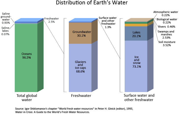
Figure 1.1.2: Breakdown of the Earth’s water.
9.5 The Water Balance
Hydrologists often use a water balance to account for the water in that part of the water cycle being studied. A Water balance is the application of the principle of conservation of mass (continuity equation) (UNESCO 1971). Conservation of energy is also an important principle in the study of hydrology, particularly in relation to measuring fluxes or phase changes of water vapour in the atmosphere.
Putting a boundary around the inflows and outflows of the water cycle of interest can be problematic, but essentially the water balance equation relies on the principle of the conservation of mass. As water is considered to be incompressible for the water cycles hydrologists generally are interested in, the conservation of mass is equivalent to the conservation of volume and so the water balance equation becomes:
\(I\Delta t-O\Delta t=\Delta S\) ………………………………….Equation 1.1
where
\(I\) is inflow [units of flowrate]
\(O\) is outflow [units of flowrate]
\(S\) is the storage [unit of volume]
\(t\) is the time interval [units of time]
The units for the flowrate, volume and time values in Equation 1.1 must of course be compatible. See Ladson (2009), p5 for information on units.
As well as the global scale the water cycle can be applied at the National or regional scale and a water balance constructed. At the National scale the inflow of interest is precipitation (\(P\)), and outflows are total evaporation (\(E\)) and the amount of water that is discharged to the sea (\(Q\)). At this scale, a steady state water balance approach is adopted (Welsh et al. 2007) and the change in storage is considered to be zero and therefore \(I=O\) or \(I=E+Q+e\) , where \(e\) is an error term or the unaccounted for volume.
This balance is applied by Ladson (2009) for Australia for an annual time step using the average measurements from the period 1918-1967 (Figure 1.1.3). This water balance demonstrates the uncertainty in the estimates made at this scale. For example the amount of river discharge to the sea (\(Q\)) is of the same order of magnitude of the unaccounted for water (or error term) in the water balance (\(e\)).

Figure 1.1.3: Hydrological Cycle Conceptualised by (Pidwirny 2010) with Ladson’s (2009) estimate of the water balance for the Australian mainland shown around the borders.
When a water balance is applied at a regional scale, a water catchment is generally the area of study. At this scale a more detailed water balance can be applied and as well as \(P\) the inflows may include surface inflows from another catchment (\(I_s\)) and groundwater inflows (\(I_g\)).
The catchment of interest may not have an outlet to the ocean and therefore the outflows are also a little different to the water balance at the global scale: evapotranspiration (\(ET\)), subsurface outflow (\(Q_g\)), streamflow (\(Q\)) and diversions (\(D\)).
At some time scales at the catchment level the changes in storage levels do contribute and are therefore included in the water balance equation. The storage types can be broken down into surface storage in lakes and dams (\(S_s\)), soil moisture storage (\(S_sm\)) and groundwater storage (\(S_g\)). There are other water storages in the catchment, but the change in their capacity is generally zero over the time period used in most water balances, e.g. vegetation, rivers and channels and snow and ice.
A catchment water balance can be a key tool for analysing the impacts of land use change and climate change (Hatton 2001). For example, if steady state conditions are assumed (i.e. changes in storages = 0), the impact on discharge to changes in rainfall and evapotranspiration can be investigated.
Access to data is one of the biggest hurdles to undertaking a water balance. For example, if we were to apply a water balance to the Mooloolah catchment, in which the University of the Sunshine Coast sits, we would need access to average rainfall, evapotranspiration and runoff from this catchment. It is difficult to find data at this catchment scale, but data is available at the Sunshine Coast Region scale from the Queensland Government Wetland Hydro-Climate Tool.
The following plot (Figure 1.1.4) is created using the annual rainfall and runoff Probability Exceedance Curve data for the Qld Southern Coastal Lowlands sub-bioregion (Qld sub-bioregion code: 12.4). These data were ‘stripped’ from the underlying html using several R libraries (RCurl and XML). Therefore you will need to install these packages (e.g. install.packages(“RCurl”)) before running the .Rmd file.

Figure 1.1.4: Annual rainfall and runoff Probability Exceedance Curves for the Qld Southern Coastal Lowlands sub-bioregion (Qld sub-bioregion code: 12.4).
9.6 Water Balance Data
The following data are the annual rainfall and runoff time series from the Queensland Government Wetland Hydro-Climate Tool. If you want to re-run this code for another location (and you do!) you will need to go the site and download new data and change the directory name in the code within the .Rmd document. Figure 1.1.5 shows the relationship between runoff and rainfall for this area.

Figure 1.1.5: Relationship between Runoff and Rainfall for the Qld Southern Coastal Lowlands sub-bioregion (Qld sub-bioregion code: 12.4), green line is 1:1 line, line of best fit is in red and shaded area represents amount of uncertainty in the fit.
If we were to conduct a water balance for each year in the record we will need annual evaporation or evapotranspiration data averaged over the same area. Unfortunately these data are not readily available, however if we assume that rainfall is the only input, and runoff and evaporation are outputs, we could estimate the annual evaporation as the difference between rainfall and runoff. The histogram of these differences (Figure 1.1.6) shows the majority of the estimated annual evaporation is from 500 to 1500mm.

Figure 1.1.6: Estimate of Evaporation as the difference between rainfall and runoff for the Qld Southern Coastal Lowlands sub-bioregion (Qld sub-bioregion code: 12.4).
The mean of the estimated annual evaporation is 1042mm, which demonstrates a good match with the long term Areal Actual Average Annual Evapotranspiration from the Bureau of Meteorology.
10 Tutorial 2: Creating a water balance
In this tutorial we will create a program that will show the water balance for a location for any year where rainfall and runoff data is available. This will be done for the Southeast Hills and Ranges sub-bioregion but it can be reused for any area where data is available.
10.1 Obtaining information
The yearly average evapotranspiration can be obtained from the Bureau of Meteorology. (Figure 1.1.7)

Figure 1.1.7: Average annual areal evapotranspiration
This map shows that the average annual evapotranspiration for the Sunshine Coast is 900
Rainfall and runoff information can be obtained from the Queensland Government’s WetlandInfo website. We want to calculate the water balance for the Southeast Hills and Ranges sub-bioregion.
Under Data Type select Mean Zonal Rainfall. Under Period select yearly then 120 years for the chart tab. Change the end date to 2006. Under the first graph that is printed select Download this data in .CSV format. Name this file ‘Rainfall’ then repeat the above process selecting Mean Zonal Run-off and name the .csv file ‘Runoff’.
We then import the .csv files into R and organize the data so there is a rainfall and runoff value for a given year.
direc <- "~/OneDrive - University of the Sunshine Coast/Courses/ENG330/ENG330_ebook"   #replace with the directory containing your .csv files
ra <- read.csv(paste(c(direc,"/Rainfall.csv"), collapse = ""))

ru <- read.csv(paste(c(direc,"/Runoff.csv"), collapse = ""))

#For the first years there is no data so all the NaN values will be removed. This is done with the complete.cases function
ra <- ra[complete.cases(ra), ]
ru <- ru[complete.cases(ru), ]

#Columns 3 and 4 contain the probability for quantity and long term mean respectively. We don't need these values for what we are doing so we can remove them.
ra <- ra[,1:2]
ru <- ru[,1:2]

#The rainfall and runoff are merged into a single data frame using the following code.
data <- merge(ra,ru,by="Year")
10.2 Creating a water balance for a given year
Now that we have a complete data set containing rainfall and runoff values for each year we can create a water balance for any year of interest. For now we will look into the water balance for 1978 (Figure 1.1.8).
year <- 1978
Rainfall <- data[grepl(year,data[,1]),2]
Runoff <- data[grepl(year,data[,1]),3]

#Average annual evapotranspiration is used to find the water balance
ET <- 900

#wb is the water balance
wb <- Rainfall - Runoff - ET

barplot(c(Rainfall, Runoff, wb), main = paste(c("Water balance for ", toString(year)), collapse = ""), col="darkgreen", names.arg=c("Rainfall", "Runoff", "Water balance"))
Figure 1.1.8: Water balance for the year 1978
In the above code all that needs to be changed is the year and, provided the year is within the years in the available data, the water balance for that year will be plotted.
You can also create your own functions in R. A function that plots the water balance for a given year can also be created.
wbalance <- function(x){
  Rainfall <- data[grepl(x,data[,1]),2]
  Runoff <- data[grepl(x,data[,1]),3]
  barplot(c(Rainfall, Runoff, wb), main = paste(c("Water balance for ", toString(x)), collapse = ""), col="darkgreen", names.arg=c("Rainfall", "Runoff", "Water balance"))
}
Typing wbalance(1975) in R will result in the following graph (Figure 1.1.9): 
10.3 Questions
Question 1: What are some of the assumptions that have been made when constructing the water balances?
Question 2: Determine the water balance for the Southern Coastal Lowlands sub-bioregion for the year 2005.
11 Theme 1, Topic 3: Statistics for Hydrology
This module will introduce some basic probability concepts and procedures used in Hydrological Frequency Analysis. The methods that have been used historically for flood frequency analyses were developed prior to the advent of the computer power that we now have access to. Subsequently the methods employed to analyse flow data are becoming more sophisticated. The R environment is particularly useful for understanding this increased complexity.
11.1 Objectives
When you have completed this module of the course you should be able to:
Describe the statistical parameters that pertain to hydrological data
Apply the key probability concepts and methods to hydrological data
Summarise hydrological data using descriptive statistics.
11.2 Resources
The draft version of the new Australian Rainfall and Runoff (AR&R), particularly Book 1, Chapter 2.
William King from Coastal Carolina University has produced a handy tutorial on Probability functions in R.
Another excellent resource is probability distributions in R.
For some basic statistics and probability theory, see the book by G Jay Kearns. This book can be accessed through R by three simple commands:
install.packages("IPSUR")
library(IPSUR)
read(IPSUR)
11.3 Probability Theory
In flood frequency analysis we are primarily interested in analysing the probability of floods of certain sizes, therefore we are generally only interested in the flood peaks. Given the stochastic nature of rainfall, and many of the processes that contribute to flooding, a probability framework is required in order to assess risk, as the flood peaks are treated as random variables.
One of the primary assumptions of applying the flood probability framework is that each peak is statistically independent of all other flood peaks. This has generally been shown to be the case, particularly with careful selection of the time period used (eg. a water year versus a calendar year - more on this later).
To understand probabilities, and hence to be able to work with the probability of the occurrence of hydrological events, we need to be able to describe and compute probabilities. This is usually done using a ‘probability density function’, or pdf.
The flood probability model is generally described by its probability density function (pdf). For sample data, the pdf is a smoothed curve applied to a histogram. There are many forms of a pdf, depending on the shape of this curve. When the underlying data fits a pdf that resembles a bell-like shape it is called a ‘normal’ (or Gaussian) distribution. This is an excellent resource for explaining probability distributions in R.
There are several distributions that are used in hydrology. Each of these curves can be described by a mathematical equation, which are characterised by one or more parameters (e.g. location, scale and skewness) which usually have some physical meaning in hydrology. For example the normal distribution is characterised by the mean (\(\mu\)) and standard deviation (\(\sigma\)).
The values of the standard normal distribution (the special normal distribution which has \(\mu = 0\) and \(\sigma = 1\)) can be generated by using the dnorm function, which returns the height of the normal curve at values along the \(x\)-axis. (Variables which follow a standard normal distribution are usually designated \(z\).) Wrapping the curve function around this result produces the familiar ‘bell-shaped’ curve. The point on the curve where z = 1 is shown by the green circle and line (Figure 1.2.1).
curve(dnorm(x), xlim=c(-3,3), col='red', lwd=3, xlab="Z", ylab="density", main="Probability Density Function")
points(1, dnorm(1), col='green', pch=19, cex=3)
lines(c(1,1), c(0,dnorm(1)) ,col='green', lwd=2)
Figure 1.2.1: Probability density function with the point where z = 1 shown
To find the density value of particular value along the \(x\)-axis (ie. the height of the curve at that point), a value is passed to the dnorm() function:
dnorm(1)## [1] 0.2419707However, this single value does not mean that the probability of \(z\) taking the value of exactly 1 is the corresponding value on the pdf curve. This is because it is the area under the curve that provides the probability, and the area under a point is zero. Therefore the probability that \(z\) will be greater than a particular value is given by the area under the pdf to the right of the \(z\)-value on the \(x\)-axis. You may remember looking up ‘\(Z\)-scores’ (values on the \(x\)-axis) in a table to return the \(p\)-value (region under the normal curve) when conducting hypothesis tests. The good news is that you no longer have to do that; you only need to enter the correct command into R! That correct command is pnorm for the normal distribution.
The area under the curve (shaded in blue below) from a specified \(z\) value on the \(x\)-axis to the maximum value on the \(x\)-axis (which is \(\infty\) for the normal distribution), gives the probability of the value of \(Z\) being greater than the particular value of \(z\) being examined: \(z\geq\) Z; ie. it gives \(P(Z \geq z)\) (Figure 1.2.2). The total area under the pdf curve is \(1\).

Figure 1.2.2: Probability density function showing the probability of Z being greater than 2
You can also specify different values for \(\mu\) and \(\sigma\) in the dnorm and pnorm functions (rather than 0 and 1 respectively). The following pdf is for the case with \(\mu = 10\) and \(\sigma = 2\) (Figure 1.2.3):

Figure 1.2.3: Probability density function with a mean of 10 and a standard deviation of 2
The cumulative distribution function (cdf) is the integral of the pdf (eg. area under the curve), or the total accumulated probability up to a certain value. It is represented as \(P(z)= \int_{-\infty}^{z}{p(z)dz}\). Therefore, like the pdf, there is a mathematical curve that describes the pdf. The pdf of ‘normally’ distributed data takes on the familiar s-shape and can be generated for the standard normal distribution (\(\mu = 0\) and \(\sigma = 1\)) using the pnorm function inside the curve function.
It stands to reason that if a value (\(z\)) is passed to the pnorm function, it will return the value on the cdf curve, which is equivalent to the area under the pdf curve to the left of \(z\) (Figure 1.2.4). It should be noted that, in general, capital letter represent the random variable (in this case \(Z\)), and small letter represent an outcome or realization of that random variable (eg. \(z\)).

Figure 1.2.4: Probability density function and cumulative distribution function showing the area under the PDF curve
11.4 Probability Functions
The probability theory used to estimate the probability of floods of certain magnitudes occurring is taken from the Sampling Theory (see the book by G Jay Kearns) and the theory of Bernoulli Trials (see page D-21 in this resource).
The binomial distribution represents the successes or failures of trials that are repetitive (eg. tossing a coin 100 times and recording the occurrence of Heads or Tails). As we are dealing with discrete events (that is, one Head or two Heads, but not 2.8034 Heads), the representation of the probability function is called a probability mass function. The graphical representation of a mass function is usually through a column chart (as opposed to a curve for the cdf). Essentially these theories result in the equations that allow the probability of k successes in n trials to be calculated (using the binomial formula):
\(P(k \text{ successes in } n \text{ trials})=\frac{n!}{k!(n-k)!}p^k(1-p)^{n-k}\)
The Annual Exceedance Probability (AEP) is the probability (p) that is of interest to us in the previous equation. We can apply the above equation to determine the probability of occurrence of various scenarios. For example, if we consider peaks that occur in an annual time period, we can calculate the probability that exactly three 50-year floods will occur in a 100 year period.
If we consider a series that represents the maximum floods over a certain period (eg. annual) or threshold (eg. Peak over Threshold or PoT), the magnitude of these floods can be related to the probability of exceedance (in the case of annual peaks) or their return interval (in the case of PoT). Fortunately there is a relationship between the probability of exceedance (AEP, or \(p\)) and the return interval (ARI): \(ARI=\frac{1}{p}\).
Therefore we need to develop skills in being able to calculate these exceedance probabilities.
11.4.1 Exceedance Probabilities
If we wanted to work out the probability that exactly three 50-year floods will occur in a 100-year period, we could of course apply the above equations. For example, in this situation, our k=3 and n=100. Our ARI = 50, therefore \(p=\frac{1}{50}\). Plugging these values into our first equation yields:
\(P(3 \text{ in } 100)=\frac{100!}{3!(100-3)!}(\frac{1}{50})^{3}(\frac{49}{50})^{97} = 0.182\), so therefore there is an 18.2% chance that three 50-year floods will occur in any 100 year period.
At this stage we don’t know the magnitude of that flood for a given location. This will come through the analysis of actual streamflow data.
Applying this equation every time we wish to calculate these probabilities seems onerous; fortunately R has a builtin function to enable the calculation of the probability of k successes in n trials to be calculated using dbinom(k,n,p) \(P(3 \text{ in } 100) =\) 18.2275941.
But what if we wanted to know the probability of 3 or more 50-year floods occurring in a 100 year period? We know that the sum of the probabilities of all possible numbers of 50-year floods occurring in 100 years must equal unity (this includes the probability of there being no 50-year events in a 100-year period), so \(P(3 \text{ or more in } 100) = P(3 \text{ in } 100) + P(4 \text{ in } 100) + ... P(100 \text{ or more in }100)\).
However, it would take a long time to apply each of these combinations in the first equation. We could take a different tack and just calculate the Probabilities of 0 in 100, 1 in 100 and 2 in 100 and take the sum of these probabilities away from 1: \(P(3 \text{ or more in } 100) = 1 - P(0 \text{ in } 100) + P(1 \text{ in } 100) + P(2 \text{ in } 100)\). However, this also seems a bit onerous, but fortunately we can again apply the dbinom(k,n,p) function and wrap a sum function around it: 1-sum(dbinom(0:2,100,1/50)) = 0.3233144. In R we could also easily apply the first option directly, eg. sum(dbinom(3:100,100,1/50)). You will see this gives the same answer.
To understand the shape of this distribution you can wrap a plot function around the binom function for the points from 0:100. (The binomial distribution is computed at disctrete values, such as 0, 1, 2, … 100; for example, in 100 years, we can have 0 years or 1 year or two years and so on with a flood, but it makes no sense to talk about 2.45604 years having a flood. This means the pdf will not be continuous.) The blue dot in the following graph corresponds to the probability of 2 occurrences of 50-year floods in 100 years (Figure 1.2.5). It makes sense that this has the highest probability, given that, on average, we could expect two 50-year floods in any 100 year period.
 x <- seq(0, 100, 1)
plot(x,dbinom(x,100,1/50),col="red",lwd=3,type="h", las=1, xlab="Number of Occurrences of 50 Year Floods in 100 Years", ylab="Probability of Occurrence", main="Probability Distribution for number of \n Occurrences of 50 Year Floods in 100 Years")

points(2,dbinom(2,100,1/50), pch=19, col ="blue")
Figure 1.2.5: Exceedence probabilities
Exercise: If you were asked to design a bridge to be safe during a 50-year flood, what is the chance that the design flood will be exceeded four or more times in a 100 year period?
In design however, we are most interested in the probability of occurrence of 1 or more ‘failures’ in n years. Using the previous logic, this equates to:
\(P(1 \text{ or more in } 100) = 1 - P(0 \text{ in } 100)\)
Applying the previous relationships yields: \[P(1 \text{ or more in } 100) = 1-\frac{n!}{0!(n-0)!}p^0(1-p)^{n}=1-(1-p)^{n}\] (since \(0! = 1\) and \(p^0 = 1\)). Therefore the probability of one or more 2000-year floods in a 30-year period is given by: \(P(1 \text{ or more in } 30) = 1- (1-\frac{1}{2000})^{30} = 0.0149\) or 1.49%
Again we can use the dbinom function to calculate this: 1-dbinom(0,30,1/2000) = 1.49%.
Exercise: What is the probability of one or more 200-year floods in a 20 year period?
Now consider the case of a project with a design lifetime of 100 years. The design discharge we are interested in is a discharge with a 100 year return period. In this case what is the probability of ‘failure’ in the lifetime of the project? In this case n=100, and the return period is also 100. Therefore the probability is 0.01: 1- dbinom(0,100,0.01). This equates to a 63.4% probability of a 100 year flood occuring in any 100 year period!
What is the probability of 100 year floods occurring in two consecutive years? In this case our \(n=2\), and we can either directly apply dbinom(2,2,0.1) or multiply the probability of one 100-year flood in 1 year (i.e. \(n\) and \(k =1\)): dbinom(1,1,0.01) by the same probability (since the events are independent): dbinom(1,1,0.01)*dbinom(1,1,0.01). Therefore the probability (expressed as a percentage) of 100-year floods occurring in two consecutive years is 0.01%: It is very unlikely.
We can also turn these relationships around to determine the design return period for an acceptable risk of failure. For example: A hydraulic construction site on a stream needs the projection of a coffer dam/tunnel for a period of three consecutive years. If the total acceptable risk of failure during this three-year period is estimated to be 0.5%, what must be the design return period for the protective structure? In this case, we have the answer to P = 1 - dbinom, which is the same as the equation: \(P = 1 - (1-p)^{n}\). Given that P=0.005 (ie. 0.5% acceptable risk of failure), and \(n=3\), the equation can be rearranged to calculate the exceedance probability (p)= 0.167%. The return period is the reciprocal of this: \(ARI=\frac{1}{p}\) = 599 years. There is no doubt an inverse binomial function in R to calculate this: can you find one?
Exercise: A total acceptable risk of failure for a bridge is 5%. Given that this bridge has a design life of 50 years, What is the ARI that the bridge should be designed for?
There are several other statistical distributions that are important for use in hydrology. These can be broken down into different distribution ‘families’. Each of these distributions has a corresponding function in R that enables you to extract a value of the density curve (d), cumulative distribution curve (p) and a range of other statistical properties. The values in brackets precede the function name shown in Table 4.1.
Table 4.1: Distributions common in hydrology with the appropriate function name. Note each function is preceded by the letter d, but this can be changed to p (and a few other options) depending on whether the value on the density or cumulative distribution curve is required.
| Family | Distribution Name | Related R Function |
|---|---|---|
| Normal Family | Normal | dnorm |
| Log-normal (that is, \(\log X\) has a normal distribution) | dlnorm |
|
| Discrete | binomial (or Bernoulli) | dbinom |
| Gamma Family | Pearson type III | dpearson available in Library (SuppDists) |
| Log-Pearson type III | dlgamma3 available in Library (FAdist) |
|
| Extreme Value | Type I - Gumbel (for max or min) | dgumbel available in Library (FAdist) |
| Type II- Weibull (for min) | dweibull |
12 Topic 4: Flood Frequency Analysis
This module will introduce some basic probability concepts and procedures used in frequency analyses of hydrological data. The methods that have been used historically for flood frequency analyses were developed prior to the advent of the computer power that we have access to today. Subsequently the methods employed to analyse flow data are becoming more sophisticated. The R environment is particularly useful for understanding this increased complexity.
In flood frequency analysis we are primarily interested in analysing the probability of floods of certain sizes, therefore we are generally only interested in the flood peaks. Given the stochastic nature of rainfall and many of the processes that contribute to flooding, a probability framework is required in order to assess risk. This probability framework treats flood peaks as random variables.
One of the primary assumptions of applying the flood probability framework is that each peak is statistically independent of all other flood peaks. This has generally been shown to be the case.
There are several distributions that are used in hydrology. Each of these curves can be described by a mathematical equation, which is characterised by one or more parameters (e.g location, scale and skewness). These parameters usually have some physical meaning in hydrology. For example the normal distribution is characterised by the mean (\(\mu\)) and standard deviation (\(\sigma\)).
There are several statistical distributions that are important for use in hydrology. These can be broken down into different distribution ‘families’. Each of these distributions has a corresponding function in R that enables you to extract a value of the density curve (d), cumulative distribution curve (p) and a range of other statistical properties. The values in brackets precede the function name shown in Table 1.2.
Table 1.2: Distributions common in hydrology with the appropriate function name. Note each function is preceded by the letter d, but this can be changed to p (and a few other options) depending on whether the value on the density or cumulative distribution curve is required.
| Family | Distribution Name | Related R Function |
|---|---|---|
| Normal Family | Normal | dnorm |
| Log-normal (that is, \(\log X\) has a normal distribution) | dlnorm |
|
| Discrete | binomial (or Bernoulli) | dbinom |
| Gamma Family | Pearson type III | dpearson available in Library (SuppDists) |
| Log-Pearson type III | dlgamma3 available in Library (FAdist) |
|
| Extreme Value | Type I - Gumbel (for max or min) | dgumbel available in Library (FAdist) |
| Type II- Weibull (for min) | dweibull |
12.1 Objectives
When you have completed this module of the course you should:
- be familiar with how to access, download and check the quality of data used in flow and flood frequency analysis,
- have learnt how to construct a flow duration curve,
- be familiar with the changing requirements in the literature for flood frequency analysis (particularly the revision of Australian Rainfall and Runoff), and
- be able to undertake flood frequency analysis using both Annual and Peak over Threshold series.
12.2 Resources
The revision of AR&R, particularly Book 3, Peak Flow Estimation, has produced material that is particularly valuable for understanding new methods in this area of hydrology.
The subject is covered well by Ladson (2011) in Chapter 6: Floods and Flood Frequency Analysis.
12.3 Streamflow Data
The starting point for understanding the driving hydrological processes in a river system or catchment is to extract streamflow data for the location(s) of interest. In Queensland, flow data is available through the Queensland Government Water Monitoring Data Portal. For current streamflow data, click on Open Stations, and select the relevant region, through the map, or basin, then gauging station through the links in the frame to the left.
Data can be downloaded for any available timestep up to the length of the data availability, under the ‘Custom Outputs’ tab. For the example below, daily stream discharge (Megalitres/Day) from the Mary River at Bellbird Creek gauging station (Station Number: 138110A) have been used. These data are available from 01/10/1959.
Data are available from the Qld Water Monitoring Data Portal in a structure that requires some manipulation prior to being able to analyse it. Several variables can be downloaded at a time, but the structure is always the same. The first column contains the Date and Time data, then the next six columns contain the Mean, Min and Max values and corresponding quality codes for the first variable. If there is more than one variable, this pattern is repeated again. The last column always contains the metadata about the station and a description of the quality codes. The structure for one variable is shown in the table 1.3.
Table 1.3: Qld Water Monitoring data format
| Time | station number | station number | station number | ||||
|---|---|---|---|---|---|---|---|
| and | Variable Code | Variable Code | Variable Code | ||||
| Date | Variable Name and Units | Variable Name and Units | Variable Name and Units | ||||
| Mean | Qual | Min | Qual | Max | Qaul | ||
| 1st Date | value | value | value | value | value | value | Sites: |
| 2nd Date | value | value | value | value | value | value | Station Number - Station Name Lat Long Elev |
| … | … | … | … | … | … | … | From row 8 onwards, there is a description of the Qual codes |
| Last Date | value | value | value | value | value | value | |
| Miscellaneous text | |||||||
| Miscellaneous text |
The following code is commented to assist your understanding of one way to import the data into R.
# The station number is represented by the variable stn.
# To bring in data for a different location, you only need to change stn,
# provided the csv file is placed in the same directory.
stn<- "138110A"

#fn is a variable that is created by pasting together the directory (change to point to your local directory), the station number (variable stn) and the file extension (.csv).
fn<-paste("/Users/helenfairweather/OneDrive - University of the Sunshine Coast/Courses/ENG330/ENG330_ebook/",stn,".csv",sep="")


#extract the first part of the file to get the variable name.


#before reading in the data determine the number of columns in the csv file. This is stored in the ncol variable.
ncol <- max(count.fields(fn, sep = ","))

# The first column always contains the date, and the last column the metadata.
# For every variable of interest, the file contains six values:
# the mean value, min value and max value, plus the corresponding quality code for each of these.
# Therefore the ncol minus 2 (to remove the date and metadata columns) divided by 6 will give the number of variables,
# which is stored in nv.
nv<-as.integer((ncol-2)/6)

#To extract the variable names, the first 4 rows of the data file are read into the hd variable
hd<-read.csv(fn,header=FALSE,nrows=4,sep=",")

#An empty vector to store the variable names is created and a loop used to capture these names for the number of variables (nv).  The first variable name is sourced from row 3, column 2, and each subsequent variable name from the same row (3), but incremented by 6 columns.
varn<-character(0)
cn<-2
for(i in 1:nv)
{

  varn[i]<-as.character(hd[3,cn])
  cn=cn+6

}

#The data are extracted from the file by using the read.csv function and skipping the first four rows.
ddtemp<-read.csv(fn,header=FALSE,skip=4,sep=",")

#The extra column at the end of the file is removed in the next line of code.
dd<-ddtemp[1:(nrow(ddtemp)-2),1:(ncol-1)]
#If the two extra lines at the end of the file are not removed, the following code is used in lieu of above.
#dd<-ddtemp[1:(nrow(ddtemp)-2),1:(ncol-1)]

#Names are assigned to the columns using the concatenate function and in a loop given by the number of variables.
cnames<-NULL
for(c in 1:nv){cnames<-c(cnames,paste(c("Mean","Qual","Min","Qual","Max","Qual"),rep(c,6)))}
names(dd)<-c("Date",cnames)

#Text appears in the second row at the bottom of the document. This confuses R and makes all the numbers appear as factors (in this case a text representation of that number) meaning no calculations can be done with them. The following code converts column 2 to numbers.
dd[, 2] <- as.numeric(as.character(dd[,2]))
#When the text is converted to a number it will be turned into NA which is what the warning message above is showing
Once the data are entered into R, they should first be interrogated to ascertain the number of missing values. For example, the summary command will provide the quartile values and the number of missing values (NA’s) for each variable.
There are libraries to handle these missing data, but we will not cover these at this time. The na.rm=TRUE option (which instructs R to remove the missing values, or NAs, before computation) will be included in functions where these missing data would cause a problem.
Several libraries are available to facilitate the relatively easy plotting of hydrological timeseries data. These are zoo, hydroTSM, lubridate and lattice. The zoo package is designed to create timeseries data, which is important for hydrological analysis. The first requirement to create a zoo object is to create an index of dates (and time, if relevant). Even though the dates are included in the imported file, they are not necessarily read as such. They may be coerced into dates using date_ind<-as.Date(dd$Date,format="%d/%m/%Y",origin="1970-01-01"). However, if this is not successful, you can read the first and last dates using a similar function, and create a sequence from this first to last date in increments of one day.
In the data frame previously created for discharge, the Mean, Min and Max discharge values are in columns 2, 4 and 6.
(Columns 3, 5 and 7 contain the quality codes for the mean, min and max respectively.) If other variables are included, they are accessed by adding 6 to these column numbers. Using these columns, the zoo command creates a timeseries object with the associated date index. The hydroTSM library’s plot command will produce a line graph of all the time series in the zoo object.

Figure 1.3.6: Time series plot of data for each variable using the hydroTSM library’s plot function
Further investigation of these data can be conducted using the lattice library, particularly the splom function, which produces a matrix plot of the three parameters (Mean, Min and Max) for each variable (in this case, Discharge (ML/Day)) in our zoo object (Figure 1.3.7). The matrix that is produced consists of two plots per parameter, each with the x and y axes reversed. This is instructive for investigating the relationship between the variables and the parameters. In this case, the plot that demonstrates the strongest relationship is between the Mean and Maximum flows, indicating the Maximum flows have a large effect on the Mean values.

Figure 1.3.7: Using the splom function in the lattice library to investigate the relationship between variables.
A boxplot is useful for investigating the behaviour of a river over certain time periods, for example each month of the year. The daily2monthly function in the hydroTSM library is used to first create monthly sums from the daily data, using the m <- daily2monthly(zd[,3], FUN=sum, na.rm=TRUE) command. A vector with the three-letter abbreviations of the month names is extracted using the cmonth <- format(time(m), "%b") command, which are then converted to factors using the command: monv <- factor(cmonth, levels=unique(cmonth), ordered=TRUE). (The use of ordered tells R that the levels of the factor have a natural order in which they appear.) These data are then used to create the boxplot using boxplot(coredata(m) ~ monv, col="lightblue", main="ML/month") (Figure 1.3.8). The m object is a timeseries, and the coredata(m) extracts the values of interest, without the related dates.
The boxplot is a representation of all available data, showing the median (think black line inside the blue box) and the interquartile range (represented by the blue box). The whiskers extend to the most extreme data point or no more than [1.5] times the length of the interquartile range. The extreme points are indicated by the open circle points outside of this range.

Figure 1.3.8: Monthly box plot showing how data varies throughout the year.
The boxplot graphically shows that the wettest months are generally from January through to March, though it is evident that extreme flows have occured in April, July and October. It is also evident that the highest flow occurred in April. Applying the command index(zd[which.max(zd[,3]),]) gives the date of this occurrence as 1989-04-25 12:00:00.
12.4 Flow Duration Curves
Like the previous boxplots, flow duration curves are a summary of the hydrology of a stream, but provide added information in terms of the percentage of time that flows of given magnitudes are exceeded. The following code produces a plot showing the flow duration curve for all the data (blue curve). This curve is produced by the cdf command from the hydroTSM library. In the example provided, all available daily data has been included in the construction of this curve.
Any time step can be used to construct the flow duration curve, but a daily time step will provide the most information. The graph can be used in two ways:
- determine the percentage of time that a given flow is exceeded, and
- find the magnitude of flow that is exceeded a certain percentage of time.
An estimate can be determined through a visual inspection, or through the application of R functions. For example, the quantile function will return the flow that is exceeded a certain percentage of time: quantile(zd[,3],1-tfe,na.rm=T). In this case, the tfe variable is the percentage of time that flow is equalled or exceeded. The flow duration curve is the cumulative distribution function with the axis swapped around, with the x-axis (% time equalled or exceed on the x-axis) representing 1 - the cdf probabilities. Therefore input into the quantile function is 1-tfe. So for the flow that is equalled or exceeded 20% of the time = ceiling(quantile(zd[,3],0.8,na.rm=T)), or 310.
To find the % of time a certain flow is equalled or exceeded the Empirical Cumulative Distribution Function (ecdf) function can be used. For example, a flow of 310 is equalled or exceeded 20% of the time. The blue arrows demonstrate this in Figure 1.3.9.

Figure 1.3.9: Flow duration curve showing how to determine the discharge that is exceed a given percentage of time.
The flow duration curve can also be applied to a subset of data, eg. data from months with high flows. The example below shows this for the high flow months (Jan - Feb) and low flow months (Aug-Sep). Examples of applying the quantile function to these subsets of data are also shown, demonstrating the changing statistical characteristics of this stream in wet versus dry times (Figure 1.3.10).
A steep section at the top end of the flow duration curve indicates a relatively small number of very high flows, which is confirmed by the boxplots shown previously. According to Ladson (2011, p.143) a steep section at the low flow end of the curve indicates that baseflow is insignificant. Baseflow will be investigated in more detail in a later theme.

Figure 1.3.10: Using the flow duration curve to investigate the discharge behaviour over different periods of the year.
Exercise: Bring in data from the Victorian Water Monitoring Portal for Joyces Creek at Strathlea Gauge no. 407320 and compare with the graphs in Ladson, p.142.
12.5 Design Flows
Much of the material presented in this topic is from the revised Book 3 of ARR, Peak Discharge Estimation.
In the previous section the flow duration curves were used to obtain the percentage of time that a flow is exceeded. As previously noted, these percentiles are used in reverse to that normally applied by statisticians. For example, the flow that is exceeded 10% of the time (a low percentile), will be relatively high flow, as 90% of the time, flows are below this value.
The flow duration curve is useful for determining ‘yields’ of catchments (eg. how reliable a flow regime is for water supply), however for determining design flows for a given level of risk, a flood probability model is required. In this flood probability model, flow peaks (from a certain time period, usually annual) are considered as random variables. The procedure fits a statistical (probability) model to a series of flood peaks. The method also relies on the assumption of independence of the data.
12.6 Hydrologic Extremes - Frequency Analysis
Hydrologists are generally interested in the behaviour of streamflows at the extreme ends of the spectrum: droughts and floods. The magnitude of these extreme events is inversely related to their frequency of occurrence (ie. floods that are large occur infrequently). In relation to floods, the peak of the river flow in some defined period (usually one year) is considered to be a random variable (q) (“the measurement associated with the next physical sample from the population” (Millard, 1998)).
The values taken by a random variable can be discrete or continuous In the case of discrete random variables there are a finite number of values. For example, when tossing a single coin, the resulting values are finite: Heads or Tails. The continuous random variable can take on an infinite number of values (eg. the peak of the river flow, q).
A set of random flood peaks is represented by an upper-case Q, where a specific realization is represented by the lower-case (eg. q). A histogram can be used to investigate the appropriate probability model for the data to be analysed (ie. the extracted series of peak flows).
The probability density function (pdf) that we previously investigated, is the limiting form of the histogram of q as the number of samples approaches infinity. We will overlay a pdf to a histogram after the peak flows have been extracted for the example dataset from the Mary River.
The frequency of occurrence is represented by either the AEP or ARI. In the case of the ARI, this is also considered to be a random variable (ie. the average or expected time between occurrences of events with certain magnitudes for a given AEP).
The frequency analysis of flood data can be undertaken using an Annual Peak or a Peak over Threshold (PoT) timeseries. By convention, the AEP is generally related to the annual series, and ARI to the PoT. This latter series is also known as the partial duration series. Any frequency analysis of timeseries data (whether annual or PoT) requires an assumption of independence.
The objective of flood frequency analysis is to define the relationship between floods of certain magnitude and their frequency of occurrence (expressed as AEP or ARI). In contrast to the flow duration curve, which is constructed from all the data, the flood frequency extracts the peaks from each year (Annual flood series) or independent peaks over a specified threshold (Partial series).
12.6.1 Annual series
The first step to investigate the behaviour of a particular river is to plot the daily data. In the following analyses daily data from the Mary River at Bellbird Creek gauging station (Station Number: 138110A) are used. Once the daily data are read in, the maximum discharges are extracted and plotted over the time series.
The daily data is read into R in the usual way (eg. read.csv). As per the previous code, the headings are stripped, and variable names extracted before the data are read into R. In this case, the data have been stored in the variable called dd. A timeseries is again created using zoo and a daily timestep. The data for this example, extracts the daily maximum values and uses the zoo function to create the timeseries, zd.
In terms of analysis, the annual series may seem to be the easiest to extract. However, the time of the year in which the majority of the floods occur influences whether the assumption of independence is met. This independence means that each flood peak included in the analysis has physical independence from the cause of the flood. For example, if a large rainfall event causing a flood and very wet antecedent conditions is followed by another large rainfall event, the subsequent flood peak may not be independent of the previous flood.
The months that define the water year are therefore very important. For example, if the calendar year is used, then in Qld, this could result in the largest floods in two consecutive years not being independent; the first flood may have occurred in late Dec, and the second in early Jan, and they may both in fact be part of the same flood.
Before we extract the annual peaks the timeseries is adjusted so that discharges are assigned to the relevant water year. If the water year commences in October, adding 3 months to a time index will create a time series, where the month assigned the value 1, is actually the tenth month (ie. October). This is very easy to achieve in R using a zoo object, and there is no need to use If statements to account for the Dec to Jan transition (which is the case if implemented in Excel).
The code to create this index of water years is as.numeric(as.yearmon(time(zd)) + 3/12) %/% 1. This code will convert the time value in the zoo object zd to be adjusted by +3 months (eg. October will now be the 1st month in the water year). The as.yearmon code converts the date to a year, and as.numeric coupled with %/% 1 returns an integer value corresponding to the correct ‘water year’.
library(hydroTSM)
stn<- "138110A"

#fn is a variable that is created by pasting together the directory (change to point to your local directory), the station number (variable stn) and the file extension (.csv).
fn<-paste("/Users/helenfairweather/OneDrive - University of the Sunshine Coast/Courses/ENG330/ENG330_ebook/",stn,".csv",sep="")
#fn<-paste("//usc.internal/usc/home/hfairwea/Desktop/Teaching/ENG3302014Sem2/RHTML/data/Daily/",stn,".csv",sep="")


#extract the first part of the file to get the variable name.


#before reading in the data determine the number of columns in the csv file. This is stored in the ncol variable.
ncol <- max(count.fields(fn, sep = ","))

nrows<-length(count.fields(fn, sep = ","))

# The first column always contains the date, and the last column the metadata.
# For every variable of interest, the file contains six values:
# the mean value, min value and max value, plus the corresponding quality code for each of these.
# Therefore the ncol minus 2 (to remove the date and metadata columns) divided by 6 will give the number of variables,
# which is stored in nv.
nv<-as.integer((ncol-2)/6)

#To extract the variable names, the first 4 rows of the data file are read into the hd variable
hd<-read.csv(fn,header=FALSE,nrows=4,sep=",")

#An empty vector to store the variable names is created and a loop used to capture these names for the number of variables (nv).  The first variable name is sourced from row 3, column 2, and each subsequent variable name from the same row (3), but incremented by 6 columns.
varn<-character(0)
cn<-2
for(i in 1:nv)
{

  varn[i]<-as.character(hd[3,cn])
  cn=cn+6

}

nrws<-length(count.fields(fn, sep = ","))
#The data are extracted from the file by using the read.csv function and skipping the first four rows.
ddtemp<-read.csv(fn,header=FALSE,skip=4,sep=",",nrows=nrws-6)

#The extra column at the end of the file is removed in the next line of code.
dd<-ddtemp[1:(nrow(ddtemp)),1:(ncol-1)]
#If the two extra lines at the end of the file are not removed, the following code is used in lieu of above.
#dd<-ddtemp[1:(nrow(ddtemp)-2),1:(ncol-1)]

#Names are assigned to the columns using the concatenate function and in a loop given by the number of variables.
cnames<-NULL
for(c in 1:nv){cnames<-c(cnames,paste(c("Mean","Qual","Min","Qual","Max","Qual"),rep(c,6)))}
names(dd)<-c("Date",cnames)
#date_ind<-as.Date(dd$Date,format="%d/%m/%Y",origin="1970-01-01")
#stdate<-as.Date(substr(toString(dd$Date[1]),1,nchar(toString(dd$Date[1]))-5),format="%d/%m/%y")

#windows
stdate<- as.POSIXct(dd$Date[1],format="%H:%M:%S %d/%m/%Y") #-100*365.25
findate<-as.POSIXct(dd$Date[nrow(dd)],format="%H:%M:%S %d/%m/%Y")

#mac
#stdate<- as.Date(dd$Date[1],format="%d/%m/%y")-100*365.25
#findate<-as.Date(dd$Date[nrow(dd)],format="%d/%m/%y")

date_ind<-seq(stdate,findate,by="day")

#can automate the number of column numbers (eg. c(2, 4, 6)) based on the number of variables
zd<-zoo(dd[,c(2,4,6)],date_ind)
nma<-4
zd$yr<-as.numeric(as.yearmon(time(zd)) + nma/12) %/% 1
#peaks extracted using water year.  To adjust the start of the water year change the nma (number of months to adjust) by 12 - the month that represents the starting year

#minyr<-year(index(zd[1]))
#maxyr<-year(index(zd[nrow(zd)]))
minyr<-as.integer(zd$yr[1])
maxyr<-as.integer(zd$yr[nrow(zd)])

nyrs<-as.integer(maxyr-(minyr-1))
maxv<-numeric(nyrs)
indd<-as.Date(nyrs)
for(i in 1:nyrs){
  temp<-subset(zd,zd$yr==(i+minyr-1))
  maxv[i]<-max(temp[,1:3],na.rm=T)
  indd[i]<-as.Date(index(temp[which.max(temp[,3])]))
}

indd2 <- as.POSIXct(paste(c(toString(indd[1]), "13:51:15"),collapse=" "), format="%Y-%m-%d %H:%M:%S")

for (i in 2:length(indd)){
  indd2[i] <- as.POSIXct(paste(c(toString(indd[i]), "13:51:15"),collapse=" "), format="%Y-%m-%d %H:%M:%S")
}

peaks <- zoo(maxv,indd2)
A plot of the annual peaks extracted in the previous code is used to further investigate the probability distribution characteristics of the annual series. The identification of the annual peaks on the daily time series plot (Figure 1.3.11) shows that there are some very small discharges included in the annual series.
plot(zd[,3],col="blue",xlab="",ylab=varn[1])
points(peaks,col="red",pch=20)

abline(v=seq(index(zd[1]),index(zd[nrow(zd)]),by="year"),col="grey")
Figure 1.3.11: Daily Maximum Flows Annual Peaks shown in red dots
A histogram of the annual peak flows, shows the positively skewed nature of the annual series for this gauging station, which is to be expected. Note the difference between the histogram produced using all the monthly values, compared to the peaks only - the skew isn’t as high. Think about why this might be the case.
The skew evident in the histogram (and overlain pdf) of the annual peaks (Figure 1.3.12) clearly shows that these data are not represented by a normal distribution (green curve). However a log-normal distribution may be suitable (also added on Figure 1.3.12).
As indicated in the revised Book 3 of ARR, “Empirically the pdf of q is the limiting form of the histogram of q as the number of samples approaches infinity”
library(lattice)
wyv<-aggregate(zd, zd$yr, max,na.rm=TRUE)
hv<-hist(coredata(wyv[,3]),breaks=15,plot=FALSE)
hist(coredata(wyv[,3]),breaks=15,xlab=varn[1],freq=F,col="blue",main="")

lines(density(coredata(wyv[,3])),col="red")
mv<-mean(coredata(wyv[,3]))
sdv<-sd(coredata(wyv[,3]))
curve(dnorm(x,mean=mv,sd=sdv),add=TRUE,col="green")
curve(dlnorm(x,mean=log(mv),sd=log(sdv)),add=TRUE,col="darkorange4")
yl<-max(hv$density)
xl<-hv$mids[length(hv$mids)-5]
legend(xl,yl,legend=c("histogram","pdf","normal","log-normal"),col=c("blue","red","green","darkorange4"),pch=c(15,NA,NA,NA),lty=c(0,1,1,1),cex=0.8)
Figure 1.3.12: Histogram of Annual Peaks
12.7 Generalised form of the flood probability model
In many regions of Australia, the frequency of floods is influenced by climatic patterns. These phenomena include the MJO (Madden Julian Oscillations), ENSO (El Nino Southern Oscillation), SAM (Southern Annual Mode), IDO (Indian Ocean Dipole) and the PDO (Pacific Ocean Dipole).
When this is the case, any flood frequency analyses should be conditioned on these exogenous (or external) climate phenomena. These phenomena are usually expressed as indices. In this case, the shape of the pdf is be described by \(p(q|\theta(x))\) where \(\theta(x)\) are the vector of parameters that influence the flood probability model over varying time periods.
Conditioning the flood probability model is beyond the level of this course. We will limit our exploration to the case of a homogenous time series (ie. there are no conditioning variables, \(\theta(x)\).)
12.8 Homogeneous Flood Probability Model
In the case of the homogenous flood probability model, each flood peak is considered to be a random realisation from the same probability model \(p(q|\theta\) (note there is no vector x). In this case, the flood peaks are said to form a homogeneous time series.
12.9 Annual Maximum Series
The flood frequency analysis technique is the preferred method for sizing hydraulic structures, where data exists (eg. a gauged catchment). The reason for this is outlined in the revised Book 3, of ARR, as are the disadvantages of the method.
To further analyse and plot the probability characteristics of the annual series, we need to construct a cumulative probability distribution function that fits the annual peaks. This fit can be estimated empirically (by plotting the peak discharges against an estimated probability) or theoretically (by undertaking a Goodness of Fit (GOF) test).
Fitting an empirical distribution is relatively straightforward, now that we have our annual peaks extracted for the required water year. The empirical distribution is also known as a probability plot, where AEP estimates are plotted (plotting position) against each of the peaks.
The first step to calculate the probability plotting position is to rank the peak discharges from lowest to highest. Calculate the plotting position (or estimated AEP) for each of these discharges, based on the following formula: \[P_{(m)}=\frac{m-\alpha}{n+1-2\alpha}\]
where \(P_{(m)}\) is the AEP \(m\) is the rank of the peak discharge \(n\) is the number of peak discharges \(\alpha\) is a constant whose value is selected to preserve desirable statistical characteristics.
Various values of \(\alpha\) are provided for a range of probability distributions. In the implementation that follows, \(\alpha=0.4\) is used, as is the case in Ladson (2008). This is known at the Cunnane formula:
\[P_{(m)}=\frac{m-0.4}{n+0.2}\]
If we assume a log normal distribution, we can plot the peak discharges (on a log scale) against the standard normal deviate, \(z\) using the qnorm, which gives the inverse of the norm distribution (Figure 1.3.13).
rind<-rank(maxv) #ranked indices
n<-length(maxv) #number of discharges in the annual series
pp<-(rind-0.4)/(n+0.2)
write.csv(qnorm(pp),"/Users/helenfairweather/OneDrive - University of the Sunshine Coast/Courses/ENG330/ENG330_ebook/qnormpp.csv")
plot(qnorm(pp),maxv,log="y",col="blue",pch=20,xlab="z",ylab=varn[1])
Figure 1.3.13: Plotting position of rank annual peaks
Ladson (2008) provides an explanation for plotting the equivalent AEP labels on the x-axis in Excel. We will go through this in the Lecture, but easier still is to use R to fit a family of distributions and test the GOF. This is more advanced than time allows for this course, but it is something you might like to pursue in your own time.
The plotting position formula should not be used to obtain the AEP or an observed flood. This is done after the probability distribution has been estimated.
Note that Ladson (2008), provides detailed instructions for the fitting of the LP3 distribution with product moments, which is not recommended in the revised chapter of AR&R.
13 Tutorial 4: Flow Duration Curves
stn<- "138110A"

#fn is a variable that is created by pasting together the directory (change to point to your local directory), the station number (variable stn) and the file extension (.csv).
fn<-paste("~/OneDrive - University of the Sunshine Coast/Courses/ENG330/ENG330_ebook/",stn,".csv",sep="")
The section on flood frequency analysis has a subsection on flow duration curves. If you open the .rmd file in R you can find the code used to create the graph. This tutorial will step through what the code is doing in more detail so you can create your own graph in R. The second section will show you how to create the flow duration curve in Excel.
tfe=0.2  #percentage of time flow exceeded

la<-c(0.1,1,10,100)
la<-c(0.1,1,10,100) contains a logarithmic scale and will be used to show where ticks should appear on the y-axis of the flow duration curve we are making.
ylim = range(pretty(c(0.1, zd[,3])))0.1 is combined with every value in the 3rd column of the zd data frame which contains the maximum daily discharge values. The pretty function creates equally spaced round values. For example pretty(c(4312,1233,654,5423,5454)) will produce 0 1000 2000 3000 4000 5000 6000. This makes is useful for determining the range for graphs. ylim = range(pretty(c(0.1, zd[,3]))) will find the range of the y-axis needed to cover all values. In this case it is 0 to 350000.
fdc(zd[,3],ylab=varn[1],thr.shw=FALSE,col="blue",lty=1,pch=0,lwd=1,ylim=ylim,yat=la,new=TRUE)

grid(nx= NULL, ny = NULL, lty = 1, lwd = 1, col="gray60",equilogs = TRUE)
Figure 1.3.14: Flow duration curve produced from the fdc() function
The next line uses the fdc() function from the hydroTSM package to create a flow duration curve. It will use the maximum flow values for each day zd[,3]. ylab=varn[1] gives the y axis a label. thr.shw= determines if the user-defined low-flow and high-flow separation thresholds are shown, this is False as we don’t need to set these thresholds. col="blue",lty=1,pch=0,lwd=1 are used to control the aesthetic qualities of the line and ylim=ylim,yat=la control the appearance of the y-axis.
The final line of code adds a gridded background to the graph.
Finally, the code to determine what code is exceeded a certain percentage of time is implemented.
qv<-quantile(zd[,3],1-tfe,na.rm=T)na.rm=T removes any NA values. As explained previously the input is 1-tfe instead of ‘tfe’ as the percentage on the a-axis is reversed for flow duration curves.
#The two lines below are the same code as above and are being recalled to add further information to the flow duration curve.
fdc(zd[,3],ylab=varn[1],thr.shw=FALSE,col="blue",lty=1,pch=0,lwd=1,ylim=ylim,yat=la,new=TRUE)
grid(nx= NULL, ny = NULL, lty = 1, lwd = 1, col="gray60",equilogs = TRUE)

arrows(tfe,0.1,tfe,qv,col="blue")
arrows(tfe,qv,0,qv,col="blue")
points(tfe,qv,col="blue",cex=2)
text(tfe,qv,paste("A flow of ",ceiling(qv)," ML/day is exceeded", tfe*100, "% of the time"),pos=4,offset=2,col="blue")
Figure 1.3.15: Final flow duration curve indicating flow exceeded for a given percentage of time
The final lines add arrows, points and text to show the flow that is exceeded for a chosen percentage of time.
13.1 Excel
Open the 138110A.csv file and save it with a different name (so the original can still be used for Knitr) . We will be using the max discharge values which are likely in column 6, you can get rid of the metadata to right to make some room. Select all the data and select sort under the data tab. If you get a warning select ‘Continue with the current selection’ then sort from smallest to largest (Figure 1.3.16).

Figure 1.3.16 - Sorting maximum daily discharges
Next we use the rank function to determine the rank of each discharge. The code is ‘=RANK(RC[-2],R5C6:R20597C6)’ (Figure 1.3.17).

Figure 1.3.17 - Assigning a rank to the discharges with the RANK() function
To determine the exceedence probabilities we use the equation:
\[P = 100*[\frac{M}{n + 1}]\] \[P = \text{the probability that a given flow will be exceeded}\] \[M = \text{the ranked position on the listing}\] \[n = \text{the number of events for period of record}\]
To calculate n use the count() function. When selecting the data to count, flows of 0 should be excluded. If the data set has some missing values (which this one does) then they also shouldn’t be included. Missing values will be at the end (Figure 1.3.18).

Figure 1.3.18 - Calculating the number of events using the count function
The equation to find precent exceeded is entered. The results at the beginning and end of the data are shown in Figure 1.3.19.

Figure 1.3.19 - % exceeded for the highest and lowest ranked data
The percentile() function is used in excel to calculate the flow that is exceeded a certain percentage of time. Similar to R, percentile takes 2 inputs: the maximum discharge data and 1 - the % of time that flow will be equalled or exceeded. The final graph and the flow that is exceeded 20% of the time is shown in Figure 1.3.20.

Figure 1.3.20 - Flow duration curve with the flow exceeded for a given percentage of time
13.2 Questions
Question 1: Using R or excel determine the months with the highest and lowest flows.
Question 2: What can be interpreted from the shape of the flow duration curve?
14 Theme 2, Topic 1: RAINFALL and IFD data
This theme will introduce you to several concepts you may not have encountered before: Intensity-Frequency-Duration curves, generally called IFD curves, temporal rainfall patterns and areal reduction factors. These three elements are the building blocks for the design rainfall event - an important input into hydrological studies.
14.1 Objectives
When you have completed this module of the course you should be able to:
Appreciate the analyses required to generate design rainfall intensity-frequency-duration information for any location in Australia.
Generate design rainfall Intensity-Frequency-Duration (IFD) information for any location in Australia using the Bureau of Meteorology tool.
Appreciate the difference between the old and new IFD generation methods.
Explore the relationships between rainfall intensity, frequency and duration.
14.2 Intensity-Frequency-Duration
Rainfall can be measured as a depth, \(d\) over a certain duration, \(t\). However rainfall intensity, \(I\) (or rainfall rate) is a more common measure in hydrology, where
\[I=\frac{d}{t}\]
Similarly to flood frequency, the frequency of rainfall events (or their intensity and durations) can be statistically characterised by their Average Recurrence Interval (ARI), or Annual Exceedance Probability (AEP).
This statistical characterisation of the rainfall event is called a design storm and this is used as input into hydrological models to predict the resulting streamflow.
A design storm is used in hydrology because the use of actual rainfall from a single station is often unreliable, when we are considering flooding that occurs over a large area. Rainfall is not temporally or spatially consistent, and should generally not be used for design purposes.
Two common features in the relationship between rainfall depth, duration and intensity are as duration increases so does the rainfall amount and as duration increases, the rainfall intensity decreases.
14.3 Weather Systems
Different synoptic systems will produce rainfall of different characteristics. For example, convective storms will generally produce rainfall of intense, short durations, which are localised. Frontal systems generally produce drizzly rainfall with some storms. Cyclones produce heavy rainfall when they cross the coast and as they move inland as a tropical depression can cause wide spread heavy rainfall. These different weather systems result in the variability we observe in rainfall measurements. Book 2, Chapters 1 and 2 of ARR provide more detail on the space-time variability of rainfall. I encourage you to carefully read through this material.
14.4 IFD Curves
Chapter 3 of Book 2 describes design rainfall concepts, which are defined as ‘probabilistic or statistically-based estimate of the likelihood of a specific rainfall depth being recorded at a particular location within a defined duration’. The Intensity-Frequency-Duration (IFD) curves used to create a design rainfall event are unique to each location. Data that generate the curves have been derived from statistical analyses of daily and sub-daily rainfall over various periods across Australia. More information is available from the Bureau of Meteorology Design Rainfall portal and the Australian Rainfall and Runoff Revision project.
Previously there were two sets of IFD data available; the so called 1987 IFD and the 2013 IFD data. Both of these have been replaced by the 2016 IFDs and the 1987 data are no longer available from the Bureau of Meteorology website. An example of the 1987 data is provided in the following section, but you will not be able to reproduce this plot without the data, which I will provide in Blackboard.
14.4.1 1987 IFD
In Figure 9 the Intensity-Frequency-Duration curves (Pilgrim, 1987) at the location of the Bureau of Meteorology’s weather station in the Beerburrum Forest are plotted. This plot is basically the same as that obtained from the Bureau of Meteorology (BoM). An additional line has been added (dashed purple line in Figure 9), which is a 2016 rainfall event recorded at the BoM’s Beerburrum weather station (Lat: -26.96 Lon: 152.96).

Figure 9: 1987 Design Rainfall Intensity Chart produced for the Beerburrum Forest BoM weather station location, with a 2016 rainfall event shown by the dashed purple line. Measured intensities for a range of durations are indicated by the closed dots.
14.4.2 2016 IFD
In conjunction with the revision of Australian Rainfall and Runoff (Pilgrim, 1987), the Bureau of Meteorology has produced revised IFD data for Australia. Apart from changes to the underlying data (the length of the dataset used in the statistical analyses has increased considerably), additional durations have been added and some terminology has changed. The change in terminology is an attempt to make the probabilistic nature of rainfall (and flood) events better understood by the community.
Previously the terms ‘Average Recurrence Interval’(ARI) and ‘Annual Exceedance Probability’ (AEP) were used within the engineering profession in Australia. They were thought to be interchangeable, however, the two were often confused and people would sometimes refer to the Annual Recurrence Interval, which of course has no meaning.
A probability framework (ie. AEP), expressed as a percentage, has been adopted by the Engineers Australia National Committee on Water Engineering (responsible for delivering the revision of ARR) as it is believed this will better convey the probabilistic nature of rainfall and subsequent flood events. For example, the 1% AEP has a 1% chance of occurring each and every year, and therefore these events can occur in consecutive years (or even more than one event in any given year). Previously when the recurrence interval or return period terminology was used, it was inferred as meaning that these events occurred at regular intervals.
In the revised ARR, the ‘Exceedance Year’ (EY) terminology has been adopted for events with the probability of occurring frequently (eg. a couple of times a year). So for events with a percentage AEP > 50%, EY is used. For example, 2EY relates to events with magnitude that occur, on average, twice a year.
The National Committee on Water Engineering, when considering the terminology to adopt for the revised ARR, were concerned that whatever was adopted had clarity of meaning, was technically correct and practical and acceptable. The revised ARR website has a terminology section which provides additional material. In this section (Book 1, Chapter 2), take particular note of the discussion around the seasonality of data in Australia, and the wet and drying periods.
Another major difference with the 2016 IFD data is the format of the output. As you saw in Figure 9, IFD data were previously provided as intensities (mm/hr), however the 2016 IFD data is provided either as depth for each duration and AEP or there is an option to download the intensities for these new IFD data.
Figure 10 is an example of the 2016 IFD depths, with the maximum depths for each duration from a 2016 weather event (29/2/2016 to 03/03/2016) also added.

Figure 10: 2016 Design Rainfall Intensity Chart produced for the Beerburrum Forest BoM weather station location (BoM 2013), with the Feb-Mar 2016 rainfall event shown by the dashed purple line. Measured depths for a range of durations are indicated by the closed dots.
15 Tutorial 5: IFD curves in R
The following code is used to return the rainfall intensity when the duration and ARI is input. All that needs to be changed in the code is the ARI and Duration at the top. It uses the ifdl data frame which is the same as the one from the lesson on IFD curves. It contains values for different durations and ARIs.
ARI = "ari10"  #enter as a string in lower case (ari1, ari2, ari5, etc.)
Dur = 3     #in hours
Dur <- Dur*60

times <- c()
values <- c()

#A data frame is created containing the durations and rainfalls that match the ARI
for (i in 1:nrow(ifdl)){
  if (toString(ifdl[i,1])==ARI){
    times <- c(times, ifdl[i,3])
    values <- c(values, ifdl[i,2])
  }
}
match <- data.frame(times, values)

#The duration is then found in the data frame to obtain the corresponding rainfall intensity
rfall <- match[2][match[1]==Dur]

paste(c("The rainfall intensity is ", rfall, " mm/hour given a ", strsplit(ARI,"i")[[1]][2], " year ARI and a duration of ", Dur/60, " hours."), collapse = "")
## [1] "The rainfall intensity is 35.2 mm/hour given a 10 year ARI and a duration of 3 hours."A function can also be written to let the user input the ARI and duration directly.
rainfall <- function(x,y){
  y <- y*60

  times <- c()
  values <- c()

  for (i in 1:nrow(ifdl)){
  if (ifdl[i,1]==x){
    times <- c(times, ifdl[i,3])
    values <- c(values, ifdl[i,2])
  }
}
match <- data.frame(times, values)

rfall <- match[2][match[1]==y]

paste(c("The rainfall intensity is ", rfall, " mm/hour given a ", strsplit(x,"i")[[1]][2], " year ARI and a duration of ", y/60, " hours."), collapse = "")
}

rainfall("ari10", 3)
## [1] "The rainfall intensity is 35.2 mm/hour given a 10 year ARI and a duration of 3 hours."15.1 Questions
Question 1: Using the code determine the rainfall intensity given a durations and ARIs of:
(a) ARI1 and 12 hours
(b) ARI10 and 3 hours
(c) ARI100 and 2 hours
Question 2: Create a similar fucntion above to calculate depths using the 2013 IFD information. The data frame that contains the information is now named ifdl2, view it in R to see that the AEPs are of the form: 1EY, 50% ARI, 20% ARI, etc. Also note which folders contain what information.
#Code to create the ifdl2 data frame
dirv<-"~/OneDrive - University of the Sunshine Coast/Courses/ENG330/ENG330_ebook"
rrv<-read.csv(paste(dirv,"event_rain.csv",sep="/"),header=T)
attach(rrv)
## The following objects are masked _by_ .GlobalEnv:
##
## dt, max_dur## The following objects are masked from rrv (pos = 4):
##
## dt, Intensity, max_dur, minv, Xfname="depths-table.csv"
ifd2<-read.csv(paste(dirv,fname,sep="/"))
names(ifd2)<-c("xlab","mins","1EY","50% AEP","20% AEP","10% AEP","5% AEP","2% AEP","1% AEP")
xlab<-ifd2$xlab
bmins<-ifd2$mins
seq_v<-c(1,2,3,4,5,10)
ylab<-c("0.2","0.5",seq_v,seq_v*10,seq_v[1:5]*100,"750","1000","1500","2000","3000")
brain<-as.numeric(ylab)
ifdl2<-melt(ifd2[,2:9],id=1)15.2 Objectives
When you have completed this part of the module of the course you should be able to:
Understand the component parts of a hydrograph.
Separate the baseflow hydrograph from the streamflow hydrograph (this is not examinable).
Comprehend the translation and attenuation concepts.
Compute the rainfall excess using different loss models.
16 Topic 1 - Flood Hydrographs
A hydrograph is the graph of discharge passing a particular point in a stream, plotted as a function of time.
Streamflow is a combination of rainfall excess (ie. that which is NOT lost to storage through interception, infiltration and depression storage) and a baseflow. The stream response to rainfall excess is rapid (termed quickflow), whereas the response to baseflow is a lot longer and primarily consists of groundwater discharging into the river.
The components of a hydrograph are the:
rising limb
peak
falling limb or recession
The area under the curve of a hydrograph is the total runoff that occurs and includes both surface runoff (rainfall excess) and baseflow. When constructing a hydrograph it is important to distinguish the baseflow from the rainfall excess component, as this is the major contributor to a rapid flood in a river. Historically the baseflow has not been considered important.
16.1 Hydrograph Definitions
In relation to Figure 11 several aspects of the hydrograph can be defined:
A: Surface runoff peak: The maximum flow for the period of interest.
B: Baseflow under the surface runoff peak: Corresponding baseflow component occuring at the same time as A.
C: Peak of baseflow hydrograph: The maximum baseflow during the period of interest.
Time to A: measured from the start of the event to the surface runoff peak.
Time to C: measured from the start of the event to the baseflow peak.
Volume of surface runoff for the event: event volume, represented by the area under the hydrograph (should exclude the baseflow).

Figure 11: Key Characteristics of a Flood Hydrograph (adapted from Ball (2015)).
16.2 Baseflow
In Australia, baseflow has typically been considered to have a minor contribution to a flood hydrograph. The newest version of AR&R however, highlights the potentially significant component it can contribute to streamflow, particularly where the catchment geology consists of high yielding aquifers.
The physical catchment characteristics are important in deciding what approach to take in quantifiying baseflow for estimating the design flood. For example (Ball, 2015):
Significant water infrastucture (farm dams and flow regulators) can mask the baseflow in the overall hydrograph. Particularly releases from reservoirs that are different to inflows will produce a low flow response that can be misinterpreted as baseflow at downstream flow gauges (Ball, 2015).
The approach adopted in the 2016 version of AR&R (Ball, 2015) was developed for rural catchments and therefore is not applicable for urban catchments. However, in urban catchments, because of the large proportion of impermeable surfaces, the baseflow is generally only a small contribution to the overall hydrograph. This is not always the case, particularly when Water Sensitive Urban Design (WSUD) principles are used in the design of an urban area.
The methods as developed assume that the main river stem of the catchment reflects the characteristics of all the contributing catchments. However the baseflow characteristics of contributing catchments are likely to be different, particularly as you move from the steep to the flatter parts of the catchment.
There are other characteristics, apart from physical, that should be considered when quantifying baseflow for the estimation of a design flood:
The method in AR&R, Book 5 (Ball, 2015) is only applicable for the design probability up to the 1% AEP. Book 8 provides guidance for the rare to extreme events.
Seasonality is not incorporated into the methods, which should be considered given the important seasonal influence of ENSO (El Ni~{n}o Southern Oscillation) on Queensland.
The methods outlined in Book 5 of AR&R (Ball, 2015) are for design flood estimates not for the estimation of the baseflow component of streamflow for individual historic events or extended periods.
The more frequent the event, the higher the baseflow contribution tends to be.
Typically in design flood estimation the surface runoff hydrograph generates a flood event model that excludes baseflow. Therefore it is important that it is included, if its contribution is significant.
16.3 Decision Tree
The decision as to whether the baseflow should be quantified is based on the estimate of the proportion of its contribution to the total hydrograph (Figure 12). This figure has been summarised from the flow diagram in the revision version of AR&R
Several GIS maps have also been produced in Book 5, Chapter 4 of the revised version of AR&R. It is difficult to interpret the exact value and the underlying data can be obtained from ARR Data Hub.

Figure 12: Decision Tree to Estimate the Baseflow Contribution to a Design Flood (adapted from Figure 5.4.2 in Book 5, Chapter 4 of the revised AR&R (Ball, 2015)).

Figure 13: Raster hydrograph of monthly maximum streamflow for the North Maroochy River at Eumundi, Queensland (station number: 141009A).
16.3.1 Data Suitability
Where it is available, recorded streamflow data should be used to extract the baseflow. The period of record should exceed 10 years of continuously measured streamflows for an at-site analysis. The steps to undertake this at-site analysis are detail in Section 5.1, Chapter 4, Book 5 of ARR (Ball, 2015).
After the data quality checks have been undertaken and the length of record determined to be sufficient, the next step is to undertake a Flood Frequency Analysis (FFA). This method is detailed in Theme 1, Topic 4. From the FFA, the 10% AEP (at a minimum) should be estimated. From this estimate, flood events which have a similiar peak flow to the design event are identified.
If sufficient events are identified above, a baseflow analyses is conducted on these flood hydrographs. Several methods are suggested by Ball (2015), but a method is outlined in Chapter 5 of Ladson (2011) as an example. The Lyne and Hollick recursive digital filter is the method suggested by Ladson (2011) even though it is recognised as lacking a physical basis. The reason for its selection is its ease of automation, the objective nature of the filter and its repeatability.
Before undertaking any analyses, the data should be examined for any anomalies or outliers. In previous themes this was achieved through the use of a box and whisker plot. Another method of examining for any patterns in flow is to plot a raster hydrograph, which is the monthly maximum (or monthly sum) streamflow by date on the x-axis, and year on the y-axis. The colours in the each square of the grid created by the intersection of the months and years plot the maximum flow for each month in the timeseries.
16.4 Objectives
When you have completed this module of the course you should be able to:
Understand the concepts and describe the dominant processes of flood routing.
Derive the routing equation.
Implement various methods of flood routing.
Compute the rainfall excess using different loss models.
Route runoff through a conceptual catchment model
17 Topic 2 - Flood Routing Concepts and Models
Book 5, Chapter 5 of AR&R provides a summary of the flood routing concepts covered in this course and which pertain to rural catchments. Book 9 of ARR provides information on routing procedures in urban catchments. Comet MetEd is another good resource for flood/streamflow routing concepts.
Flood or Streamflow routing is the mathematical representation of the movement of water from one location to another through a river. Of particular interest is the shape of the hydrograph at different locations in the river. A hydrograph integrates the processes that have occured, and the physical conditions that exist, upstream of the location of interest (or downstream in the case of a tidal river).
Discharge is generally measured indirectly by measuring the height of water (stage) in a river at a gauging station. The relationship between stage and discharge is established over time by measuring both at periodic intervals; this is known as the stage-discharge curve and is its name conveys it is required to convert the stage to a discharge. This relationship can change over time because of erosion or sedimentation changing the cross-sectional area and geometry of the channel where the gauging station is located.
There are two dominant processes in streamflow routing: Attenuation and Translation:
- Attenuation is the reduction in the magnitude of a flood peak as it moves down a river.
- Translation is the change in time that a flow peak occurs as it moves down a river.
Attenuation and translation are responsible for change the shape of the hydrograph from one point in the catchment to another.
17.1 Inflow - Outflow hydrographs
Recall that a hydrograph is the graph of discharge passing a particular point in a stream, plotted as a function of time (Figure 14). In many cases a smaller increment is required (see later) and values in between are interpolated.
 Figure 14: An example of a hydrograph measured at 6 hour intervals (open red circles) and smoothed to 1 hour interval (closed blue circles).
If we consider that the hydrograph above is measured at a location towards the top of a catchment,
##    Time Inflow  Storage  Outflow     I-O dt(I-O)
## 1     0   0.00        0   0.0000   0.000       0
## 2     1   3.50        0   0.0000   3.500   12600
## 3     2   7.00    12600   0.0027   6.997   25190
## 4     3  10.50    37790   0.0140  10.490   37750
## 5     4  14.00    75540   0.0394  13.960   50260
## 6     5  17.50   125800   0.0847  17.420   62690
## 7     6  21.00   188500   0.1554  20.840   75040
## 8     7  60.17   263500   0.2569  59.910  215700
## 9     8  99.33   479200   0.6300  98.700  355300
## 10    9 138.50   834500   1.4480 137.100  493400
## 11   10 177.70  1328000   2.9060 174.800  629100
## 12   11 216.80  1957000   5.2000 211.600  761900
## 13   12 256.00  2719000   8.5150 247.500  890900
## 14   13 351.80  3610000  13.0300 338.800 1220000
## 15   14 447.70  4830000  20.1600 427.500 1539000
## 16   15 543.50  6369000  30.5200 513.000 1847000
## 17   16 639.30  8215000  44.7200 594.600 2141000
## 18   17 735.20 10360000  63.2900 671.900 2419000
## 19   18 831.00 12770000  86.7200 744.300 2679000
## 20   19 898.00 15450000 115.4000 782.600 2817000
Figure 3.1: Hydrograph routed through a reservoir
17.2 Muskingum method
slope<-0.003
n<-0.045        #Manning's n
R<-2            #Hydraulic radius
Dis<-24000

#Manning's equation
vel <- ((R^(2/3))*slope^0.5)/n

secs <- Dis/vel
Hours <- secs/3600

K <- 4
x <- 0.2
delt <- 2

#Check if delt is between 2Kx and 2K(1-x)

if (2*K*x<=delt & delt<=2*K*(1-x)){
  print("delta t is Ok")
}
## [1] "delta t is Ok"C0 <- (-K*x+0.5*delt)/(K*(1-x)+0.5*delt)
C1 <- (K*x+0.5*delt)/(K*(1-x)+0.5*delt)
C2 <- (K*(1-x)-0.5*delt)/(K*(1-x)+0.5*delt)
tsteps <- 22 #Number of time steps
Time <- seq(0, (tsteps-1)*delt, delt)
flow <- c(0,10,20,100,160,220,300,180,175,160,155,140,130,100,95,86,74,50,43,38,29,25)
C0I2 <- 0
C1I1 <- 0
C2O1 <- 0
O <- 0
for (i in 2:tsteps){
C0I2 <- c(C0I2, (-K*x+0.5*delt)/(K*(1-x)+0.5*delt)* flow[i])
C1I1 <- c(C1I1, (K*x+0.5*delt)/(K*(1-x)+0.5*delt)* flow[i-1])
C2O1 <- c(C2O1, (K*(1-x)-0.5*delt)/(K*(1-x)+0.5*delt)* O[i-1])
O <- c(O, C0I2[i]+C1I1[i]+C2O1[i])
}
Muskingum <- data.frame(seq(0, tsteps*delt-1, delt), flow, O)
names(Muskingum) <- c("Time", "Inflow", "Outflow")
plot(seq(0, tsteps*delt-1, delt), flow, type="l", col="red", xlab="Time (hours)", ylab="Flow (cumecs)")
lines(seq(0, tsteps*delt-1, delt), O, col="blue")
title("Muskingum method")
mtext("Inflow and outlow")
legend("topright", c("Inflow", "Outflow"), lty=c(1,1), col=c("red", "blue"), bty="n", cex=.75)
Figure 3.2: Streamflow routing using the Muskingum method
17.3 Questions
Question 1: What is the translation and attenuation of of the flood hydrograph in figure 1 and figure 2?
Question 2: The inflow hydrograph is shown below for a spillway. Calculate the outflows for the first 12 1 hour time steps. The discharge over the weir is described by: \[C = 2, W = 50m, {H_o = 80m}, A_{fsl} = 5.4x10^6m^2\]| Time | Val | |
|---|---|---|
| 1 | 0.00 | 0.00 |
| 2 | 3.00 | 9.00 |
| 3 | 6.00 | 30.00 |
| 4 | 9.00 | 64.00 |
| 5 | 12.00 | 146.00 |
| 6 | 15.00 | 223.00 |
| 7 | 18.00 | 290.00 |
| 8 | 21.00 | 302.00 |
| 9 | 24.00 | 245.00 |
| 10 | 27.00 | 124.00 |
| 11 | 30.00 | 52.00 |
| 12 | 33.00 | 21.00 |
| 13 | 36.00 | 12.00 |
| 14 | 39.00 | 3.00 |
| 15 | 42.00 | 1.00 |
| 16 | 45.00 | 1.00 |
| 17 | 48.00 | 1.00 |
| 18 | 51.00 | 0.00 |
| 19 | 54.00 | 0.00 |
| 20 | 57.00 | 0.00 |
| 21 | 60.00 | 0.00 |
Question 3: Graph the inflow and outflow hydrograph for the above dataset using either R or Excel.
18 Tutorial 6: Runoff routing
This tutorial will use the Muskingum method to route the hyetographs from the nodes and junctions shown in figure 3.3 to find the outflow hydrograph from the catchment outlet.
Figure 3.3 - Conceptual model of the catchment
The values for the hyetographs are shown below.
tsteps <- 18    #Number of time steps
delt <- 2       #Time step
Time <- seq(0, (tsteps-1)*delt, delt)
rainA <- c(0,10,20,17,12,8,11,18,15,8,7,5,4,4,3,2,1,1)
rainB <- c(0,1,5,7,11,14,15,17,16,14,11,8,6,3,2,1,1,0)
rainC <- c(0,4,9,15,18,14,12,15,17,12,10,9,7,5,4,3,2,1)

Hyet <- data.frame(Time,rainA,rainB,rainC)
names(Hyet) <- c("Time (Hours)", "Node A rainfall", "Node B rainfall", "Node C rainfall")
Hyet
## Time (Hours) Node A rainfall Node B rainfall Node C rainfall
## 1 0 0 0 0
## 2 2 10 1 4
## 3 4 20 5 9
## 4 6 17 7 15
## 5 8 12 11 18
## 6 10 8 14 14
## 7 12 11 15 12
## 8 14 18 17 15
## 9 16 15 16 17
## 10 18 8 14 12
## 11 20 7 11 10
## 12 22 5 8 9
## 13 24 4 6 7
## 14 26 4 3 5
## 15 28 3 2 4
## 16 30 2 1 3
## 17 32 1 1 2
## 18 34 1 0 1The parameters are as follows: \[k = 4\] \[x = 0.2\] \[\Delta t = 2\] \[\text{Area of catchment A} = 100km^2\] \[\text{Area of catchment B} = 100km^2\] \[\text{Area of catchment C} = 80km^2\] \[\text{Initial loss} = 4mm\] \[\text{Continuing loss} = 1mm/hour\]
The first step is to check that the time step is acceptable.
K <- 4
x <- 0.2
delt <- 2

#Check if delt is between 2Kx and 2K(1-x)

if (2*K*x<=delt & delt<=2*K*(1-x)){
  print("delta t is Ok")
}
## [1] "delta t is Ok"The hyetographs for all nodes are shown below (Figure 3.4).
ylim <- ceiling(max(Hyet[,2:4])/5)*5

plot(Hyet[,1],Hyet[,2], type="l", col="red", main="Hyetographs for nodes A, B and C", xlab="Time (hours)", ylab="Rainfall (mm)", ylim=c(0,ylim))
lines(Hyet[,1],Hyet[,3], col="blue")
lines(Hyet[,1],Hyet[,4], col="yellow")
legend("topright", c("Node A", "Node B", "Node C"), lty=c(1,1,1), col=c("red", "blue", "yellow"), bty="n", cex=.75)
Figure 3.4: Hyetographs for all nodes
18.1 Applying losses to the hyetographs
It is often adequate to model rainfall losses conceptually by dividing them into initial losses and continuing losses. The first part of the rainfall event is assumed to be initial loss because it does not contribute to quickflow because it is intercepted by vegetation, or is lost by some other process. After the initial loss the rain is divided between continuing loss and rainfall excess. The continuing loss may be constant or a fixed proportion of the rainfall, and is then referred to as a runoff coefficient. For our example the initial loss is 4mm and the continuing loss is 1mm/hour which will be 2mm per timestep. The hyetographs with losses applied are shown below (Figure 3.5).
initial <- 4
cont <- 1           #Loss per hour
cont <- cont*delt

init <- initial

for (i in 1:nrow(Hyet)){
    if (init==0){
    Hyet[i,2]<-Hyet[i,2]-cont
  }
  if (Hyet[i,2]-init<0){
  init<-init-Hyet[i,2]
  Hyet[i,2]<-0} else {
    Hyet[i,2]<-Hyet[i,2]-init
  init <- 0}
  if (Hyet[i,2]<0){
    Hyet[i,2]<-0
  }
}

init <- initial

for (i in 1:nrow(Hyet)){
    if (init==0){
    Hyet[i,3]<-Hyet[i,3]-cont
  }
  if (Hyet[i,3]-init<0){
    init<-init-Hyet[i,3]
    Hyet[i,3]<-0} else {
    Hyet[i,3]<-Hyet[i,3]-init
  init <- 0}
    if (Hyet[i,3]<0){
    Hyet[i,3]<-0
  }
}

init <- initial

for (i in 1:nrow(Hyet)){
  if (init==0){
    Hyet[i,4]<-Hyet[i,4]-cont
  }
  if (Hyet[i,4]-init<0){
  init<-init-Hyet[i,4]
  Hyet[i,4]<-0} else {
    Hyet[i,4]<-Hyet[i,4]-init
  init <- 0}
    if (Hyet[i,4]<0){
    Hyet[i,4]<-0
  }
}

#This graph will use the same y-axis scale as the previous
plot(Hyet[,1],Hyet[,2], type="l", col="red", main="Hyetographs with losses applied", xlab="Time (hours)", ylab="Rainfall (mm)", ylim=c(0,ylim))
lines(Hyet[,1],Hyet[,3], col="blue")
lines(Hyet[,1],Hyet[,4], col="yellow")
legend("topright", c("Node A", "Node B", "Node C"), lty=c(1,1,1), col=c("red", "blue", "yellow"), bty="n", cex=.75)
Figure 3.5: Hyetographs with losses applied for all nodes
18.2 Creating the inflow hydrographs
The rainfall excess hyetographs multiplied by the subcatchment area becomes the inflow hydrograph at each node. The area is in hectares so it will be divided by 100 to obtain \(km^2\).
areaA <- 1                        #Subcatchment area in km^2
areaB <- 1
areaC <- 0.8

#We are multiplying mm by km2 and want cubic metres so we must multiply by an additional 1000

flowA <- Hyet[,2]/1000*areaA*1000000
flowB <- Hyet[,3]/1000*areaB*1000000
flowC <- Hyet[,4]/1000*areaC*1000000

#To get cubic metres per second we divide by the timestep (in this case 2 hours) converted to seconds.

cumecA <- flowA/(2*3600)
cumecB <- flowB/(2*3600)
cumecC <- flowC/(2*3600)

Hyd <- data.frame(Time, cumecA, cumecB, cumecC)
names(Hyd) <- c("Time (Hours)","Node A flow","Node B flow","Node C flow")
Hyd
## Time (Hours) Node A flow Node B flow Node C flow
## 1 0 0.0000000 0.0000000 0.0000000
## 2 2 0.8333333 0.0000000 0.0000000
## 3 4 2.5000000 0.2777778 0.7777778
## 4 6 2.0833333 0.6944444 1.4444444
## 5 8 1.3888889 1.2500000 1.7777778
## 6 10 0.8333333 1.6666667 1.3333333
## 7 12 1.2500000 1.8055556 1.1111111
## 8 14 2.2222222 2.0833333 1.4444444
## 9 16 1.8055556 1.9444444 1.6666667
## 10 18 0.8333333 1.6666667 1.1111111
## 11 20 0.6944444 1.2500000 0.8888889
## 12 22 0.4166667 0.8333333 0.7777778
## 13 24 0.2777778 0.5555556 0.5555556
## 14 26 0.2777778 0.1388889 0.3333333
## 15 28 0.1388889 0.0000000 0.2222222
## 16 30 0.0000000 0.0000000 0.1111111
## 17 32 0.0000000 0.0000000 0.0000000
## 18 34 0.0000000 0.0000000 0.000000018.3 Creating the outflow hydrographs
We can now create outflow hydrographs for nodes A, B and C to be used for inputs into juntions 1 and 2. The first step is to find the coefficient values.
C0 <- (-K*x+0.5*delt)/(K*(1-x)+0.5*delt)
C1 <- (K*x+0.5*delt)/(K*(1-x)+0.5*delt)
C2 <- (K*(1-x)-0.5*delt)/(K*(1-x)+0.5*delt)
Then use these values to calculate the outflow for each time step for all nodes.
C0I2 <- 0
C1I1 <- 0
C2O1 <- 0
AO <- 0

#Outflow for A
for (i in 2:tsteps){
  C0I2 <- c(C0I2, (-K*x+0.5*delt)/(K*(1-x)+0.5*delt)* Hyd[i,2])
  C1I1 <- c(C1I1, (K*x+0.5*delt)/(K*(1-x)+0.5*delt)* Hyd[i-1,2])
  C2O1 <- c(C2O1, (K*(1-x)-0.5*delt)/(K*(1-x)+0.5*delt)* AO[i-1])
  AO <- c(AO, C0I2[i]+C1I1[i]+C2O1[i])
}

#Outflow for B
C0I2 <- 0
C1I1 <- 0
C2O1 <- 0
BO <- 0

for (i in 2:tsteps){
  C0I2 <- c(C0I2, (-K*x+0.5*delt)/(K*(1-x)+0.5*delt)* Hyd[i,3])
  C1I1 <- c(C1I1, (K*x+0.5*delt)/(K*(1-x)+0.5*delt)* Hyd[i-1,3])
  C2O1 <- c(C2O1, (K*(1-x)-0.5*delt)/(K*(1-x)+0.5*delt)* BO[i-1])
  BO <- c(BO, C0I2[i]+C1I1[i]+C2O1[i])
}

#Outflow for C
C0I2 <- 0
C1I1 <- 0
C2O1 <- 0
CO <- 0

for (i in 2:tsteps){
  C0I2 <- c(C0I2, (-K*x+0.5*delt)/(K*(1-x)+0.5*delt)* Hyd[i,3])
  C1I1 <- c(C1I1, (K*x+0.5*delt)/(K*(1-x)+0.5*delt)* Hyd[i-1,3])
  C2O1 <- c(C2O1, (K*(1-x)-0.5*delt)/(K*(1-x)+0.5*delt)* CO[i-1])
  CO <- c(CO, C0I2[i]+C1I1[i]+C2O1[i])
}

Muskingum <- data.frame(Time, AO, BO, CO)
names(Muskingum) <- c("Time", "Outflow A", "Outflow B", "Outflow C")
18.4 Junction 1
The inflow hydrograph at junction 1 will be a combination of the outflow hydrograph from Node A and B (Figure 3.6).
plot(Muskingum[,1],Muskingum[,2]+Muskingum[,3], type="l", col="red", main="Inflow hydrograph for junction 1", xlab="Time (hours)", ylab="Flow (cumecs)")
lines(Muskingum[,1],Muskingum[,2], col="blue")
lines(Muskingum[,1],Muskingum[,3], col="yellow")
legend("topright", c("Junction 1 inflow", "Node A outflow", "Node B outflow"), lty=c(1,1,1), col=c("red", "blue", "yellow"), bty="n", cex=.75)
Figure 3.6: Inflow hydrograph for junction 1 and outflow hydrographs for Nodes A and B
With the Junction 1 inflow hydrograph we can now determine the outflow hydrograph (Figure 3.7).
C0I2 <- 0
C1I1 <- 0
C2O1 <- 0
J1O <- 0

J1in <- Muskingum[,2]+Muskingum[,3]

#Outflow for junction 1
for (i in 2:tsteps){
  C0I2 <- c(C0I2, (-K*x+0.5*delt)/(K*(1-x)+0.5*delt)* J1in[i])
  C1I1 <- c(C1I1, (K*x+0.5*delt)/(K*(1-x)+0.5*delt)* J1in[i-1])
  C2O1 <- c(C2O1, (K*(1-x)-0.5*delt)/(K*(1-x)+0.5*delt)* J1O[i-1])
  J1O <- c(J1O, C0I2[i]+C1I1[i]+C2O1[i])
}

Muskingum["Junction1"] <- J1O

plot(Muskingum[,1],Muskingum[,5], type="l", col="red", main="Outflow hydrograph for junction 1", xlab="Time (hours)", ylab="Flow (cumecs)")
Figure 3.7: Outflow hydrograph for junction 1
18.5 Junction2
The inflow hydrograph at junction 2 will be a combination of the outflow hydrograph from Junction 1 and Node C (Figure 3.8).
plot(Muskingum[,1],Muskingum[,4]+Muskingum[,5], type="l", col="red", main="Inflow hydrograph for junction 2", xlab="Time (hours)", ylab="Flow (cumecs)")
lines(Muskingum[,1],Muskingum[,4], col="blue")
lines(Muskingum[,1],Muskingum[,5], col="yellow")
legend("topleft", c("Junction 2 inflow", "Node C outflow", "Junction 2 outflow"), lty=c(1,1,1), col=c("red", "blue", "yellow"), bty="n", cex=.75)
Figure 3.8: Inflow hydrograph for junction 2 and outflow hydrographs for Node C and junction 1
18.6 Catchment outflow hydrograph
Finally we can find the outflow hydrograph from Junction 2 and the catchment (Figure 3.9).
C0I2 <- 0
C1I1 <- 0
C2O1 <- 0
J2O <- 0

J2in <- Muskingum[,4]+Muskingum[,5]

#Outflow for junction 1
for (i in 2:tsteps){
  C0I2 <- c(C0I2, (-K*x+0.5*delt)/(K*(1-x)+0.5*delt)* J2in[i])
  C1I1 <- c(C1I1, (K*x+0.5*delt)/(K*(1-x)+0.5*delt)* J2in[i-1])
  C2O1 <- c(C2O1, (K*(1-x)-0.5*delt)/(K*(1-x)+0.5*delt)* J2O[i-1])
  J2O <- c(J2O, C0I2[i]+C1I1[i]+C2O1[i])
}

Muskingum["Junction2"] <- J2O
plot(Muskingum[,1],Muskingum[,6], type="l", col="red", main="Catchment outflow hydrograph", xlab="Time (hours)", ylab="Flow (cumecs)")
This has all been moved to the Theme4_RationalMethod.rmd file #Theme 4: The Rational Method The following section shows an example of the rational method implemented in R. This is done for a 50 year AEP on a catchment with an area of \(100km^2\), a mainstream length of 5 and an equal area slope of 3.
#Q = 0.278 * Cy * Iyd * A

#Initial known conditions
A <- 100    #Area in km^2
L <- 5      #Mainstream length in km
Se <- 3     #Equal area slope in m/km
y <- 50     #AEP of 1 in y years

#Step 1: Find the time of concentration (in minutes) using Bransby Williams formula
tc <- 58*L/((A^0.1)*Se^0.2)

#Step 2: Use the time of concentration to find the intensity
tc <- tc/60
tc <- round(tc/0.25)*.25    #Rounds the answer to the closest multiple of 0.25

I10 <- 40   #Obtained from the BoM site but the answer can also be obtained
            #by importing the IFD .csv into the IFD tutorial code.
Iy <- 57

#Step 3: Find the frequency factor

#The code below creates the table with frequency factors (table 8.1 in Ladson)
FreqFact <- data.frame(c(2,5,10,20,50,100), c(0.75,0.9,1,1.1,1.2,1.3))
names(FreqFact) <- c("ARI Y (years)", "Frequency factor FFy")

#Matches the ARI year to the frequency factor
FF <- FreqFact[,2][FreqFact[,1]==y]

#Step 4: Calculate the runoff coefficient for a 1 in 10 ARI
C10 <- (((L/(Se)^0.5)^0.156)*(I10)^0.929)/100

Cy <- C10*.54*log10(y)+0.46

#Step 5: Calculate the peak flow rate for th required AEP
Q <- 0.278*Cy*Iy*A

paste(c("The ", y, "-year peak flow is ", round(Q), " ML/d"), collapse="")
## [1] "The 50-year peak flow is 1257 ML/d"19 Tutorial 7: Find the area, mainstream length and equal area slope of the Coochin Creek catchment.
The area can be calculated using Google Earth Pro. Download it if you don’t already have it. If it asks for a login use your email as the username and GEPFREE as the password.
There is a map of the Coochin Creek catchment here. Searching for Beerwah in Google Earth and then zooming out will reveal the area the catchment is in (Figure 4.1). You can add roads to Google Earth with the layers section on the left to help you match it with stormwater map linked above.

Figure 4.1: Location of the Coochin Creek catchment in Google maps.
Use the add polygon tool to create a catchment area similar to that from the stormwater map and get the area (Figure 4.2). It doesn’t matter if the area of the catchment is a bit inaccurate, the purpose of this tutorial is to demonstrate the use of the Rational Method, not produce a perfect catchment map.

Figure 4.2: Using the polygon tool to find the area of the Coochin Creek catchment.
The add path button is then used to determine the mainstream length (Figure 4.3). The mainstream can be found by looking for the heavily vegetated areas in the catchment and by checking the stormwater map.

Figure 4.3: Using the add path tool to find the mainstream length.
Finally, measure the mainstream length and elevation at both catchment boundaries and at least 3 points in-between (Figure 4.4). Set the catchment outlet boundary as 0 then take the difference in height for all points along the catchment.

Figure 4.4: Calculating the mainstream length and elevation at points along the mainstream.
When graphed my points look like this (Figure 4.5): 
An example of how to calculate the equal area slope is shown below (Figure 4.6).

Figure 4.6: Example of calculating the equal area slope.
I have calculated the equal area slope for my values below using R (Figure 4.7). You should do the same with your values using either R or Excel.
plot(Earea$Distance, Earea$Difference, type="l", main="Equal area slope", xlab="Distance from catchment (km)", ylab="Height above catchment outlet (m)", col="red")
lines(c(1.66,1.66),c(0,6), col="red")
lines(c(3.45,3.45),c(0,24), col="red")
lines(c(5.53,5.53),c(0,26), col="red")
lines(c(6.93,6.93),c(0,29), col="red")
lines(c(8.83,8.83),c(0,102), col="red")

Area <- ((0+6)/2)*1.66+((6+24)/2)*(3.45-1.66)+((24+26)/2)*(5.53-3.45)+((26+29)/2)*(6.93-5.53)+((29+102)/2)*(8.83-6.93)

line <- Area*2/8.83

lines(c(0,8.83), c(0,line), col="blue")
Figure 4.7: Equal area slope shown and measurements of height above catchment vs distance from catchment
Eq <- line/8.83

paste(c("The Equal area slope is "), round(Eq,3), "m/km")
## [1] "The Equal area slope is 6.33 m/km"19.1 Questions
Question 1: Find the peak flow rate for a 1 in 100 year AEP flood at Coochin Creek.
As Coochin Creek is in Queensland you will need to consult QUDM for the tables to calculate the Coefficient of discharge. If you are doing this in R, the code below can be used to obtain data frames that already contain the C10 values and frequency factors from QUDM. For fraction impervious you can either estimate it based on a map or produce a result that can calculate the peak flow for any fraction impervious values added.
intens1 <- c(39,45,50,55,60,65,70)
intens2 <- c(44,49,54,59,64,69,90)
f0.2 <- c(0.44,0.49,0.55,0.60,0.65,0.71,0.74)
f0.4 <- c(0.55,0.6,0.64,0.68,0.72,0.76,0.78)
f0.6 <- c(0.67,0.70,0.72,0.75,0.78,0.80,0.82)
f0.8 <- c(0.78, 0.8, 0.81, 0.83,0.84,0.85,0.86)
f0.9 <- c(0.84,0.85,0.86,0.86,0.87,0.88,0.88)
f1.0 <- c(0.90,0.90,0.90,0.90,0.90,0.90,0.90)

C10 <- data.frame(intens1,intens2,f0.2,f0.4,f0.6,f0.8,f0.9,f1.0)
names(C10) <- c("Intensity from", "Intensity to", "Fi 0.2", "Fi 0.4", "Fi 0.6", "Fi 0.8", "Fi 0.9", "Fi 1.0")

FreqF <- data.frame(c(1,2,5,10,20,50,100), c(0.8,0.85,0.95,1,1.05,1.15,1.2))
names(FreqF) <- c("ARI Y (years)", "Frequency factor FFy")
20 References
[1] J. Ball, ed. Australian Rainfall and Runoff: A Guide to Flood Estimation – Draft for Industry Comment 151205. 2015. <URL: http://book.arr.org.au.s3-website-ap-southeast-2.amazonaws.com/>. [1] A. Ladson. Hydrology, An Australian Introduction. Oxford University Press, 2011.