Case Study 1
Sabik Sanchez
4/27/2019
plot(1:20)
What Kind of Online Fraud is Growing the Fastest?
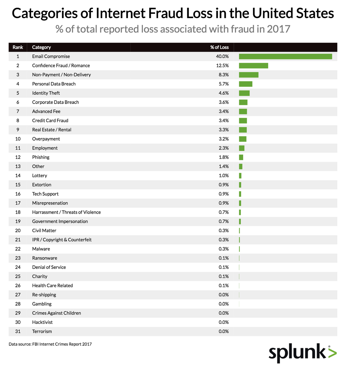
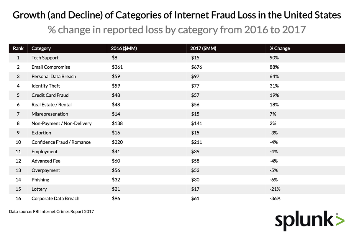
This Data shows the Internet Fraud Categories with larger presence in the United States during the year 2017 according to the FBI. This is representative of the monetary risk that each category presents when there is a successful attempt to commit fraud. Forty percent of Online Fraud losses come from “Email Compromise”. This attack category targets businesses that rely heavily in daily wire transfers. This involves sending fake invoices to companies posing as suppliers of goods or services with the intention of getting erroneously paid. The following table shows de Growth and Decline of Internet Fraud Loss in the United States.
Both are effective communication representations; however, I can see that the second table could have been represented in a more graphic style. (i.e. Line chart showing the growth or decline trend over time). This is a very helpful observation since it can be used to drive Cyber Security projects to prevent future attacks and build compliance regulations and best practices to educate employees to reduce vulnerability.
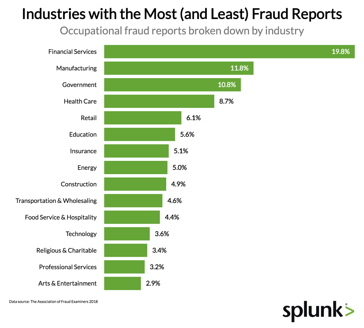
The visualization above addresses the percentage of successful fraud attempts across industries. This representation could be useful for aspiring Cyber Security students to understand the need of professionals in the Financial, Manufacturing and Government Industries. This may also help insurance companies forecast the level of risk each company presents and drive their policy costs.
Gender Pay Gap
This is a very interesting graph. The article says “Black and Hispanic women are most affected by the wage gap, especially when compared to white men, who make up the largest demographic segment of the workforce.” And later, they present another graph that shows the following data:
The interpretation they provide is: ““Data suggest that women suffer a ‘mommy penalty’ after they have children,” This is a very delicate and important subject that requires to consider more than just a few factors. This might be an example of using visualizations to persuade the audience to lean towards the presenter’s point of view. This seems to be an oversimplified representation of a multi-dimensional phenomenon.