Graphics in ggplot2
Ekaphan Kraichak
2/25/2019
1. ggplot2 graphics
ggplot2 is a package that allows us to plot beautiful graphs very quickly and intuitively. It is a part of the tidyverse package, which contains a number of useful tools like dplyr that we have used in the data manipulation class. Today we will learn about how to use graph to understand our data better.
We will continue to use our australian_soybean.csv file here for demonstration. Here is details about the data again.
australian_soybean.csv is a data frame with 464 observations on the following 10 variables.
env: environment, 8 levels, first character of location and last two characters of year
loc: location
year: year (1970, 1971)
gen: genotype of soybeans, 1-58
yield: yield, metric tons / hectare
height: height (meters)
lodging: lodging
size: seed size, (millimeters)
protein: protein (percentage)
oil: oil (percentage)
So let’s first import data.
library(tidyverse)## ── Attaching packages ──────────────── tidyverse 1.2.1 ──## ✔ ggplot2 3.1.0 ✔ purrr 0.3.0
## ✔ tibble 2.0.1 ✔ dplyr 0.7.8
## ✔ tidyr 0.8.2 ✔ stringr 1.3.1
## ✔ readr 1.3.1 ✔ forcats 0.3.0## Warning: package 'tibble' was built under R version 3.5.2## Warning: package 'purrr' was built under R version 3.5.2## ── Conflicts ─────────────────── tidyverse_conflicts() ──
## ✖ dplyr::filter() masks stats::filter()
## ✖ dplyr::lag() masks stats::lag()aus.soy <- read_csv("australian_soybean.csv")## Parsed with column specification:
## cols(
## env = col_character(),
## loc = col_character(),
## year = col_double(),
## gen = col_character(),
## yield = col_double(),
## height = col_double(),
## lodging = col_double(),
## size = col_double(),
## protein = col_double(),
## oil = col_double()
## )Exercise 1
As a review, write a code to show the first 20 lines of this data.
2. Your first ggplot graph.
Let’s do the first simple scattered plot.
ggplot(aus.soy) +
geom_point(aes(x = height, y = lodging))
The ggplot function requires at least two parts:
- The main part:
ggplot()tells the program what data to draw. This only creates an empty canvas for your data. - The layer:
geom_point()tells the program what type of geometry to draw to represent the data. In the layer, you must mapxandyto inside theaes()or aesthetic for the plot. In the case ofgeom_point, the function will tell the program to draw points on the empty canvas.
These two parts are connected with the + sign in between.
Exercise 2
In the code chunk, create a scattered plot of
proteinandoil. Do you see any relationship?In the code chunk, create a scattered plot of
proteinandloc. Does the graph tells you anything? Why does it look the way it looks?
3. Aesthetic mapping
We can add additional variables from the data in the aesthetic mapping to provide more information. For example, we can see if the relationships between height and lodging differ between the four different locations. You can show this in different colors by specifying the color in your aesthetic mapping.
ggplot(aus.soy) +
geom_point(aes(x = height, y = lodging, color = loc))
The command above gives each location a different color. You can also assign the loc to different shape as well.
ggplot(aus.soy) +
geom_point(aes(x = height, y = lodging, shape = loc))
We can also have each shape with a different color too by specifying both color and shape to location.
ggplot(aus.soy) +
geom_point(aes(x = height, y = lodging, shape = loc, color = loc))
Additional aesthetic mappings include alpha and size. alpha gives different levels of transparency, and size gives different size of the point. Let’s see what they do here:
ggplot(aus.soy) +
geom_point(aes(x = height, y = lodging, alpha = loc))## Warning: Using alpha for a discrete variable is not advised.
ggplot(aus.soy) +
geom_point(aes(x = height, y = lodging, size = loc))## Warning: Using size for a discrete variable is not advised.
For both of these commands, it will show a warning message that Using alpha/size for a discrete variable is not advised, because loc is a discrete variable, but alpha and size normally takes a continuous variable. For example, let’s plot height vs. lodging with different size of yield.
ggplot(aus.soy) +
geom_point(aes(x = height, y = lodging, alpha = yield))
So far, the aesthetic mapping inside the aes will draw the information from the dataset. If you want to manually specify the aesthetic, you can put it outside the parenthesis like this.
ggplot(aus.soy) +
geom_point(aes(x = height, y = lodging), color = "blue")
Here I tell the program to plot all the points blue, so I put the color = "blue" outside the aes(). We can do additional aesthetics outside the parentheses. Let’s try to plot height, lodging, and yield again, but this time with some help from alpha aesthetic.
ggplot(aus.soy) +
geom_point(aes(x = height, y = lodging, size = yield), alpha = 0.5)
The values for each aesthetic are different. You need to specify them correctly as follow:
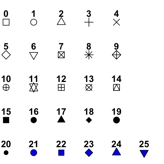
colorneeds a color name or HTML color code (#FF00FF) in " ".sizeneeds a number (unit in mm).alphatakes a number of 0 to 1. 0 is completely transparent. 1 is complete opaque.shapealso needs a number, but different numbers represent different shape. See the details here: http://www.sthda.com/sthda/RDoc/figure/graphs/r-plot-pch-symbols-points-in-r.png. For the numbers 21-25, you can specify the color of border (throughcolor) and the color of the inside (throughfill) like this.
ggplot(aus.soy) +
geom_point(aes(x = height, y = lodging), shape = 21, color = "darkgreen", fill = "green")
Exercise 3
- The code below tries to make the points green, but it doesn’t work. Fix it, so that the points are actually green.
ggplot(aus.soy) +
geom_point(aes(x = height, y = lodging, color = "green"))
- Write a code that produce a scatter plot between
proteinandoiland mapsizeto color. What does the graph looks like? What happens when you map a continous variable to color?
4.Facet
As you see from above, the plot with location as colors is not very helpful. We can split the plot, using the facet_wrap with a discrete variable.
ggplot(aus.soy) +
geom_point(aes(x = height, y = lodging)) +
facet_wrap(~ loc)
You can also specify the number of rows for the facet with nrow.
ggplot(aus.soy) +
geom_point(aes(x = height, y = lodging)) +
facet_wrap(~ loc, nrow = 4)
Another function facet_grid can take two discrete variables at the same time to create a two-way panel. For example, we want to plot these relationship separately for each location and each year.
ggplot(aus.soy) +
geom_point(aes(x = height, y = lodging)) +
facet_grid(year ~ loc)
Any of the previous aesthetics (e.g. color, shape, alpha) can be used with facet, like this.
ggplot(aus.soy) +
geom_point(aes(x = height, y = lodging, color = loc, shape = factor(year))) +
facet_grid(year ~ loc)
Note that we need to add factor() around year, because year is numeric, but shape need a discrete number to identify what to plot.
Exercise 4
Create a plot between
proteinandoilwith different facets for each year.Create a plot between Create a plot between
proteinandoilwith different facets for each year and location, using thefacet_wrapfunction instead offacet_grid. How are they different?
5. Geometric Object
The function begins with geom_ refers to different geometry that will be plotted on your empty canvas. Let’s try to plot these three different types of geom with the same data.
geom_point for point
ggplot(aus.soy) +
geom_point(aes(x = height, y = lodging))
geom_line for line graph
ggplot(aus.soy) +
geom_line(aes(x = height, y = lodging))
geom_smooth for trend line
ggplot(aus.soy) +
geom_smooth(aes(x = height, y = lodging))## `geom_smooth()` using method = 'loess' and formula 'y ~ x'
Every geom function takes their own aesthetic mapping, but each type of geom takes slightly different aesthetics. For example, geom_line and geom_smooth cannot take the shape aesthetic, but instead it can take linetype like this:
ggplot(aus.soy) +
geom_smooth(aes(x = height, y = lodging, linetype = loc))## `geom_smooth()` using method = 'loess' and formula 'y ~ x'
ggplot(aus.soy) +
geom_smooth(aes(x = height, y = lodging, linetype = loc, color = loc))## `geom_smooth()` using method = 'loess' and formula 'y ~ x'
There are over 30 types of geom functions in ggplot2 https://ggplot2.tidyverse.org/reference/index.html. We will learn about a few of them here. If you are interested in anything in particular, look up on the web, or feel free to ask me.
If you want to have multiple geoms on the same graph, you can simply “add” additional layer by using the “+” sign.
ggplot(aus.soy) +
geom_point(aes(x = height, y = lodging)) +
geom_smooth(aes(x = height, y = lodging))## `geom_smooth()` using method = 'loess' and formula 'y ~ x'
You can see that there are a lot of repetition of code. We can simplify this by providing the aesthetic only in the ggplot that will be used for both geoms. The code below will provide the same graph as above.
ggplot(aus.soy, aes(x = height, y = lodging)) +
geom_point() +
geom_smooth()## `geom_smooth()` using method = 'loess' and formula 'y ~ x'
If you want to control only one geom and keep everything else the same, you can still add aesthetic in the individual geom.
ggplot(aus.soy, aes(x = height, y = lodging)) +
geom_point(color = "red") +
geom_smooth(method = "lm", se = FALSE)
Ask yourself: what do se = FALSE and method = lm do here?
Another example of individual control of aesthetic.
ggplot(aus.soy, aes(x = height, y = lodging)) +
geom_point(aes(color = loc)) +
geom_smooth(linetype = 2)## `geom_smooth()` using method = 'loess' and formula 'y ~ x'
Notice that the trendline is still for the whole group, while the colors for the point are separated by groups.
Exercise 5
Create a plot between
proteinandoilwith the linear smooth on the same graph.Create a plot between
proteinandoilwith the linear smooth on the same graph and facet the graph by year.
6. Working with discrete data
Normally when we work with discrete data, we want to create a bargraph. In ggplot, we can the geom_bar function to draw a bar plot.
ggplot(aus.soy) +
geom_bar(aes(x = loc, y = yield))But the function above DOES NOT work, because the geom_bar can only used for the count data (how many cases are there). The correct usage to show average of each group is geom_boxplot().
ggplot(aus.soy) +
geom_boxplot(aes(x = loc, y = yield))
This boxplot is better at displaying the spread of data and you can decide better wheter the groups are actually different. Another option is geom_violin.
ggplot(aus.soy) +
geom_violin(aes(x = loc, y = yield))
The width of the violin is corresponding with how many data points are around there. We can overlay the data point on the violin to observe this.
ggplot(aus.soy, aes(x = loc, y = yield)) +
geom_violin() +
geom_point(alpha = 0.3)
Ask yourself (or try): Would it make a different if I put geom_point() before geom_violin()? Why?
A cleaner way to show this data is to plot stat_summary to show min, max, and mean, using the following code.
ggplot(aus.soy) +
stat_summary(aes(x = loc, y = yield),
fun.ymin = min,
fun.ymax = max,
fun.y = mean)
Ask yourself: How is this different from boxplot.
If you still want that ugly bargraph you’re used to, you can still do it, but you will need a data manipulation first (recall last time).
new.aus <- aus.soy %>%
group_by(loc) %>%
summarize(yield.mean = mean(yield))Then, you can use this to plot the graph.
ggplot(new.aus) +
geom_col(aes(x = loc, y = yield.mean))
You can do it all in one step by the power of pipes %>% like this.
aus.soy %>%
group_by(loc) %>%
summarize(yield.mean = mean(yield)) %>%
ggplot() +
geom_col(aes(x = loc, y = yield.mean, fill = loc))
If you do it this way, you don’t have to add anything in ggplot(),because the data is passed down to the function by %>%.
Exercise 6
Create a boxplot comparing
oilbetween the two years of the experiment.Decide what would be the best way to show the differences between seed size among the location. Use the same color for all four locations.
7. Adjust positions and coordinates
7.1 Side bars
Let’s try to summarize the yield by year and location at the same time. So first we need to summarize the data.
new.aus2 <- aus.soy %>%
group_by(year, loc) %>%
summarize(yield.mean = mean(yield))
new.aus2## # A tibble: 8 x 3
## # Groups: year [?]
## year loc yield.mean
## <dbl> <chr> <dbl>
## 1 1970 Brookstead 1.56
## 2 1970 Lawes 2.24
## 3 1970 Nambour 1.89
## 4 1970 RedlandBay 1.64
## 5 1971 Brookstead 2.46
## 6 1971 Lawes 2.51
## 7 1971 Nambour 2.30
## 8 1971 RedlandBay 1.79Then we can plot the bargraph.
ggplot(new.aus2) +
geom_col(aes(x = loc, y = yield.mean, fill = year))
Hmmm… that’s not what we want we want the two bars next to each other, and the year to be discrete. So here is how we fix it.
ggplot(new.aus2) +
geom_col(aes(x = loc, y = yield.mean, fill = factor(year)), position = "dodge")
Ask yourself: What did the code just do?
Alternatively, you don’t have to worry about all these, if you just use boxplot on the raw data, which will automatically recognize the grouping for you.
ggplot(aus.soy) +
geom_boxplot(aes(x = loc, y = yield, fill = factor(year)))
7.2 Reordering and Flipping co-ordinate.
Let’s look at another example, by trying to plot yield by gen (genotypes).
ggplot(aus.soy) +
geom_boxplot(aes(x = gen, y = yield))
This looks horrible and very difficult to read. We can flip the x-y by just adding coord_flip.
ggplot(aus.soy) +
geom_boxplot(aes(x = gen, y = yield)) +
coord_flip()
Ask/Try yourself what happens if you just simply switch between y and x within the aes()?
This is slightly easier to read, but still not very informative. We can reorder to boxplot, based on their median value.
ggplot(aus.soy) +
geom_boxplot(aes(x = reorder(gen, yield, FUN = median), y = yield)) +
coord_flip()
The function reorder needs the variable that you want to reorder, the variable to calculate the summary, and the function to use.
Now you can see the trend of how has the highest yield.
Exercise 7
Write a code to create a best graph to compare the oil content of soybeans between two years and four locations.
Create a bar graph comparing the means of yield between two years of the genotype G42, G49, G30. (Hint: do the filter and summary of data by
yearandgenfirst.)
[Extra] 8. Fine-tuning your graphs
This section is for those of you who really want to make your graph pretty. If you don’t have time in the class, you can skip this for now. Feel free to change the code below to see what happens.
8.1 Add axis names, graph title, and legend title with labs
ggplot(aus.soy) +
geom_boxplot(aes(x = loc, y = yield, fill = factor(year))) +
labs(title = "Yields of Soybeans in Australia",
x = "location",
y = "Yield (ton/ha)",
fill = "Year")
8.2 move or remove the legend
ggplot(aus.soy) +
geom_boxplot(aes(x = loc, y = yield, fill = factor(year))) +
theme(legend.position = "none")
ggplot(aus.soy) +
geom_boxplot(aes(x = loc, y = yield, fill = factor(year))) +
theme(legend.position = "bottom")
ggplot(aus.soy) +
geom_boxplot(aes(x = loc, y = yield, fill = factor(year))) +
theme(legend.position = "left")
8.3 Change the color
You can do this manually, or using the preset colors. Note that the function will depends on whether your color is defined by fill or color in your main geom.
1) Manual input
ggplot(aus.soy) +
geom_boxplot(aes(x = loc, y = yield, fill = factor(year))) +
scale_fill_manual(values = c("blue","orange"))
ggplot(aus.soy) +
geom_point(aes(x = size, y = oil, color = factor(year))) +
scale_color_manual(values = c("blue","orange"))
2) Preset colors
The nice preset colors are in the RColorBrewer package, which is built-in in the ggplot2. To see the color, please visit https://www.r-graph-gallery.com/wp-content/uploads/2015/10/38_Show_RColorBrewers_palettes.png
ggplot(aus.soy) +
geom_boxplot(aes(x = loc, y = yield, fill = factor(year))) +
scale_fill_brewer(palette = "Pastel1")
ggplot(aus.soy) +
geom_point(aes(x = size, y = oil, color = factor(year))) +
scale_color_brewer(palette = "Dark2")
8.4 Scale
You can manually change the scale by the groups of function scale_ followed by x or y and continuous or log10 if you want to change it into a log.
ggplot(aus.soy) +
geom_point(aes(x = size, y = oil, color = factor(year))) +
scale_y_continuous(breaks = seq(15,25, by = 5)) +
scale_x_continuous(breaks = seq(4,26, by = 2))
8.5 Text size and theme
You can manually specify the text size of each element of the graph.
ggplot(aus.soy) +
geom_point(aes(x = size, y = oil, color = factor(year))) +
theme(axis.text = element_text(size = 20),
axis.title = element_text(size = 20))
Or you can just use the theme and change the base_size (for font size) and base_family (for the font) of the graph.
ggplot(aus.soy) +
geom_point(aes(x = size, y = oil, color = factor(year))) +
theme_classic(base_size = 16, base_family = "serif")
In ggplot2, you have 8 premade themes (see more here https://ggplot2.tidyverse.org/reference/ggtheme.html)