STAT 451, Day 4
Let's do this!
![]()
Video
What to Look For, Patterns
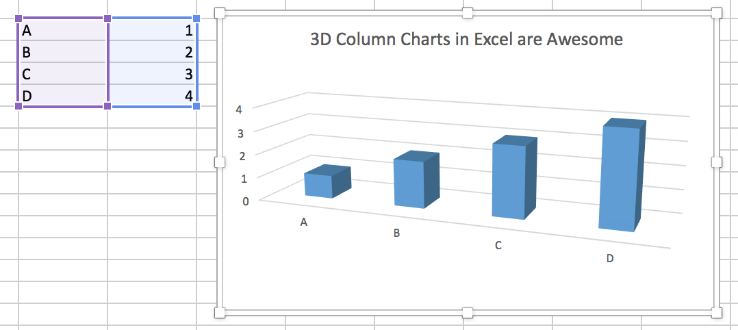
Example
Consider the bike data which represents four years of quar- terly mountain bike sales. Fit a time series regression model using seasonal dummy variables. Estimate the next year of sales by quarter.
quarter=rep(1:4,4)
bike = ts(c(10,31,43,16,11,33,45,17,13,34,48,19,15,37,51,21), frequency=4,
start=c(2007,1))
plot.ts(bike)

Better View
What to Look For, Relationships
- Oftentimes, this means finding and exploring relationships betweeen multiple variables.
loadstuff <-c("ggplot2", "devtools", "dplyr", "stringr", "maps", "mapdata")
lapply(loadstuff, require, character.only=TRUE)
ggplot(mtcars, aes(x=wt, y=mpg)) + geom_point(shape=18, color='blue', size=5)

Better View
Multiple Variables
# Change point shapes and colors
require(ggplot2)
ggplot(mtcars, aes(x=wt, y=mpg, shape=factor(cyl), color=factor(cyl))) +
  geom_point(size=5)

Better View
Design
Example
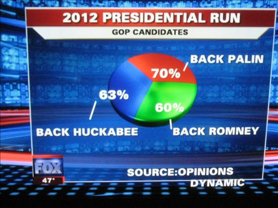
 What's wrong with this? Let's reproduce it.
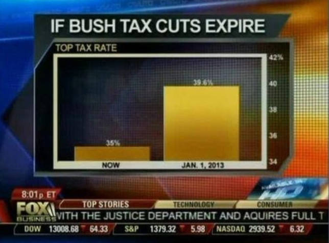
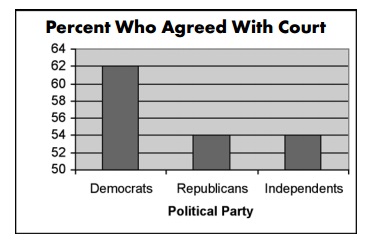
Scale
 Changing the aspect ratio and/or scale can distort your message.
Visual Cues
More Examples of Bad Visualizations
 Baseline?
More...
More...
 Ummm…
Ummm…
More...
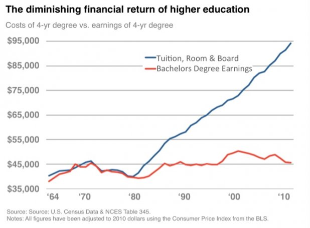 A key fact that wasn't on the chart: the cost of not going to college has diminished even more. Than means, your prospects as a high school graduate are a lot worse than your prospects as a college graduate.
More...
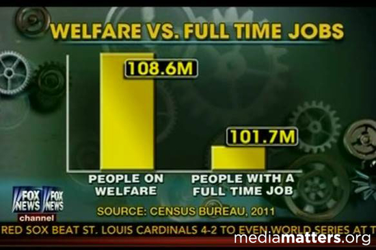 If you live with your Mom, Dad, brother Joe and cousin Sam, and Sam was (briefly) on some kind of welfare program, that counted against you and everyone in your household.
More...
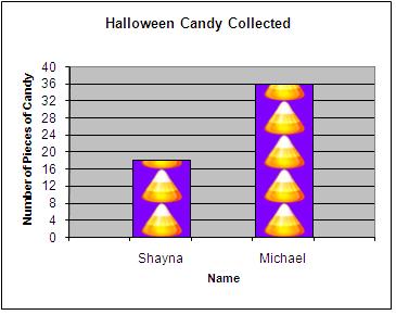
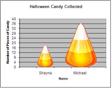
A pictograph is basically a bar graph which is made up of a picture related to the topic of the graph. When the picture grows in two dimensions, width as well as height, it misleads the viewer by presenting a two-fold growth in the area or size of the picture