Graphics: Customization
Prologue
- In our previous session session, we looked at creating simple graphs with no aesthetics or additional annotations whatsoever.
- Sometimes we want to tweak the non-data part of our graph, or should I say “the little things”.
- Nevertheless, it is always the little things that make the biggest difference. Therefore, I stongly believe in also giving great attention to small details.
- Customazing one’s graph is often for the intention of presentation or publication. Oftertimes, we would plot quick and basic graphs as previously for exploration or exploratory analysis.
- We will be using the ggplot2 for plotting purposes here.
- We will be using the iris dataset availabe in base R here.
library(ggplot2)

data(iris)
class(iris); dim(iris); str(iris)
## [1] "data.frame"## [1] 150 5## 'data.frame': 150 obs. of 5 variables:
## $ Sepal.Length: num 5.1 4.9 4.7 4.6 5 5.4 4.6 5 4.4 4.9 ...
## $ Sepal.Width : num 3.5 3 3.2 3.1 3.6 3.9 3.4 3.4 2.9 3.1 ...
## $ Petal.Length: num 1.4 1.4 1.3 1.5 1.4 1.7 1.4 1.5 1.4 1.5 ...
## $ Petal.Width : num 0.2 0.2 0.2 0.2 0.2 0.4 0.3 0.2 0.2 0.1 ...
## $ Species : Factor w/ 3 levels "setosa","versicolor",..: 1 1 1 1 1 1 1 1 1 1 ...Title and axis labels
- Pass the relevant arguments into the labs() function.
- The title argument specifies your main title.
- The subtitle argument specifies the smaller-front title just below your main title.
- The x argument specifies your x-axis label.
- The y argument specifies your y-axis label.
# Bare
ggplot(data=iris) +
  geom_point(mapping=aes(x=Sepal.Length, y=Petal.Length))
# Ornamented
ggplot(data=iris) +
  geom_point(mapping=aes(x=Sepal.Length, y=Petal.Length)) +
  labs(title="Iris Dataset", subtitle="Correlation between septal length and petal length", x="Sepal length", y="Petal Length")
- The main and subtitle are left-aligned by default.
- Pass the hjust argument to the element_text() function to configure the alignment.
- The plot.title and plot.subtitle objects refer to the main and subtitle, respectively.
ggplot(data=iris) +
  geom_point(mapping=aes(x=Sepal.Length, y=Petal.Length)) +
  labs(title="Iris Dataset", subtitle="Correlation between septal length and petal length", x="Sepal length", y="Petal Length") +
  theme(plot.title=element_text(hjust = 0.5), plot.subtitle=element_text(hjust = 0.5))
Tick labels
- This would be relevant for categorial variables mapped to the x-axis.
- You may prefer labels other than the default ones in your data frame.
- Pass the labels argument to the scale_x_discrete() function for this purpose.
# Bare
ggplot(data=iris) +
  geom_boxplot(mapping=aes(x=Species, y=Sepal.Length))
# Ornamented
ggplot(data=iris) +
  geom_boxplot(mapping=aes(x=Species, y=Sepal.Length)) +
  scale_x_discrete(labels=c("Setosa species", "Versicolor species", "Virginica species"))
Tick values and intervals
- Or more appropriately called axis scale and intervals.
- This would be relevant for continuous variables mapped to either the x- or y-axis.
- Pass the limits argument to the scale_x_continuous() and scale_y_continuous() functions for this purpose.
- The first variable specifies the lower limit. The second variable specifies the upper limit.
ggplot(data=iris) +
  geom_point(mapping=aes(x=Sepal.Length, y=Petal.Length)) +
  scale_x_continuous(limits=c(4, 9)) +
  scale_y_continuous(limits=c(1, 8))
- You may want to also specify the intervals in addition to specifying the lower and upper limits of the scale.
- Pass the breaks argument to the scale_x_continuous() and scale_y_continuous() functions for this purpose.
- The first variable specifies the lower limit. The second variable specifies the upper limit. The third variable specifies the interval.
ggplot(data=iris) +
  geom_point(mapping=aes(x=Sepal.Length, y=Petal.Length)) +
  scale_x_continuous(breaks=seq(4, 9, by=0.5)) +
  scale_y_continuous(breaks=seq(1, 8, by=0.5))
Front size
- Pass the size argument to the element_text() function to configure the alignment.
- The axis.text and axis.title objects refer to the tick labels and axis labels, respectively.
# Smaller front
ggplot(data=iris) +
  geom_point(mapping=aes(x=Sepal.Length, y=Petal.Length))  +
  labs(title="Iris Dataset", subtitle="Correlation between septal length and petal length", x="Sepal length", y="Petal Length") +
  theme(axis.text=element_text(size=1), axis.title=element_text(size=2), plot.subtitle=element_text(hjust=0.5, size=3), plot.title=element_text(hjust=0.5, size=4))
# Larger front
ggplot(data=iris) +
  geom_point(mapping=aes(x=Sepal.Length, y=Petal.Length))  +
  labs(title="Iris Dataset", subtitle="Correlation between septal length and petal length", x="Sepal length", y="Petal Length") +
  theme(axis.text=element_text(size=11), axis.title=element_text(size=12), plot.subtitle=element_text(hjust=0.5, size=13), plot.title=element_text(hjust=0.5, size=14))
- Aside from size, there are other parameters for which you may configure. The complete list as follows.
#element_text(family = NULL, face = NULL, colour = NULL, size = NULL, hjust = NULL, vjust = NULL, angle = NULL, lineheight = NULL, color = NULL)Color fills
- We will been looking into using just 1 color here.
- We will look into using >1 colours for later session when we look into adding new variables/dimensions/levels.
- Pass the color argument to the geom_*() function for dots.
- Pass the fill argument geom_*() function for boxes.
ggplot(data=iris) +
  geom_boxplot(mapping=aes(x=Species, y=Sepal.Length), fill="blue")
ggplot(data=iris) +
  geom_point(mapping=aes(x=Sepal.Length, y=Petal.Length), color="blue")
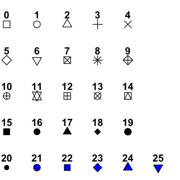
Shapes
- The default shape for dot points, such as those in the scatterplots, are round opaques ones.
- The full list of shapes can be found here.
- Pass the shape argument geom_*() function to specify your preferred shape.
ggplot(data=iris) +
  geom_point(mapping=aes(x=Sepal.Length, y=Petal.Length), shape=23)
# Combine color with shape
ggplot(data=iris) +
  geom_point(mapping=aes(x=Sepal.Length, y=Petal.Length), shape=23, fill="blue")
- Note that, the fill argument can be used only for the point shapes 21 to 25.
Borders
- You may want your bars and your points in your boxplots or scatterplots, respectively to have colored borders.
- For boxplots (and also bar charts), you would need to pass the fill and color arguments into the geom_*() function where fill and color specify the fill and border, respectively.
- Similarly for scatterplots, you would need to pass the fill and color arguments into the geom_*() function where fill and color specify the fill and border, respectively.
ggplot(data=iris) +
  geom_boxplot(mapping=aes(x=Species, y=Sepal.Length), fill="blue", color="red")
ggplot(data=iris) +
  geom_point(mapping=aes(x=Sepal.Length, y=Petal.Length), shape=23, fill="blue", color="red")
Background
- The default background color is grey with white grids.
- Use the theme_*() functions to specify which background you prefer.
- There are numerous theme_*() functions. Here, we will look into just a few..
- The theme_bw() yields light grids against an empty background
- The theme_classic() darkens the x- and y-axes but removes the grids.
- The theme_linedraw() hightlights the edge of the graph and retains the grids.
ggplot(data=iris) +
  geom_point(mapping=aes(x=Sepal.Length, y=Petal.Length)) +
  theme_bw()
ggplot(data=iris) +
  geom_point(mapping=aes(x=Sepal.Length, y=Petal.Length)) +
  theme_classic()
ggplot(data=iris) +
  geom_point(mapping=aes(x=Sepal.Length, y=Petal.Length)) +
  theme_linedraw()
Flipped graphs
- Useful for some bar charts and boxplots especially when the variables are ordered in some way, i.e. in ascending or descending order.
- Switches the position of x- and y-axes.
- The coord_flip() is useful for this purpose.
- Example of a flipped bar chart as follows.
# Calculate mean of sepal length for each species
collapsed <- aggregate(Sepal.Length ~ Species, data=iris, mean)

# Not flipped
ggplot(data=iris) +
  geom_bar(mapping=aes(x=Species, y=Sepal.Length), stat="identity")
# Flipped
ggplot(data=iris) +
  geom_bar(mapping=aes(x=Species, y=Sepal.Length), stat="identity") +
  coord_flip()
- Notice that the tick labels are automatically rotated to a horizonal position.
- Example of a flipped boxplot as follows.
ggplot(data=iris) +
  geom_boxplot(mapping=aes(x=Species, y=Sepal.Length)) +
  coord_flip()
Summary
- Remember that you may combine customization for different features into a single function, e.g. you may customize the front, alignment, color etc. all in one function call.
- These are just some of the features for customization that I can think right off the top of my head.
- As you plot your own graphs, you may realize additional features that you may wish to customize.