MATH2270 Assignment 1
Deconstruct and Reconstruct
Student Details
- Dean Iovenitti (s3486013)
Part I - Data Visualisation

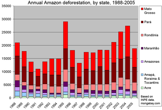
img src=“http://photos.mongabay.com/07/amazon_defor_state-568.jpg” The above gives image only.
Taken from: “http://rainforests.mongabay.com/defor_index.htm” This is the link for the website for the image. Image is under Annual Amazon deforestation by state 1988-2005.
Data src = “http://www.obt.inpe.br/prodes/prodes_1988_2011.htm”
Note that the data are updated on an annual basis.
Part II - Deconstruct
The original design data visualisation message was to convey that there was an increase in the annual deforestation of the Amazon rainforest, in Brazil, over the time period (1988-2005). Two significant problems: 1. The stacked bar chart makes it very difficult to compare categories from different years as there is no common baseline. A line plot is a better option and for 9 categories (i.e. Brazilian states), it is best to highlight the most important categories and use transparency to lessen the categories that are less significant and not revealing much information to the viewer. 2. No labels on either the x- or y- axis. There is no way for a viewer to know that the y-axis represents the amount of deforestation in km2/year without looking at the raw data. Also, the title could have been more informative. The Amazon rainforest covers a large amount of area (with parts of it in multiple countries) so it is unclear where the deforestation is occurring.
Part III - Reconstruct
amazonian_v3 <- read.csv("F:/RMIT/Analytics/Year 1/Semester 2/Data visualisation/Assignments/Assignment 1/Amazon-data-v3.csv",header = TRUE)
Brazilian_states_less <- c("Acre","Amazonas","Maranhao","Mato.Grosso","Para","Rondonia","Roraima","Tocantins")
am_version3 <- melt(amazonian_v3, id.vars = "Year", measure.vars = Brazilian_states_less ,value.name = "squarekmperyear", variable.name = "BrazilianStates") # Some fancy stuff here to get it into a nice format.
bigplot <- ggplot(data=am_version3,aes(x=Year,y=squarekmperyear,group=BrazilianStates,colour=BrazilianStates))
bigplot + geom_line() + labs(X="Year", y="Deforestation rate in square kilometres per year") +
  scale_colour_discrete(breaks=c("Mato.Grosso", "Para", "Rondonia", "Maranhao", "Amazonas", "Acre", "Tocantins", "Roraima")) +
  theme_bw() +
  ggtitle("Annual deforestation of the Amazon rainforest in each Brazilian state from 1988-2005") +
  theme(legend.title = element_text(face = "bold"))
The reconstructed visualisation is a line plot. For this type of plot, it is easier to compare the Brazilian states (and identify any trends in the data) against each other from the same year or from different years. I also removed the Amapa state from the data as there was negligible deforestation in comparison to the other states (in particular Mato Grosso and Para, the two Brazilian states with the highest deforestation rates).
The main message of the reconstructed visualisation is to show there has been a general increase in deforestation for the majority of states in Brazil which is most pronounced for the Mato Grosso and Para states.