install.packages(c('ggplot2','data.table')
library(ggplot2) # plotting
library(data.table) #fread
install.packages('tidyverse')
library(tidyverse) #includes ggplot2, dplyr, tidy, + more
![]()
5/12/2017
install.packages(c('ggplot2','data.table')
library(ggplot2) # plotting
library(data.table) #fread
install.packages('tidyverse')
library(tidyverse) #includes ggplot2, dplyr, tidy, + more
![]()

Geometric objects (geoms)
Reference: http://ggplot2.tidyverse.org/reference/
ggplot()+geom_point(data, aes(x, y))
Burritos in southern California https://srcole.github.io/100burritos/

url<-'https://raw.githubusercontent.com/collnell/burritos/master/sd_burritos.csv'
ritos <- fread(url)
ggplot()

ggplot()+
  geom_histogram(data=ritos, aes(x=Cost))

Data & aes() mapping can be applied to each geom:
ggplot()+
  geom_histogram(data=ritos, aes(x=Cost, fill=Chips), binwidth = .25)
 Or to all layers:
ggplot(data=ritos, aes(x=Cost, fill=Chips))+
  geom_histogram()
Or between both:
ggplot(data=ritos, aes(x=Cost))+
  geom_histogram(aes(fill=Chips))

Multiple geoms can be plotted together using '+'
Use geom_boxplot to examine burrito cost by recommendation (Rec):
ggplot(data=ritos, aes(x=Rec, y=Cost))+
  geom_boxplot()

Add layer showing data points with boxplot:
ggplot(data=ritos, aes(x=Rec, y=Cost))+
  geom_boxplot()+
  geom_point()

Color, fill, shape, size, and alpha can be mapped to variables inside 'aes()'.
Create a scatterplot with Volume on the x-axis and Cost on y-axis
Start with base plot:
k<-ggplot(data=ritos, aes(x=Volume, y=Cost))
k

Add points for scatterplot:
k+geom_point()

Map levels of a variable using shapes
ritos$Rec<-as.factor(ritos$Rec)
levels(ritos$Rec) #aes maps to levels of a variable
[1] "no" "yes"
k+geom_point(aes(shape=Rec))

Map geom color to show whether or not the burrito had guacaomle (Guac)
k+geom_point(aes(shape=Rec, color=Guac))

Size
k+geom_point(aes(shape=Rec, size=Taste))
 ##
##
Alpha = transparency
k+geom_point(aes(shape=Rec, alpha=Taste))

You can also set aesthetic properties manually by assigning them outside of 'aes()'
k + geom_point(color='blue')

k + geom_point(aes(color=Taste), shape=21, alpha=.75, size=3)

#alpha ranges from 0 (transparent) to 1 (opaque)
# size is in mm
Fill & color assign color to different elements of the geom.
k + geom_point(aes(color=Taste), alpha=.5, size=3)

#alpha ranges from 0 (transparent) to 1 (opaque)
# size is in mm
Shapes: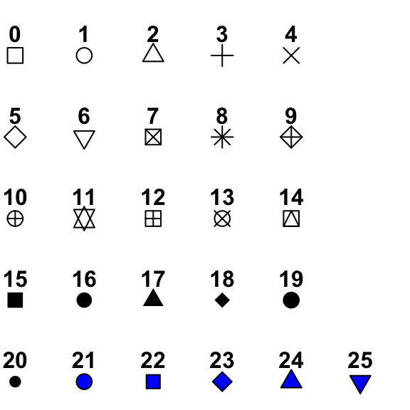
k + geom_point(aes(fill=Taste), color='red',shape=21, alpha=.5, size=3)
 ##
##
k + geom_point(aes(fill=Taste), color='red',shape=21, alpha=.5, size=3, stroke = 3)

Add trend line:
k+geom_point()+
  geom_smooth()
 ## geom_smooth
method - lm, glm, loess
?methods

k+geom_point()+
  geom_smooth()
k+geom_point()+
  geom_smooth(method='lm', se=F)

Control the mapping of data and aesthetics
scale_x_reverse()
scale_y_reverse()
scale_x_log10()
ggplot(ritos, aes(log10(Volume), Cost))+
  geom_point()+
  geom_smooth(method='lm', se=F)

Transform the scale instead of the data.
How is this different than before?
ggplot(ritos, aes(Volume, Cost))+
  geom_point()+
  geom_smooth(method='lm', se=F)+
  scale_x_log10()
Wes Anderson - https://github.com/karthik/wesanderson
virdis - https://cran.r-project.org/web/packages/viridis/vignettes/intro-to-viridis.html
RColorBrewer - http://colorbrewer2.org/#type=sequential&scheme=BuGn&n=3
Color cheatsheet - https://www.nceas.ucsb.edu/~frazier/RSpatialGuides/colorPaletteCheatsheet.pdf
#install.packages('RColorBrewer')
library(RColorBrewer)

display.brewer.all()

ggplot(ritos, aes(Volume, Cost))+
  geom_point(aes(color = Taste), size=2)+
  geom_smooth(method='lm', se=F, color='black', lty='dashed')+
  scale_x_log10()+
  scale_color_gradient(low='red', high='blue')

scale_color_gradient - sequential color scale
scale_color_gradient2 - diverging color scale
scale_fill_gradient
scale_shape_discrete
scale_shape_manual - supply own values
scale_ + color/fill/size/shape/linetype/alpha_ + gradient/discrete/manual
ggplot(ritos, aes(Volume, Cost))+
  geom_point(aes(shape = Rec), size=2)+
  geom_smooth(method='lm', se=F, color='black', lty='dashed')+
  scale_x_log10()+
  scale_shape_manual(values = c(3,6), labels = c('Throw it away','Eat it again'))

Occur after statistics, affect geom appearance
To make a pie chart:
?coord_polar
d<-last_plot()
d+coord_flip()

d+labs(title='Title goes here', y='Volume',
       x='Burrito prices', caption='caption appears here ')
 ## Multiple plots
install.packages('cowplot')
library(cowplot)

?plot_grid
g<-ggplot(ritos, aes(Volume, Cost))+
  geom_point(aes(color = Taste), size=2)+
  geom_smooth(method='lm', se=F, color='black', lty='dashed')+
  scale_color_gradient(low='red', high='blue')

g_bw<-g+theme_bw()

g_min<-g+theme_minimal()

plot_grid(g_bw, g_min, nrow=1, ncol=2, labels=c('theme_bw','theme_minimal'))

library(ggthemes)

g_538<-g+theme_fivethirtyeight()

g_econ<-g+theme_economist()

plot_grid(g_538, g_econ, nrow=1, ncol=2, labels=c('538','The Economist'))

https://cran.r-project.org/web/packages/ggthemes/vignettes/ggthemes.html
Or independent elements can be set manually
g_bw + theme(legend.position = 'none', plot.background = element_rect(fill='green'),axis.text.y=element_text(angle=75, size=20))

g_bw+theme_mooney()

ggplot2 cheatsheet - https://www.rstudio.com/wp-content/uploads/2015/03/ggplot2-cheatsheet.pdf
Symbols and color palettes - http://vis.supstat.com/2013/04/plotting-symbols-and-color-palettes/
Color cheatsheet - https://www.nceas.ucsb.edu/~frazier/RSpatialGuides/colorPaletteCheatsheet.pdf
ggthemes - https://cran.r-project.org/web/packages/ggthemes/vignettes/ggthemes.html
