DATA 607 Final Project
Ahsanul Choudhury
December 2, 2016

Picture credit: http://climate.nasa.gov/system/content_pages/main_images/1321_cc-vs-gw-vs-wx-768px.jpg
Introduction
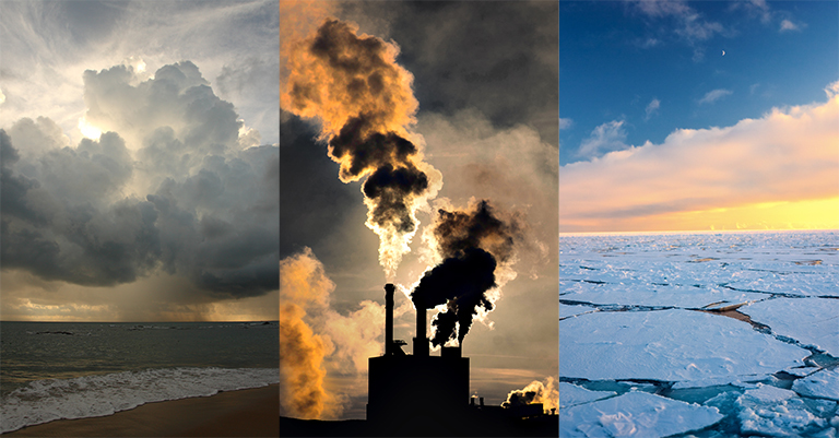
One of the biggest problems our world facing today is climate change. With climate change the average temperature of the world is rising dramatically, arctic ice are melting , sea levels are rising, natural disaster such as hurricane and tornados are becoming more often and stronger. Because of these erratic behaviors of nature a lot of animal species losing their natural habitat and are becoming extinct or on the verge of becoming extinct. This phenomenon is ultimately threatening the very existence of humanity.
Although most of us acknowledge the occurrence of climate change, a vast majority of us do not believe that human race has anything to do with it. There is hundreds of scientific research conducted on climate change and all of them show a strong correlation between human activity and climate change. Global warming is a big part of climate change and according to the climate scientists global \(CO_2\) emission plays a vital role on global warming. In this project we will look at historical data on global temperature and \(CO_2\) emission to find a link and then conduct a twitter sentiment analysis to get feel of the sentiment on the issue.
#install.packages("twitteR")
library(tidyr)
library(ggplot2)
library(plotly)
library(dplyr)
#install.packages("ggmap")
library(ggmap)
library(twitteR)
library(DT)
library(stringr)
library(tm)
library(SnowballC)
library(wordcloud)
library(RColorBrewer)
#install.packages("syuzhet")
library(syuzhet)
Historical Analysis
More Common “Unusually Hot” Days
Let us start by looking at map of contiguous 48 States that shows unusually hot temperatures at individual weather stations that have operated consistently since 1948. “Unusually hot” in this case refers to a daily maximum temperature that is hotter than the 95th percentile temperature during the 1948-2015 period. If the maximum temperature of a particular day at a particular station falls within the warmest 5 percent of measurements at that station during the 1948-2015 period it would be considered ’unusually hot" ( https://www.epa.gov/sites/production/files/2016-08/documents/print_high-low-temps-2016.pdf). The map shows changes 10 or more days per year that were hotter than the 95th percentile.
Unusually Hot Temperatures in the Contiguous 48 States, 1948-2015
change_hot <- read.csv("https://raw.githubusercontent.com/choudhury1023/Data-607/gh-pages/change_hot.csv", stringsAsFactors = FALSE)

more_10 <- change_hot %>% group_by(Change.in.95.percent.Days) %>% filter(all(Change.in.95.percent.Days>=10))

datatable(more_10, options = list(pageLength = 10))
usa_center = as.numeric(geocode("United States"))
USAMap = ggmap(get_googlemap(center=usa_center, scale=2, zoom=4), extent="normal")
qmplot(Long, Lat, data = more_10,
colour = I('red'), size = I(3), darken = .3) Data Source:https://www.epa.gov/sites/production/files/2016-08/high-low-temps_fig-4.csv
We can see from the table and map above “unusually hot” hot days re pretty common occurrence in contiguous 48 States. This is an indication of global warming happening and Green House Gases are a major factor behind it.
\(CO_2\) Emission and Global Warming
Since the record started 136 years ago, we had 10 warmest years on record since 2010 with the exception of 1998 and 2015 being the warmest (http://climate.nasa.gov/vital-signs/global-temperature/). We will look at global yearly \(CO_2\) emission data caused by human actions (burning of fossil fuel, cement production, gas flaring, etc.) and data set containing global land-ocean temperature index (c) (anomaly with base: 1951-1980)and try to create a connection between the two variables. For this project we will look into data ranging from 1990 to 2013.
#load CO2 emmission data
co2_emissions_raw <- read.csv("https://raw.githubusercontent.com/choudhury1023/Data-607/gh-pages/global.1751_2013.csv", stringsAsFactors = FALSE)
names(co2_emissions_raw)
co2_emissions <- data.frame(co2_emissions_raw$Year, co2_emissions_raw$Total.carbon.emissions.from.fossil.fuel.consumption.and.cement.production..million.metric.tons.of.C.)
#Removing everything but data from desired time frame
co2_emissions <- co2_emissions[-c(1:240),]
names(co2_emissions) <- c("year", "emissions")Table Showing Global Fossil-Fuel CO2 Emissions
datatable(co2_emissions, options = list(pageLength = 10))pco2 <- ggplot(co2_emissions, aes(year, emissions, group = 1, color=emissions)) +
geom_line() +
geom_point(size = 1) +
labs(x = "Year", y = "CO2 emissions (million metric tons)",
title = "Human Caused CO2 emission (1990-2013)") +
theme(axis.text.x = element_text(angle = 90, hjust = 1), axis.text=element_text(size=6))
ggplotly(pco2)From the \(CO_2\) emission plot we can see with few exception \(CO_2\) grew every year continuously and has a strong upward trend
global_temperature_data_raw <- read.csv("https://raw.githubusercontent.com/choudhury1023/Data-607/gh-pages/ZonAnn.Ts%2BdSST.csv", stringsAsFactors = FALSE)Data Source: http://data.giss.nasa.gov/gistemp/
names(global_temperature_data_raw)
global_temperature_data <- data.frame(global_temperature_data_raw$Year, global_temperature_data_raw$Glob)

#Removing everything but data from desired time frame
global_temperature_data <- global_temperature_data[-c(1:110, 135, 136),]
names(global_temperature_data) <- c("year", "anomaly")
Table Showing Global Land-Ocean Temperature Index (C) (Anomaly with Base: 1951-1980)
datatable(global_temperature_data, options = list(pageLength = 10))ggplot(global_temperature_data, aes(year, anomaly, group = 1, color = anomaly)) +
geom_point() +
geom_line() +
labs(x = "Year", y = "Temparature Anomaly (C)",
title = "Temparature Anomaly(c) for Years 1990-2013
Relative to 1951-1980 Average Temperatures") +
theme(plot.title = element_text(hjust = 0.5))
Temparature Anomaly has more movement in both direction but form the plot we can conclude it also has a strong upward trend.
Linear Regression
#Join two tables
li_data <- cbind(co2_emissions, global_temperature_data$anomaly)
li_data
names(li_data) <- c("year", "emissions", "anomaly")
write.csv(li_data, file = "li_data.csv", row.names = FALSE)
#I was having problem transforming the data frame variables to numeric, and was getting error message for both "lm" and "cor" function. To get around the error I have converted the data frme to .csv uploaded to github and reloaded.new_data <-read.csv("https://raw.githubusercontent.com/choudhury1023/Data-607/gh-pages/li_data.csv", stringsAsFactors = FALSE)In the following bar plot I have scaled down the \(CO_2\) emission data to a 1:1000 ratio to visualize the emission and anomaly side by side for each year between 1990 and 2013.
scaled_data <- mutate(new_data, scaled_emissions = emissions/1000)
wide_data <- gather(scaled_data,"type", "value", 3,4)

ggplot(data = wide_data, aes(x = year, y = value, fill = type)) +
                 geom_bar(stat="identity", position="dodge") +
                 theme(legend.position = "dodge") +
                 xlab("Year") + ylab("Anomaly(c) and Scaled Down
(1:1000) CO2 Emissions") +
                 ggtitle(" Human Caused CO2 Emission
in Million Metric Tons (Scale 1:1000)
and Yearly Average Temperature Anomaly
Relative to 1951-1980 Average Temperatures") +
                 theme(plot.title = element_text(hjust = 0.5))
m <- lm(anomaly ~ emissions, data = new_data)
summary(m)
##
## Call:
## lm(formula = anomaly ~ emissions, data = new_data)
##
## Residuals:
## Min 1Q Median 3Q Max
## -0.17717 -0.07725 0.01503 0.05204 0.18449
##
## Coefficients:
## Estimate Std. Error t value Pr(>|t|)
## (Intercept) -1.011e-01 1.198e-01 -0.844 0.408
## emissions 8.318e-05 1.583e-05 5.255 2.85e-05 ***
## ---
## Signif. codes: 0 '***' 0.001 '**' 0.01 '*' 0.05 '.' 0.1 ' ' 1
##
## Residual standard error: 0.09614 on 22 degrees of freedom
## Multiple R-squared: 0.5566, Adjusted R-squared: 0.5364
## F-statistic: 27.62 on 1 and 22 DF, p-value: 2.847e-05plot(new_data$anomaly ~ new_data$emissions)
abline(m)
From the regression model summary data we get a \(r^2\) value of 0.5566 which means we can explain 55.66% of temperature anomaly with the \(CO_2\) emissions, a very low p-value indicates we can indicates that we can reject null hypothesis and conclude there is a statistically significant relationship between the two variables and from the plot we can conclude there is a strong positive linear relationship between the two variables.The correlation between the two variable is 0.7460549 which is very strong.
Twitter Sentiment Analysis on Climate
set.seed(1)Extract Tweets
For the second part of the project, we will extract 2500 latest tweets using #climate and conduct a sentiment analysis on the tweets. We will not exclude retweets from our search as retweets are also sentiment of twitter user. To maintain consistency of the analysis, the extracted tweets were converted to .csv file and uploaded to GitHub repository.
consumer_key = ''
consumer_secret = ''
access_token = ''
access_token_secret = ''


setup_twitter_oauth(consumer_key, consumer_secret, access_token, access_token_secret)

tweets <-searchTwitter("#climate", n = 2500)
tweets_df <- do.call("rbind", lapply(tweets, as.data.frame))
View(tweets_df)

#should get 2500
length(tweets)

#create .csv file
write.csv(tweets_df, file = "tweets_climate.csv", row.names=FALSE)
Load tweets
The .csv file was loaded again from the GitHub repository. The extracted tweets are presented in a searchable format below.
#load tweets
tweets_climate <- read.csv("https://raw.githubusercontent.com/choudhury1023/Data-607/gh-pages/tweets_climate.csv", stringsAsFactors = FALSE)
tweet_data <- data.frame(tweets_climate$text, tweets_climate$created, tweets_climate$screenName)
datatable(tweet_data, options = list(pageLength = 5))Word Frequency
As the first step of our analysis we will find the words that were used in the tweets most frequently and create a word cloud for visualization of those words. To accomplish this step, first, we will conduct an initial clean up the tweets by getting rid of retweet entities, remove tagged people’s name, remove URL and HTML tags and then create a corpus.
# Remove retweet entities from the stored tweets (text)
tweets_climate$text <- gsub("(RT|via)((?:\\b\\W*@\\w+)+)", "", tweets_climate$text)
# Remove all "@people"
tweets_climate$text <- gsub("@\\w+", "", tweets_climate$text)
# Remove URL
tweets_climate$text <- gsub("http[^[:space:]]*", "", tweets_climate$text)
# Remove HTML tags
tweets_climate$text <- gsub ("<.*?>", "", tweets_climate$text)
#create corpus
tweets_climate_corpus <- Corpus(VectorSource(tweets_climate$text))
summary(tweets_climate_corpus)After initial cleanup we will conduct further cleanup from the corpus. In this step we will remove numbers, remove punctuations, convert to lower case, stem document, convert to plain text document, remove stop words, strip white spaces and then we will create a document term matrix. Following the cleanup and document term matrix creation we will look at the top twenty five words by frequency of appearance.
#convert to UTF-8
tweets_climate_corpus <- tm_map(tweets_climate_corpus,
                         content_transformer(function(x) iconv(x, to='UTF-8',                           sub='byte')),mc.cores=1
)
#remove numbers
tweets_climate_corpus <- tm_map(tweets_climate_corpus,removeNumbers)
#remove punctuations
tweets_climate_corpus <- tm_map(tweets_climate_corpus,str_replace_all,pattern =                          "[[:punct:]]", replacement = " ",lazy=TRUE)
#convert to lower case
tweets_climate_corpus <- tm_map(tweets_climate_corpus, tolower,lazy=TRUE)
#stem document
tweets_climate_corpus <- tm_map(tweets_climate_corpus, stemDocument)
#convert to plain text document
tweets_climate_corpus <- tm_map(tweets_climate_corpus, PlainTextDocument)
#remove stopwords
tweets_climate_corpus <- tm_map(tweets_climate_corpus,removeWords, stopwords("english"))
#remove meaningless words
tweets_climate_corpus <- tm_map(tweets_climate_corpus, removeWords, c("amp", "clim", "htt"))
#strip white spaces
tweets_climate_corpus <- tm_map(tweets_climate_corpus,                                                  stripWhitespace,lazy=TRUE)
#create document term matrix
dtm <- DocumentTermMatrix(tweets_climate_corpus)
dtm## <<DocumentTermMatrix (documents: 2500, terms: 3393)>>
## Non-/sparse entries: 21826/8460674
## Sparsity : 100%
## Maximal term length: 23
## Weighting : term frequency (tf)tweets_matrix = as.matrix(dtm)
word_freqs = sort(colSums(tweets_matrix),decreasing=TRUE)
freq_df = data.frame(word=names(word_freqs),freq=word_freqs)
rownames(freq_df) <- NULL
freq <- freq_df[c(1:25),]
knitr::kable(freq)| word | freq |
|---|---|
| climate | 2430 |
| change | 409 |
| trump | 326 |
| scientists | 263 |
| energy | 233 |
| science | 199 |
| record | 197 |
| data | 158 |
| global | 152 |
| globalwarming | 140 |
| fossil | 138 |
| nuclear | 120 |
| auspol | 109 |
| climatechange | 109 |
| latest | 108 |
| says | 93 |
| thorium | 93 |
| warming | 93 |
| fuels | 92 |
| policy | 92 |
| focus | 91 |
| saving | 90 |
| thanks | 89 |
| new | 85 |
| moving | 84 |
ggplot(data = freq, aes(x = reorder(word, +freq), y =  freq)) +
        geom_bar(aes(fill = word), stat = "identity") +
        theme(legend.position = "none") +
        xlab("Word") + ylab("Frequency") + ggtitle("Top 25 Frequently Appeared Words")+ coord_flip()
From the word frequency table one word that stands out is “trump” at close to very top. This proves the division that we have in the issue. As most pick of the incoming administration of President Elect Donald Trump so openly do not believe in climate the word “trump” is becoming synonymous with climate change. Another interesting appearance on our top 25 list is “auspol”. #auspol hashtag is a popular hashtag for anything related to politics in Australia and another indication of politicizing climate change. It is unfortunate to see such an important issue to become politicized and partisan. Another interesting appearance on our top 25 list is “auspol”. #auspol hashtag is a popular hashtag for anything related to politics in Australia and another indication of politicizing climate change.
Word Cloud
Now let’s plot a word cloud with the words that appeared minimum of 10 times in our tweets.
wordcloud(freq_df$word, freq_df$freq, min.freq=10, random.order = FALSE, colors = brewer.pal(6,"Dark2"))
Cluster Dendrogram
tdm <- TermDocumentMatrix(tweets_climate_corpus)
tdm
## <<TermDocumentMatrix (terms: 3393, documents: 2500)>>
## Non-/sparse entries: 21826/8460674
## Sparsity : 100%
## Maximal term length: 23
## Weighting : term frequency (tf)tdm.freq = removeSparseTerms(tdm, 0.98)
dim(tdm)## [1] 3393 2500dim(tdm.freq)## [1] 51 2500d <- dist(tdm.freq)
groups <- hclust(d,method = "ward.D")
plot(groups, hand=-1)
The cluster dendrogram gives us a hit of what exactly going on with the tweets. We can see as outliers fossil, fuel, investing, funds, moving etc. all clustered together as we see in our tweets there are few tweets about how investors are turning away from investing in fossil fuel. Trump, scientists data etc. clustered together as there tweets on how scientists are fearful of trump dismissing their data. Nuclear, uranium, auspol etc. are clustered together as there are few tweets about nuclear energy in Australia. Then in the middle we have artic, warming, weather, extreme etc. all clustered together to give us a hint of what exactly going on.
Sentiment Analysis
For sentiment analysis we will use algorithm based on the NRC Word-Emotion Association Lexicon of Saif Mohammad and Peter Turney. This dictionary/lexicon contains words with associated scores for eight different emotions and two sentiments (positive/negative). Each individual word in this lexicon has a yes(one) or no (zero) for the emotions and sentiments, by adding up the individual sentiments for each word we can get the total sentiment of the sentence. The lexicon does not include words that do not have any sentiment or neutral.( http://juliasilge.com/blog/Joy-to-the-World/)
tweets_climate$text <- as.character(tweets_climate$text)
Climate_sentiment <- get_nrc_sentiment(tweets_climate$text)
tweets <- cbind(tweets_climate$text, Climate_sentiment)
Plot Sentiments
sentimentTotals <- data.frame(colSums(tweets[,c(2:11)]))
names(sentimentTotals) <- "count"
sentimentTotals <- cbind("sentiment" = rownames(sentimentTotals), sentimentTotals)
rownames(sentimentTotals) <- NULL
knitr::kable(sentimentTotals)| sentiment | count |
|---|---|
| anger | 469 |
| anticipation | 671 |
| disgust | 279 |
| fear | 1055 |
| joy | 481 |
| sadness | 335 |
| surprise | 569 |
| trust | 1035 |
| negative | 1015 |
| positive | 1706 |
I was surprised to see there are more positive sentiments then negative in climate change tweet, which makes me believe Its not all doom and gloom, there is still hope. As for emotion it is also surprising to see we have almost same amount of fear and trust.
plot_sentiment <-ggplot(data = sentimentTotals, aes(x = sentiment, y = count)) +
                 geom_bar(aes(fill = sentiment), stat = "identity") +
                 theme(legend.position = "none") +
                 xlab("Sentiment") + ylab("Total Count") +
                 ggtitle("Total Sentiment Score for All Tweets Containing the Word Climate") +
                 theme(axis.text.x = element_text(angle = 90, hjust = 1))
ggplotly(plot_sentiment)
Sentiment analysis limitation
One big limitation of sentiment analysis is that we cannot distinguish between sarcasm and real sentiment. In our analysis it can have a big impact as tweets with two of our top twenty five frequently used words “trump” and “auspol” has a few sarcastic comments.
Conclusions
From our data and analysis we have seen global average temperature is going up and established a link between \(CO_2\) emissions and global warming. There is no way this project is completely scientific; we have looked at only one of many greenhouse gases which contributes to global warming, the historical data time line we have used was very small and we did not conduct a model test to see if linear regression model is appropriate for our project. But there are plenty of scientific studies conducted to prove beyond any doubt that global warming is real and human behavior is contributing to it. From our twitter sentiment analysis we have seen how politicized the issue is, we have also seen there is hope, more people are positive about climate then negative. We have one Earth to live and now is the time to take action to save it.