knitr::include_graphics(c("https://upload.wikimedia.org/wikipedia/commons/thumb/2/27/Snow-cholera-map-1.jpg/300px-Snow-cholera-map-1.jpg", "https://upload.wikimedia.org/wikipedia/commons/thumb/0/00/Chol_an.gif/300px-Chol_an.gif"))

eRum 2016, Poznan. Slides: rpubs.com/RobinLovelace. Source: GitHub
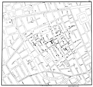
knitr::include_graphics(c("https://upload.wikimedia.org/wikipedia/commons/thumb/2/27/Snow-cholera-map-1.jpg/300px-Snow-cholera-map-1.jpg", "https://upload.wikimedia.org/wikipedia/commons/thumb/0/00/Chol_an.gif/300px-Chol_an.gif"))
"With the advent of “modern” GIS software, most people want to point and click their way through life. That’s good, but there is a tremendous amount of flexibility and power waiting for you with the command line. Many times you can do something on the command line in a fraction of the time you can do it with a GUI (Sherman 2008, p. 283)
If you cannot visualise your data, it is very difficult to understand your data. Conversely, visualisation will greatly aid in communicating your results.
Human beings are remarkably adept at discerning relationships from visual representations. A well-crafted graph can help you make meaningful comparisons among thousands of pieces of information, extracting patterns not easily found through other methods. … Data analysts need to look at their data, and this is one area where R shines. (Kabacoff, 2009, p. 45).

base graphics
Source: Cheshire and Lovelace (2014) - available online

Source: This tutorial!

census

Dutch shipping routes
Source: R-Bloggers

energy

Flexibility of ggplot2 - see robinlovelace.net

13:30 - 14:00: Introduction and downloading the data
14:00 - 15:00: Base graphics and ggplot2
**Coffee break** and discussion/questions15:30 - 17:00: tmap and interactive maps
# Make lots of comments!
Before progressing further: Any questions?
1: The internet!
Bivand, R. S., Pebesma, E. J., & Rubio, V. G. (2013). Applied spatial data analysis with R. Springer. 2nd ed.
Cheshire, J., & Lovelace, R. (2015). Spatial data visualisation with R. In C. Brunsdon & A. Singleton (Eds.), Geocomputation (pp. 1–14). SAGE Publications. Retrieved from https://github.com/geocomPP/sdv . Full chapter available from https://www.researchgate.net/publication/274697165_Spatial_data_visualisation_with_R
Lovelace, R., Cheshire, J., 2014. Introduction to visualising spatial data in R. Comprehensive R Archive Network.
Dorman, M. (2014). Learning R for Geospatial Analysis. Packt Publishing Ltd.
Everitt, B. S., & Hothorn, T. (2015). HSAUR: A Handbook of Statistical Analyses Using R. Retrieved from http://cran.r-project.org/package=HSAUR
Harris, R. (2012). A Short Introduction to R. social-statistics.org.
Lamigueiro, O. P. (2012). solaR: Solar Radiation and Photovoltaic Systems with R. Journal of Statistical Software, 50(9), 1–32. Retrieved from http://www.jstatsoft.org/v50/i09
Wickham, H. (2009). ggplot2: elegant graphics for data analysis. Springer.
Wickham, H. (2014). Tidy data. The Journal of Statistical Software, 14(5), Retrieved from http://www.jstatsoft.org/v59/i10
Wilkinson, L. (2005). The grammar of graphics. Springer.