Exploring Two Variables
Scatterplots and Perceived Audience Size
Please install and load these packages before continuing
# Loading some packages for data manipulation and plotting
library(dplyr); library(ggplot2); library(lubridate); library(stringr)
library(tidyr); library(readr); library(ggthemes); library(alr3)
theme_set(theme_minimal(13))
Scatterplots
pf <- read_tsv("pseudo_facebook.tsv")

ggplot(data = pf, aes(x = age, y = friend_count)) +
        geom_point()
Simple Scatter Plot
What are some things that you notice right away?
We can easity notice that younger users (below 30) have a lot more friends than older ones. Also, we can notice some pretty strange vertical bars after the age 60, around 69 and 100. These apparantly represent people who lied about their age.
ggplot Syntax
# We want to know the range of the variable age
summary(pf$age)
## Min. 1st Qu. Median Mean 3rd Qu. Max.
## 13.00 20.00 28.00 37.28 50.00 113.00# We find it's between 13 and 113. 13 is reasonalbe as lower limit, as users
# below 13 are not allowed to create a facebook account.
# as for the upper limit, let's chose it to be 90. It's not reasonable to find
# someone ove 90 using facebook!!
ggplot(data = pf, aes(x = age, y = friend_count)) +
geom_point() +
xlim(13, 90)
Limiting The X-axis
Overplotting
Now you may notice that some of some points are spread out from one another, while others are stacked right on top of each other. The bottom area of the graph is considered to be over plotted. Over plotting makes it difficult to tell how many points are in each region.
So we can set the transparency of the points using the alpha parameter and geom point.
I’m going to add this on a new line so that we can see our layers more clearly.
Next I set the alpha parameter equal to 1/20. So this means it’s going to take 20 points to be the equivalent of one of the original black dots.
ggplot(data = pf, aes(x = age, y = friend_count)) +
        geom_point(alpha = 1/20) +
        xlim(13, 90)
running this code, we can see that the bulk of our data lies below the 1000 threshold for friend count.
Now let’s also add a little jitter here too. We can swap out geom-point with the geom_jitter. Age is a continuous variable but you really only have integer values, so we are seeing these perfectly lined up columns on the x-axis. Which isn’t a true reflection of age. These columns should feel intuitively wrong and we want to make sure that we can see more of the points.
So using jitter we can add some noise to each age so we get a clearer picture of the relationship between age and friend count.
ggplot(data = pf, aes(x = age, y = friend_count)) +
        geom_jitter(alpha = 1/20) +
        xlim(13, 90)
running our code with jitter we can see that we get a more disperse distribution. What stands out to you in this new plot? Keep in mind that the alpha is set to 120th or 0.05.
What do you notice in the plot?
Response:
With this new plot, we can see that the friend counts for young users aren’t nearly as high as they looked before. The bulk of young users really have friend counts below 1000. That’s why we see these really dark regions in the lower left corner of the graph.
Remember, alpha is set to 0.05, so it takes 20 points for a circle to appear completely dark. You also still might have seen a peak around 69, which is what we originally saw when we looked at friend count in our data. It’s faint because we have the alpha parameter set to 0.05, but I would say that this is comparable to users in say, the 25 or 26 age group.
Coord_trans()
Notes: Now, let’s make some more adjustments to our plot. This time we’re going to use a transformation on the y-axis, so we change the friend count. We’re going to do this so that we can get a better visualization of the data. Let’s see if you can figure this out on your own. I want you to look at the documentation for coord_trans and add it as a layer to this plot.
The function you’re going to use to transform friend count will be the square root function. See if you can make the plot and think about any observations you have, once you’ve made it. Now here again is an instance where we haven’t given you all the knowledge upfront, but I think you can figure this one out.
Look up the documentation for coord_trans and add a layer to the plot that transforms friend_count using the square root function. Create your plot!
Coord_trans solution
For this programming exercise, you just needed to add a new layer onto our code, and that was the coord_trans layer. I’ll pass at the y variable, and I’ll set that y equal to square root, which is the function we’ll use to transform the y axis.
ggplot(data = pf, aes(x = age, y = friend_count)) +
        geom_point(alpha = 1/20) +
        xlim(13, 90) +
        coord_trans(y = 'sqrt')
With this plot, it’s much easier to see the distribution of friend count, conditional on age. For example, we can see thresholds of friend count above which there are very few users.
Now, you might have noticed I went back from geom_jitter to geom_point. If we wanted to also add jitter to the points, we’d have to use a bit more elaborate syntax to specify that we only want to jitter the ages.
We also need to be careful since some people have a friend count of 0. If we add noise to 0 friend counts, we might end up with negative numbers for some of our friend counts and those square roots would be imaginary. So to make this adjustment I’m going to set the position parameter equal to position_jitter and then I’ll pass it a minimum height of 0.
ggplot(data = pf, aes(x = age, y = friend_count)) +
        geom_point(alpha = 1/20, position = position_jitter(h = 0)) +
        xlim(13, 90) +
        coord_trans(y = 'sqrt')
This is a bit more advanced in terms of syntax but it prevents us from having that warning message and getting negative friend counts. Remember
that jitter can add positive or negative noise to each of our points.
What do you notice?
Alpha and Jitter
Notes: Explore the relationship between age and friends initiated
ggplot(data = pf, aes(x = age, y = friendships_initiated)) +
        geom_point(alpha = 1/10, position = position_jitter(h = 0)) +
        coord_trans(y = 'sqrt')
Overplotting and Domain Knowledge
Notes:
Conditional Means
Notes: Let’s take a step back and look at our scatter plot between friend count and age. This scatter plot keeps us really close to the data because we are visualizing every point in the data set. In general, it’s not possible to judge important quantities from such a display.
Sometimes you want to understand how the mean or median of a variable. Varies with another variable. That is it can be helpful to summarize the relationship between two variables in other ways rather than just always plotting every single point.
For example we can ask how does the average friend count vary over age. To do this, we could start by creating a table that for each age it gives us the mean and median friend count.
To do this we’re going to need to learn some new code. To create the table, we’re going to use the R package called dPlyr. I’m going to install and load that package now.
library(dplyr)The dPlyr package lets us split up a data frame and apply a function to some parts of the data. Some of the common functions you might use are filter, group_by, mutate and arrange. You can learn more about the dplyr package and browse through some examples from the following link: intro to dplyr
For now we’ll work through an example together.
# So the first thing that I want to do is to group my data frame by age.
# I'm going to save this grouping in a new variable called age groups.

age_groups <- group_by(pf, age)

# Next I want to summarize this new grouping of data And
# create new variables of mean friend count, median friend count and
# the number people in each group.

pf.fc_age <- summarize(age_groups,
          friend_count_mean = mean(friend_count),
          friend_count_median = median(friend_count),
          n = n())

# Note: The n() function can only be used for
# summarise, and it reports how many observations are in each group.

# Using the head command, I can print out the first couple
# rows to examine the data from.

head(pf.fc_age)
## # A tibble: 6 x 4
## age friend_count_mean friend_count_median n
## <int> <dbl> <dbl> <int>
## 1 13 164.7500 74.0 484
## 2 14 251.3901 132.0 1925
## 3 15 347.6921 161.0 2618
## 4 16 351.9371 171.5 3086
## 5 17 350.3006 156.0 3283
## 6 18 331.1663 162.0 5196The two things that I really want to point out regarding the previous piece of code is that we need to pass in a data frame at the beginning of each function. We also need to save the result into a new variable, and we pass that into the next function. This is what makes it difficult to understand this code at first, so I’m going to show you one other way to get this same table.
To start, we’re just going to take our data set and apply some function to it. To do that, I’m going to use the %>% symbol. This allows me to chain functions onto our data set.
So I’m going to perform one function at a time. One after another on pf.
# The following piece of code will do the following:
# 1 - group the pf data set by age
# 2 - take the resulting data frame and summarizing it using 3 new variables:
#     friend_count_mean, friend_count_median, n

pf.fc_age <- pf %>%
        group_by(age) %>%
        summarize(friend_count_mean = mean(friend_count),
                  friend_count_median = median(friend_count),
                  n = n())

# Let's print out the head of our newly generated data frame to see what it
# looks like
head(pf.fc_age)
## # A tibble: 6 x 4
## age friend_count_mean friend_count_median n
## <int> <dbl> <dbl> <int>
## 1 13 164.7500 74.0 484
## 2 14 251.3901 132.0 1925
## 3 15 347.6921 161.0 2618
## 4 16 351.9371 171.5 3086
## 5 17 350.3006 156.0 3283
## 6 18 331.1663 162.0 5196Now, We want to see some observations from the resulting table. The best way to do so is by visualization. So let’s plot this table of averages. This is going to be your next programming assignment.
Practice
I want you to plot the average friend_count versus age. Make sure that you use the the appropriate data set. We’re using this new data set here that we just created. And be sure that you have the appropriate variable names. They’re different from before.
Solution
ggplot(data = pf.fc_age, aes(x = age, y = friend_count_mean)) +
        geom_point()
Now that doesn’t seem quite intuitive, does it? we can do better than this plot if we connected these dots. We can do that using geom_line() rather than geom_point. You can look up the documentation for geom_line() to see what it does.
ggplot(data = pf.fc_age, aes(x = age, y = friend_count_mean)) +
        geom_line()
This plot immediately makes clear the patterns we mentioned before, as well as the oddness at age 69. We see that through the older ages, our estimates are highly variable for friend count mean. They’re jumping up and down, sort of all over the place. And for our young users, they still have high friend counts, and for the ages between 30 and 60, the mean count is hovering just about over 100.
Overlaying summaries with raw data
ggplot allows us to easily create various summaries of our data and plot them. This could be especially useful for quick exploration and for combining plots of raw data, like our original scatter plot with displaying summaries. This plot is one of those displaying summaries and I want to be able to display it over the original plot we had for friend_count versus age.
Let’s see that first original scatter plot again.

Let’s change the color of these points so it’s easier to see when we overlay the summary plot.
ggplot(data = pf, aes(x = age, y = friend_count)) +
        geom_point(alpha = 1/20,
                   position = position_jitter(h = 0),
                   color = 'orange') +
        xlim(13, 90) +
        coord_trans(y = 'sqrt')
So now, I’ve got my scatter plot and I want to overlay the summary that we have from before.
# add a geom_line to our plot
# pass the parameter stat and set it equal to summary, and
# give it a function for y. The fun.y parameter takes
# any type of function to be applied to the y values
# In this case, we want the mean
ggplot(data = pf, aes(x = age, y = friend_count)) +
        geom_point(alpha = 1/20,
                   position = position_jitter(h = 0),
                   color = 'orange') +
        xlim(13, 90) +
        coord_trans(y = 'sqrt') +
        geom_line(stat = 'summary', fun.y = mean)
And there it is, this is my summary line of the mean friend count by age, over my raw data or my scatter plot.
This plot immediately reveals the increase in friend_count for very young users and the subsequent decrease right after that.
We can add even more detail to this plot by displaying multiple summaries at the same time. Despite having this conditional mean plotted, we can’t immediately see how dispersed the data is around the mean.
We can help ourselves understand this conditional distribution of friend_counts by also plotting quantiles of the data. So let’s use the 10%, 50% (or median) and 90% quantiles.
# start by adding our 10% quantile summary line to this plot, by adding
# another geom_line, pass it a stat of summary and then for the function,
# pass it quantile instead of mean
# to differentiate it from the mean line, make the line dashed (linetype =2),
# and set the color equals to 'blue'
# do the same for the 50% and 90% quantiles
ggplot(data = pf, aes(x = age, y = friend_count)) +
        geom_point(alpha = 1/20,
                   position = position_jitter(h = 0),
                   color = 'orange') +
        xlim(13, 90) +
        coord_trans(y = 'sqrt') +
        geom_line(stat = 'summary', fun.y = mean) +
        geom_line(stat = 'summary', fun.y = quantile,
                  fun.args = list(probs = 0.1),
                  linetype = 2, color = 'blue') +
        geom_line(stat = 'summary', fun.y = quantile,
                  fun.args = list(probs = 0.5),
                  color = 'blue') +
        geom_line(stat = 'summary', fun.y = quantile,
                  fun.args = list(probs = 0.9),
                  linetype = 2, color = 'blue')
Coord_cartizian()
Without making any adjustments to this plot, we notice that having more than 1,000 friends is quite rare. And that the 90 percentile is well below 1,000. Now, let’s zoom in on this plot using the coord_cartesian layer.
# To use the coord_cartesian we neeg get rid of coord_trans and xlim layers
# Add the coord_cartesian layer and set an appropriate X-axis and Y-axis limits
ggplot(data = pf, aes(x = age, y = friend_count)) +
        geom_point(alpha = 1/20,
                   position = position_jitter(h = 0),
                   color = 'orange') +
        coord_cartesian(xlim = c(13, 70), ylim = c(0, 1000)) +
        geom_line(stat = 'summary', fun.y = mean) +
        geom_line(stat = 'summary', fun.y = quantile,
                  fun.args = list(probs = 0.1),
                  linetype = 2, color = 'blue') +
        geom_line(stat = 'summary', fun.y = quantile,
                  fun.args = list(probs = 0.5),
                  color = 'blue') +
        geom_line(stat = 'summary', fun.y = quantile,
                  fun.args = list(probs = 0.9),
                  linetype = 2, color = 'blue')
Now with this plot, we can see that we get a little bit more detail. For example, we can see that for 35 year olds to 60 year olds, the friend count falls below 250. So 90% of our users between this age group have less than 250 friends. At least according to Facebook.
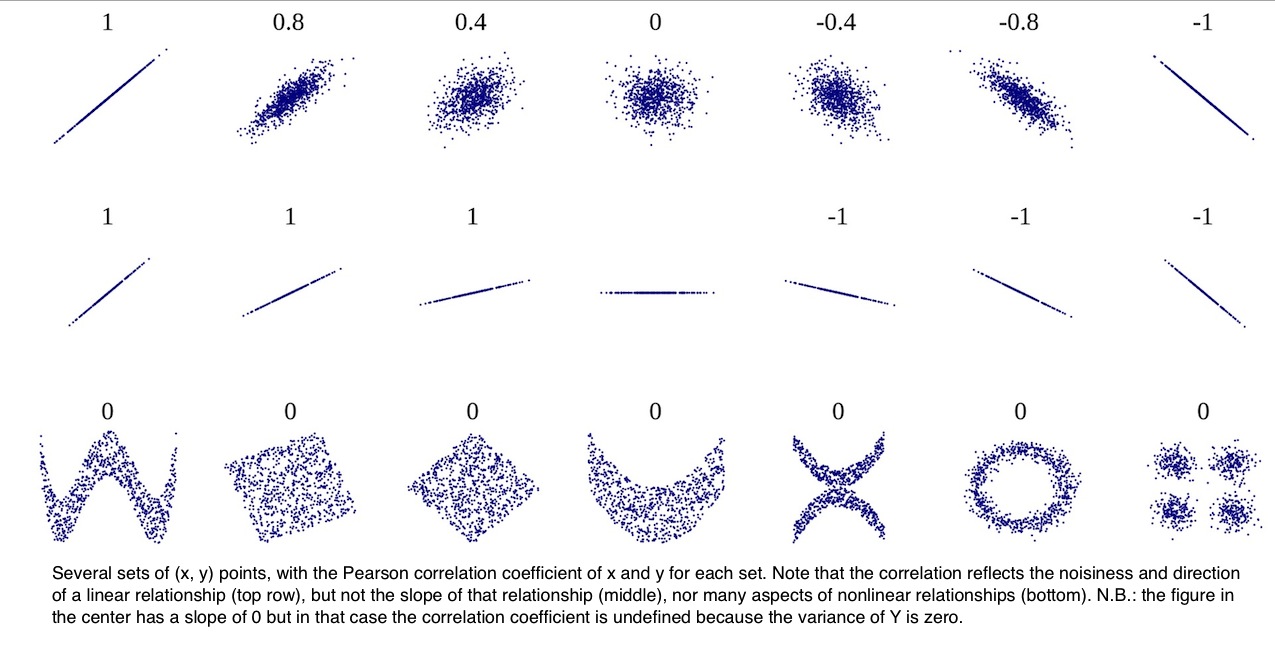
Correlation
It might be appealing to further summarize the relationship of age and friend count, rather than having the four extra layers of geom line, we could try to summarize the strength of this relationship in a single number.
Often, analyst will use a correlation coefficient to summarize this. Now, if you’re not familiar with correlation, have a look on these links:
A Visual Guide to Correlation, Correlation Coefficient, Intro to Inferential Statistics- Correlation.
We’re going to use the Pearson product moment correlation, noted with a lower case r, to measure the linear relationship between age and friend count.
Practice
Now, try to look up the documentation for the core.test function. Figure out how to find Pearson’s r using any two variables. What’s the correlation between age and friend_count? Round your answer to three decimal places.
Solution
#
cor.test(pf$age, pf$friend_count, method = 'pearson')
##
## Pearson's product-moment correlation
##
## data: pf$age and pf$friend_count
## t = -8.6268, df = 99001, p-value < 2.2e-16
## alternative hypothesis: true correlation is not equal to 0
## 95 percent confidence interval:
## -0.03363072 -0.02118189
## sample estimates:
## cor
## -0.02740737We get a correlation coefficient of 0.0274. This indicates that there’s no meaningful relationship between the two variables. A good rule of thumb is that a correlation greater than 0.3 or less than minus 0.3, is meaningful, but small. Around 0.5 is moderate and 0.7 or greater is pretty large.
Another way to compute the same coefficient is to use this code:
with(pf, cor.test(age, friend_count, method = 'pearson'))##
## Pearson's product-moment correlation
##
## data: age and friend_count
## t = -8.6268, df = 99001, p-value < 2.2e-16
## alternative hypothesis: true correlation is not equal to 0
## 95 percent confidence interval:
## -0.03363072 -0.02118189
## sample estimates:
## cor
## -0.02740737Here, I’m using the with function around the data frame. The with function let’s us evaluate an R expression in an environment constructed from the data.
Note: The default method for computing the correlation coefficient is Pearson, and this is true for most statistical software. You do not need to pass the method parameter when calculating the Pearson Product Moment Correlation.
Practice: Correlation and Subsets
Based on the correlation coefficient in this plot, we just observed that the relationship between age and friend count is not linear. It isn’t monotonic, either increasing or decreasing.
Furthermore, based on the plot, we know that we maybe don’t want to include the older ages in our correlation number. Since older ages are likely to be incorrect. Let’s re-calculate the same correlation coefficient that we had earlier with users who are ostensibly aged 70 or less. What command would you use to subset our data frame so that way we can get a correlation coefficient for just this data?
Solution
with(subset(pf, age <= 70), cor.test(age, friend_count))##
## Pearson's product-moment correlation
##
## data: age and friend_count
## t = -52.592, df = 91029, p-value < 2.2e-16
## alternative hypothesis: true correlation is not equal to 0
## 95 percent confidence interval:
## -0.1780220 -0.1654129
## sample estimates:
## cor
## -0.1717245we get a very different summary statistic. In fact, this tells a different story about a negative relationship between age and friend_count. As age increases, we can see that friend count decreases.
It’s important to note that one variable doesn’t cause the other. For example, it’d be unwise to say that growing old means that you have fewer internet friends. We’d really need to have data from experimental research and make use of inferential statistics, Rather than descriptive statistics to address causality.
Correlation Methods
The Pearson product-moment correlation measures the strength of relationship between any two variables, but there can be lots of other types of relationships. Even other ones that are monotonic, either increasing or decreasing. So we also have measures of monotonic relationships, such as a rank correlation measures like Spearman. We can assign Spearman to the method parameter and calculate the correlation that way.
with(subset(pf, age <= 70), cor.test(age, friend_count,
                                     method = 'spearman'))
##
## Spearman's rank correlation rho
##
## data: age and friend_count
## S = 1.5782e+14, p-value < 2.2e-16
## alternative hypothesis: true rho is not equal to 0
## sample estimates:
## rho
## -0.2552934Here we have a different test statistic called row, and notice how our value is slightly different as well.
You can learn more about the assumptions and uses of the different methods in this link: Correlation Methods.
The main point I want to make here is that single number coefficients are useful, but they are not a great substitute for looking at a scatter plot and computing conditional summaries like we did earlier.
Practice: Create Scatterplots
Let’s look at the number of likes users received from friends on the desktop version on the site. This is the www_likes_received received. We’ll compare this variable to the total number of likes users received which is the likes_received variable.
Create a scatterplot of likes_received (y) vs. www_likes_received (x). Use any of the techniques that you’ve learned so far to modify the plot.
Hint: likes_received should be higher than www_likes_received, since some of the likes may be coming from other sources, either mobile or unknown.
Solution
ggplot(data = pf, aes(x = www_likes_received, y = likes_received)) +
        geom_point()
Looking at this plot, we can see that we have some outliers. And the bulk of our data is centered around the lower left corner. To determine good x and y limits for our axis, we can look at 95th percentile, using the Quantile command.
ggplot(data = pf, aes(x = www_likes_received, y = likes_received)) +
        geom_point() +
        xlim(0, quantile(pf$www_likes_received, 0.95)) +
        ylim(0, quantile(pf$www_likes, 0.95))
When we run this code, we’re in effect zooming in on that lower portion of the graph that we had before. The slope of the line of best fit through these points is the correlation. And, we can even add it to the plot by using some code.
We do that by adding a smoother, and setting the method to a linear model or lm.
ggplot(data = pf, aes(x = www_likes_received, y = likes_received)) +
        geom_point(color = 'salmon') +
        xlim(0, quantile(pf$www_likes_received, 0.95)) +
        ylim(0, quantile(pf$www_likes, 0.95)) +
        geom_smooth(method = 'lm')
Practice
Let’s quantify this relationship with a number. So what’s the correlation between our two variables?
Solution
with(pf, cor.test(www_likes_received, likes_received))##
## Pearson's product-moment correlation
##
## data: www_likes_received and likes_received
## t = 937.1, df = 99001, p-value < 2.2e-16
## alternative hypothesis: true correlation is not equal to 0
## 95 percent confidence interval:
## 0.9473553 0.9486176
## sample estimates:
## cor
## 0.9479902So, we seem to have a very strong correlation between the two variables. But you should keep in mind that a strong correlation might not always be a good thing. We’ll see why quite shortly
More Caution with Correlation
Correlation can help us decide which variables are related. But even correlation coefficients can be deceptive if you’re not careful. Plotting your data is the best way to help you understand it and it can lead you to key insights.
Let’s consider another data set that comes with the alr3 package. You’ll need to install this package first and then make sure you load it. The data set that we’re going to load is called the Mitchell Data Set. The Mitchell Data Set contains soil temperatures from Mitchell, Nebraska. And they were collected by Kenneth G. Hubbard from 1976 to 1992.
data(Mitchell)
head(Mitchell)
## Month Temp
## 1 0 -5.18333
## 2 1 -1.65000
## 3 2 2.49444
## 4 3 10.40000
## 5 4 14.99440
## 6 5 21.71670By working with this data set, we’ll see how correlation can be somewhat deceptive.
Practice
So, for your first task, I want you to create a scatter plot of temperature Temp versus months Month.
Solution
ggplot(data = Mitchell, aes(x= Month, y = Temp)) +
        geom_point()
Practice:
- Take a guess of the correlation coefficient of the scatter plot
- What is the actual correlation of the two variables?
Solution
Looking at the scatter plot, there seems to be no correlation between the two variables. So, it’s reasonable to say it’s around zero.
To find the actual correlation:
with(Mitchell, cor(Month, Temp))## [1] 0.05747063Almost zero, as we guessed it !!
Making Sence of Data
While there might not appear to be a correlation between the two variables, let’s think about this a little bit more.
What’s on the x-axis? Months. And what’s on the y-axis? Temperature. So, we know that this month variable is very discreet. We’ll have the months from January to December, and they’ll repeat over and over again. Let’s be sure we add that detail to our plot.
Practice:
What layer and syntax would you add to this plot in order to make that change? You’ll want to break up the x-axis every 12 months, so that way it corresponds to a year.
Solution
# We can add our `scale_x_discrete layer`.
# We're going to pass it the parameter `breaks`, and set the breaks
# from zero to 203, with a step equals to 12, since 12 months is a year.

ggplot(data = Mitchell, aes(x= Month, y = Temp)) +
        geom_point() +
        scale_x_discrete(breaks = seq(0, 203, 12))
And you might be wondering how I decided upon 203? Using the range function
range(Mitchell$month)## [1] Inf -InfWe can see The range of the month variable and it runs from zero to 203. Now we have a little bit of a better plot with our months in discrete units.
New Perspective
Now let’s stretch our plot horizontally as much as possible.
# We can add our `scale_x_discrete layer`.
# We're going to pass it the parameter `breaks`, and set the breaks
# from zero to 203, with a step equals to 12, since 12 months is a year.

ggplot(data = Mitchell, aes(x= Month, y = Temp)) +
        geom_point() +
        scale_x_discrete(breaks = seq(0, 203, 12))
We can notice a cyclical pattern. It’s almost like a sine or a cosine graph. And this makes sense with what the story the data’s telling. I mean, there are seasons in Nebraska, so we should see fluctuation in the temperature every 12 months.
This is one example of how it’s so important to get perspective on your data. You want to make sure you put your data in context.
Another important point to make here is that the proportion and scale of your graphics do matter. Pioneers in the field of data visualization such as Playfair and Tukey studied this extensively. They determined that the nature of the data should suggest the shape of the graphic. Otherwise, you should tend to have a graphic that’s about 50% wider than it is tall.
Understanding Noise: Age to Age Months
Let’s return to our scatter plot that summarized the relationship between age and mean friend count. Recall that we ended up creating this plot from the new data frame that we created using the dplyr package. The plot looked like this:
As you can see, the black line has a lot of random noise to it. That is, the mean friend count rises and falls over each age.
Now some year to year discontinuities might make sense, such as the spike at age 69. But others are likely just to be noise around the true smoother relationship between age and friend count. That is, they reflect that we just have a sample from the data generating process, and so the estimated mean friend count for each age is the true mean plus some noise.
We can imagine that the noise for this plot would be worse if we chose finer bins for age. For example, we could estimate conditional means for each age, measured in months instead of years.
Over the next few programming exercises, you’re going to do just that.
Practice: create age_with_months variable
Create a new variable, age_with_months, in the pf data frame. Be sure to save the variable in the data frame rather than creating a separate, stand-alone variable. You will need to use the variables age and dob_month to create the variable age_with_months.
Assume the reference date for calculating age is December 31, 2013.
The variable age_with_months in the data frame pf should be a decimal value. For example, the value of age_with_months for a 33 year old person born in March would be 33.75 since there are nine months from March to the end of the year.
Solution
pf$age_with_months <- pf$age + (12 - pf$dob_month)/12Practice: Age with Months Means
Create a new data frame called pf.fc_by_age_months that contains the mean friend count, the median friend count, and the number of users in each group of age_with_months. The rows of the data framed should be arranged in increasing order by the age_with_months variable.
Solution
pf.fc_by_age_months <- pf %>%
        group_by(age_with_months) %>%
        summarize(
                friend_count_mean = mean(friend_count),
                friend_count_median = median(friend_count),
                n = n()) %>%
        arrange(age_with_months)

pf.fc_by_age_months
## # A tibble: 1,194 x 4
## age_with_months friend_count_mean friend_count_median n
## <dbl> <dbl> <dbl> <int>
## 1 13.16667 46.33333 30.5 6
## 2 13.25000 115.07143 23.5 14
## 3 13.33333 136.20000 44.0 25
## 4 13.41667 164.24242 72.0 33
## 5 13.50000 131.17778 66.0 45
## 6 13.58333 156.81481 64.0 54
## 7 13.66667 130.06522 75.5 46
## 8 13.75000 205.82609 122.0 69
## 9 13.83333 215.67742 111.0 62
## 10 13.91667 162.28462 71.0 130
## # ... with 1,184 more rowsPractice: Noize in Conditional Means
Create a new scatterplot showing friend_count_mean versus the new variable, age_with_months. Be sure to use the correct data frame (the one you create in the last exercise) AND subset the data to investigate users with ages less than 71.
Solution:
ggplot(data = filter(pf.fc_by_age_months, age_with_months < 71),
       aes(x = age_with_months, y = friend_count_mean)) +
        geom_line()
Smoothing Conditional Means
In this lesson, you created two plots for conditional means. Let’s take a closer look at both of the plots and see how they’re different
# friend_count_mean vs. age_with_months
p1 <- ggplot(data = filter(pf.fc_age, age < 71), aes(x = age, y = friend_count_mean)) +
        geom_line()

# friend_count_mean vs. age
p2 <- ggplot(data = filter(pf.fc_by_age_months, age_with_months < 71),
       aes(x = age_with_months, y = friend_count_mean)) +
        geom_line()

library(gridExtra)
grid.arrange(p2, p1, ncol = 1)
So, here’s the difference between age and age with months. By decreasing the size of our bins and increasing the number of bins, we have less data to estimate each conditional mean. Hence, the noise gets worse.
On the other hand, we could go the other direction and increase the size of the bins. Say, we could lump everyone together whose age falls under a multiple of five.
Here’s how to do this in code:
# divide the age by 5, round the result, then multiply by 5
# this will make X take data points that are mutliples of 5
p3 <- ggplot(data = filter(pf, age < 71),
             aes(x = round(age/5)*5, y = friend_count)) +
        geom_line(stat = 'summary', fun.y = mean)

grid.arrange(p2, p1, p3, ncol = 1)
Notice that we have less data points and wider bins here in the lowest graph. By doing this, we would estimate the mean more precisely, but potentially miss important features of the age and friend count relationship.
These three plots are an example of the bias-variance tradeoff, and it’s similar to the tradeoff we make when choosing the bin width in histograms.
One way that analysts can better make this trade off is by using a flexible statistical model to smooth our estimates of conditional means. ggplot makes it easy to fit such models using geom_smooth. So, instead of seeing all this noise, we’ll have a smooth modular function that will fit along the data. We’ll apply this for p1 and p2
# Adding geom_smooth layer to both p1 and p2

# friend_count_mean vs. age_with_months
p1 <- ggplot(data = filter(pf.fc_age, age < 71), aes(x = age, y = friend_count_mean)) +
        geom_line() +
        geom_smooth()

# friend_count_mean vs. age
p2 <- ggplot(data = filter(pf.fc_by_age_months, age_with_months < 71),
       aes(x = age_with_months, y = friend_count_mean)) +
        geom_line() +
        geom_smooth()

library(gridExtra)
grid.arrange(p2, p1, p3, ncol = 1)
We can notice that While the smoother captures some of the features of the relationship, it doesn’t draw attention to the non-monotonic relationship in the low ages well. Not only that, but it really misses the discontinuity at age 69.
This highlights that using models like Local Regression (LOESS) or smoothing splines can be useful. But, like nearly any model, it can be subject to systematic errors, when the true process generating our data isn’t so consistent with the model itself.
Here the models are based on the idea that true function is smooth. But, we really know that there’s some discontinuity in the relationship.
Which Plot to Choose?
So, we’ve been looking at lots of different plots of the same data, and talking about some of the trade-offs that are involved in data visualization. So, which plot should you choose?
One important answer is that you don’t have to choose. In exploratory data analysis, we’ll often create multiple visualizations and summaries of the same data, gleaning different incites from each. So, through out the course, as we iteratively refine a particular plot of the same data, it’s not that the later versions are always better than the previous versions. Sometimes they are. But, sometimes they’re just revealing different things about the same data.
Now, when it comes time to share your work with a larger audience, you may need to choose one or two visualizations that best communicate, the main findings of your work.
Summary
In this lesson, we learned how to explore the relationship between two variables. Our main visualization tool, was the scatter plot. But we also augmented the scatter plot, with conditional summaries, like means. We also learned about the benefits and the limitations of using correlation To understand the relationship between two variables and how correlation may effect your decisions over which variables to include in your final models.
As usual, another important part of this lesson was learning how to make sense of data through adjusting our visualizations. We learned not to necessarily trust our interpretation of initial scatter plots like with the seasonal temperature data.
And we learned how to use jitter and transparency to reduce over plotting.