Jorge Cimentada
5th of March of 2016

R is a language and environment for statistical computing and graphics
An effective data handling and storage facility;
A large, coherent, integrated collection of intermediate tools for data analysis;
Graphical facilities for data analysis and display either on-screen or on hardcopy;
Simple and effective programming language which includes conditionals, loops, user-defined recursive functions and input and output facilities.
You have the freedom to run the program as you wish, for any purpose (freedom 0).
You have the freedom to study how the program works, and change it so it does your computing as you wish (freedom 1).
You have the freedom to redistribute copies so you can help your neighbor (freedom 2).
You have the freedom to distribute copies of your modified versions to others (freedom 3).


Adapted from 'R for Stata users' by Muenchen and Hilbe
Problem = Explanatory graphs for teaching
Problem = Showing overlapping variation using distributions
Problem = Showing overlapping variation using Venn diagrams
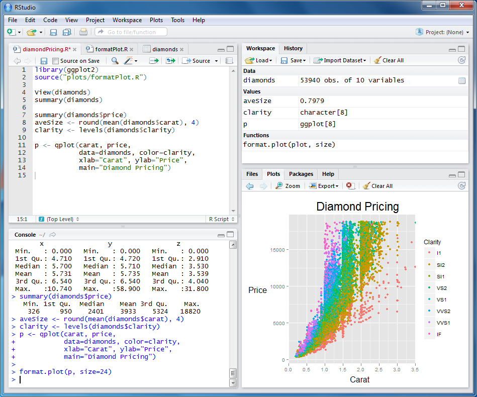
Problem = Nicely formatted barplot with minimum code
## Run this in your console
library(ggplot2)
ggplot(diamonds, aes(clarity, fill=cut)) + geom_bar()
Problem = Visualizing a bivariate relationship filtered by two variables
## Run this in your console
library(ggplot2)
qplot(wt, mpg, data=mtcars, size=qsec, color=factor(carb))
Problem = Visualizing a bivariate relationship by a categorical variable
## Run this in your console
library(ggplot2)
qplot(mpg, wt, data = mtcars, facets = cyl ~ ., geom = c("point", "smooth")) +
coord_flip()
Problem = Combine existing graphs in a nice format
## Do not run this. It's incomplete code.
multiplot(p1, p2, p3, p4, cols = 2)
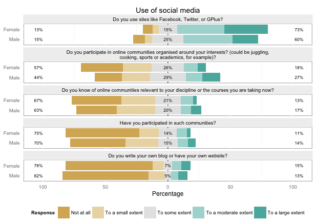
Problem = Visualize Likert type questions quickly

Problem = Visualizing statistical techniques
Problem = Plotting distributions next to scatterplots
Problem = Making graphical summaries
Problem = Exploring your data visually in a fast way
## Run this in your console
library(openintro)
edaPlot(mtcars)
Problem = Getting QUALITY visualizations with almost no work.
Let's go to the console to get to know ggvis
Advantages of ggvis over other graph packages:
HTML and Javascript graphics are the ones actually doing the work behind ggvis.
For more graphs, go here
Let's play around!
## Run this in your console
library(ggvis)
span <- waggle(0.2,1)
span <- left_right(0.2,1,step = 0.1)
mtcars %>%
ggvis(~mpg, ~disp) %>%
layer_lines() %>%
layer_smooths(span=span)
Problem = Getting QUALITY visualizations exportable to websites
## Run this in your console
library(plotly)
set.seed(100)
d <- diamonds[sample(nrow(diamonds), 1000), ]
plot_ly(d, x = carat, y = price, text = paste("Clarity: ", clarity),
mode = "markers", color = carat, size = carat)
For more, check out plotly

Crime density in Baltimore

Problem = Showing relationships between data points

You can get summary statistics in text or in html format
## Run this in your console
library(stargazer)
stargazer(mtcars[c("mpg","hp","drat")], type = "text",
title="Descriptive statistics/selected variables", digits=1, out="table2.txt", flip=TRUE,
covariate.labels=c("Miles/(US)gallon","Gross horsepower","Rear axle ratio"))
## Run this in your console
library(stargazer)
mtcars$fast <- as.numeric((mtcars$mpg > 20.1))
m1 <- lm(mpg ~ hp + drat + factor(gear), data=mtcars)
m2 <- glm(fast ~ hp + drat + am, family=binomial(link="logit"), data=mtcars)
stargazer(m1, m2,type="text", dep.var.labels=c("Miles/(US) gallon","Fast car (=1)"), covariate.labels=c("Gross horsepower","Rear axle ratio","Four foward gears","Five forward gears","Type of transmission (manual=1)"))
R can also produce written reports, PDFs' and Powerpoint presentations.
Checkout the fantastic Rmarkdown here and here
But of course, it's not built to write research papers, it's more for:
There's also Powerpoint presentations with slidify
With the swirl package you can program exercises and homeworks that students can do anywhere.
Try it out yourself:
## Run this in your console
library("swirl")
swirl()