Working with R and R Markdown
Israel Del Toro
January 26, 2016
Welcome to R! Here is my list of reasons why I use R:
Getting R:
Base R can be intimidating:

So instead many people use R Studio to write, edit and run code:

So back to my list of why I use R:
1) R is a language + A. Scripting can be scary at first but intuitive once you get going
M1<-lm(y~x, data=df); summary (M1)
- R packages for all sorts of analyses- a package is a library of special functions designed for a specific problem.
- Using R you can prepare reproducible examples
2) R is Free!
- Can do simple tasks like use R as a calculator
1+1
- Can do simple tasks like use R as a calculator
- Tools for data management: Link to data wrangling cheat sheet
https://www.rstudio.com/wp-content/uploads/2015/02/data-wrangling-cheatsheet.pdf
- Tools for data management: Link to data wrangling cheat sheet
- Tools for complex spatial modeling “Building SDMs”

- Tools for complex spatial modeling “Building SDMs”
3) R has a community of support
- Packages are typically written by accessible users who reply to emails
- Stack Overflow http://stackoverflow.com/
- Inside R Community http://www.inside-r.org/
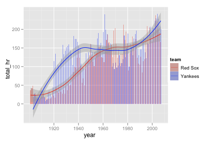
4) R graphics
- Packages like “ggplot2” allow for detailed and high quality graphics

- Packages like “ggplot2” allow for detailed and high quality graphics
- R Graphics Cookbook for ggplot2 http://stat405.had.co.nz/drills/ggplot2/hrbars8.png
5) R as GIS
- Many packages out there are designed to handle geographic data
- Packages like raster: allow you to make interesting basic maps and analyze raster data
- an example from ggmap package

- an example from ggmap package
- an example from gmap

- an example from gmap
What is R Markdown?
Markdown allows you to create clean AND reproducible code and analysis outputs embedded into written documents and shared in various formats (pdf, html, word)
You can integrate code in “Code Chunks”
You can integrate figures
You can also annotate your code and your analyses to share your results
more at: http://rmarkdown.rstudio.com/
We can find some examples of the types of RMarkdown Documents here: http://rpubs.com/
Getting R Markdown
Required Packages
install.packages("rmarkdown") install.packages ("knitr")
Note that if you plan on exporting files as .pdf you will also need a LaTeX editor. I used MacTeX found here: https://tug.org/mactex/mactex-download.html
once installed you can:
1) Start a new Markdown document in RStudio by: + File>New File>R Markdown 
- Enter your document tilte, author and choose an output format

Then simply edit your document and code using the RMarkdown formatting requirements:
Here are two key resources that will help you create your documents: The Markdown CheatSheet: https://www.rstudio.com/wp-content/uploads/2015/02/rmarkdown-cheatsheet.pdf 
The RMarkdown Reference Guide: http://www.rstudio.com/wp-content/uploads/2015/03/rmarkdown-reference.pdf
Both of these files have been uploaded to our Basecamp account.
Now lets try an example of what an annotated script might looks like:
How does rainfall correlate with the richness of ants in the genus Pheidole?

I like to start my code by setting a working directory, loading the required packages and datasets
you can download the data from a shared Dropbox folder if you are interested: https://goo.gl/wZZb2T
#sets working directory
setwd ("/Users/israel/Desktop/Teaching/R Intro/")
#load libaries
require (raster) # a GIS library to handle spatial raster data ## Loading required package: raster## Loading required package: sprequire (ggplot2) # a graphics package to produce neat plots ## Loading required package: ggplot2#read in datasets
sites<-read.csv ("Aussie_sites.csv", header=T)
xy<-sites[,c(2,3)] #pull out only the x and y coordinates of the sites
ants<- read.csv ("Pheidole.csv", header=T)
bioclim = getData('worldclim', var='bio', res=10, lon=5, lat=45) #downloads climate raster data from worldclim.org
rainfall<- bioclim$bio12 #pull out only the rainfall data from the bioclim object
#take a quick look at the data and its structure
head (sites) # displays the first six rows of data ## Site lon lat
## 1 Hughes 131.0869 -12.70154
## 2 Ringwood 131.1063 -13.08040
## 3 Bridge Creek 131.3134 -13.43723
## 4 North Pine Creek1 131.6766 -13.65729
## 5 South Pine Creek 131.9294 -14.00215
## 6 South Edith 132.1676 -14.37818str (sites) #gives us information about the structure of the data## 'data.frame': 15 obs. of 3 variables:
## $ Site: Factor w/ 15 levels "Bridge Creek",..: 3 11 1 10 14 13 4 2 15 6 ...
## $ lon : num 131 131 131 132 132 ...
## $ lat : num -12.7 -13.1 -13.4 -13.7 -14 ...Lets first build a map to look at the range of rainfall.
# we can zoom into our study region by creating an extent object
?extent
NT<-extent (128, 138, -20, -10)
#crop the raster to extent
rainfall.NT<-crop (rainfall, NT)
#plot the base layer
plot (rainfall.NT)
# add the sites based on lonitude and latitude coordinates
points (sites$lon, sites$lat, pch=16, col="red", cex=.5) 
You can also add text to plots, change color schemes, add polygon objects and add map insets to make it look something like this: 
We can extract values to data from raster maps:
rain.data<-extract (rainfall.NT, xy)
#now simply bind your ants data with the rainfall and locality data
ants.w.data<-cbind (xy, rain.data, ants) Lets plot the data of ant species richness predicted by Rainfall
ggplot(ants.w.data, aes(x=rain.data, y=Richness)) +
geom_point(shape=1) + # Use hollow circles
geom_smooth(method=lm) # Add linear regression line
How much of the variance is explained by both of the regression models?
lm1<- lm (Richness ~ rain.data, data=ants.w.data)
summary (lm1)##
## Call:
## lm(formula = Richness ~ rain.data, data = ants.w.data)
##
## Residuals:
## Min 1Q Median 3Q Max
## -2.2344 -0.6698 0.1426 0.8946 1.4456
##
## Coefficients:
## Estimate Std. Error t value Pr(>|t|)
## (Intercept) 0.1486586 0.9760332 0.152 0.88128
## rain.data 0.0034828 0.0009956 3.498 0.00393 **
## ---
## Signif. codes: 0 '***' 0.001 '**' 0.01 '*' 0.05 '.' 0.1 ' ' 1
##
## Residual standard error: 1.154 on 13 degrees of freedom
## Multiple R-squared: 0.4849, Adjusted R-squared: 0.4453
## F-statistic: 12.24 on 1 and 13 DF, p-value: 0.003928