Geospatial
Visualization
In R
A visual introduction to geospatial visualization, spatial data types, R packages and an example workflow using Düsseldorf OSM data.

A visual introduction to geospatial visualization, spatial data types, R packages and an example workflow using Düsseldorf OSM data.
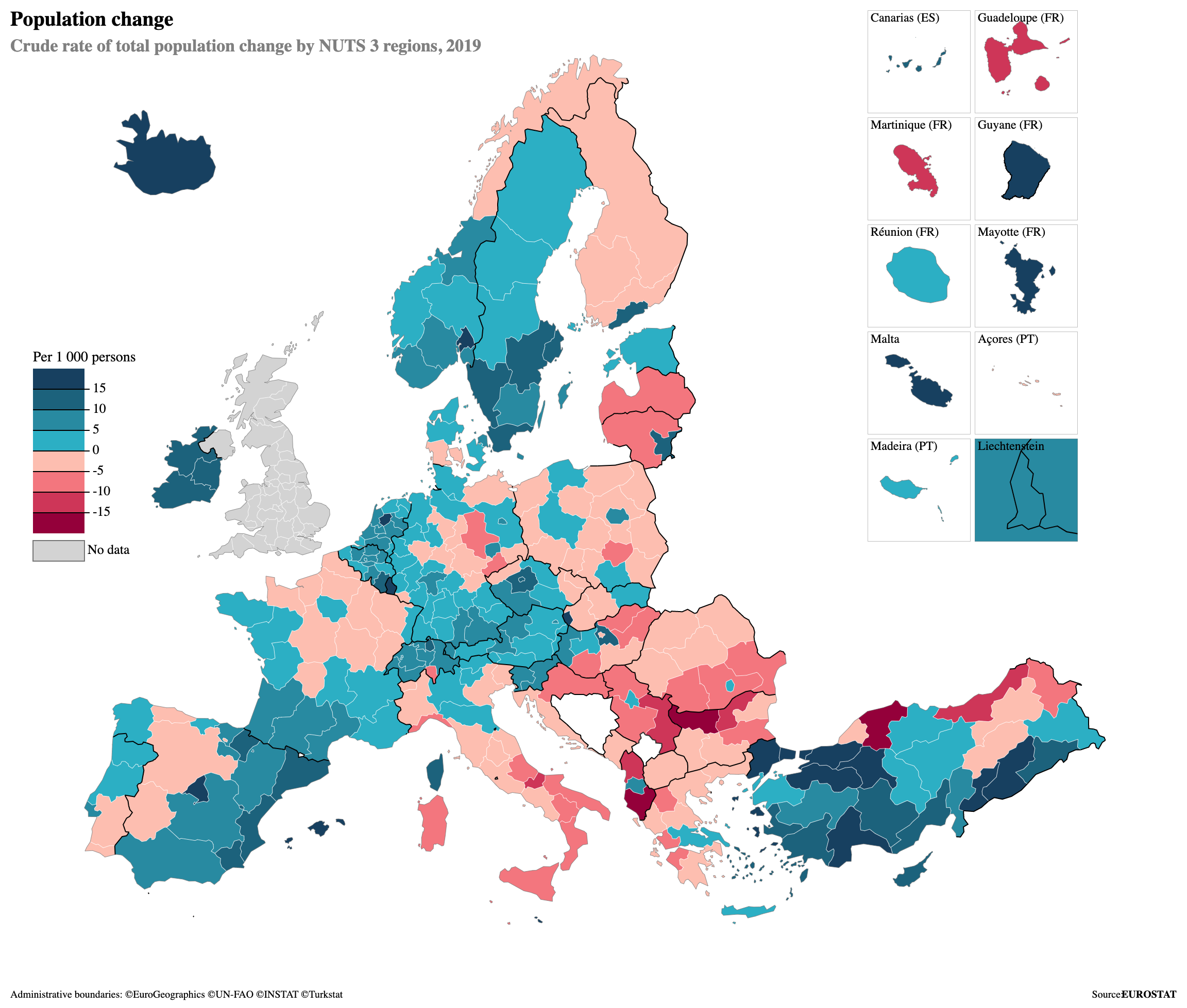
Geospatial visualization transforms location-based data into maps, patterns and visual stories. Different map types help explain spatial relationships in planning, accessibility analysis and decision-making.
Heatmaps and choropleths are common examples of geospatial visualization.


Spatial visualization supports urban planning and location-based business analysis.


R combines spatial data handling, statistical analysis and visual storytelling in one reproducible workflow.
| Feature | R | QGIS | ArcGIS |
|---|---|---|---|
| Free | ✓ | ✓ | Limited |
| Reproducible | ✓ | Limited | Limited |
| Automation | ✓ | Limited | ✓ |
This workflow uses OpenStreetMap data provided through Geofabrik. The Düsseldorf extract includes roads, land use, water, buildings and other spatial layers.
Spatial data describes position, size and form in any space. Geospatial data is a specific type of spatial data connected to real-world locations on Earth.
Spatial data can describe any coordinate-based environment. Geospatial data is earth-referenced and usually uses coordinates, maps and geographic layers.
| Feature | Spatial | Geospatial |
|---|---|---|
| Real World Location | Optional | Required |
| Coordinates | Optional | Required |
| Examples | CAD, games, 3D models | GPS, OSM, satellite data |
Vector data represents features such as roads, buildings and boundaries. Raster data represents space as grid cells or pixels. Geospatial analysis can combine both data types in the same workflow.

Single coordinate features such as POIs, bus stops or GPS points.

Linear features such as roads, railways, rivers and routes.

Closed shapes such as city boundaries, parks, land use and buildings.
Pixel-based data such as satellite images, elevation and heatmaps.

Reading, cleaning and processing vector spatial data.
Creating clean static maps and visualizations.
Building interactive web maps.
Alternative thematic mapping workflow.
Read shapefiles with st_read().
Check geometries, missing values and spatial validity.
Use a consistent coordinate reference system for all layers.
Build layered maps with ggplot2, leaflet or tmap.
This presentation website transforms a step-by-step R geospatial workflow into a visual data story. Each map adds one analytical layer to understand the urban structure of Düsseldorf.
The analysis focuses on Düsseldorf as the spatial frame.
Land use, water, roads and residential areas are used.
The maps are produced through a reproducible R workflow.
The final result is a visual sequence of spatial layers.
This example is connected to a future research proposal on the relationship between housing prices and accessibility to recreational areas in Düsseldorf. The maps shown here form the first technical foundation for that research idea.
Green areas, residential zones and road networks can be transformed into spatial indicators. These indicators can later support research on urban quality, accessibility and housing prices.
The workflow starts with green areas and residential locations. Accessibility can then be measured through distance-based spatial analysis. In a later research project, this accessibility indicator can be compared with housing prices to explore whether proximity to recreational areas is related to property values in Düsseldorf.
The maps are ordered as a visual build-up: first the boundary, then green areas, residential areas, water bodies, road network and accessibility to green spaces.
The first map introduces Düsseldorf as the geographic boundary of the analysis.


Parks, forests, grass areas and recreation grounds are added to the city boundary.
Residential areas are added to compare built-up urban zones with green spaces.


The Rhein River and water bodies are included as major spatial elements of Düsseldorf.
The road layer reveals the mobility skeleton and connects residential and green areas.


Residential points are compared by their distance to green areas.
Distance values are grouped into categories to make accessibility patterns easier to read.

The visual sequence shows how different spatial layers gradually reveal the structure of the city.
Green areas are widely distributed, but their intensity changes across the city.
Residential areas and roads create a denser structure around central districts.
Distance to green areas can be visualized as a simple spatial accessibility indicator.
The static maps explain the analytical process. The interactive Leaflet map can be used as an additional exploration layer.
Open Interactive MapIn the classroom activity, we will open RStudio together and reproduce a simple geospatial visualization step. The aim is to show how spatial data can be imported, visualized and interpreted directly in R.
GIS Theory
Longley et al. (2021)
Geocomputation with R
Lovelace et al. (2024)
Applied R Workflows
Huber (2025)
OpenStreetMap contributors and Geofabrik Düsseldorf extract.
sf, ggplot2, leaflet and tmap documentation.
External map examples from Alamy, ResearchGate, R Charts, MDPI, Springer Nature and Ordnance Survey.
Geospatial data can be transformed into meaningful insights through reproducible R workflows and clear visual storytelling.