Part I
2025-11-24
From Manual to Digital: Started with paper charts; now uses software for real-time monitoring (e.g., Minitab, JMP).
Integration with Quality Systems: Became core to ISO 9001, Six Sigma, Lean Manufacturing.
Advanced Techniques: Beyond Shewhart charts, includes CUSUM and EWMA for small shifts.
Industry Adoption: Widely used in manufacturing, healthcare, services; expanded to non-manufacturing processes.
Current Trends: AI-driven SPC, predictive maintenance, cloud-based analytics for global teams.
Variable Charts: For continuous data.
X-bar & R: Average and range.
X-bar & S: Average and std dev.
Individuals & Moving Range: For single measurements.
Attribute Charts: For discrete data.
p-chart: Proportion defective.
np-chart: Number defective.
c-chart: Count of defects.
u-chart: Defects per unit.
Other: EWMA, CUSUM for small shifts.
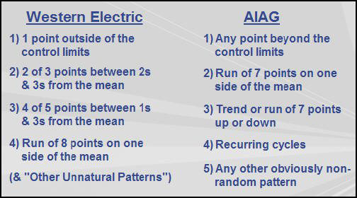
Western Electric Rules (basic set):
1 point beyond 3σ limits.
2 out of 3 points beyond 2σ.
4 out of 5 points beyond 1σ.
8 consecutive points on one side of center.
Nelson Rules (expanded, 8 rules): Includes trends, runs, etc.
Use to detect non-random patterns indicating special causes.
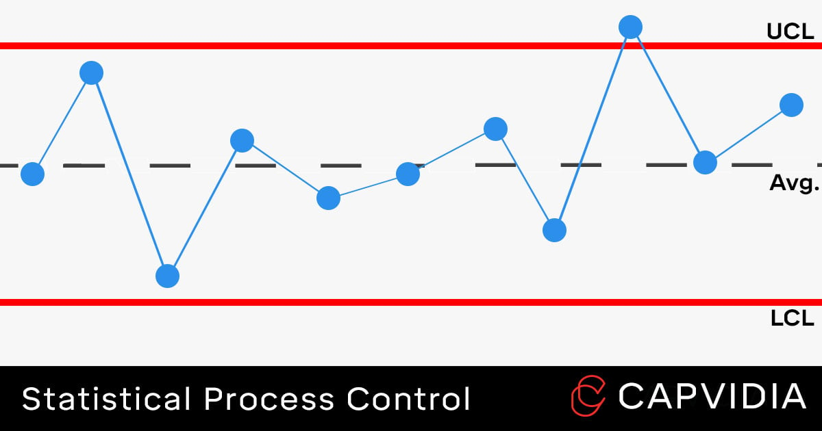
Points Beyond Limits: Sudden shift in process mean (e.g., tool breakage, material change).
Runs/Trending: Gradual shift (e.g., tool wear, temperature drift).
Too Many Near Center: Overcontrol or data manipulation.
Cycles: Periodic factors (e.g., operator shifts, machine cycles).
Stratification: Mixed processes or incorrect subgrouping.
Investigate root causes using 5 Whys or fishbone diagram.
Assumes Normality: Sensitive to non-normal data; may give false signals.
Detects Large Shifts Well: Poor for small shifts (<1.5σ).
Autocorrelation: Assumes independent data; fails with correlated processes.
Short Runs: Needs 20-30 points for reliable limits; not ideal for low-volume.
Over-Reliance on Rules: Too many rules increase false alarms (Type I error).
Alternatives Needed: For small shifts or non-normal, use CUSUM/EWMA.
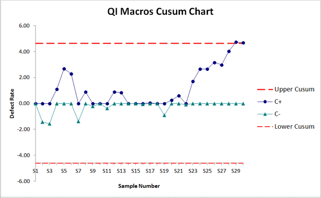
CUSUM (Cumulative Sum): Accumulates deviations from target; sensitive to small, sustained shifts.
Formula: C_i^+ = max(0, x_i - (μ_0 + K) + C_{i-1}^+)
Good for detecting shifts of 0.5-1σ.
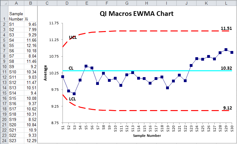
EWMA (Exponentially Weighted Moving Average): Weights recent data more; λ (0.05-0.3) controls sensitivity.
Formula: z_i = λ x_i + (1-λ) z_{i-1}
Better for non-normal data and small shifts.
Use when Shewhart fails to detect subtle changes.
Explore a simple X-bar control chart with adjustable parameters.
#| '!! shinylive warning !!': |
#| shinylive does not work in self-contained HTML documents.
#| Please set `embed-resources: false` in your metadata.
#| standalone: true
#| viewerHeight: 800
library(shiny)
library(qcc)
ui <- fluidPage(
titlePanel("Interactive SPC Control Chart"),
sidebarLayout(
sidebarPanel(
selectInput("chart_type", "Chart Type:", choices = c("X-bar", "cusum")),
sliderInput("n", "Sample Size (n):", min = 2, max = 10, value = 5),
sliderInput("mean", "Process Mean:", min = 0, max = 100, value = 50),
sliderInput("sd", "Process SD:", min = 1, max = 10, value = 5),
sliderInput("samples", "Number of Subgroups:", min = 10, max = 50, value = 20),
numericInput("usl", "Upper Spec Limit (USL):", value = 60),
numericInput("lsl", "Lower Spec Limit (LSL):", value = 40),
actionButton("generate", "Generate Data")
),
mainPanel(
plotOutput("controlChart",height="350px"),
plotOutput("capabilityChart",height="350px"),
verbatimTextOutput("violations")
)
)
)
server <- function(input, output, session) {
data <- reactiveVal()
observeEvent(input$generate, {
set.seed(NULL) # optional: remove if you want reproducibility
base_data <- matrix(rnorm(input$samples * input$n, input$mean, input$sd),
nrow = input$samples)
shift_start <- round(input$samples * 1/5)
base_data[shift_start:input$samples, ] <- base_data[shift_start:input$samples, ] + 0.5 * input$sd
# Add an obvious outlier in the last subgroup
base_data[input$samples, 1] <- base_data[input$samples, 1] + 3 * input$sd
data(base_data)
})
# Reactive qcc object for X-bar (shared when possible)
qcc_xbar <- reactive({
req(data())
qcc(data(), type = "xbar", plot = FALSE)
})
output$controlChart <- renderPlot({
req(data())
if (input$chart_type == "X-bar") {
q <- qcc(data(), type = "xbar")
plot(q, title = "X-bar Chart (with Western Electric rules)")
} else if (input$chart_type == "cusum") {
q <- cusum(data(), decision.interval = 5, se.shift = 1)
plot(q, title = "CUSUM Chart")
}
})
output$violations <- renderPrint({
req(data())
if (input$chart_type == "X-bar") {
q <- qcc(data(), type = "xbar", plot = FALSE)
cat("Western Electric / Nelson Rules Violations:\n")
print(shewhart.rules(q))
} else if (input$chart_type == "cusum") {
q <- cusum(data(), decision.interval = 5, se.shift = 1, plot = FALSE)
cat("CUSUM Violations (points beyond decision interval):\n")
print(q$violations)
}
})
output$capabilityChart <- renderPlot({
req(data())
# Correct way: assign q first, then use it
q <- qcc(data(), type = "xbar", nsigmas = 3, plot = FALSE)
process.capability(q, spec.limits = c(input$lsl, input$usl))
})
}
shinyApp(ui, server)Start Simple: Begin with basic charts (p chart or X-bar/R) on one process.
Hands-On Training: Use simulations or real data exercises.
Interpret Correctly: Focus on patterns, not just points out of limits.
Act on Signals: Investigate special causes promptly; document actions.
Avoid Tampering: Don’t adjust stable processes (increases variation).
Regular Reviews: Update limits as process improves.
Software Tools: Learn Minitab, Excel add-ins, or R/Python for charts.
Common Pitfalls: Confusing control/spec limits, ignoring autocorrelation.
Books: “Introduction to Statistical Quality Control” by Douglas Montgomery.
Online Courses: ASQ SPC Certification, AIAG SPC Certification
Software: Minitab, JMP, SPC for Excel, R (qcc package), Python (scipy, statsmodels).
Standards: ISO 7870 (Control Charts), AIAG Manuals for automotive.
Websites: ASQ.org, SixSigmaStudyGuide.com, SPCforexcel.com.
Confidential • Quality Department 2025