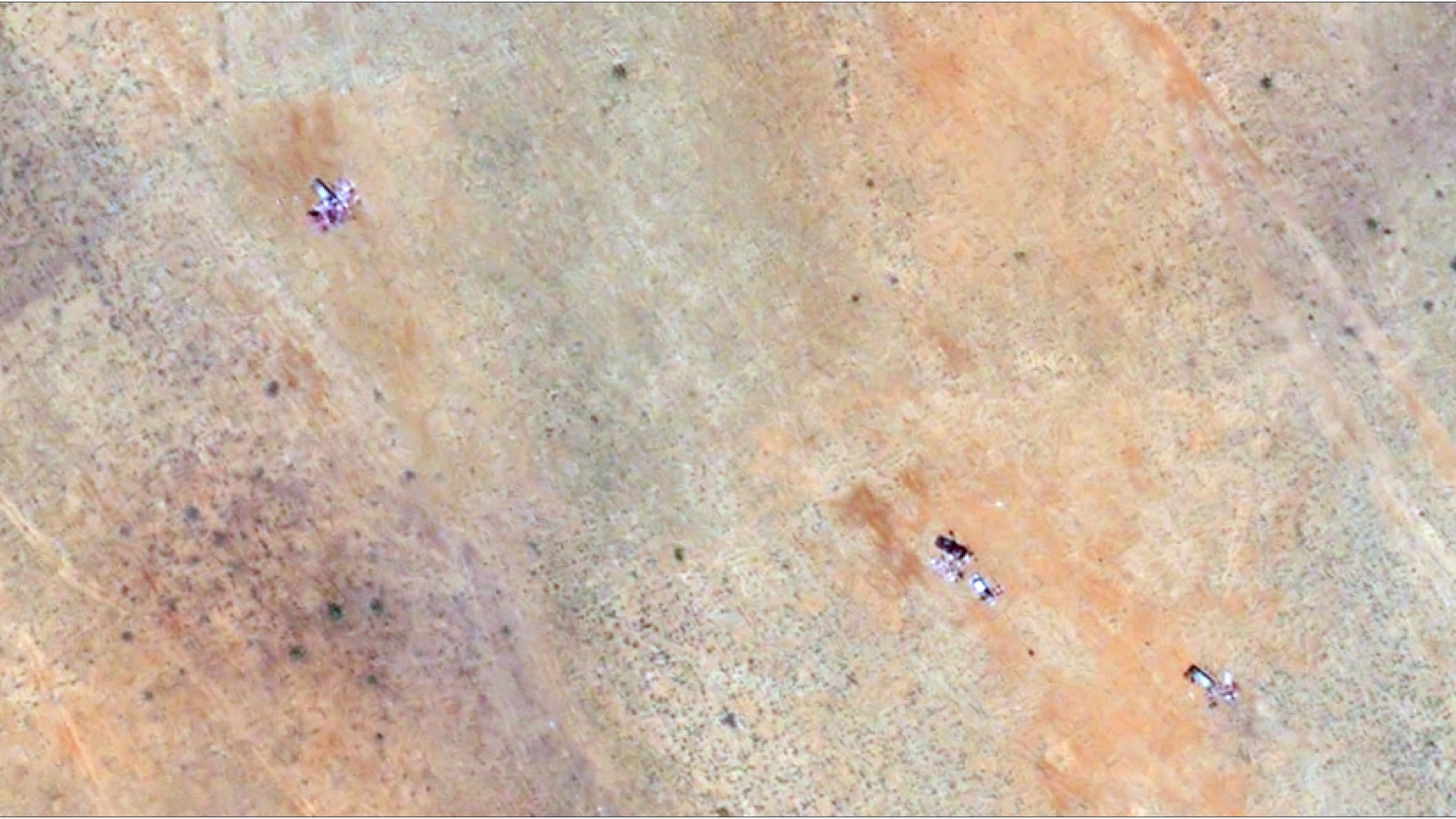
The Humanitarian Research Lab (HRL) at the Yale School of Public Health observed numerous clusters with discoloration around them, consistent with the appearance of human bodies in the Darfur region of Sudan. Humanitarian Research Lab at the Yale School of Public Health
I chose this dataset after seeing satalite images of sudan where the sand was stained red outside of people’s homes. I had no idea that there was a war in Sudan, let alone almost daily massacres. I have seen almost no major news reports on it and even while researching, it was really only covered by smaller companies or very small subsections of larger news stations. So many people have died that we can see their blood from space. While my visualization is just an assignment, I want to get more experience working with similar datasets so I can hopefully work on humanitarian projects in the future.
A big pattern that arises is that civillian deaths increased almost exponentially since 2023, the start of the civil war. I wish I included more images in my final dataset. I could not get the images in rstudio to work and the images that did work are weirdly formatted. I wish I could have included more datapoints with an animation of the amount of events every day from the 90s to the present day, but my computer lags out even with the filtered dataset, so I know I wouldn’t be able to include any more datapoints. I also wish I could have used more colors but my computer kept crashing and lagging with any additions to the first plot.
I used Yale and ABC News,for my information and a project on rpubs to help me with image formatting.
Rows: 884519 Columns: 12
── Column specification ────────────────────────────────────────────────────────
Delimiter: ","
chr (4): admin1_name, admin2_name, event_type, Loc_En
dbl (8): admin_level, events, fatalities, year_start, FID, Total_Pop, Lat, Lon
ℹ Use `spec()` to retrieve the full column specification for this data.
ℹ Specify the column types or set `show_col_types = FALSE` to quiet this message.
ggplot(sudan4, aes(x = year_start, y= fatalities, bins =10))+geom_smooth(se =FALSE)+geom_vline(xintercept =2023)+geom_text(aes(x=2021.5,y=3, label ="Start of Civil War"))+scale_x_continuous(breaks =seq(from =2015, to =2025, by =1))+labs(x="Year", y ="Total Deaths", title ="Civillian Murders by Year")+#scale_color_manual(values = c(year_start > "pink"))+theme_minimal()
Warning in geom_text(aes(x = 2021.5, y = 3, label = "Start of Civil War")): All aesthetics have length 1, but the data has 884519 rows.
ℹ Please consider using `annotate()` or provide this layer with data containing
a single row.
`geom_smooth()` using method = 'gam' and formula = 'y ~ s(x, bs = "cs")'
sudan5<- sudan4|>filter(year_start >=2023) |>filter(fatalities >0) |>select(-FID)#The original dataset had too many observations and lagged out my computer so I limited it to events during the civil war. I did some more cleaning in Excel, like capitalizing certain characters because I didn't know how to do it in Rstudio.
popup1 <-paste0("<b>Location: </b>", sudan5$Loc_En, "<br>","<strong>Population: </strong>", sudan5$Total_Pop, "<br>","<b>Deaths: </b>", sudan5$fatalities, "<br>","<b>Type of Conflict: </b>", sudan5$event_type, "<br>","<strong># of Conflicts in the Year: </strong>", sudan5$events, "<br>")
image1 <-paste(sep ="<br/>",paste0("<img src='https://i.abcnewsfe.com/a/627292bb-8b4c-4dba-967f-69b92b42f9e3/sudan-satellite-04-ht-jt-251030_1761861217892_hpEmbed_16x9.jpg?", "' />"))image2 <-paste(sep ="<br/>",paste0("<img src=https://i.abcnewsfe.com/a/a2354031-0be8-468b-ba7e-2e64a37344a1/sudan-satellite-hospital-ht-jt-251030_1761861306949_hpEmbed_7x4.jpg?w=21l=1", "' />"))#This is a special popup for images I found on ABC News, the photos were taken from Yale's HRP database.