The Environmental Notes
A Blog About Sustainability and Eco-Friendly Updates
Jackelyn Castro Canales
2024-12-10
Supporting File 2: Blog
Driving Towards a New Sustainable Future: Exploring the Rising Electric Vehicle Trends in Washington
Electric Vehicles are now considered the future of transportation. As the impact of climate change and the shift towards reducing carbon emissions, electric vehicles are seen as a green alternative to gas-powered vehicles. As policies are created to eliminate climate-related emissions from transportation, the federal government has set a goal to make half of all new vehicles sold in the U.S. in 2030, as vehicles with zero emissions.
Additionally, Washington is one of the 17 states that has adopted California’s vehicle emissions standards and its goal to limit greenhouse gas emissions. By law, Washington is required to reduce state emissions by 45% by 2030. In contrast, zero-emissions vehicle standards of manufacturer sales of passenger cars, light-duty trucks, and medium-duty vehicles for sale or lease in Washington will be zero-emission vehicles starting in 2025.
This information is found on data compromised in Washington. The objective of this research is to determine if there are any trends in the growth of electric vehicle ownership in the state. It also considers any social and economic factors that may influence the outcomes of the datasets.
By analyzing the distribution and growth of zero-emission vehicles, what patterns or drivers can be identified in a specific state that may align with the state’s goal of achieving a zero-emission transportation future by 2030?
[remember to cite picture]

# BASE CODE:
library(dplyr)##
## Attaching package: 'dplyr'## The following objects are masked from 'package:stats':
##
## filter, lag## The following objects are masked from 'package:base':
##
## intersect, setdiff, setequal, unionlibrary(ggplot2)
# DATSET 1 -- Electric Vehicle Population Data
#EVP <- read.csv("EVP.csv") # DO NOT DELETE
EVP <- read.csv("/Users/jackelyncastrocanales/Downloads/EVP.csv")
# RENAMING COLUMNS
colnames(EVP)[colnames(EVP) == "Clean.Alternative.Fuel.Vehicle..CAFV..Eligibility"] <- "CAFV"
colnames(EVP)[colnames(EVP) == "VIN..1.10."] <- "VIN"
colnames(EVP)[colnames(EVP) == "X2020.Census.Tract"] <- "Census.Tract"
# DATASET 2 -- Electric Vehicle Population Size History by County
# EVP_COUNTY <- read.csv("EVP_COUNTY.csv") # DO NOT DELETE
EVP_COUNTY <- read.csv("/Users/jackelyncastrocanales/Downloads/EVP_COUNTY.csv")
EVP_COUNTY <- EVP_COUNTY %>%
filter(State == "WA")
# RENAMING COLUMNS
colnames(EVP_COUNTY)[colnames(EVP_COUNTY) == "Battery.Electric.Vehicles..BEVs."] <- "BEVs"
colnames(EVP_COUNTY)[colnames(EVP_COUNTY) == "Electric.Vehicle..EV..Total"] <- "EV.Total"
colnames(EVP_COUNTY)[colnames(EVP_COUNTY) == "Plug.In.Hybrid.Electric.Vehicles..PHEVs."] <- "PHEVs"
colnames(EVP_COUNTY)[colnames(EVP_COUNTY) == "Non.Electric.Vehicle.Total"] <- "non.EV.total"
colnames(EVP_COUNTY)[colnames(EVP_COUNTY) == "Percent.Electric.Vehicles"] <- "percent.EV"
date1 <- as.Date(EVP_COUNTY$Date, format = "%B %d %Y")
# WA_MEDIAN <- read.csv("WA_MEDIAN.csv") # DO NOT DELETE
WA_MEDIAN <- read.csv("/Users/jackelyncastrocanales/Downloads/WA_MEDIAN.csv")
colnames(WA_MEDIAN)[colnames(WA_MEDIAN) == "WA.Counties"] <- "County"
colnames(WA_MEDIAN)[colnames(WA_MEDIAN) == "Value..Dollars."] <- "Median.Income"
colnames(WA_MEDIAN)[colnames(WA_MEDIAN) == "Rank.Within.US..of.3142.counties."] <- "Rank"
# How do I convert my Median.Income into numeric values?
# REMOVES COMMAS
WA_MEDIAN$Median.Income <- gsub(",", "", WA_MEDIAN$Median.Income)
# CONVERTS TO NUMERIC VARIABLE
WA_MEDIAN$Median.Income <- as.numeric(WA_MEDIAN$Median.Income)The First Step: Exploring the Economy in Washington
One of the most important things that is considered when transitioning to a net-zero emitting transportation sector is to look at the economy. THIS MATTERS because electric vehicles are a new technology and they cost money! Counties with higher median incomes have advantages of financial resources to pursue a more sustainable transportation future. However, basic economics show that lower income areas face more barriers with shifting towards electric vehicles.
It’s always important to look at the context of income, in this case median income becomes a source of the counties economic status. This as well, has indicators of wealth from historical factors, such as the effects of redlining, where counties currently face these disparities in resources. This is true, especially with access to sustainable technologies such as electric vehicles.
The data below demonstrates the economic landscape of median income data from Washington counties. This include the top and bottom 10 counties in Washington.
# LIBRARIES
library(shiny)
library(ggplot2)
library(dplyr)
# DATASET
WA_MEDIAN <- read.csv("/Users/jackelyncastrocanales/Downloads/WA_MEDIAN.csv")
# RENAME COLUMNS
colnames(WA_MEDIAN)[colnames(WA_MEDIAN) == "WA.Counties"] <- "County"
colnames(WA_MEDIAN)[colnames(WA_MEDIAN) == "Value..Dollars."] <- "Median.Income"
colnames(WA_MEDIAN)[colnames(WA_MEDIAN) == "Rank.Within.US..of.3142.counties."] <- "Rank"
# Asked ChatGPT: the slider too, its like blue but i want to change it to a black color:
# CHANGES SLIDER COLOR
ui <- fluidPage(
tags$style(HTML("
/* Slider handle (thumb) */
.irs-slider {
background: black !important;
border: 2px solid black !important;
}
/* Slider track (bar) */
.irs-bar, .irs-bar-edge {
background: black !important;
border-color: black !important;
}
/* Slider line */
.irs-line {
background: black !important;
}
/* Grid points (if shown) */
.irs-grid-pol {
background: black !important;
}
/* Numbers (if visible on the slider) */
.irs-grid-text {
color: black !important;
}
")),
titlePanel("Median Income by County in Washington"),
tabsetPanel(
tabPanel(
"Bottom Counties",
fluidRow(
mainPanel(
plotOutput(outputId = "incomePlotBottom"),
sliderInput(
inputId = "num_counties_Bottom",
label = "Number of Bottom Counties to Display:",
min = 1,
max = 10,
value = 10
)
)
)
),
tabPanel(
"Top Counties",
fluidRow(
mainPanel(
plotOutput(outputId = "incomePlotTop"),
sliderInput(
inputId = "num_counties_Top",
label = "Number of Top Counties to Display:",
min = 1,
max = 10,
value = 10
)
)
)
)
)
)
# SERVER
server <- function(input, output) {
# BOTTOM COUNTIES PLOT
output$incomePlotBottom <- renderPlot({
# FILTER AND ARRANGES DATA FOR BOTTOM COUNTIES
filtered_data <- WA_MEDIAN %>%
arrange(desc(Median.Income)) %>%
slice(1:input$num_counties_Bottom) %>%
mutate(County = factor(County, levels = County))
# Plot
ggplot(filtered_data, aes(x = County, y = Median.Income)) +
geom_bar(stat = "identity", fill = "darkred") +
coord_flip() +
labs(
title = paste("Bottom", input$num_counties_Bottom, "Counties by Median Income"),
x = "County",
y = "Median Income (USD)"
) +
theme_minimal() +
theme(
axis.line = element_blank(),
#axis.ticks = element_blank(),
#axis.text = element_blank(),
panel.grid.major = element_blank(),
panel.grid.minor = element_blank()
)
})
# TOP COUNTIES PLOT
output$incomePlotTop <- renderPlot({
# FILTERS AND ARRANGES DATA FOR TOP COUNTIES
filtered_data <- WA_MEDIAN %>%
arrange(Median.Income) %>%
slice(1:input$num_counties_Top) %>%
mutate(County = factor(County, levels = County))
# PLOT
ggplot(filtered_data, aes(x = County, y = Median.Income)) +
geom_bar(stat = "identity", fill = "steelblue") +
coord_flip() +
labs(
title = paste("Top", input$num_counties_Top, "Counties by Median Income"),
x = "County",
y = "Median Income (USD)"
) +
theme_minimal() +
theme(
axis.line = element_blank(),
#axis.ticks = element_blank(),
#axis.text = element_blank(),
panel.grid.major = element_blank(),
panel.grid.minor = element_blank()
)
})
}
shinyApp(ui = ui, server = server)Let’s Measure Current Electric Vehicle Trends
As there is a global shift towards a sustainable future, more related towards a net-zero emission towards the transportation sector, understanding current trends in EV ownership can give insights into consumer behavior when analyzing for vehicles to purchase. One way to look at these trends are through looking at the popularity of specific EV models in the current market. Washington is great example of a state looking to change their car preferences among gas vehicles to electric vehicles.
In exploring this, we checked out data that showed the 10 most popular EV models in Washington. This visualization highlights two things, the dominance of EV models and the manufacturers who dominate the EV market.
library(ggplot2)
library(plotly)##
## Attaching package: 'plotly'## The following object is masked from 'package:ggplot2':
##
## last_plot## The following object is masked from 'package:stats':
##
## filter## The following object is masked from 'package:graphics':
##
## layoutlibrary(dplyr)
# Filter for the top 10 most popular EV models and sort in descending order
filtered_EVP <- EVP %>%
count(Model, Make, sort = TRUE) %>% # Count occurrences of each Model-Make combination
arrange(desc(n)) %>% # Ensure descending order
slice_max(n, n = 10) # Select the top 10 models by count
# GGPLOT
p <- ggplot(filtered_EVP, aes(x = reorder(Model, -n), fill = Make)) + # Reorder models in descending order of count
geom_bar(aes(y = n, text = paste("Count: ", n)), stat = "identity") +
labs(
title = "Top 10 Most Popular EV Models",
x = "Model",
y = "Number of Vehicles",
fill = "Make"
) +
theme_minimal() +
theme(
axis.text.x = element_text(angle = 45, hjust = 1),
plot.title = element_text(face = "bold", size = 16),
panel.grid.major = element_blank(),
panel.grid.minor = element_blank()
)## Warning in geom_bar(aes(y = n, text = paste("Count: ", n)), stat = "identity"):
## Ignoring unknown aesthetics: text# GGPLOT --> PLOTLY
plotly_p <- ggplotly(p, tooltip = "text")
# SUBTITLE
plotly_p <- plotly_p %>%
layout(
title = list(
text = paste0(
"Top 10 Most Popular EV Models", # Title
"<br><sup>Color-coded by Manufacturer (Make) - Ordered by Popularity</sup>"
)
)
)
plotly_p# LARGEST VALUE : 44,038
# LOWEST LARGEST 10TH VALUE : 4,116 Some of the key findings can be quickly glanced by the graph. As noted the most popular model is Model Y, with 44,038 registrations, while the 10th highest ranked model is Wrangler with 4,116 registrations. Based on the graph, the dominant manufacturer is Tesla with holding 4 of the 10 highest ranks among most popular EV models.

https://image.cnbcfm.com/api/v1/image/107248804-1685557819267-gettyimages-1494887228-dsc_6170_tmhhfzze.jpeg?v=1717021448&w=1858&h=1045&vtcrop=y – remember to cite picture
Let’s Track Vehicle Ownership Trends Overtime
With the states goal of achieving a zero-emission transportation future by 2030, understanding how vehicle ownership has changed in the past 7 years tells us about the state’s progress to achieving this future. In comparing the trends in electric and non-electric vehicle ownership from 2017 to 2024, we can better see the pace where EV adoption has been present. As well, see the overall development of vehicles and try to analyze for any patterns.
Measuring the Growth of Electric Vehicle Ownership
EV ownership in Washington has demonstrated growth over the recent years, as it reflects the overall shift towards a sustainable transportation future. Some observations to note is that the trends of ownership has increased, this may be due to state-level efforts to promote these zero-emission vehicles. [mention grants/policies here]
# DATA VISUALIZATION 3: LINE + AREA PLOT OF ELECTRIC VEHICLE OWNERSHIP IN WASHINGTON (2017-2024)
# EVP_COUNTY <- read.csv("EVP_COUNTY.csv")
EVP_COUNTY <- read.csv("/Users/jackelyncastrocanales/Downloads/EVP_COUNTY.csv")
EVP_COUNTY <- EVP_COUNTY %>%
filter(State == "WA")
# RENAMING COLUMNS
colnames(EVP_COUNTY)[colnames(EVP_COUNTY) == "Battery.Electric.Vehicles..BEVs."] <- "BEVs"
colnames(EVP_COUNTY)[colnames(EVP_COUNTY) == "Electric.Vehicle..EV..Total"] <- "EV.Total"
colnames(EVP_COUNTY)[colnames(EVP_COUNTY) == "Plug.In.Hybrid.Electric.Vehicles..PHEVs."] <- "PHEVs"
colnames(EVP_COUNTY)[colnames(EVP_COUNTY) == "Non.Electric.Vehicle.Total"] <- "non.EV.total"
colnames(EVP_COUNTY)[colnames(EVP_COUNTY) == "Percent.Electric.Vehicles"] <- "percent.EV"
EVP_COUNTY <- EVP_COUNTY %>%
filter(State == "WA") %>%
mutate(
Date = as.Date(Date, format = "%B %d %Y"),
Year = format(Date, "%Y")
) %>%
group_by(Year) %>% # Group by year
summarise(
EV.Total = sum(EV.Total, na.rm = TRUE)
)
ggplot(EVP_COUNTY, aes(x = as.numeric(Year), y = EV.Total)) +
geom_area(fill = "lightblue", alpha = 0.5) +
geom_line(color = "steelblue", size = 1) +
geom_point(color = "steelblue", size = 2) +
labs(
title = "Electric Vehicles Over the Years",
x = "Year",
y = "Number of Electric Vehicles"
) +
theme_minimal() +
theme(
axis.text.x = element_text(angle = 45, hjust = 1),
legend.position = "none"
)## Warning: Using `size` aesthetic for lines was deprecated in ggplot2 3.4.0.
## ℹ Please use `linewidth` instead.
## This warning is displayed once every 8 hours.
## Call `lifecycle::last_lifecycle_warnings()` to see where this warning was
## generated.
Measuring the Decline of Non-Electric Vehicle Ownership
With the rise of EVs, non-electric vehicles continue to dominate in terms of numbers. The graph illustrates the number of non-electric vehicles (NEVs) registered in Washington from 2017 to 2024. An observation can be make there the total number of NEVs has declined based on it’s trend but still hold a majority of vehicles in the state.
EVP_COUNTY <- read.csv("/Users/jackelyncastrocanales/Downloads/EVP_COUNTY.csv")
#EVP_COUNTY <- read.csv("EVP_COUNTY.csv")
EVP_COUNTY <- EVP_COUNTY %>%
filter(State == "WA")
# RENAMING COLUMNS
colnames(EVP_COUNTY)[colnames(EVP_COUNTY) == "Battery.Electric.Vehicles..BEVs."] <- "BEVs"
colnames(EVP_COUNTY)[colnames(EVP_COUNTY) == "Electric.Vehicle..EV..Total"] <- "EV.Total"
colnames(EVP_COUNTY)[colnames(EVP_COUNTY) == "Plug.In.Hybrid.Electric.Vehicles..PHEVs."] <- "PHEVs"
colnames(EVP_COUNTY)[colnames(EVP_COUNTY) == "Non.Electric.Vehicle.Total"] <- "non.EV.total"
colnames(EVP_COUNTY)[colnames(EVP_COUNTY) == "Percent.Electric.Vehicles"] <- "percent.EV"
# Verify and fix the processing step
EVP_COUNTY <- EVP_COUNTY %>%
mutate(
Date = as.Date(Date, format = "%B %d %Y")
) %>%
mutate(
Year = format(Date, "%Y") # Extract the year
) %>%
group_by(Year) %>% # Group by Year
summarise(
Non_EV_Total = sum(non.EV.total, na.rm = TRUE)
) %>%
mutate(Year = as.numeric(Year))
ggplot(EVP_COUNTY, aes(x = Year, y = Non_EV_Total)) +
geom_area(fill = "lightcoral", alpha = 0.5) +
geom_line(color = "darkred", size = 1) +
geom_point(color = "darkred", size = 2) +
labs(
title = "Non-Electric Vehicles Over the Years (WA)",
x = "Year",
y = "Number of Non-Electric Vehicles"
) +
theme_minimal() +
theme(
axis.text.x = element_text(angle = 45, hjust = 1),
legend.position = "none"
) +
scale_y_continuous(labels = scales::comma)
In combining both of these data together we get a graph that comparatively tells us the number for NEVs and EVs based on the number of registrations. Together, these visualizations tells a story where a transition may be initiating, as the EVs may start to replace traditional vehicles. As well, it notes the progress of Washington’s goal to achieve a net zero transportation sector. Especially with noting the effectiveness of the strategies that are put into place for net-zero emission.
# DATA VISUALIZATION 5: COMBINED LINE GRAPH OF ELECTRIC AND NON-ELECTRIC VEHICLE OWNERSHIP IN WASHINGTON
library(ggplot2)
library(dplyr)
library(tidyr)
# Load the dataset
EVP_COUNTY <- read.csv("/Users/jackelyncastrocanales/Downloads/EVP_COUNTY.csv")
# Filter for WA and rename columns
EVP_COUNTY <- EVP_COUNTY %>%
filter(State == "WA") %>%
rename(
BEVs = Battery.Electric.Vehicles..BEVs.,
EV.Total = Electric.Vehicle..EV..Total,
PHEVs = Plug.In.Hybrid.Electric.Vehicles..PHEVs.,
non.EV.total = Non.Electric.Vehicle.Total,
percent.EV = Percent.Electric.Vehicles
) %>%
mutate(
Date = as.Date(Date, format = "%B %d %Y"), # Convert Date
Year = format(Date, "%Y") # Extract Year
)
# Summarize EV.Total and Non_EV_Total by Year
EVP_COUNTY_SUMMARIZED <- EVP_COUNTY %>%
group_by(Year) %>%
summarise(
EV.Total = sum(EV.Total, na.rm = TRUE),
Non_EV_Total = sum(non.EV.total, na.rm = TRUE)
) %>%
mutate(Year = as.numeric(Year))
# Reshape data to long format for plotting
EVP_LONG <- EVP_COUNTY_SUMMARIZED %>%
pivot_longer(cols = c(EV.Total, Non_EV_Total), names_to = "Type", values_to = "Count")
# Plot combined graph without shading
ggplot(EVP_LONG, aes(x = Year, y = Count, color = Type)) +
geom_line(size = 1) +
geom_point(size = 2) +
scale_color_manual(values = c("EV.Total" = "steelblue", "Non_EV_Total" = "darkred")) +
labs(
title = "Electric and Non-Electric Vehicles Over the Years (WA)",
x = "Year",
y = "Number of Vehicles",
color = "Vehicle Type"
) +
theme_minimal() +
theme(
axis.text.x = element_text(angle = 45, hjust = 1),
legend.position = "bottom"
) +
scale_y_continuous(labels = scales::comma)
Where are these EVs Trending? Let’s Account for the Top 10 Counties in EV Ownership
EV ownership varies from each of the states counties. In understanding this distribution, we looked at the top 10 counties based on ownership. This highlights areeas where the influence of shifting towards EVs are most prevelant.
It seems that the counties with the highest number of EVs may be contributed to areas that highly concentrated population-wise. As well, the trend lie shows the patterns of EV adoption varied by county. It seems that the value of King County is significant compared to the rest of the counties. This also accounts for other counties potential to rise in EV ownership.
# DATA VISUALIZATION 6: TOP 10 COUNTIES IN EV OWNERSHIP
# maybe try to rank it by median income and it may help with finding a relationship to it's economic context.
county.sum <- EVP %>%
count(County) %>%
rename(Number_of_EVs = n) %>%
arrange(desc(Number_of_EVs)) %>%
slice_head(n = 10)
# VERTICAL BAR CHART WITH A LINEAR TREND LINE
ggplot(county.sum, aes(x = reorder(County, -Number_of_EVs), y = Number_of_EVs)) +
geom_col(fill = "lightpink") +
# Add the values for every county
geom_text(aes(label = Number_of_EVs), vjust = -0.5, size = 3) +
scale_y_continuous(limits = c(0, 125000), breaks = seq(0, 125000, 25000)) + # Sets the scale to see all of the labels
# Add a linear trend line
geom_smooth(aes(group = 1), method = "lm", color = "red", se = FALSE, linetype = "solid", size = 1) +
# Titles
labs(
title = "Top 10 Counties by EV Ownership",
x = "County",
y = "Number of EVs",
subtitle = "Distribution of EV registrations across the Top Counties in Washington\n(additonal a linear trend line)"
) +
theme_minimal() +
# Removing the grid lines
theme(panel.grid.major.x = element_blank(),
panel.grid.minor.x = element_blank(),
axis.text.x = element_text(angle = 45, hjust = 1))## `geom_smooth()` using formula = 'y ~ x'## Warning: Removed 16 rows containing missing values or values outside the scale range
## (`geom_smooth()`).
Mapping EV Ownership Through A State Map
In visualizing the distributions of electric and non-electrics vehicles across Washington provides a view into the regional ownership patterns. Here we can identify which areas are leading upon EV ownership and are going through a faster transition to EVs. Here urban areas such as King County and Snohomish have the highest EV ownership, as noted by the last visualization.
# MAPS OF WASHINGTON: DISPLAYING A GEOGRAPHIC DISTRIBUTION AMONG EV OWNERSHIP ACROSS WASHINGTON COUNTIES
# DATA VISUALIZATION 7: CHOROPLETH MAP OF EV OWNERSHIP ACROSS WASHINGTON COUNTIES
# didn't use log transformation because it was too harsh
library(ggplot2)
library(dplyr)
library(maps)
washington_map <- map_data("county") %>%
filter(region == "washington")
county_summary <- EVP %>%
count(County) %>%
rename(Number_of_EVs = n) %>%
arrange(desc(Number_of_EVs))
county_summary <- county_summary %>%
mutate(County = tolower(County))
map.data <- washington_map %>%
left_join(county_summary, by = c("subregion" = "County"))
ggplot(map.data, aes(long, lat, group = group, fill = sqrt(Number_of_EVs))) + # square root transformation
geom_polygon(color = "white") +
# adjusted scale for square root-transformed values
scale_fill_gradient(
low = "lightblue",
high = "darkblue",
na.value = "gray90",
breaks = scales::pretty_breaks(n = 5),
labels = ~ scales::comma(.^2)
) +
labs(
title = "EV Ownership Across Washington Counties",
subtitle = "Distribution of EV registrations (Square Root Adjusted)",
#caption = "Data Source: Electric Vehicle Population Data",
fill = "Number of Electric Vehicles"
) +
coord_fixed(1.3) +
theme_minimal() +
theme(
panel.grid = element_blank(),
axis.text = element_blank(),
axis.title = element_blank(),
axis.ticks = element_blank()
)
Distribution of Non-Electric Vehicles Across Counties in Washington
In looking at this map, we are able to compare it to the last EV ownership map, where we are able to analyze where traditional vehicles dominate.
# DATA VISUALIZATION 8: CHOROPLETH MAP OF THE DISTRIBUTION OF NON-ELECTRIC VEHICLES ACROSS COUNTIES IN WASHINGTON
library(sf)## Linking to GEOS 3.11.0, GDAL 3.5.3, PROJ 9.1.0; sf_use_s2() is TRUElibrary(ggplot2)
library(dplyr)
library(tigris)## To enable caching of data, set `options(tigris_use_cache = TRUE)`
## in your R script or .Rprofile.library(scales) # For number formatting
# DATASET 2 -- Electric Vehicle Population Size History by County
# EVP_COUNTY <- read.csv("EVP_COUNTY.csv")
EVP_COUNTY <- read.csv("/Users/jackelyncastrocanales/Downloads/EVP_COUNTY.csv")
EVP_COUNTY <- EVP_COUNTY %>%
filter(State == "WA")
# RENAMING COLUMNS
colnames(EVP_COUNTY)[colnames(EVP_COUNTY) == "Battery.Electric.Vehicles..BEVs."] <- "BEVs"
colnames(EVP_COUNTY)[colnames(EVP_COUNTY) == "Electric.Vehicle..EV..Total"] <- "EV.Total"
colnames(EVP_COUNTY)[colnames(EVP_COUNTY) == "Plug.In.Hybrid.Electric.Vehicles..PHEVs."] <- "PHEVs"
colnames(EVP_COUNTY)[colnames(EVP_COUNTY) == "Non.Electric.Vehicle.Total"] <- "non.EV.total"
colnames(EVP_COUNTY)[colnames(EVP_COUNTY) == "Percent.Electric.Vehicles"] <- "percent.EV"
date1 <- as.Date(EVP_COUNTY$Date, format = "%B %d %Y")
# Load Washington county boundaries
wa_counties <- counties(state = "WA", cb = TRUE, class = "sf")## Retrieving data for the year 2022## | | | 0% | | | 1% | |= | 1% | |= | 2% | |== | 2% | |== | 3% | |== | 4% | |=== | 4% | |=== | 5% | |==== | 5% | |==== | 6% | |===== | 6% | |===== | 7% | |===== | 8% | |====== | 8% | |====== | 9% | |======= | 9% | |======= | 10% | |======= | 11% | |======== | 11% | |======== | 12% | |========= | 12% | |========= | 13% | |========== | 14% | |========== | 15% | |=========== | 15% | |=========== | 16% | |============ | 17% | |============ | 18% | |============= | 18% | |============= | 19% | |============== | 19% | |============== | 20% | |============== | 21% | |=============== | 21% | |=============== | 22% | |================ | 22% | |================ | 23% | |================ | 24% | |================= | 24% | |================= | 25% | |================== | 25% | |================== | 26% | |=================== | 26% | |=================== | 27% | |=================== | 28% | |==================== | 28% | |==================== | 29% | |===================== | 29% | |===================== | 30% | |===================== | 31% | |====================== | 31% | |====================== | 32% | |======================= | 32% | |======================= | 33% | |======================= | 34% | |======================== | 34% | |======================== | 35% | |========================= | 35% | |========================= | 36% | |========================== | 36% | |========================== | 37% | |========================== | 38% | |=========================== | 38% | |=========================== | 39% | |============================ | 39% | |============================ | 40% | |============================ | 41% | |============================= | 41% | |============================= | 42% | |============================== | 42% | |============================== | 43% | |=============================== | 44% | |=============================== | 45% | |================================ | 45% | |================================ | 46% | |================================= | 47% | |================================= | 48% | |================================== | 48% | |================================== | 49% | |=================================== | 49% | |=================================== | 50% | |=================================== | 51% | |==================================== | 51% | |==================================== | 52% | |===================================== | 52% | |===================================== | 53% | |===================================== | 54% | |====================================== | 54% | |====================================== | 55% | |======================================= | 55% | |======================================= | 56% | |======================================== | 56% | |======================================== | 57% | |======================================== | 58% | |========================================= | 58% | |========================================= | 59% | |========================================== | 59% | |========================================== | 60% | |========================================== | 61% | |=========================================== | 61% | |=========================================== | 62% | |============================================ | 62% | |============================================ | 63% | |============================================ | 64% | |============================================= | 64% | |============================================= | 65% | |============================================== | 65% | |============================================== | 66% | |=============================================== | 66% | |=============================================== | 67% | |=============================================== | 68% | |================================================ | 68% | |================================================ | 69% | |================================================= | 69% | |================================================= | 70% | |================================================= | 71% | |================================================== | 71% | |================================================== | 72% | |=================================================== | 72% | |=================================================== | 73% | |==================================================== | 74% | |==================================================== | 75% | |===================================================== | 75% | |===================================================== | 76% | |====================================================== | 77% | |====================================================== | 78% | |======================================================= | 78% | |======================================================= | 79% | |======================================================== | 79% | |======================================================== | 80% | |======================================================== | 81% | |========================================================= | 81% | |========================================================= | 82% | |========================================================== | 82% | |========================================================== | 83% | |========================================================== | 84% | |=========================================================== | 84% | |=========================================================== | 85% | |============================================================ | 85% | |============================================================ | 86% | |============================================================= | 87% | |============================================================= | 88% | |============================================================== | 88% | |============================================================== | 89% | |=============================================================== | 89% | |=============================================================== | 90% | |=============================================================== | 91% | |================================================================ | 91% | |================================================================ | 92% | |================================================================= | 92% | |================================================================= | 93% | |================================================================= | 94% | |================================================================== | 94% | |================================================================== | 95% | |=================================================================== | 95% | |=================================================================== | 96% | |==================================================================== | 97% | |==================================================================== | 98% | |===================================================================== | 98% | |===================================================================== | 99% | |======================================================================| 99% | |======================================================================| 100%# Aggregate Non-EV counts by county
non_EV_aggregated <- EVP_COUNTY %>%
group_by(County) %>%
summarise(Non_EV_Count = sum(non.EV.total, na.rm = TRUE), .groups = "drop")
# Convert county names to lowercase for merging
non_EV_aggregated <- non_EV_aggregated %>%
mutate(County = tolower(County))
wa_counties <- wa_counties %>%
mutate(NAME = tolower(NAME))
# Merge map data with aggregated Non-EV data
map_data <- wa_counties %>%
left_join(non_EV_aggregated, by = c("NAME" = "County"))
# Create the map
ggplot(map_data) +
geom_sf(aes(fill = sqrt(Non_EV_Count)), color = "black", size = 0.2) +
# square root transformation
scale_fill_viridis_c(
option = "plasma",
name = "Non-EV Count",
na.value = "gray90",
labels = scales::comma # Format numbers with commas
) +
labs(
title = "Geographic Distribution of Non-Electric Vehicles in Washington",
subtitle = "Number of Non-EVs by County",
caption = "Data Source: Electric Vehicle Population Data"
) +
theme_minimal() +
theme(
panel.grid = element_blank(),
axis.text = element_blank(),
axis.title = element_blank(),
axis.ticks = element_blank()
)
# Extra zero in legend is missing?Some insights that can be made is with high NEV concentration where rural counties and lower median incomes tend to have a higher density of non-electric vehicles among the state. As well, this graph serves as a way to the state to visualize areas to target the development towards adopting EVs. Especially the areas that need to accelaterate towards this transition.
Exploring Vehicle Characteristics: Electric Range of the Top 10 EV Models
Electric range is a critical factor when considering to purchase a EV. It influences the customers choice in evaluating EVs to purchase in the current market.
# VEHICLE CHARACTERISTICS OF ELECTRIC VEHICLES
# DATA VISUALIZAION 9: PLOTLY -- ELECTRIC RANGE OF THE TOP 10 ELECTRIC VEHICLE MODELS IN WASHINGTON
library(dplyr)
library(plotly)
# Prepare the data (same as your original ggplot2 preparation)
top_models <- EVP %>%
count(Model, sort = TRUE) %>%
slice_head(n = 10) %>%
pull(Model)
filtered_EVP <- EVP %>%
filter(Model %in% top_models)
filtered_EVP <- filtered_EVP %>%
filter(Make %in% unique(filtered_EVP$Make))
label_data <- filtered_EVP %>%
group_by(Make) %>%
slice_max(Electric.Range, n = 1)
ordered_makes <- label_data %>%
arrange(desc(Electric.Range)) %>%
distinct(Make, .keep_all = TRUE) %>%
pull(Make)
filtered_EVP <- filtered_EVP %>%
mutate(Make = factor(Make, levels = ordered_makes))
label_data <- label_data %>%
mutate(Make = factor(Make, levels = ordered_makes))
# Create the interactive plot
plot_ly(data = filtered_EVP,
x = ~Make,
y = ~Electric.Range,
color = ~Model,
type = "scatter",
mode = "markers",
marker = list(size = 10, opacity = 0.3)) %>%
add_text(data = label_data,
x = ~Make,
y = ~Electric.Range,
text = ~Electric.Range,
textposition = "top center",
showlegend = FALSE) %>%
layout(
title = list(
text = "Top 10 Electric Vehicle Models and Range by Manufacturer<br><sup>Data Collected from the State of Washington</sup>",
x = 0.5
),
xaxis = list(
title = "Make",
tickangle = 45
),
yaxis = list(
title = "Electric Range (miles)",
range = c(0, 400),
tickvals = seq(0, 400, 50)
),
legend = list(
title = list(text = "<b>Model</b>"),
orientation = "h",
xanchor = "center",
x = 0.5,
y = -0.2
)
)## Warning in RColorBrewer::brewer.pal(N, "Set2"): n too large, allowed maximum for palette Set2 is 8
## Returning the palette you asked for with that many colors
## Warning in RColorBrewer::brewer.pal(N, "Set2"): n too large, allowed maximum for palette Set2 is 8
## Returning the palette you asked for with that many colors## A marker object has been specified, but markers is not in the mode
## Adding markers to the mode...
## A marker object has been specified, but markers is not in the mode
## Adding markers to the mode...
## A marker object has been specified, but markers is not in the mode
## Adding markers to the mode...
## A marker object has been specified, but markers is not in the mode
## Adding markers to the mode...
## A marker object has been specified, but markers is not in the mode
## Adding markers to the mode...
## A marker object has been specified, but markers is not in the mode
## Adding markers to the mode...Some features are that the top models dominate with some manufactures that offer models with ranges of nearly 400 miles. As well, there is a difference among the ranges presented in the data, where some vehicles may focus on the convenient of shorter commutes as an economical option or longer commutes for a higher price. This may inform consumers decisions for models that such with higher range may encourage the consumer to purchase a certain model and manufactuerer or overall, see if it’s worth purchasing an EV.
Comparing BEVs and PHEVs Across Vehicle Uses
[ADD PICTURE OF GRAPH SHOWING THE DIFFERENCE OF BEVS AND PHEVS – CITE PICTURE]
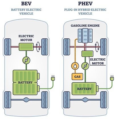
There are two type of electric vehicles that dominate the market:
Battery Electric Vehicles (BEVs) [explain what this is] Plug-in Hybrid Electric Vehicles (PHEVs) [explain what this is]
In understanding their distribution across the different vehicle uses, it provides an insight into the consumer preferences among the type of EV to purchase.
EVP_COUNTY <- read.csv("/Users/jackelyncastrocanales/Downloads/EVP_COUNTY.csv")
EVP_COUNTY <- EVP_COUNTY %>%
filter(State == "WA")
# RENAMING COLUMNS
colnames(EVP_COUNTY)[colnames(EVP_COUNTY) == "Battery.Electric.Vehicles..BEVs."] <- "BEVs"
colnames(EVP_COUNTY)[colnames(EVP_COUNTY) == "Electric.Vehicle..EV..Total"] <- "EV.Total"
colnames(EVP_COUNTY)[colnames(EVP_COUNTY) == "Plug.In.Hybrid.Electric.Vehicles..PHEVs."] <- "PHEVs"
colnames(EVP_COUNTY)[colnames(EVP_COUNTY) == "Non.Electric.Vehicle.Total"] <- "non.EV.total"
colnames(EVP_COUNTY)[colnames(EVP_COUNTY) == "Percent.Electric.Vehicles"] <- "percent.EV"
date1 <- as.Date(EVP_COUNTY$Date, format = "%B %d %Y")
library(ggplot2)
# # Create a bar plot to compare BEVs and PHEVs
# bar_plot <- ggplot(EVP_COUNTY, aes(x = Vehicle.Primary.Use, fill = factor(BEVs > PHEVs, labels = c("PHEVs", "BEVs")))) +
# geom_bar(position = "dodge", alpha = 0.8) +
# labs(
# title = "Popularity of BEVs vs PHEVs by Vehicle Primary Use",
# x = "Vehicle Primary Use",
# y = "Count",
# fill = "Dominant Type"
# ) +
# theme_minimal(base_size = 18) +
# theme(legend.position = "bottom")
#
# bar_plot
bar_plot <- ggplot(EVP_COUNTY, aes(x = Vehicle.Primary.Use, fill = factor(BEVs > PHEVs, labels = c("PHEVs", "BEVs")))) +
geom_bar(position = "dodge", alpha = 0.8) +
scale_fill_manual(
values = c("PHEVs" = "darkorange", "BEVs" = "royalblue"), # Custom colors
name = "Type of Electric Vehicle"
) +
labs(
title = "Popularity of BEVs vs PHEVs by Vehicle Primary Use",
x = "Vehicle Primary Use",
y = "# of Vehicles"
) +
theme_minimal(base_size = 14) +
theme(
legend.position = "bottom",
legend.title = element_text(face = "bold", size = 10),
legend.text = element_text(size = 9),
axis.text.x = element_text(hjust = 1, size = 10),
axis.text.y = element_text(size = 10),
axis.title = element_text(size = 12),
plot.title = element_text(hjust = 0.5, face = "bold", size = 14),
plot.subtitle = element_text(size = 12)
)
bar_plot
Here, it’s noted that PHEVs are the most popular among trucks and BEVs are the most popular among BEVs.
Interactive Analysis of Exploring Electric Vehicle Ranges
[discuss ways BEVs and PHEVs and electric ranges vary across vehicle types] – boxplot / histogram
# DATA VISUALIZATION 10: SHINY -- BOXPLOT + HISTOGRAM OF THE DISTRIBUTION OF EV RANGES BY VEHICLE TYPE
# Load necessary libraries
library(shiny)
library(ggplot2)
library(dplyr)
library(plotly)
# Sample data preparation (replace this with your actual EVP dataset)
# EVP <- your_dataset_here
# Filter out invalid or missing Electric Range values
EVP_clean <- EVP %>%
filter(!is.na(Electric.Range), Electric.Range > 0)
# Define UI
ui <- fluidPage(
titlePanel("Electric Vehicle Data Visualization"),
sidebarLayout(
sidebarPanel(
# Conditional panel for the slider, only visible in the Histogram tab
conditionalPanel(
condition = "input.tabs == 'Histogram'",
sliderInput(
"bins",
"Number of bins:",
min = 5,
max = 100,
value = 30,
step = 1
)
)
),
mainPanel(
tabsetPanel(
id = "tabs",
tabPanel(
"Boxplot",
plotlyOutput("boxplot")
),
tabPanel(
"Histogram",
plotlyOutput("histogram")
)
)
)
)
)
# Define Server
server <- function(input, output) {
# Render Boxplot
output$boxplot <- renderPlotly({
ggplot_boxplot <- ggplot(EVP_clean, aes(x = Electric.Vehicle.Type, y = Electric.Range)) +
geom_boxplot(outlier.color = "red", outlier.size = 2, alpha = 0.7, color = "black") + # Clear boxes with black outlines
labs(
title = "Distribution of Electric Ranges for BEVs and PHEVs",
x = "Electric Vehicle Type",
y = "Electric Range (miles)"
) +
theme_minimal(base_size = 15) +
theme(legend.position = "none")
ggplotly(ggplot_boxplot)
})
# Render Histogram
output$histogram <- renderPlotly({
ggplot_histogram <- ggplot(EVP_clean, aes(x = Electric.Range, fill = Electric.Vehicle.Type)) +
geom_histogram(bins = input$bins, alpha = 0.7, position = "identity", color = "black") + # Use bins based on slider input
facet_wrap(~ Electric.Vehicle.Type, scales = "free_y") +
labs(
title = "Electric Range Distribution for BEVs and PHEVs",
x = "Electric Range (miles)",
y = "Count",
fill = "Vehicle Type"
) +
theme_minimal(base_size = 10)
ggplotly(ggplot_histogram)
})
}
shinyApp(ui = ui, server = server)Another Interactive Analysis: Exploring the Trends of EV Ownership Overtime Based on Vehicle Type
[can be made into an ANIMATION PLOT] Here we are tracking the trends of EV Ownership Overtime. As EVs are considered the primary driver towards a sustainable transportable future, understanding the trends of EV ownership provides insights towards consumer adoption and market treends.
# DATA VISUALIZTION 11: SHINY APP -- TRENDS OF EV OWNERSHIP OVERTIME BASED ON VEHICLE TYPE
library(shiny)
library(ggplot2)
library(dplyr)
library(plotly)
# DATSET 1 -- Electric Vehicle Population Data
# EVP <- read.csv("EVP.csv")
EVP <- read.csv("/Users/jackelyncastrocanales/Downloads/EVP.csv")
colnames(EVP)[colnames(EVP) == "Clean.Alternative.Fuel.Vehicle..CAFV..Eligibility"] <- "CAFV"
colnames(EVP)[colnames(EVP) == "VIN..1.10."] <- "VIN"
colnames(EVP)[colnames(EVP) == "X2020.Census.Tract"] <- "Census.Tract"
# SHINY
EVP <- EVP %>%
group_by(Model.Year, Electric.Vehicle.Type) %>%
summarise(Count = n_distinct(DOL.Vehicle.ID), .groups = "drop")
# Define the UI
ui <- fluidPage(
titlePanel("Trends in EV Ownership Over Time"),
sidebarLayout(
sidebarPanel(
checkboxGroupInput("vehicleType", "Select Vehicle Type(s):",
choices = unique(EVP$Electric.Vehicle.Type),
selected = unique(EVP$Electric.Vehicle.Type))
),
mainPanel(
plotlyOutput("linePlot")
)
)
)
server <- function(input, output) {
output$linePlot <- renderPlotly({
filtered_data <- EVP %>%
filter(Electric.Vehicle.Type %in% input$vehicleType)
p <- ggplot(filtered_data, aes(x = Model.Year, y = Count, color = Electric.Vehicle.Type)) +
geom_line(size = 1) +
geom_point(size = 2) +
labs(
title = "Trends in EV Ownership Over Time",
x = "Model Year",
y = "Number of Registrations",
color = "Vehicle Type"
) +
theme_minimal()
# Convert ggplot to plotly
ggplotly(p)
})
}
shinyApp(ui = ui, server = server)[add analysis of this shinyApp]
[Add a conclusion after all edits are made for this blog]