Summary of the first 7 chapters of R for datascience book
Stephen Omondi Oganga
2024-10-29
- 1 Introduction
- 2 Explore
- 3 Data visualisation
- 4 Workflow: basics
- 5 Data transformation
- 6 Workflow: scripts
- 7 Exploratory Data Analysis
1 Introduction
Data science is an exciting discipline that allows you to turn raw data into understanding, insight, and knowledge. The goal of “R for Data Science” is to help you learn the most important tools in R that will allow you to do data science. After reading this book, you’ll have the tools to tackle a wide variety of data science challenges, using the best parts of R.
1.1 What you will learn
Data science is a huge field, and there’s no way you can master it by reading a single book. The goal of this book is to give you a solid foundation in the most important tools. Our model of the tools needed in a typical data science project looks something like this:

The above diagram shows the steps that you need to chronologically as listed below:
- Import
- Tidy
- Transform
- Visualise
- Model
- Communicate
Import-> This typically means that you take data stored in a file, database, or web application programming interface (API), and load it into a data frame in R. If you can’t get your data into R, you can’t do data science on it!
Tidy -> Tidying your data means storing it in a consistent form that matches the semantics of the dataset with the way it is stored. In brief, when your data is tidy, each column is a variable, and each row is an observation. Tidy data is important because the consistent structure lets you focus your struggle on questions about the data, not fighting to get the data into the right form for different functions.
Transform-> Transformation includes narrowing in on observations of interest (like all people in one city, or all data from the last year), creating new variables that are functions of existing variables (like computing speed from distance and time), and calculating a set of summary statistics (like counts or means). Together, tidying and transforming are called wrangling, because getting your data in a form that’s natural to work with often feels like a fight!
Visualisation-> is a fundamentally human activity. A good visualisation will show you things that you did not expect, or raise new questions about the data. A good visualisation might also hint that you’re asking the wrong question, or you need to collect different data. Visualisations can surprise you, but don’t scale particularly well because they require a human to interpret them.
Models-> are complementary tools to visualisation. Once you have made your questions sufficiently precise, you can use a model to answer them. Models are a fundamentally mathematical or computational tool, so they generally scale well. Even when they don’t, it’s usually cheaper to buy more computers than it is to buy more brains! But every model makes assumptions, and by its very nature a model cannot question its own assumptions. That means a model cannot fundamentally surprise you.
Communication-> The last step of data science is communication, an absolutely critical part of any data analysis project. It doesn’t matter how well your models and visualisation have led you to understand the data unless you can also communicate your results to others.
1.2 How this book is organised
The previous description of the tools of data science is organised roughly according to the order in which you use them in an analysis (although of course you’ll iterate through them multiple times). In our experience, however, this is not the best way to learn them:
Starting with data ingest and tidying is sub-optimal because 80% of the time it’s routine and boring, and the other 20% of the time it’s weird and frustrating. That’s a bad place to start learning a new subject! Instead, we’ll start with visualisation and transformation of data that’s already been imported and tidied. That way, when you ingest and tidy your own data, your motivation will stay high because you know the pain is worth it.
Some topics are best explained with other tools. For example, we believe that it’s easier to understand how models work if you already know about visualisation, tidy data, and programming.
Programming tools are not necessarily interesting in their own right, but do allow you to tackle considerably more challenging problems. We’ll give you a selection of programming tools in the middle of the book, and then you’ll see how they can combine with the data science tools to tackle interesting modelling problems.
Within each chapter, we try and stick to a similar pattern: start with some motivating examples so you can see the bigger picture, and then dive into the details. Each section of the book is paired with exercises to help you practice what you’ve learned. While it’s tempting to skip the exercises, there’s no better way to learn than practicing on real problems.
1.3 What you won’t learn
1.3.1 Big data
This book proudly focuses on small, in-memory datasets. This is the right place to start because you can’t tackle big data unless you have experience with small data. The tools you learn in this book will easily handle hundreds of megabytes of data, and with a little care you can typically use them to work with 1-2 Gb of data.
1.3.2 Python, Julia, and friends
In this book, you won’t learn anything about Python, Julia, or any other programming language useful for data science. This isn’t because we think these tools are bad. They’re not! And in practice, most data science teams use a mix of languages, often at least R and Python.
However, we strongly believe that it’s best to master one tool at a time. You will get better faster if you dive deep, rather than spreading yourself thinly over many topics. This doesn’t mean you should only know one thing, just that you’ll generally learn faster if you stick to one thing at a time. You should strive to learn new things throughout your career, but make sure your understanding is solid before you move on to the next interesting thing.
1.3.3 Non-rectangular data
This book focuses exclusively on rectangular data: collections of values that are each associated with a variable and an observation. There are lots of datasets that do not naturally fit in this paradigm, including images, sounds, trees, and text. But rectangular data frames are extremely common in science and industry, and we believe that they are a great place to start your data science journey.
1.3.4 Hypothesis confirmation
It’s possible to divide data analysis into two camps: hypothesis generation and hypothesis confirmation (sometimes called confirmatory analysis). The focus of this book is unabashedly on hypothesis generation, or data exploration. Here you’ll look deeply at the data and, in combination with your subject knowledge, generate many interesting hypotheses to help explain why the data behaves the way it does. You evaluate the hypotheses informally, using your scepticism to challenge the data in multiple ways.
The complement of hypothesis generation is hypothesis confirmation. Hypothesis confirmation is hard for two reasons:
You need a precise mathematical model in order to generate falsifiable predictions. This often requires considerable statistical sophistication.
You can only use an observation once to confirm a hypothesis. As soon as you use it more than once you’re back to doing exploratory analysis. This means to do hypothesis confirmation you need to “preregister” (write out in advance) your analysis plan, and not deviate from it even when you have seen the data. We’ll talk a little about some strategies you can use to make this easier in modelling.
It’s common to think about modelling as a tool for hypothesis confirmation, and visualisation as a tool for hypothesis generation. But that’s a false dichotomy: models are often used for exploration, and with a little care you can use visualisation for confirmation. The key difference is how often do you look at each observation: if you look only once, it’s confirmation; if you look more than once, it’s exploration.
1.4 Prerequisites
We’ve made a few assumptions about what you already know in order to get the most out of this book. You should be generally numerically literate, and it’s helpful if you have some programming experience already. If you’ve never programmed before, you might find Hands on Programming with R by Garrett to be a useful adjunct to this book.
There are four things you need to run the code in this book: R, RStudio, a collection of R packages called the tidyverse, and a handful of other packages. Packages are the fundamental units of reproducible R code. They include reusable functions, the documentation that describes how to use them, and sample data.
1.4.1 R
To download R, go to CRAN, the comprehensive R archive network. CRAN is composed of a set of mirror servers distributed around the world and is used to distribute R and R packages. Don’t try and pick a mirror that’s close to you: instead use the cloud mirror, https://cloud.r-project.org, which automatically figures it out for you.
A new major version of R comes out once a year, and there are 2-3 minor releases each year. It’s a good idea to update regularly. Upgrading can be a bit of a hassle, especially for major versions, which require you to reinstall all your packages, but putting it off only makes it worse.
1.4.2 RStudio
RStudio is an integrated development environment, or IDE, for R programming. Download and install it from http://www.rstudio.com/download. RStudio is updated a couple of times a year. When a new version is available, RStudio will let you know. It’s a good idea to upgrade regularly so you can take advantage of the latest and greatest features. For this book, make sure you have at least RStudio 1.0.0.
When you start RStudio, you’ll see two key regions in the interface:

For now, all you need to know is that you type R code in the console pane, and press enter to run it. You’ll learn more as we go along!
1.4.3 The tidyverse
You’ll also need to install some R packages. An R package is a collection of functions, data, and documentation that extends the capabilities of base R. Using packages is key to the successful use of R. The majority of the packages that you will learn in this book are part of the so-called tidyverse. The packages in the tidyverse share a common philosophy of data and R programming, and are designed to work together naturally.
You can install the complete tidyverse with a single line of code:
install.packages("tidyverse")On your own computer, type that line of code in the console, and then press enter to run it. R will download the packages from CRAN and install them on to your computer. If you have problems installing, make sure that you are connected to the internet, and that https://cloud.r-project.org/ isn’t blocked by your firewall or proxy.
You will not be able to use the functions, objects, and help files in a package until you load it with library(). Once you have installed a package, you can load it with the library() function:
1.4.4 Other packages
There are many other excellent packages that are not part of the tidyverse, because they solve problems in a different domain, or are designed with a different set of underlying principles. This doesn’t make them better or worse, just different. In other words, the complement to the tidyverse is not the messyverse, but many other universes of interrelated packages. As you tackle more data science projects with R, you’ll learn new packages and new ways of thinking about data.
1.5 Running R code
In your console, you type after the >, called the prompt.
Functions are in a code font and followed by parentheses, like sum(), or mean().
Other R objects (like data or function arguments) are in a code font, without parentheses, like flights or x.
If we want to make it clear what package an object comes from, we’ll use the package name followed by two colons, like dplyr::mutate(), or nycflights13::flights. This is also valid R code.
1.6 Getting help and learning more
This book is not an island; there is no single resource that will allow you to master R. As you start to apply the techniques described in this book to your own data you will soon find questions that we do not answer. This section describes a few tips on how to get help, and to help you keep learning.
If you get stuck, start with Google. Typically adding “R” to a query is enough to restrict it to relevant results: if the search isn’t useful, it often means that there aren’t any R-specific results available. Google is particularly useful for error messages. If you get an error message and you have no idea what it means, try googling it! Chances are that someone else has been confused by it in the past, and there will be help somewhere on the web.
If Google doesn’t help, try stackoverflow. Start by spending a little time searching for an existing answer, including R to restrict your search to questions and answers that use R. If you don’t find anything useful, prepare a minimal reproducible example or reprex. A good reprex makes it easier for other people to help you, and often you’ll figure out the problem yourself in the course of making it.
2 Explore
2.1 Introduction
The goal of the first part of this book is to get you up to speed
with the basic tools of data exploration as quickly as
possible. Data exploration is the art of looking at your data, rapidly
generating hypotheses, quickly testing them, then repeating again and
again and again. The goal of data exploration is to generate many
promising leads that you can later explore in more depth. 
In this part of the book you will learn some useful tools that have an immediate payoff:
- Visualisation is a great place to start with R programming, because the payoff is so clear: you get to make elegant and informative plots that help you understand data. In data visualisation you’ll dive into visualisation, learning the basic structure of a ggplot2 plot, and powerful techniques for turning data into plots.
- Visualisation alone is typically not enough, so in data transformation you’ll learn the key verbs that allow you to select important variables, filter out key observations, create new variables, and compute summaries. Finally, in exploratory data analysis, you’ll combine visualisation and transformation with your curiosity and scepticism to ask and answer interesting questions about data. Nestled among these three chapters that teach you the tools of exploration are three chapters that focus on your R workflow. In workflow: basics, workflow: scripts, and workflow: projects you’ll learn good practices for writing and organising your R code. These will set you up for success in the long run, as they’ll give you the tools to stay organised when you tackle real projects.
3 Data visualisation
3.1 Introduction
This chapter will teach you how to visualise your data using ggplot2. R has several systems for making graphs, but ggplot2 is one of the most elegant and most versatile. ggplot2 implements the grammar of graphics, a coherent system for describing and building graphs. With ggplot2, you can do more faster by learning one system and applying it in many places.
3.1.1 Prerequisites
This chapter focusses on ggplot2, one of the core members of the tidyverse. To access the datasets, help pages, and functions that we will use in this chapter, load the tidyverse by running this code:
install.packages("tidyverse")
library( tidyverse )
You only need to install a package once, but you need to reload it every time you start a new session. If we need to be explicit about where a function (or dataset) comes from, we’ll use the special form package::function(). For example, ggplot2::ggplot() tells you explicitly that we’re using the ggplot() function from the ggplot2 package.
3.2 First steps
Let’s use our first graph to answer a question: Do cars with big engines use more fuel than cars with small engines? You probably already have an answer, but try to make your answer precise. What does the relationship between engine size and fuel efficiency look like? Is it positive? Negative? Linear? Nonlinear?
3.2.1 The mpg data frame
A data frame is a rectangular collection of variables (in the columns) and observations (in the rows). mpg contains observations collected by the US Environmental Protection Agency on 38 models of car. Among the variables in mpg are:
- displ, a car’s engine size, in litres.
- hwy, a car’s fuel efficiency on the highway, in miles per gallon (mpg). A car with a low fuel efficiency consumes more fuel than a car with a high fuel efficiency when they travel the same distance.
3.2.2 Creating a ggplot
With ggplot2, you begin a plot with the function ggplot() . ggplot() creates a coordinate system that you can add layers to. The first argument of ggplot() is the dataset to use in the graph. So ggplot(data = mpg) creates an empty graph. You complete your graph by adding one or more layers to ggplot() . The function geom_point() adds a layer of points to your plot, which creates a scatterplot. ggplot2 comes with many geom functions that each add a different type of layer to a plot. You’ll learn a whole bunch of them throughout this chapter. Each geom function in ggplot2 takes a mapping argument. This defines how variables in your dataset are mapped to visual properties. The mapping argument is always paired with aes() , and the x and y arguments of aes() specify which variables to map to the x and y axes. ggplot2 looks for the mapped variables in the data argument, in this case, mpg.
ggplot(data = mpg) +
geom_point(mapping = aes(x = displ, y = hwy))
3.2.3 A graphing template
To make a graph, replace the bracketed sections in the code with a dataset, a geom function, or a collection of mappings.
3.2.4 Aesthetic mappings
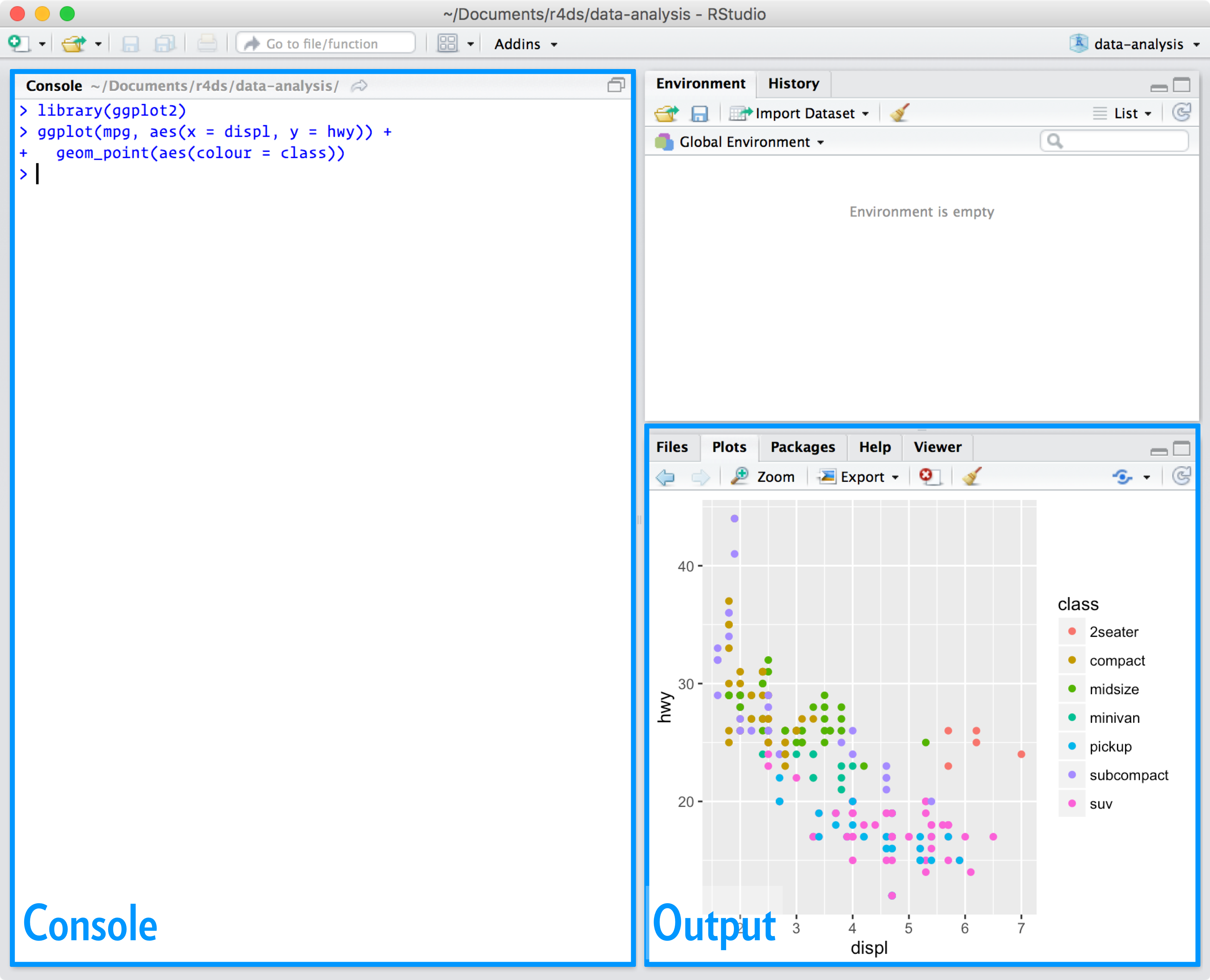
You can add a third variable, like class, to a two dimensional scatterplot by mapping it to an aesthetic. An aesthetic is a visual property of the objects in your plot. Aesthetics include things like the size, the shape, or the color of your points. You can convey information about your data by mapping the aesthetics in your plot to the variables in your dataset. For example, you can map the colors of your points to the class variable to reveal the class of each car.
ggplot(data = mpg) +
geom_point(mapping = aes(x = displ, y = hwy, color = class))
To map an aesthetic to a variable, associate the name of the aesthetic to the name of the variable inside aes() . ggplot2 will automatically assign a unique level of the aesthetic (here a unique color) to each unique value of the variable, a process known as scaling. ggplot2 will also add a legend that explains which levels correspond to which values. For each aesthetic, you use aes() to associate the name of the aesthetic with a variable to display. The aes() function gathers together each of the aesthetic mappings used by a layer and passes them to the layer’s mapping argument. The syntax highlights a useful insight about x and y: the x and y locations of a point are themselves aesthetics, visual properties that you can map to variables to display information about the data. Once you map an aesthetic, ggplot2 takes care of the rest. It selects a reasonable scale to use with the aesthetic, and it constructs a legend that explains the mapping between levels and values. For x and y aesthetics, ggplot2 does not create a legend, but it creates an axis line with tick marks and a label. The axis line acts as a legend; it explains the mapping between locations and values.
3.3 Common problems
As you start to run R code, you’re likely to run into problems. Don’t worry — it happens to everyone. I have been writing R code for years, and every day I still write code that doesn’t work! Start by carefully comparing the code that you’re running to the code in the book. R is extremely picky, and a misplaced character can make all the difference. Make sure that every ( is matched with a ) and every " is paired with another ". Sometimes you’ll run the code and nothing happens. Check the left-hand of your console: if it’s a +, it means that R doesn’t think you’ve typed a complete expression and it’s waiting for you to finish it. In this case, it’s usually easy to start from scratch again by pressing ESCAPE to abort processing the current command. One common problem when creating ggplot2 graphics is to put the + in the wrong place: it has to come at the end of the line, not the start. If you’re still stuck, try the help. You can get help about any R function by running ?function_name in the console, or selecting the function name and pressing F1 in RStudio. Don’t worry if the help doesn’t seem that helpful - instead skip down to the examples and look for code that matches what you’re trying to do.
If that doesn’t help, carefully read the error message. Sometimes the answer will be buried there! But when you’re new to R, the answer might be in the error message but you don’t yet know how to understand it. Another great tool is Google: try googling the error message, as it’s likely someone else has had the same problem, and has gotten help online.
3.4 Facets
One way to add additional variables is with aesthetics. Another way, particularly useful for categorical variables, is to split your plot into facets, subplots that each display one subset of the data. To facet your plot by a single variable, use facet_wrap() . The first argument of facet_wrap() should be a formula, which you create with ~ followed by a variable name (here “formula” is the name of a data structure in R, not a synonym for “equation”). The variable that you pass to facet_wrap() should be discrete.
ggplot(data = mpg) +
geom_point(mapping = aes(x = displ, y = hwy)) +
facet_wrap(~ class, nrow = 2)
To facet your plot on the combination of two variables, add facet_grid() to your plot call. The first argument of facet_grid() is also a formula. This time the formula should contain two variable names separated by a ~.
ggplot(data = mpg) +
geom_point(mapping = aes(x = displ, y = hwy)) +
facet_grid(drv ~ cyl)
If you prefer to not facet in the rows or columns dimension, use a . instead of a variable name, e.g. + facet_grid(. ~ cyl).
3.5 Geometric objects
A geom is the geometrical object that a plot uses to represent data. People often describe plots by the type of geom that the plot uses. For example, bar charts use bar geoms, line charts use line geoms, boxplots use boxplot geoms, and so on. Scatterplots break the trend; they use the point geom. We can use different geoms to plot the same data.
To change the geom in your plot, change the geom function that you add to ggplot() . Every geom function in ggplot2 takes a mapping argument. However, not every aesthetic works with every geom. You could set the shape of a point, but you couldn’t set the “shape” of a line. Many geoms, like geom_smooth() , use a single geometric object to display multiple rows of data. For these geoms, you can set the group aesthetic to a categorical variable to draw multiple objects. ggplot2 will draw a separate object for each unique value of the grouping variable. In practice, ggplot2 will automatically group the data for these geoms whenever you map an aesthetic to a discrete variable (as in the linetype example). It is convenient to rely on this feature because the group aesthetic by itself does not add a legend or distinguishing features to the geoms. To display multiple geoms in the same plot, add multiple geom functions to ggplot().
3.6 Statistical transformations
Bar charts seem simple, but they are interesting because they reveal something subtle about plots. Consider a basic bar chart, as drawn with geom_bar() . Other graphs, like bar charts, calculate new values to plot: - bar charts, histograms, and frequency polygons bin your data and then plot bin counts, the number of points that fall in each bin. smoothers fit a model to your data and then plot predictions from the model. - boxplots compute a robust summary of the distribution and then display a specially formatted box. The algorithm used to calculate new values for a graph is called a stat, short for statistical transformation. ou can learn which stat a geom uses by inspecting the default value for the stat argument. For example, ?geom_bar shows that the default value for stat is “count”, which means that geom_bar() uses stat_count() . stat_count() is documented on the same page as geom_bar() , and if you scroll down you can find a section called “Computed variables”. That describes how it computes two new variables: count and prop.
You can generally use geoms and stats interchangeably. For example, you can recreate the previous plot using stat_count() instead of geom_bar().
3.7 Position adjustments
There’s one more piece of magic associated with bar charts. You can colour a bar chart using either the colour aesthetic, or, more usefully, fill:
ggplot(data = diamonds) +
geom_bar(mapping = aes(x = cut, colour = cut))
ggplot(data = diamonds) +
geom_bar(mapping = aes(x = cut, fill = cut))
Note what happens if you map the fill aesthetic to another variable, like clarity: the bars are automatically stacked. Each colored rectangle represents a combination of cut and clarity. The stacking is performed automatically by the position adjustment specified by the position argument. If you don’t want a stacked bar chart, you can use one of three other options: "identity", "dodge" or "fill". position = "dodge" places overlapping objects directly beside one another. This makes it easier to compare individual values.
3.8 Coordinate systems
Coordinate systems are probably the most complicated part of ggplot2. The default coordinate system is the Cartesian coordinate system where the x and y positions act independently to determine the location of each point. There are a number of other coordinate systems that are occasionally helpful. coord_flip() switches the x and y axes. This is useful (for example), if you want horizontal boxplots. It’s also useful for long labels: it’s hard to get them to fit without overlapping on the x-axis.
ggplot(data = mpg, mapping = aes(x = class, y = hwy)) +
geom_boxplot()
ggplot(data = mpg, mapping = aes(x = class, y = hwy)) +
geom_boxplot() +
coord_flip()
coord_quickmap() sets the aspect ratio correctly for maps. This is very important if you’re plotting spatial data with ggplot2. nz <- map_data("nz") ggplot(nz, aes(long, lat, group = group)) + geom_polygon(fill = "white", colour = "black") ggplot(nz, aes(long, lat, group = group)) + geom_polygon(fill = "white", colour = "black") + coord_quickmap()
coord_polar() uses polar coordinates. Polar coordinates reveal an interesting
connection between a bar chart and a Coxcomb chart.
```r
bar <- ggplot(data = diamonds) +
geom_bar(
mapping = aes(x = cut, fill = cut),
show.legend = FALSE,
width = 1
) +
theme(aspect.ratio = 1) +
labs(x = NULL, y = NULL)
bar + coord_flip()
bar + coord_polar()
3.9 The layered grammar of graphics
The grammar of graphics is based on the insight that you can uniquely describe any plot as a combination of a dataset, a geom, a set of mappings, a stat, a position adjustment, a coordinate system, and a faceting scheme.
4 Workflow: basics
4.1 Coding basics
- You can use R as a calculator 1 / 200 * 30
#> [1] 0.15 (59 + 73 + 2) / 3
#> [1] 44.66667 sin(pi / 2)
#> [1] 1
- You can create new objects with <-:
- x <- 3 * 4
All R statements where you create objects, assignment statements, have the same form: object_name <- value
When reading that code say “object name gets value” in your head. You will make lots of assignments and <- is a pain to type. Don’t be lazy and use =: it will work, but it will cause confusion later. Instead, use RStudio’s keyboard shortcut: Alt + - (the minus sign). Notice that RStudio automagically surrounds <- with spaces, which is a good code formatting practice. Code is miserable to read on a good day, so giveyoureyesabreak and use spaces.
4.2 What’s in a name?
Object names must start with a letter, and can only contain letters, numbers, and .. You want your object names to be descriptive, so you’ll need a convention for multiple words. We recommend snake_case where you separate lowercase words with .
4.3 Calling functions
R has a large collection of built-in functions that are called like this: function_name(arg1 = val1, arg2 = val2, …)
5 Data transformation
5.1 Introduction
Visualisation is an important tool for insight generation, but it is rare that you get the data in exactly the right form you need. Often you’ll need to create some new variables or summaries, or maybe you just want to rename the variables or reorder the observations in order to make the data a little easier to work with.
5.1.1 Prerequisites
In this chapter we’re going to focus on how to use the dplyr package, another core member of the tidyverse. We’ll illustrate the key ideas using data from the nycflights13 package, and use ggplot2 to help us understand the data.
library(nycflights13)
library(tidyverse)
5.1.2 nycflights13
To explore the basic data manipulation verbs of dplyr, we’ll use nycflights13::flights. This data frame contains all 336,776 flights that departed from New York City in 2013. The data comes from the US Bureau of Transportation Statistics, and is documented in ?flights.
You might notice that this data frame prints a little differently from other data frames you might have used in the past.It prints differently because it’s a tibble. Tibbles are data frames, but slightly tweaked to work better in the tidyverse.
You might also have noticed the row of three (or four) letter abbreviations under the column names. These describe the type of each variable:
int stands for integers.
dbl stands for doubles, or real numbers.
chr stands for character vectors, or strings.
dttm stands for date-times (a date + a time).
There are three other common types of variables that aren’t used in this dataset but you’ll encounter later in the book:
lgl stands for logical, vectors that contain only TRUE or FALSE.
fctr stands for factors, which R uses to represent categorical variables with fixed possible values.
date stands for dates.
5.1.3 dplyr basics
In this chapter you are going to learn the five key dplyr functions that allow you to solve the vast majority of your data manipulation challenges:
- Pick observations by their values (filter()).
- Reorder the rows (arrange()).
- Pick variables by their names (select()).
- Create new variables with functions of existing variables (mutate()).
- Collapse many values down to a single summary (summarise()).
These can all be used in conjunction with group_by() which changes the scope of each function from operating on the entire dataset to operating on it group-by-group. These six functions provide the verbs for a language of data manipulation.
All verbs work similarly:
The first argument is a data frame.
The subsequent arguments describe what to do with the data frame, using the variable names (without quotes).
The result is a new data frame.
Together these properties make it easy to chain together multiple simple steps to achieve a complex result. Let’s dive in and see how these verbs work.
5.2 Filter rows with filter()
filter() allows you to subset observations based on their values. The first argument is the name of the data frame. The second and subsequent arguments are the expressions that filter the data frame.
When you run that line of code, dplyr executes the filtering operation and returns a new data frame. dplyr functions never modify their inputs, so if you want to save the result, you’ll need to use the assignment operator, <-:
jan1 <- filter(flights, month == 1, day == 1)R either prints out the results, or saves them to a variable. If you want to do both, you can wrap the assignment in parentheses:
(dec25 <- filter(flights, month == 12, day == 25))5.2.1 Comparisons
To use filtering effectively, you have to know how to select the observations that you want using the comparison operators. R provides the standard suite: >, >=, <, <=, != (not equal), and == (equal).
When you’re starting out with R, the easiest mistake to make is to use = instead of == when testing for equality. When this happens you’ll get an informative error:
5.2.2 Logical operators
Multiple arguments to filter() are combined with “and”: every expression must be true in order for a row to be included in the output. For other types of combinations, you’ll need to use Boolean operators yourself: & is “and”, | is “or”, and ! is “not”.
5.2.3 Missing values
One important feature of R that can make comparison tricky are missing values, or NAs (“not availables”). NA represents an unknown value so missing values are “contagious”: almost any operation involving an unknown value will also be unknown.
If you want to determine if a value is missing, use is.na():
is.na(x) #> [1] TRUE filter() only includes rows where the condition is TRUE; it excludes both FALSE and NA values. If you want to preserve missing values, ask for them explicitly:
5.3 Arrange rows with arrange()
arrange() works similarly to filter() except that instead of selecting rows, it changes their order. It takes a data frame and a set of column names (or more complicated expressions) to order by. If you provide more than one column name, each additional column will be used to break ties in the values of preceding columns:
Use desc() to re-order by a column in descending order:
Missing values are always sorted at the end:
5.4 Select columns with select()
It’s not uncommon to get datasets with hundreds or even thousands of variables. In this case, the first challenge is often narrowing in on the variables you’re actually interested in. select() allows you to rapidly zoom in on a useful subset using operations based on the names of the variables.
There are a number of helper functions you can use within select():
starts_with(“abc”): matches names that begin with “abc”.
ends_with(“xyz”): matches names that end with “xyz”.
contains(“ijk”): matches names that contain “ijk”.
matches(“(.)\1”): selects variables that match a regular expression. This one matches any variables that contain repeated characters. You’ll learn more about regular expressions in strings.
num_range(“x”, 1:3): matches x1, x2 and x3.
See ?select for more details.
select() can be used to rename variables, but it’s rarely useful because it drops all of the variables not explicitly mentioned. Instead, use rename(), which is a variant of select() that keeps all the variables that aren’t explicitly mentioned:
Another option is to use select() in conjunction with the everything() helper. This is useful if you have a handful of variables you’d like to move to the start of the data frame.
5.5 Add new variables with mutate()
Besides selecting sets of existing columns, it’s often useful to add new columns that are functions of existing columns. That’s the job of mutate().
mutate() always adds new columns at the end of your dataset so we’ll start by creating a narrower dataset so we can see the new variables. Remember that when you’re in RStudio, the easiest way to see all the columns is View().
5.5.1 Useful creation functions
There are many functions for creating new variables that you can use with mutate(). The key property is that the function must be vectorised: it must take a vector of values as input, return a vector with the same number of values as output. There’s no way to list every possible function that you might use, but here’s a selection of functions that are frequently useful:
- Arithmetic operators: +, -, , /, ^. These are all vectorised, using the so called “recycling rules”. If one parameter is shorter than the other, it will be automatically extended to be the same length. This is most useful when one of the arguments is a single number: air_time / 60, hours 60 + minute, etc.
Arithmetic operators are also useful in conjunction with the aggregate functions you’ll learn about later. For example, x / sum(x) calculates the proportion of a total, and y - mean(y) computes the difference from the mean.
Modular arithmetic: %/% (integer division) and %% (remainder), where x == y * (x %/% y) + (x %% y). Modular arithmetic is a handy tool because it allows you to break integers up into pieces. For example, in the flights dataset, you can compute hour and minute from dep_time with:
Logs: log(), log2(), log10(). Logarithms are an incredibly useful transformation for dealing with data that ranges across multiple orders of magnitude. They also convert multiplicative relationships to additive, a feature we’ll come back to in modelling.
All else being equal, I recommend using log2() because it’s easy to interpret: a difference of 1 on the log scale corresponds to doubling on the original scale and a difference of -1 corresponds to halving.
Offsets: lead() and lag() allow you to refer to leading or lagging values. This allows you to compute running differences (e.g. x - lag(x)) or find when values change (x != lag(x)). They are most useful in conjunction with group_by(), which you’ll learn about shortly.
Cumulative and rolling aggregates: R provides functions for running sums, products, mins and maxes: cumsum(), cumprod(), cummin(), cummax(); and dplyr provides cummean() for cumulative means. If you need rolling aggregates (i.e. a sum computed over a rolling window), try the RcppRoll package.
Logical comparisons, <, <=, >, >=, !=, and ==, which you learned about earlier. If you’re doing a complex sequence of logical operations it’s often a good idea to store the interim values in new variables so you can check that each step is working as expected.
Ranking: there are a number of ranking functions, but you should start with min_rank(). It does the most usual type of ranking (e.g. 1st, 2nd, 2nd, 4th). The default gives smallest values the small ranks; use desc(x) to give the largest values the smallest ranks.
5.6 Grouped summaries with summarise()
It collapses a data frame to a single row:
summarise() is not terribly useful unless we pair it with group_by(). This changes the unit of analysis from the complete dataset to individual groups. Then, when you use the dplyr verbs on a grouped data frame they’ll be automatically applied “by group”.
5.6.1 Combining multiple operations with the pipe
This focuses on the transformations, not what’s being transformed, which makes the code easier to read. You can read it as a series of imperative statements: group, then summarise, then filter. As suggested by this reading, a good way to pronounce %>% when reading code is “then”.
Behind the scenes, x %>% f(y) turns into f(x, y), and x %>% f(y) %>% g(z) turns into g(f(x, y), z) and so on. You can use the pipe to rewrite multiple operations in a way that you can read left-to-right, top-to-bottom. We’ll use piping frequently from now on because it considerably improves the readability of code, and we’ll come back to it in more detail in pipes.
Working with the pipe is one of the key criteria for belonging to the tidyverse. The only exception is ggplot2: it was written before the pipe was discovered. Unfortunately, the next iteration of ggplot2, ggvis, which does use the pipe, isn’t quite ready for prime time yet.
5.6.2 Missing values
We get a lot of missing values! That’s because aggregation functions obey the usual rule of missing values: if there’s any missing value in the input, the output will be a missing value. Fortunately, all aggregation functions have an na.rm argument which removes the missing values prior to computation:
5.6.3 Counts
Whenever you do any aggregation, it’s always a good idea to include either a count (n()), or a count of non-missing values (sum(!is.na(x))). That way you can check that you’re not drawing conclusions based on very small amounts of data.
5.6.4 Useful summary functions
Just using means, counts, and sum can get you a long way, but R provides many other useful summary functions:
Measures of location: we’ve used mean(x), but median(x) is also useful. The mean is the sum divided by the length; the median is a value where 50% of x is above it, and 50% is below it.
Measures of spread: sd(x), IQR(x), mad(x). The root mean squared deviation, or standard deviation sd(x), is the standard measure of spread. The interquartile range IQR(x) and median absolute deviation mad(x) are robust equivalents that may be more useful if you have outliers.
Measures of rank: min(x), quantile(x, 0.25), max(x). Quantiles are a generalisation of the median. For example, quantile(x, 0.25) will find a value of x that is greater than 25% of the values, and less than the remaining 75%.
Measures of position: first(x), nth(x, 2), last(x). These work similarly to x[1], x[2], and x[length(x)] but let you set a default value if that position does not exist (i.e. you’re trying to get the 3rd element from a group that only has two elements). For example, we can find the first and last departure for each day:
Counts: You’ve seen n(), which takes no arguments, and returns the size of the current group. To count the number of non-missing values, use sum(!is.na(x)). To count the number of distinct (unique) values, use n_distinct(x).
Counts and proportions of logical values: sum(x > 10), mean(y == 0). When used with numeric functions, TRUE is converted to 1 and FALSE to 0. This makes sum() and mean() very useful: sum(x) gives the number of TRUEs in x, and mean(x) gives the proportion.
5.6.5 Grouping by multiple variables
When you group by multiple variables, each summary peels off one level of the grouping. That makes it easy to progressively roll up a dataset:
Be careful when progressively rolling up summaries: it’s OK for sums and counts, but you need to think about weighting means and variances, and it’s not possible to do it exactly for rank-based statistics like the median. In other words, the sum of groupwise sums is the overall sum, but the median of groupwise medians is not the overall median.
5.6.6 Ungrouping
If you need to remove grouping, and return to operations on ungrouped data, use ungroup().
5.7 Grouped mutates (and filters)
Grouping is most useful in conjunction with summarise(), but you can also do convenient operations with mutate() and filter():
Find the worst members of each group:
Find all groups bigger than a threshold:
Standardise to compute per group metrics:
A grouped filter is a grouped mutate followed by an ungrouped filter. I generally avoid them except for quick and dirty manipulations: otherwise it’s hard to check that you’ve done the manipulation correctly.
Functions that work most naturally in grouped mutates and filters are known as window functions (vs. the summary functions used for summaries). You can learn more about useful window functions in the corresponding vignette: vignette(“window-functions”).
6 Workflow: scripts
So far you’ve been using the console to run code. That’s a great place to start, but you’ll find it gets cramped pretty quickly as you create more complex ggplot2 graphics and dplyr pipes. To give yourself more room to work, it’s a great idea to use the script editor.
The script editor is a great place to put code you care about. Keep experimenting in the console, but once you have written code that works and does what you want, put it in the script editor. RStudio will automatically save the contents of the editor when you quit RStudio, and will automatically load it when you re-open. Nevertheless, it’s a good idea to save your scripts regularly and to back them up.
6.1 Running code
The script editor is also a great place to build up complex ggplot2 plots or long sequences of dplyr manipulations. The key to using the script editor effectively is to memorise one of the most important keyboard shortcuts: Cmd/Ctrl + Enter. This executes the current R expression in the console.
Instead of running expression-by-expression, you can also execute the complete script in one step: Cmd/Ctrl + Shift + S. Doing this regularly is a great way to check that you’ve captured all the important parts of your code in the script.
6.2 RStudio diagnostics
The script editor will also highlight syntax errors with a red squiggly line and a cross in the sidebar.
Hover over the cross to see what the problem is.
RStudio will also let you know about potential problems.
7 Exploratory Data Analysis
7.1 Introduction
This chapter will show you how to use visualisation and transformation to explore your data in a systematic way.
EDA is an iterative cycle. You:
Generate questions about your data.
Search for answers by visualising, transforming, and modelling your data.
Use what you learn to refine your questions and/or generate new questions
7.1.1 Prerequisites
We’ll combine what you’ve learned about dplyr and ggplot2
7.2 Questions
Your goal during EDA is to develop an understanding of your data. The easiest way to do this is to use questions as tools to guide your investigation. When you ask a question, the question focuses your attention on a specific part of your dataset and helps you decide which graphs, models, or transformations to make.
7.3 Variation
Variation is the tendency of the values of a variable to change from measurement to measurement. You can see variation easily in real life; if you measure any continuous variable twice, you will get two different results. This is true even if you measure quantities that are constant, like the speed of light. Each of your measurements will include a small amount of error that varies from measurement to measurement.
7.3.1 Visualising distributions
How you visualise the distribution of a variable will depend on whether the variable is categorical or continuous. A variable is categorical if it can only take one of a small set of values. In R, categorical variables are usually saved as factors or character vectors. To examine the distribution of a categorical variable, use a bar chart.
A variable is continuous if it can take any of an infinite set of ordered values. Numbers and date-times are two examples of continuous variables. To examine the distribution of a continuous variable, use a histogram.
7.3.2 Typical values
In both bar charts and histograms, tall bars show the common values of a variable, and shorter bars show less-common values. Places that do not have bars reveal values that were not seen in your data. To turn this information into useful questions, look for anything unexpected:
Which values are the most common? Why?
Which values are rare? Why? Does that match your expectations?
Can you see any unusual patterns? What might explain them?
7.3.3 Unusual values
Outliers are observations that are unusual; data points that don’t seem to fit the pattern. Sometimes outliers are data entry errors; other times outliers suggest important new science. When you have a lot of data, outliers are sometimes difficult to see in a histogram.
7.4 Missing values
If you’ve encountered unusual values in your dataset, and simply want to move on to the rest of your analysis, you have two options.
- Drop the entire row with the strange values.
I don’t recommend this option because just because one measurement is invalid, doesn’t mean all the measurements are. Additionally, if you have low quality data, by time that you’ve applied this approach to every variable you might find that you don’t have any data left!
- Instead, I recommend replacing the unusual values with missing values. The easiest way to do this is to use mutate() to replace the variable with a modified copy. You can use the ifelse() function to replace unusual values with NA.
7.5 Covariation
If variation describes the behavior within a variable, covariation describes the behavior between variables. Covariation is the tendency for the values of two or more variables to vary together in a related way. The best way to spot covariation is to visualise the relationship between two or more variables. How you do that should again depend on the type of variables involved.
7.5.1 A categorical and continuous variable
It’s common to want to explore the distribution of a continuous variable broken down by a categorical variable, as in the previous frequency polygon. The default appearance of geom_freqpoly() is not that useful for that sort of comparison because the height is given by the count. That means if one of the groups is much smaller than the others, it’s hard to see the differences in shape.
To make the comparison easier we need to swap what is displayed on the y-axis. Instead of displaying count, we’ll display density, which is the count standardised so that the area under each frequency polygon is one.
Another alternative to display the distribution of a continuous variable broken down by a categorical variable is the boxplot. A boxplot is a type of visual shorthand for a distribution of values that is popular among statisticians. Each boxplot consists of:
A box that stretches from the 25th percentile of the distribution to the 75th percentile, a distance known as the interquartile range (IQR). In the middle of the box is a line that displays the median, i.e. 50th percentile, of the distribution. These three lines give you a sense of the spread of the distribution and whether or not the distribution is symmetric about the median or skewed to one side.
Visual points that display observations that fall more than 1.5 times the IQR from either edge of the box. These outlying points are unusual so are plotted individually.
A line (or whisker) that extends from each end of the box and goes to the farthest non-outlier point in the distribution.
7.5.2 Two categorical variables
To visualise the covariation between categorical variables, you’ll need to count the number of observations for each combination. One way to do that is to rely on the built-in geom_count().
If the categorical variables are unordered, you might want to use the seriation package to simultaneously reorder the rows and columns in order to more clearly reveal interesting patterns. For larger plots, you might want to try the d3heatmap or heatmaply packages, which create interactive plots.
7.5.3 Two continuous variables
Scatterplots become less useful as the size of your dataset grows, because points begin to overplot, and pile up into areas of uniform black (as above). You’ve already seen one way to fix the problem: using the alpha aesthetic to add transparency.
But using transparency can be challenging for very large datasets. Another solution is to use bin.
7.6 Patterns and models
Patterns in your data provide clues about relationships. If a systematic relationship exists between two variables it will appear as a pattern in the data. If you spot a pattern, ask yourself:
Could this pattern be due to coincidence (i.e. random chance)?
How can you describe the relationship implied by the pattern?
How strong is the relationship implied by the pattern?
What other variables might affect the relationship?
Does the relationship change if you look at individual subgroups of the data?
Models are a tool for extracting patterns out of data.
7.7 ggplot2 calls
The first two arguments to ggplot() are data and mapping, and the first two arguments to aes() are x and y. In the remainder of the book, we won’t supply those names. That saves typing, and, by reducing the amount of boilerplate, makes it easier to see what’s different between plots. That’s a really important programming concern that we’ll come back in functions.
7.8 Learning more
If you want to learn more about the mechanics of ggplot2, I’d highly recommend grabbing a copy of the ggplot2 book: https://amzn.com/331924275X. It’s been recently updated, so it includes dplyr and tidyr code, and has much more space to explore all the facets of visualisation. Unfortunately the book isn’t generally available for free, but if you have a connection to a university you can probably get an electronic version for free through SpringerLink.
Another useful resource is the R Graphics Cookbook by Winston Chang. Much of the contents are available online at http://www.cookbook-r.com/Graphs/.
I also recommend Graphical Data Analysis with R, by Antony Unwin. This is a book-length treatment similar to the material covered in this chapter, but has the space to go into much greater depth.