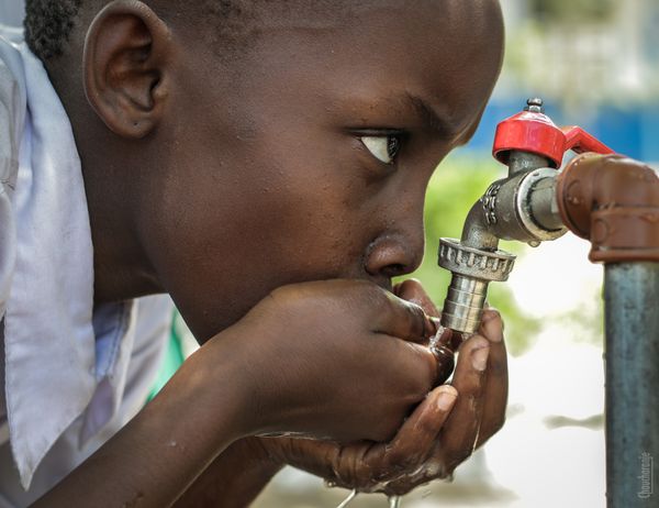
This R Shiny application visualizes water and sanitation deprivation data in Kenya. It provides interactive maps and plots to explore changes over time in water sources and sanitation access between 2009 and 2019.
setwd(“E:/Learning”)
kenya_shp_adm1 <- st_read(“ken_admbnda_adm1_iebc_20191031.shp”)
data <- read.csv(“E:/Learning/water_sanitation_2009_2019.csv”)
print(str(data))
colnames(data) <- gsub(” “,”.”, colnames(data)) print(colnames(data)) # Print column names for verification
kenya_shp_adm1 <- kenya_shp_adm1 %>% left_join(data, by = c(“ADM1_EN” = “County”))
The UI includes a title, custom CSS for styling, and multiple tabs:
ui <- fluidPage( theme = shinytheme(“flatly”),
# Custom CSS for background image tags\(head( tags\)style(HTML(” #home-content { position: relative; background-image: url(‘https://images.pexels.com/photos/1446504/pexels-photo-1446504.jpeg?auto=compress&cs=tinysrgb&w=600’); background-size: cover; background-position: center; color: white; padding: 50px; } #home-overlay { position: absolute; top: 0; left: 0; right: 0; bottom: 0; background: rgba(0, 0, 0, 0.6); /* Semi-transparent black / z-index: 1; } #home-content h3, #home-content p { position: relative; z-index: 2; / Bring text above the overlay / background: rgba(0, 0, 0, 0.4); padding: 10px; border-radius: 5px; } h3 { font-size: 2em; / Increase size for headers / } p { font-size: 1.2em; / Increase size for paragraphs */ } “)) ),
titlePanel(“Water and Sanitation Deprivation in Kenya”),
tabsetPanel( tabPanel(“Home”, div(id = “home-content”, div(id = “home-overlay”), h3(“Overview of Water and Sanitation Deprivation”), p(“Nearly 4 in 10 Kenyans did not have access to safe drinking water in 2019 and 2 in 10 were deprived of adequate sanitation. However, there were remarkable improvements in both sectors between 2009 and 2019, albeit the decrease in deprivation was stronger in sanitation where it almost halved. Safe drinking water and basic sanitation are essential for the survival of children.”), tags$div( style = “margin-top: 20px; line-height: 1.5;”, HTML(”Strong efforts need to be put to tackle issues in the sector, as Kenya is classified as a water-scarce country. This, coupled with more frequent cycles of severe and unpredictable weather conditions and increased rates of natural resource depletion, will make water less available, especially in the country’s arid and semi-arid areas, calling for urgent and sustainable solutions.
                 <p>Another structural issue facing the sector is that the water service providers in Kenya struggle
                 to raise the capital and strengthen local capacities needed to accelerate water delivery.
                 Inequalities in access to water and sanitation were large across areas of residence and counties.
                 Rainfall patterns as well as existing investments by national and county government, as well as
                 international partners, are some of the key factors that explain part of these differences.</p>
                 <p>In 2019, the share of the population in rural areas deprived in water was more than twice that in urban
                 areas, 46 versus 21 percent, respectively. Likewise, while nearly 3 in 10 persons in rural areas
                 were deprived of adequate sanitation, in urban areas the deprivation rate was 1 in 10 persons.</p>
               ")
             )
         )
),

tabPanel("Map View",
         leafletOutput("kenya_map", height = 600)
),

tabPanel("Data Visualization",
         mainPanel(
           tabsetPanel(
             tabPanel("Water Source Graph",
                      plotlyOutput("water_graph", height = 600, width = 1200)
             ),
             tabPanel("Sanitation Graph",
                      plotlyOutput("sanitation_graph", height = 600, width = 1200)
             ),
             tabPanel("Changes",
                      selectInput("change_indicator", "Select Change Indicator",
                                  choices = c("Change in Water", "Change in Sanitation")),
                      plotlyOutput("changes_graph", height = 600, width = 1200)
             )
           )
         )
)
) )
The server function contains the logic for rendering the map and plots based on user input and data. It includes three outputs: a map view with counties colored by water source data, and two graphs to visualize changes in water and sanitation data over time.
server <- function(input, output, session) {
# Map output output\(kenya_map <- renderLeaflet({ pal_water <- colorQuantile("YlGnBu", kenya_shp_adm1\)Water.Source.2019, n = 5)
leaflet(kenya_shp_adm1) %>%
  addTiles() %>%
  addPolygons(
    fillColor = ~pal_water(Water.Source.2019),
    weight = 2,
    opacity = 1,
    color = "white",
    dashArray = "3",
    fillOpacity = 0.7,
    highlight = highlightOptions(
      weight = 5,
      color = "#666",
      dashArray = "",
      fillOpacity = 0.7,
      bringToFront = TRUE
    ),
    popup = ~paste(
      "County: ", ADM1_EN,
      "<br>Water Source 2009: ", Water.Source.2009,
      "<br>Water Source 2019: ", Water.Source.2019,
      "<br>% Change Water: ", X..Change.Water.Source,
      "<br>Sanitation 2009: ", Sanitation.2009,
      "<br>Sanitation 2019: ", Sanitation.2019,
      "<br>% Change Sanitation: ", X..Change.Sanitation
    )
  ) %>%
  addLegend(pal = pal_water, values = ~Water.Source.2019, opacity = 0.7, title = "Water Supply", position = "bottomright")
})
# Water Graph output output$water_graph <- renderPlotly({ plot_data <- data %>% select(County, Water.Source.2009, Water.Source.2019) %>% pivot_longer(cols = c(Water.Source.2009, Water.Source.2019), names_to = “Year”, values_to = “Value”)
plot_ly(plot_data, x = ~County, y = ~Value, color = ~Year, type = 'scatter', mode = 'lines+markers',
        line = list(width = 2),
        marker = list(size = 6),
        colors = c("Water.Source.2009" = "red", "Water.Source.2019" = "green")) %>%
  layout(title = "Water Indicators Over Time",
         xaxis = list(title = "County", tickangle = -45, automargin = TRUE, tickmode = "array", tickvals = plot_data$County, tickfont = list(size = 10)),
         yaxis = list(title = "Water Source (%)", titlefont = list(size = 16)),
         margin = list(b = 300, t = 50, l = 80, r = 50),
         width = 1200,
         showlegend = TRUE) %>%
  config(displayModeBar = FALSE)
})
# Sanitation Graph output output$sanitation_graph <- renderPlotly({ plot_data <- data %>% select(County, Sanitation.2009, Sanitation.2019) %>% pivot_longer(cols = c(Sanitation.2009, Sanitation.2019), names_to = “Year”, values_to = “Value”)
plot_ly(plot_data, x = ~County, y = ~Value, color = ~Year, type = 'scatter', mode = 'lines+markers',
        line = list(width = 2),
        marker = list(size = 6),
        colors = c("Sanitation.2009" = "blue", "Sanitation.2019" = "green")) %>%
  layout(title = "Sanitation Indicators Over Time",
         xaxis = list(title = "County", tickangle = -45, automargin = TRUE, tickmode = "array", tickvals = plot_data$County, tickfont = list(size = 10)),
         yaxis = list(title = "Sanitation (%)", titlefont = list(size = 16)),
         margin = list(b = 300, t = 50, l = 80, r = 50),
         width = 1200,
         showlegend = TRUE) %>%
  config(displayModeBar = FALSE)
})
# Changes Graph output output\(changes_graph <- renderPlotly({ if (input\)change_indicator == “Change in Water”) { plot_data <- data %>% select(County, X..Change.Water.Source) title_text <- “% Change in Water (2009-2019)” } else { plot_data <- data %>% select(County, X..Change.Sanitation) title_text <- “% Change in Sanitation (2009-2019)” }
plot_ly(plot_data, x = ~County, y = ~get(input$change_indicator), type = 'bar', marker = list(color = 'lightblue')) %>%
  layout(title = title_text,
         xaxis = list(title = "County", tickangle = -45, automargin = TRUE, tickmode = "array", tickvals = plot_data$County, tickfont = list(size = 10)),
         yaxis = list(title = "% Change", titlefont = list(size = 16)),
         margin = list(b = 300, t = 50, l = 80, r = 50),
         width = 1200)
}) }
To run the Shiny app, execute the following code in R: shiny::runApp(“E:/Learning/water and sanitation.R”)