US at Night
Roman Tyshynsky, Hannah Stoker
October 25, 2015
Introduction
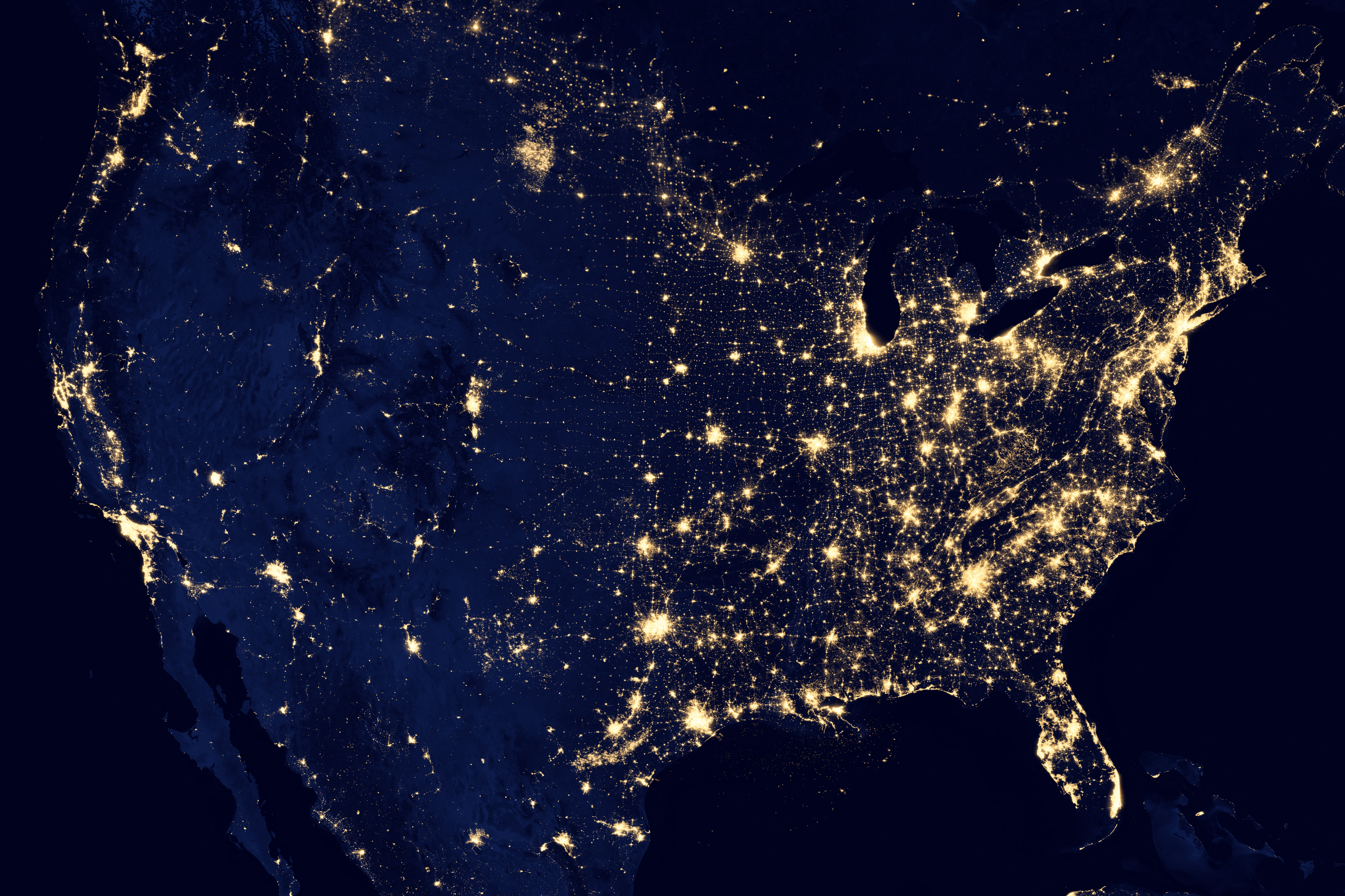
This image was taken by an astronaut in the International Space Station looking toward Chicago at one end of Lake Michigan (photo credit: NASA.) In this project we are going to examine data from a weather satellite taking pictures of North America at night, together with a map of US population. Please begin by skimming this article about light pollution.

http://www.minnpost.com/politics-policy/2008/07/dark-stars-light-pollution-fills-metro-sky
Data
Original night data: http://eoimages.gsfc.nasa.gov/images/imagerecords/79000/79800/dnb_united_states_lrg.jpg
Description of Data: http://earthobservatory.nasa.gov/IOTD/view.php?id=79800
The US population data can be found as a PDF https://www.census.gov/geo/maps-data/maps/2010popdistribution.html on the US census website and converted into an image. The US population data is given as a map that shows a dot on a dark background for every 10,000 people.
Reformatting the Data
The night data image was warped to approximately fit the projection used for the population data, by splitting it in half along a north-south line and then linearly interpolating each side. This warp process was not exact, as you will see, so the lights of a city will not always match the corresponding dots in the population data. Also, both the night data and the population data were converted to the ppm image format. If at some point you would like to look at the full scale images, they are available on the lab machines as ~cs125/data/night/lights.ppm and ~cs125/data/night/pop.ppm
These images have about 25 million red-green-blue pixels each. This amount of data can be difficult to handle directly in R. Instead of processing the entire images, we will use two sets of cropped images in the same directory as the images above: first a cropped version showing the North Shore of Lake Superior (DuluthLights.ppm and DuluthPop.ppm) and then a cropped version showing more of the north central region of the US, including Minnesota, North Dakota and South Dakota (NorthCentralLights.ppm and NorthCentalPop.ppm).
Background on Images
A digital image is a rectangular array of picture elements, or pixels for short. In a color image, each pixel typically consists of three numbers. The three numbers represent the amount of red, green, and blue, respectively, in that pixel. If the numbers are 1, 0, and 0, then the pixel will appear to be pure red. If the numbers are 1,0,1, then it will appear purple. If the numbers are 1, 1, 1, it will appear white. If we have a 1000x1000 pixel image (a one megapixel image), we will have three million numbers to work with, since each pixel is three numbers: red, green, and blue. In R, it may be most convenient to represent an image as an array, e.g. a 1000x1000x3 array of doubles between 0 and 1.
Part A: Adding Blue and Green Near Duluth
In this part, we are going to do some image modifications using a small cropped part of the initial light and population images. In general, it is a good idea to test your code on smaller datasets before you try it on larger datasets.
## Loading required package: pixmap
## Loading required package: ggmap
## Loading required package: ggplot2
If all goes well, you will see a mostly dark image, with a bright spot in the lower left (the city lights of Duluth).
Exercise 4
The colors represented by the dL array are mostly quite dark, but there are some areas that are especially dark. Create a boolean matrix that indicates, for each pixel, whether the green channel is less than 0.01. Do not ‘print’ this matrix, but you can plot this matrix with ggimage (ggimage can plot a matrix of booleans just as easily as an array of doubles).
dark<-matrix(dL[49777:99552]<.01,ncol=1)Exercise 5
Use the boolean matrix in step 4 to create a new array, in which each of the pixels that are especially dark are colored pure blue, but the other pixels keep their original colors. Then plot this new array. Hint: you could try changing one color channel at a time, but use the same boolean matrix each time.
blue<-matrix(dL[99553:149328],ncol=1)
red<-matrix(dL[1:49776],ncol=1)
green<-matrix(dL[49777:99552],ncol=1)
dkred<-ifelse(dark==T,0,red)
dkgreen<-ifelse(dark==T,0,green)
dkblue<-ifelse(dark==T,1,blue)
arrgb<-array(c(dkred,dkgreen,dkblue),dim=c(204,244,3))
ggimage(arrgb) ##### Exercise 6
What do you notice about the data you have just plotted? What happens if you use a threshold of 0.02, or 0.005, instead of 0.01? It is sufficient to comment on your findings; no need to make new images.
###Lakes are now blue. 0.02 threshold - more is colored blue (more pixels fall under "dark" category). 0.005 - less is colored blue (less pixels fall under "dark" category).The data for population near to Duluth is in the dP array.
ggimage(dP)
If all goes well, you will see a mostly dark image, with white dots representing 10,000 people each, and dark blue for Lake Superior and Canada.
Exercise 8
Once again, create a boolean matrix showing which pixels have very low values in the green channel, perhaps again less than 0.01. Plot this boolean matrix directly. Verify that the new boolean matrix shows Canada and Lake Superior.
darkdp<-matrix(dP[49777:99552]<.01,ncol=1)
dpblue<-matrix(dP[99553:149328],ncol=1)
dpred<-matrix(dP[1:49776],ncol=1)
dpgreen<-matrix(dP[49777:99552],ncol=1)
dpdkred<-ifelse(darkdp==T,0,dpred)
dpdkgreen<-ifelse(darkdp==T,0,dpgreen)
dpdkblue<-ifelse(darkdp==T,1,dpblue)
dparrgb<-array(c(dpdkred,dpdkgreen,dpdkblue),dim=c(204,244,3))
ggimage(dparrgb)
Exercise 9
Create a boolean array that attempts to indicate which pixels are in Canada but not in Lake Superior, by combining the boolean matrix from the previous step with the boolean matrix from step 4. To combine the two boolean matrices, please use logical operations (and, or, not). The result will not be perfect; this is just an approximation.
can<-darkdp!=dark
dpblue<-matrix(dP[99553:149328],ncol=1)
dpred<-matrix(dP[1:49776],ncol=1)
dpgreen<-matrix(dP[49777:99552],ncol=1)
candkred<-ifelse(can==T,0,dpred)
candkgreen<-ifelse(can==T,0,dpgreen)
candkblue<-ifelse(can==T,1,dpblue)
candparrgb<-array(c(candkred,candkgreen,candkblue),dim=c(204,244,3))
ggimage(candparrgb)
Exercise 10
Use the boolean matrix from steps 4 and 8 to create a new array dBoth in which Lake Superior is (mostly) blue, Canada is entirely green, and the remaining pixels show the night illumination. Plot this new array.
gcandkred<-ifelse(can==T,0,dkred)
gcandkgreen<-ifelse(can==T,1,dkgreen)
gcandkblue<-ifelse(can==T,0,dkblue)
gcandparrgb<-array(c(gcandkred,gcandkgreen,gcandkblue),dim=c(204,244,3))
ggimage(gcandparrgb)
Part B: Adding Pure Black
What would happen to the night image if the people in the major towns and cities turned all their lights off? We will try to get an approximation of this effect in several steps, below. Broadly speaking, we would like to make the areas of the night image that correspond to population centers black, and leave the rest of the image as it was in part A.
Exercise 1
Create a boolean matrix from dP that records TRUE for all pixels that correspond to population dots, and FALSE otherwise. Plot this matrix.
whitedp<-matrix(dP[49777:99552]==1 & dP[1:49776]==1 & dP[99553:149328]==1,nrow=204)
whiteblue<-matrix(dP[99553:149328],ncol=1)
whitered<-matrix(dP[1:49776],ncol=1)
whitegreen<-matrix(dP[49777:99552],ncol=1)
whitedpred<-ifelse(whitedp==T,1,whitered)
whitedpgreen<-ifelse(whitedp==T,0,whitegreen)
whitedpblue<-ifelse(whitedp==T,0,whiteblue)
whitearrgb<-array(c(whitedpred,whitedpgreen,whitedpblue),dim=c(204,244,3))
ggimage(whitearrgb)
Exercise 2
Plot the boolean matrix from step 1, and compare it with the location of the lights in dL (by switching between different plots). You will notice that they don’t line up quite right as they should. In the next few steps, we are going to modify the boolean matrix so that the population centers appear to grow outward, so that they can appear to cover more of the brightly lit areas.
Exercise 3
Build four functions to shift a boolean matrix left, right, up, and down, respectively. Use a small test case to check each of your four functions. For example, if your test case looks like this:
FFT
FTT
TTT
then, when it is shifted left (you add a column of FALSE), it should look like this:
FTF
TTF
TTF
left <- function(x){
x <- x[,-1]
x <- cbind(x,c(FALSE))
return(x)
}
right <- function(x){
x <- x[,-ncol(x)]
x <- cbind(c(FALSE),x)
return(x)
}
down <- function(x){
x <- x[-nrow(x),]
x <- rbind(c(FALSE),x)
return(x)
}
up <- function(x){
x <- x[-1,]
x <- rbind(x,c(FALSE))
return(x)
}Exercise 4
Build a function that uses your four shift functions to dilate the matrix, as follows: any matrix element that is already TRUE or that has a TRUE neighbor left, right, up, or down should become TRUE. For example, the following test matrix:
FFFFFFFFFFFFF
FFFFFFFFFFFFF
FFFTTTFFFFFFF
FFFFFFFFFFFFF
FFFFFFFFFFFFF
FFFFFFFTTTFFF
FFFFFFFTTFFFF
FFFFFFFFFFFFF
should change to look like this:
FFFFFFFFFFFFF
FFFTTTFFFFFFF
FFTTTTTFFFFFF
FFFTTTFFFFFFF
FFFFFFFTTTFFF
FFFFFFTTTTTFF
FFFFFFTTTTFFF
FFFFFFFTTFFFF
dilate <- function(x) ifelse(left(x)==T|right(x)==T|up(x)==T|down(x)==T,T,x)Exercise 5
Now apply your dilation function three times to the boolean matrix from step one, to create a new boolean matrix that has more spread out estimates of significant population centers.
one <- dilate(whitedp)
two <- dilate(one)
three <- dilate(two)Exercise 6
Use your new boolean matrix to black out the areas of the night image that correspond to population centers, leaving the other areas intact. Be careful to keep the green and blue pixels as they were at the end of part A!
blackred<-ifelse(three==T,0,gcandkred)
blackgreen<-ifelse(three==T,0,gcandkgreen)
blackblue<-ifelse(three==T,0,gcandkblue)
blackarrgb<-array(c(blackred,blackgreen,blackblue),dim=c(204,244,3))
ggimage(blackarrgb)
Part C: Scaling up
We have a method for treating the data at a small scale, so it is time to try some bigger data. For this part, we will only use medium size images, because the lab machines may not be able to handle the full dataset in R.
Exercise 1
The data for the north central region of the United States, including Minnesota and North and South Datoka, is again stored in two arrays called ncL and ncP for lights and populations, respectively. Check that you are able to see each of the using ggimage (this time it may take several seconds for R to draw all this data).
ggimage(ncL)
ggimage(ncP)
Exercise 2
Prepare to process these larger images in the same way that you processed the small images in Part A and Part B. That is, go back and rewrite your code so that it can be run with a new pair of arrays easily. You may want to create a function that takes two arguments, each of which is an array representing an image, and for which the return value is a new array that contains the desired blue, green, and black areas. Test your rewritten code using the small images.
fdark <- function(x,y){
dark<-matrix(x[((length(x)/3)+1):(2*(length(x)/3))]<.01,ncol=1)
blue<-matrix(x[((2*(length(x)/3))+1):(length(x))],ncol=1)
red<-matrix(x[1:(length(x)/3)],ncol=1)
green<-matrix(x[((length(x)/3)+1):(2*(length(x)/3))],ncol=1)
dkred<-ifelse(dark==T,0,red)
dkgreen<-ifelse(dark==T,0,green)
dkblue<-ifelse(dark==T,1,blue)
darkdp<-matrix(y[((length(y)/3)+1):(2*(length(y)/3))]<.01,ncol=1)
dpblue<-matrix(y[(2*(length(y)/3))+1:length(y)],ncol=1)
dpred<-matrix(y[1:(length(y)/3)],ncol=1)
dpgreen<-matrix(y[((length(y)/3)+1):(2*(length(y)/3))],ncol=1)
dpdkred<-ifelse(darkdp==T,0,dpred)
dpdkgreen<-ifelse(darkdp==T,0,dpgreen)
dpdkblue<-ifelse(darkdp==T,1,dpblue)
can<-darkdp!=dark
dpblue<-matrix(y[((2*(length(y)/3))+1):length(y)],ncol=1)
dpred<-matrix(y[1:(length(y)/3)],ncol=1)
dpgreen<-matrix(y[((length(y)/3)+1):(2*(length(y)/3))],ncol=1)
candkred<-ifelse(can==T,0,dpred)
candkgreen<-ifelse(can==T,0,dpgreen)
candkblue<-ifelse(can==T,1,dpblue)
gcandkred<-ifelse(can==T,0,dkred)
gcandkgreen<-ifelse(can==T,1,dkgreen)
gcandkblue<-ifelse(can==T,0,dkblue)
gcandparrgb<-array(c(gcandkred,gcandkgreen,gcandkblue),dim=c(nrow(y),ncol(y),3))
whitedp<-matrix(y[((length(y)/3)+1):(2*(length(y)/3))]==1 & y[1:(length(y)/3)]==1 & y[((2*(length(y)/3))+1):(length(y))]==1,nrow=(nrow(y)))
whiteblue<-matrix(y[((2*(length(y)/3))+1):length(y)],ncol=1)
whitered<-matrix(y[1:(length(y)/3)],ncol=1)
whitegreen<-matrix(y[((length(y)/3)+1):(2*(length(y)/3))],ncol=1)
whitedpred<-ifelse(whitedp==T,1,whitered)
whitedpgreen<-ifelse(whitedp==T,0,whitegreen)
whitedpblue<-ifelse(whitedp==T,0,whiteblue)
whitearrgb<-array(c(whitedpred,whitedpgreen,whitedpblue),dim=c(nrow(y),ncol(y),3))
left <- function(w){
w <- w[,-1]
w <- cbind(w,c(FALSE))
return(w)
}
right <- function(w){
w <- w[,-ncol(w)]
w <- cbind(c(FALSE),w)
return(w)
}
down <- function(w){
w <- w[-nrow(w),]
w <- rbind(c(FALSE),w)
return(w)
}
up <- function(w){
w <- w[-1,]
w <- rbind(w,c(FALSE))
return(w)
}
dilate <- function(w) ifelse(left(w)==T|right(w)==T|up(w)==T|down(w)==T,T,w)
one <- dilate(whitedp)
two <- dilate(one)
three <- dilate(two)
blackred<-ifelse(three==T,0,gcandkred)
blackgreen<-ifelse(three==T,0,gcandkgreen)
blackblue<-ifelse(three==T,0,gcandkblue)
blackarrgb<-array(c(blackred,blackgreen,blackblue),dim=c(nrow(y),ncol(y),3))
return(blackarrgb)
}
ggimage(fdark(dL,dP))
Exercise 3
Now apply your function to the medium size images. Hopefully, your function will just work, but if not, please fix your function so that it does work for both the small and the medium size images. When you are ready, plot the results for the medium size images.
ggimage(fdark(ncL,ncP))
Exercise 4
Write a paragraph of observations as you look at the result for the medium size images. Is there anything surprising? Can you explain what is going on in the various parts of the image?
###The most obvious oddity in our medium sized image is the amount of light pollution in what looks like North Dakota that does not correspond to any population centers. We have no clue what is producing this much light in such a sparsely populated area - the light produced is even greater than that produced by the MSP area. Obvious striations from East to West can be found, especially in the bottom half of the image, which likely correspond to major highways and small towns. The left side of the image is a sparesly populated area (except for our mystery light pollutant), as evidenced by the lack of dark spots and light pollutants. The MSP area is densely populated in the middle right of the image, but the light pollution is mostly covered by our diluted population data. However, most other areas produce on average more light per capita than the twin cities, as evidenced by the fact that their diluted population data does not cover their light pollution.
###After skimming part 5, we found that the mysterious source of light pollution is due to the ridiculous amount of flaring from Bakken oil fields.Exercise 5
Skim this study for any facts you might like to add to your observations.
To turn in your project you should send the HTML output file and the .rmd input file to the CS125 TAs no later than class time on Monday. Make sure to practice ‘knitting’ your file. Check your HTML before submitting it to the TAs. You should not have any unnecessary output from code you used for testing. Make sure your code for plotting each image is the last line of each chunk so that your image does not divide the output chunks in half.