2024-03-19

Overview

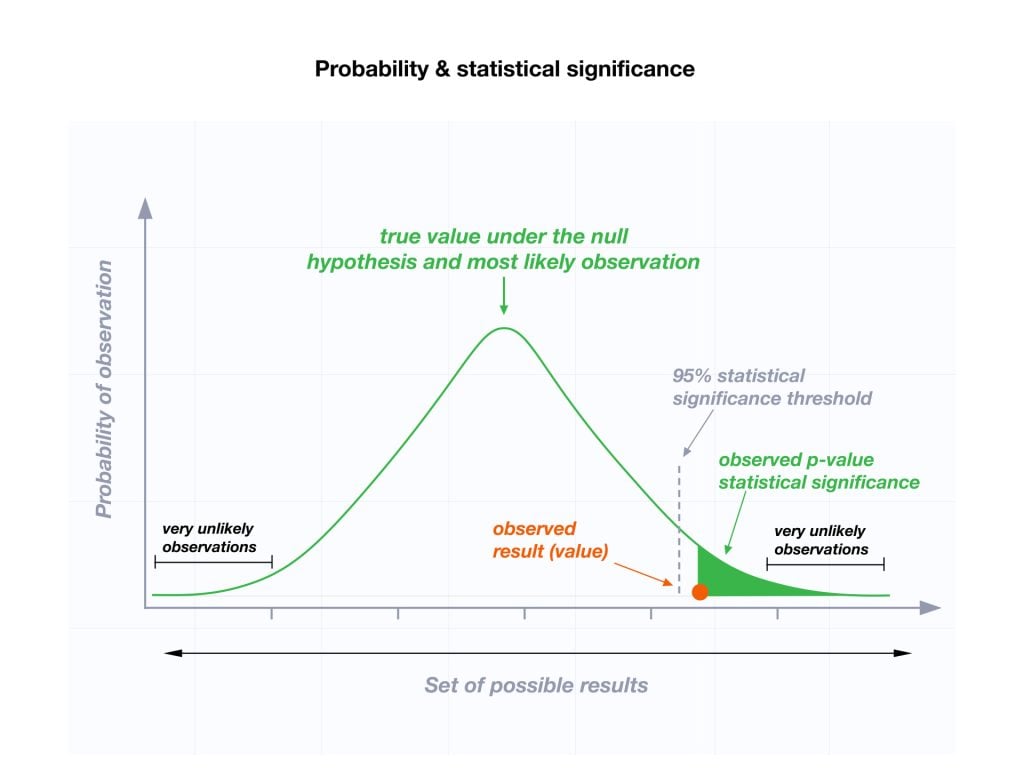
The p-value is a number, calculated from a statistical test, that describes how likely you are to have found a particular set of observations if the null hypothesis were true.

P-values are used in hypothesis testing to help decide whether to reject the null hypothesis. The smaller the p-value, the more likely you are to reject the null hypothesis.

Null hypothesis: assuming a statement about a population is true. For most tests, the null hypothesis is that there is no relationship between your variables of interest or that there is no difference among groups.

Alternative hypothesis: something else about that population is true. For most tests, the alternative hypothesis is that there is a relationship between your variables of interest or that there is a difference among groups.

Understanding P-Values

P-values are calculated from the deviation between the observed value and a chosen reference value, given the probability distribution of the statistic, with a greater difference between the two values corresponding to a lower p-value.

A p-value of 0.05 or lower is generally considered statistically significant.

The Role of P-Values in Hypothesis Testing

P-values are integral to the process of hypothesis testing. They provide a way to quantify the evidence against the null hypothesis (\(H_0\)) based on the sample data.

Null Hypothesis (\(H_0\)): The population mean (\(\mu\)) is equal to a hypothetical mean (\(\mu_0\)). \(H_0: \mu = \mu_0\).

Alternative Hypothesis (\(H_A\)): Depending on the test (or the hypothetical mean), it can be:
Left-tailed test: \(\mu < \mu_0\).
Right-tailed test: \(\mu > \mu_0\).
Two-tailed test: \(\mu \neq \mu_0\).

Interpretation of P-Value: A small p-value (typically ≤ 0.05) suggests that it is unlikely to observe the sample data if the null hypothesis is true, leading us to reject \(H_0\). A large p-value suggests that the sample data is consistent with the null hypothesis, leading us to fail to reject \(H_0\).

Test Statistic Formula

Given a sample mean (\(\bar{x}\)), hypothetical mean (\(\mu_0\)), sample standard deviation (s), and sample size (n), the test statistic is calculated as:

\[ t = \frac{\bar{x} - \mu_0}{s/\sqrt{n}} \]

We then compare the calculated test statistic to a critical value based on the desired significance level (\(\alpha\)) to determine the p-value.

Note: If p-value > \(\alpha\) → fail to reject \(H_0\).

To find the critical value, we need to find the z-score of the significance level (\(\alpha\)) using z-table. For example, given \(\alpha\) = 0.01, critical value = \(z_\alpha\) = 2.326.

Understanding P-Values with ggplot

To understand the concept of p-values, we visualize the distribution of the test statistic under the null hypothesis. The area under the curve beyond the observed test statistic represents the p-value.

R Code

The ggplot visualization is given by the following R code along with ggplot2 library:

library(ggplot2)

# Generating a sequence of test statistics under the null hypothesis
null_values <- rnorm(10000, mean = 0, sd = 1)

# Calculating the observed test statistic (e.g., 2.5)
observed_value <- 2.5

# Creating a dataframe for ggplot
null_data <- data.frame(null_values)

# Generating the plot
ggplot(null_data, aes(x = null_values)) +
  geom_histogram(aes(y = ..density..), binwidth = .1, fill = "grey", color = "black") +
  geom_density(alpha = .2, fill = "hotpink") +
  geom_vline(aes(xintercept = observed_value), color = "skyblue", linetype = "dashed", size = 1) +
  geom_area(stat = 'function', fun = function(x) dnorm(x, mean = 0, sd = 1), 
            fill = "blue", xlim = c(observed_value, Inf), alpha = .2) +
  labs(title = "Distribution of Test Statistic under the Null Hypothesis",
       subtitle = "The shaded area represents the p-value",
       x = "Test Statistic",
       y = "Density") +
  theme_minimal()

Type I and Type II Errors in Hypothesis Testing

Understanding the p-value also involves recognizing the potential errors in hypothesis testing: Type I and Type II errors.

Type I Error (False Positive): Incorrectly rejecting a true null hypothesis.

Type II Error (False Negative): Failing to reject a false null hypothesis.

Let’s visualize these errors with a plot:

Note: Annotations are added to highlight the critical value and demonstrate the direction towards which the Type I error (false positive) would occur.

The two overlaid histograms representing the distribution under the null hypothesis and the alternative hypothesis. The critical value for a significance level of 0.05 is marked with a dashed line.

Interactive Visualization of P-Values with Plotly

P-values change depending on the value of the test statistic. With Plotly, we can interactively explore this relationship.

Let’s create an interactive visualization that shows the p-value as the area under the curve to the right of the test statistic on a standard normal distribution:

Note: This interactive plot will allow users to hover over points, see different z-values, and understand the p-value’s relationship with the test statistic visually.

In this Plotly plot, I have plotted the standard normal distribution and highlighted the area under the curve that represents the p-value. The test statistic is marked with a dashed line. The shaded area under the curve beyond the test statistic represents the p-value for a right-tailed test.