Probability Distributions
American University of Armenia
ESS 103 - Spring 2024
Whether you’re guessing if it’s going to rain tomorrow, betting on a sports team to win an away match, or framing a policy for an insurance company, probability and distributions come into action in all aspects of life to determine the likelihood of events. But before we jump into probabilities, let’s remind ourselves with the types of data.
- Discrete data have a limited number of outcomes possible. Examples include: counts, number of arrivals, or number of successes. They are often represented by integers, say, 0, 1, 2, etc. e.g. The number of students in class.
- Continuous data have infinite or continuous outcomes. These are also known as scale data, interval data, or measurement data. Examples include: height, weight, length, time, etc. Continuous data are often characterized by fractions or decimals: 3.82, 7.0001, etc.

Test: Volume of water in a tank represents what type of data?
Volume often represents continuous data
Note that the distinction between discrete and continuous data is not always clear-cut. Sometimes it is convenient to treat data as if they were continuous, even though strictly speaking they are not continuous.
To bring one such example, we will look into the ‘Lengths of Major North American Rivers’ dataset
print(rivers) [1] 735 320 325 392 524 450 1459 135 465 600 330 336 280 315
[15] 870 906 202 329 290 1000 600 505 1450 840 1243 890 350 407
[29] 286 280 525 720 390 250 327 230 265 850 210 630 260 230
[43] 360 730 600 306 390 420 291 710 340 217 281 352 259 250
[57] 470 680 570 350 300 560 900 625 332 2348 1171 3710 2315 2533
[71] 780 280 410 460 260 255 431 350 760 618 338 981 1306 500
[85] 696 605 250 411 1054 735 233 435 490 310 460 383 375 1270
[99] 545 445 1885 380 300 380 377 425 276 210 800 420 350 360
[113] 538 1100 1205 314 237 610 360 540 1038 424 310 300 444 301
[127] 268 620 215 652 900 525 246 360 529 500 720 270 430 671
[141] 1770str(rivers) num [1:141] 735 320 325 392 524 ...The output says that rivers is a numeric vector of length 141, and the first few values are 735, 320, 325, etc. These data are definitely quantitative and it appears that the measurements have been rounded to the nearest mile. Thus, strictly speaking, these are discrete data. But we will find it convenient later to take data like these to be continuous for some of our statistical procedures.
Differentiating between discrete and continuous data is important as probability distributions are grouped into two categories, discrete distributions for discrete data (finite outcomes) and continuous distributions for continuous data (infinite outcomes).
What is a probability distribution?
In probability theory and statistics, a probability distribution is the mathematical function that gives the probabilities of occurrence of different possible outcomes for an experiment. It is a mathematical description of a random phenomenon in terms of its sample space and the probabilities of events (subsets of the sample space).
A probability density function is a mathematical function that describes a continuous probability distribution. It provides the probability density of each value of a variable, which can be greater than one.
A probability density function can be represented as an equation or as a graph.
In graph form, a probability density function is a curve. You can determine the probability that a value will fall within a certain interval by calculating the area under the curve within that interval. You can use reference tables or software to calculate the area.
The area under the whole curve is always exactly one because it’s certain (i.e., a probability of one) that an observation will fall somewhere in the variable’s range.
A cumulative distribution function is another type of function that describes a continuous probability distribution.
Types of probability distributions
There are many types of probability distributions depending on the type of data used. A few of the common ones are shown in Fig. 2 below. For a more comprehensive list, you can see here. Note that you don’t need to memorize all these

Discrete distributions
Discrete uniform distribution:
All outcomes are equally likely
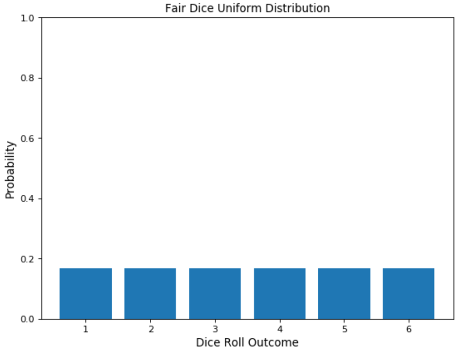
In statistics, uniform distribution refers to a statistical distribution in which all outcomes are equally likely. Consider rolling a six-sided die. You have an equal probability of obtaining all six numbers on your next roll, i.e., obtaining precisely one of 1, 2, 3, 4, 5, or 6, equaling a probability of 1/6, hence an example of a discrete uniform distribution.
As a result, the uniform distribution graph contains bars of equal height representing each outcome. In our example, the height is a probability of 1/6 (0.166667).
[Fig. 3: Uniform distribution of the outcomes of throwing a dice event. Image source: datasciencedojo] (https://datasciencedojo.com/wp-content/uploads/fair-dice-uniform-distribution.webp)
To recreate this in R, we can use the sample command:
sample(1:6, 1)[1] 11:6 indicate the possible outcomes are 1,2,3,4,5,6 (for the numbers on the dice) and 1 after the comma indicates how many times we threw the dice. If you run the above chunk again, there’s a good chance you will get a different outcome. However, all outcomes have equal probability of showing up, just like when you throw a dice.
To try multiple dice throws:
sample(1:6, 3, replace = T)[1] 5 3 2In the above example, we threw the dice three times. We used the replace command so that the number that comes up can reappear again, thereby keeping equal probability for all outcomes. This is called an independent event if one experiment’s outcome does not affect the other event’s probabilities.
A contrasting example to this would be if you are selecting out candidates. e.g. giving away gifts and you don’t want the same person to receive 2 or more gifts. So once their name comes out, they are taken out of the lottery pool. In that case, you can select replace = F.
For example:
sample(1:6, 5, replace = F)[1] 6 5 3 4 2None of the numbers show up again after throwing the dice 5 times.
Now let’s roll a thousand times and save the output vector to an object that we can do something with:
rolls = sample(1:6, 1000, replace = TRUE)
table(rolls)
rolls
1 2 3 4 5 6
154 162 156 156 195 177 dice_data = data.frame(outcome=rolls)
dice_dataThe table output above shows how many times each number came up after rolling the dice 1000 times. Let’s create a histogram of the above to visualize it.
library(ggplot2)Use suppressPackageStartupMessages() to eliminate package startup
messagesggplot(dice_data, aes(x = outcome)) +
geom_histogram(binwidth = 1, fill = "grey", color = "black") +
labs(title = "Histogram of Dice Roll Outcomes",
x = "Dice Roll Outcome",
y = "Frequency")+
theme_bw()
So although each number had the same exact probability to show up (1/6 = 0.1666667), the results still show a slight variability in the final outcomes.
To demonstrate this in a clearer way:
table(rolls) / 1000rolls
1 2 3 4 5 6
0.154 0.162 0.156 0.156 0.195 0.177 Note: the higher the sample size (n), the closer these numbers will get to achieving 1/6 probability.
Let’s do a few exercises:
What is the probability of throwing a dice once and getting a 4 or higher?
(1/6)+(1/6)+(1/6)[1] 0.5Under a uniform distribution, the probability of each outcome is 1/6 = 0.1666667, so to get 4, 5, or 6, we have 3/6 = 50%
What is the probability of getting 1 or 5 when a fair six-sided die is rolled?
(2/6)[1] 0.3333333What is the probability of throwing a dice twice and getting at least one 6?
(1/6)+(1/6)[1] 0.3333333What is the probability of throwing a dice twice and getting two 6?
(1/6)*(1/6)[1] 0.02777778As in the latter case it is a must to get a “6” both times, we multiply the probability of each throw instead of adding. The result then is only 2.8% chance.
When two dice are thrown simultaneously, the number of events is \(6^2 = 36\) because each die has 1 to 6 number on its faces. The possible outcomes are shown in the below table.

As you can see, our outcome is only 1/36 possible outcomes, hence = 2.8%.
What is the probability of throwing a dice twice and getting sum ≤ 4.
Looking at the table, we can see there are 6/36 possible outcomes that result in a sum 4 or lower. Therefore:
(6/36)[1] 0.1666667If we want to write the above as a formula:
((1/6)*(3/6)+(1/6)*(2/6)+(1/6)*(1/6))[1] 0.1666667What is the probability of throwing a dice twice and getting 2 even numbers?
(3/6)*(3/6)[1] 0.25**Important to remember: When you read or you use addition (+), when you read and, you use multiplication (*).**
Bernoulli Distribution:
Single-trial with two possible outcomes
The Bernoulli distribution is one of the easiest distributions to understand. It can be used as a starting point to derive more complex distributions. Any event with a single trial and only two outcomes follows a Bernoulli distribution. Flipping a coin or choosing between True and False in a quiz are examples of a Bernoulli distribution.
They have a single trial and only two outcomes. Let’s assume you flip a coin once; this is a single trail. The only two outcomes are either heads or tails. This is an example of a Bernoulli distribution.
Usually, when following a Bernoulli distribution, we have the probability of one of the outcomes (p). From (p), we can deduce the probability of the other outcome by subtracting it from the total probability (1), represented as (1-p).
Binomial Distribution:
A sequence of Bernoulli events
The Binomial Distribution can be thought of as the sum of outcomes of an event following a Bernoulli distribution. Therefore, Binomial Distribution is used in binary outcome events, and the probability of success and failure is the same in all successive trials. An example of a binomial event would be flipping a coin multiple times to count the number of heads and tails.
Binomial vs Bernoulli distribution:
The difference between these distributions can be explained through an example. Consider you’re attempting a quiz that contains 10 True/False questions. Trying a single T/F question would be considered a Bernoulli trial, whereas attempting the entire quiz of 10 T/F questions would be categorized as a Binomial trial.
The main characteristics of Binomial Distribution are:
In multiple trials, each trial is independent of the other. That is, the outcome of one trial doesn’t affect another one. Each trial can lead to just two possible results (e.g., winning or losing), with probabilities p and (1 – p).
A binomial distribution is represented by B (n, p), where n is the number of trials and p is the probability of success in a single trial. A Bernoulli distribution can be shaped as a binomial trial as B (1, p) since it has only one trial.
In R, there are a number of commands you can use for binomial distributions. The 3 most commonly used ones are dbinom, pbinom, rbinom.
- dbinom function finds the probability of getting a certain number of successes (x) from a certain number of trials (size) where the probability of success on each trial is fixed (prob). You can write it as follows:
dbinom (x, size, prob)
- The function pbinom returns the value of the cumulative density function of the binomial distribution given a certain random variable q, number of trials (size) and probability of success on each trial (prob).
The syntax for using pbinom is as follows:
pbinom(q, size, prob)
Put simply, pbinom returns the area to the left of a given value q in the binomial distribution. If you’re interested in the area to the right of a given value q, you can simply add the argument lower.tail = FALSE. Here’s an example:
pbinom(q, size, prob, lower.tail = FALSE)
- The function rbinom generates a vector of binomial distributed random variables given a vector length n, number of trials (size) and probability of success on each trial (prob). The syntax for using rbinom is as follows:
rbinom(n, size, prob)
Let’s test these with a few exercises:
According to ESPN, Lebron James is a career 73.5% Free Throw shooter. In his last game, James attempted 8 FTs. What is the probability that he scored exactly 6 of them?
dbinom(6,8, 0.735)[1] 0.3100087According to the same source, James is currently having his second-best year in 3-pt% of his career, scoring 40.1% of all attempts from beyond the arc. If he attempts 7 such shots in the next game, what’s the probability that he will score 4 times or less?
Since this is a cumulative probability (indicating he will score 0, 1, 2, 3, or 4 attempts out of 7), we use the pbinom command:
pbinom(4,7, 0.401)[1] 0.9027731Same as the previous question, what’s the probability that he will miss at least 3 times?
Trick question: exactly the same as the one before it.
Same as the last 2 questions, what’s the probability that he will score 3 times or more?
pbinom(3,7, 0.401, lower.tail = FALSE)[1] 0.2917298Poisson Distribution:
The probability that an event may or may not occur
The Poisson distribution deals with the frequency with which an event occurs within a specific interval. Instead of the probability of an event, Poisson distribution requires knowing how often it happens in a particular period or distance. For example, a cricket chirps two times in 7 seconds on average. We can use the Poisson distribution to determine the likelihood of it chirping five times in 15 seconds.
A Poisson process is represented with the notation Po(λ), where λ represents the expected number of events that can take place in a period. X represents the discrete random variable.
The main characteristics which describe the Poisson processes are:
- The events are independent of each other.
- An event can occur any number of times (within the defined period).
- Two events can’t take place simultaneously.
 In R, the syntax used for a Poisson distribution is similar to that of
the binomial distribution but with pois being used instead of
binom (see Fig. 5 below).
In R, the syntax used for a Poisson distribution is similar to that of
the binomial distribution but with pois being used instead of
binom (see Fig. 5 below).

On average, I receive 35 emails per day. What is the probability that I receive more than more than 40 emails today?
Since we are looking for a cumulative distribution (>41 emails), we’ll use the ppois command. Moreover, since we are looking for the area below the right tail, we’ll add lower.tail=F to our syntax.
ppois(40, 35, lower.tail = FALSE)[1] 0.1750619Continuous distributions
Normal Distribution:
Symmetric distribution of values around the mean
Normal distribution is the most used distribution in data science. In a normal distribution graph, data is symmetrically distributed with no skew. When plotted, the data follows a bell shape, with most values clustering around a central region and tapering off as they go further away from the center.
The normal distribution frequently appears in nature and life in various forms. For example, the scores of a quiz follow a normal distribution. Many of the students scored between 60 and 80 as illustrated in the graph below. Of course, students with scores that fall outside this range are deviating from the center.

Here, you can witness the “bell-shaped” curve around the central region, indicating that most data points exist there. The normal distribution is represented as N(µ, σ2) here, µ represents the mean, and σ2 represents the variance, one of which is mostly provided. The expected value of a normal distribution is equal to its mean. Some of the characteristics which can help us to recognize a normal distribution are:
- The curve is symmetric at the center. Therefore mean, mode, and median are equal to the same value, distributing all the values symmetrically around the mean.
- The area under the distribution curve equals 1 (all the probabilities must sum up to 1).
While plotting a graph for a normal distribution, 68% of all values lie within one standard deviation from the mean. In the example above, if the mean is 70 and the standard deviation is 10, 68% of the values will lie between 60 and 80. Similarly, 95% of the values lie within two standard deviations from the mean, and 99.7% lie within three standard deviations from the mean. This last interval captures almost all matters. If a data point is not included, it is most likely an outlier.
In R, the syntax for normal distributions follows the same logic as those of binomial and poisson distributions, replacing binom and pois, respectively with norm. Thus, the functions are as follows:

Suppose the scores on a test follow a normal distribution with a mean of 70 and a standard deviation of 10. Calculate the probability that a randomly selected student scores between 60 and 80.
r1 = pnorm(80, 70, 10) - pnorm(60, 70, 10)
r1
[1] 0.6826895Same sample as above, calculate the score below which 90% of the students fall.
qnorm(0.9, mean = 70, sd = 10)[1] 82.81552Student t-Test Distribution:
Small sample size approximation of a normal distribution
The student’s t-distribution, also known as the t distribution, is a type of statistical distribution similar to the normal distribution with its bell shape but has heavier tails. The t distribution is used instead of the normal distribution when you have small sample sizes.
For example, suppose we deal with the total apples sold by a shopkeeper in a month. In that case, we will use the normal distribution. Whereas, if we are dealing with the total amount of apples sold in a day, i.e., a smaller sample, we can use the t distribution.
Another critical difference between the students’ t distribution and the Normal one is that apart from the mean and variance, we must also define the degrees of freedom for the distribution. In statistics, the number of degrees of freedom is the number of values in the final calculation of a statistic that are free to vary. A Student’s t distribution is represented as t(k), where k represents the number of degrees of freedom. For k=2, i.e., 2 degrees of freedom, the expected value is the same as the mean.
Exponential distribution:
Exponential distribution is one of the widely used continuous distributions. It is used to model the time taken between different events. For example, in physics, it is often used to measure radioactive decay; in engineering, to measure the time associated with receiving a defective part on an assembly line; and in finance, to measure the likelihood of the next default for a portfolio of financial assets. Another common application of Exponential distributions in survival analysis (e.g., expected life of a device/machine).
The exponential distribution is commonly represented as Exp(λ), where λ is the distribution parameter, often called the rate parameter. We can find the value of λ by the formula = 1/μ, where μ is the mean. Here standard deviation is the same as the mean. Var (x) gives the variance = 1/λ2

An exponential graph is a curved line representing how the probability changes exponentially. Exponential distributions are commonly used in calculations of product reliability or the length of time a product lasts.