Chapter 11 Work
Dimple K. Patel
2024-02-18
Section 11.13
For these exercises, we will be using the vaccines data in the dslabs package:
library(dslabs)
library(ggplot2)
library(dplyr)
##
## Attaching package: 'dplyr'## The following objects are masked from 'package:stats':
##
## filter, lag## The following objects are masked from 'package:base':
##
## intersect, setdiff, setequal, unionlibrary(tidyverse)## ── Attaching core tidyverse packages ──────────────────────── tidyverse 2.0.0 ──
## ✔ forcats 1.0.0 ✔ stringr 1.5.1
## ✔ lubridate 1.9.3 ✔ tibble 3.2.1
## ✔ purrr 1.0.2 ✔ tidyr 1.3.0
## ✔ readr 2.1.4## ── Conflicts ────────────────────────────────────────── tidyverse_conflicts() ──
## ✖ dplyr::filter() masks stats::filter()
## ✖ dplyr::lag() masks stats::lag()
## ℹ Use the conflicted package (<http://conflicted.r-lib.org/>) to force all conflicts to become errorsdata(us_contagious_diseases)1. Pie charts are appropriate:
A. When we want to display percentages.
2. What is the problem with the plot below:
B. The axis does not start at 0. Judging by the length, it appears Trump received 3 times as many votes when, in fact, it was about 30% more.
3. Take a look at the following two plots. They show the same information: 1928 rates of measles across the 50 states.

4. To make the plot on the left, we have to reorder the levels of the states’ variables.
dat<-us_contagious_diseases |> filter(year==1967 & disease=="Measles" & !is.na(population)) |> mutate(rate=count/population*10000*52/weeks_reporting)Note what happens when we make a barplot:
dat |> ggplot(aes(state, rate)) + geom_bar(stat="identity") + coord_flip() 

Define these objects. Redefine the state object so that the levels are re-ordered. Print the new object state and its levels so you can see that the vector is not re-ordered by the levels.
state<-dat$state
rate<-dat$count/dat$population*10000*52/dat$weeks_reporting
state<-reorder(state, rate, FUN=mean)
state
## [1] Alabama Alaska Arizona
## [4] Arkansas California Colorado
## [7] Connecticut Delaware District Of Columbia
## [10] Florida Georgia Hawaii
## [13] Idaho Illinois Indiana
## [16] Iowa Kansas Kentucky
## [19] Louisiana Maine Maryland
## [22] Massachusetts Michigan Minnesota
## [25] Mississippi Missouri Montana
## [28] Nebraska Nevada New Hampshire
## [31] New Jersey New Mexico New York
## [34] North Carolina North Dakota Ohio
## [37] Oklahoma Oregon Pennsylvania
## [40] Rhode Island South Carolina South Dakota
## [43] Tennessee Texas Utah
## [46] Vermont Virginia Washington
## [49] West Virginia Wisconsin Wyoming
## attr(,"scores")
## Alabama Alaska Arizona
## 4.16107582 5.46389893 6.32695891
## Arkansas California Colorado
## 6.87899954 2.79313560 7.96331905
## Connecticut Delaware District Of Columbia
## 0.36986840 1.13098183 0.35873614
## Florida Georgia Hawaii
## 2.89358806 0.09987991 2.50173748
## Idaho Illinois Indiana
## 6.03115170 1.20115480 1.34027323
## Iowa Kansas Kentucky
## 2.94948911 0.66386422 4.74576011
## Louisiana Maine Maryland
## 0.46088071 2.57520433 0.49922233
## Massachusetts Michigan Minnesota
## 0.74762338 1.33466700 0.37722410
## Mississippi Missouri Montana
## 3.11366532 0.75696354 5.00433320
## Nebraska Nevada New Hampshire
## 3.64389801 6.43683882 0.47181511
## New Jersey New Mexico New York
## 0.88414264 6.15969926 0.66849058
## North Carolina North Dakota Ohio
## 1.92529764 14.48024642 1.16382241
## Oklahoma Oregon Pennsylvania
## 3.27496900 8.75036439 0.67687303
## Rhode Island South Carolina South Dakota
## 0.68207448 2.10412531 0.90289534
## Tennessee Texas Utah
## 5.47344506 12.49773953 4.03005836
## Vermont Virginia Washington
## 1.00970314 5.28270939 17.65180349
## West Virginia Wisconsin Wyoming
## 8.59456463 4.96246019 6.97303449
## 51 Levels: Georgia District Of Columbia Connecticut Minnesota ... Washington5. Now with one line of code, define the dat table as done above, but change mutate to create a rate variable and re-order the state variable so that the levels are re-ordered by this variable. Then make a barplot using the code above, but for this new dat.
dat<-us_contagious_diseases |> filter(year==1967 & disease=="Measles" & !is.na(population)) |> mutate(rate=count/population*10000*52/weeks_reporting) |> mutate(state=reorder(state, rate, FUN=mean))
dat |> ggplot(aes(state, rate)) + geom_bar(stat="identity") + coord_flip()
6. Say we are interested in comparing gun homicide rates across regions of the US. We see this plot: and decide to move to a state in the western region. What is the main problem with this interpretation?
library(dslabs)
data("murders")
murders |> mutate(rate = total/population*100000) |> group_by(region) |>
summarize(avg = mean(rate)) |> mutate(region = factor(region)) |>
ggplot(aes(region, avg)) + geom_bar(stat="identity") + ylab("Murder Rate Average")
C. It does not show all the data. We do not see the variability within a region and it’s possible that the safest states are not in the West.

7. Make a boxplot of the murder rates defined as by region, showing all the points and ordering the regions by their median rate.
data("murders")
murders |> mutate(rate=total/population*100000) |> mutate(region=reorder(region, rate, FUN=median)) |> ggplot(aes(region, rate)) + geom_boxplot() + geom_point()
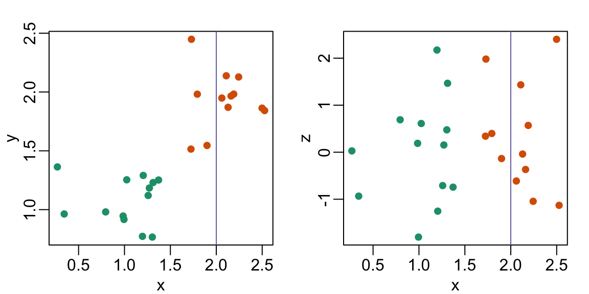
8. The plots below show three continuous variables.

The line x=2 appears to separate the points. But it is actually not the case, which we can see by plotting the data in a couple of two-dimensional points.
[] (https://rafalab.dfci.harvard.edu/dsbook/book_files/figure-html/pseud-3d-exercise-2-1.png)
Why is this happening?
D. Scatterplots should not be used to compare two variables when we have access to 3.