Stats in R - Part 7: Two Sample T-Tests
Shawn Hemelstrand
2023-09-03

Introduction
Welcome to Part 7 of my Stats in R Tutorial series. If you missed the last tutorial, you can check it out at the following link. Last time we touched on two t-tests, the Student t-test and the Wilcoxon signed rank test. This time we will cover two-sample t-tests, namely the independent samples t-test and a useful alternative, the Welch t-test. By the end of this tutorial, you should know how to:
- Visualize two distributions.
- Run two parametric t-tests.
- Compute two-sample effect sizes (along with corrections).
- Understand extrema in null hypothesis testing.
- Compare t-tests to linear regressions.
Independent Samples T-Test
By now, you should be familiar with how z-tests and t-tests work (if not, check out my other tutorials listed at the end). The core idea is to check whether or not a given mean from a sample differs from the mean of a known population. However, a lot of research is based on comparisons between samples. For example, perhaps we devise a literacy intervention and we want to know if it has any effect on reading scores for a population of interest (here we can just generalize to all students).
There is an issue to overcome here. After the intervention, we need to know how to untether the actual effect and what can be simply attributed to individual differences. For example, running an intervention on a sample and then comparing the sample mean to the population doesn’t do a good job with this, as our sample may just be different, but more importantly there is no way to know if it was indeed our intervention that made the mean change or if it was just the sample characteristics we were given.
Now what if we instead attempted to compare two samples, one that is a control group and one that is a treatment group. The treatment group gets the intervention and is the group of participants we are most interested in. The control group does not receive the treatment and is simply compared to the treatment group. If there are systematic differences between the otherwise equal groups, we should be able to assume that the effect in the treatment group should be (to a degree) attributed to the treatment itself.
Enter the two-sample t-test, which is designed for this very paradigm. Much like the z-test and t-tests we have already explored, we simply compare means as usual. However, this time we are comparing two sample means, so the formulation of the t-statistic is different and the original formula devised by Student is slightly more complicated.
\[ t = \frac{\bar{x}_1 - \bar{x}_2}{\sqrt{\frac{(n_1-1)s^2_1+(n_2-1)s^2_2}{n_1+n_2-2}*(\frac{1}{n_1}+\frac{1}{n_2})}} \] where \(\bar{x}\) is a given sample mean, \(s^2\) is a given sample variance, and \(n\) is a given sample size. This formula can essentially be rewritten into a simpler form such that:
\[ t = \frac{\bar{x}_1 - \bar{x}_2}{\sqrt{\frac{s^2_1}{n_1}+\frac{s^2_2}{n_2}}} \] And here we have a much cleaner look at what is being done. The mean differences are at the top, whereas the pooled variance and sample sizes are at the bottom. Dividing our mean difference by the pooled variance gives us an approximation of our t-value and in turn gives us some idea to what degree we can reject the null hypothesis. In order to know if this t-statistic is significant, we need a new formulation of degrees of freedom, represented as:
\[
df = n_1 + n_2 – 2
\] Here \(n_1\) and \(n_2\) are obviously just our sample sizes
for each group. Conducting an independent sample t-test is quite
straightforward and uses the same t.test function we are
already familiar with, albeit with some slight alterations. R is
actually the oddball compared to most other statistical software, in
that by default it uses the Welch t-test for two sample tests. We will
learn more about this later, but for now, lets use the version that we
have covered so far. First, we need to simulate some data, like we have
in the past. We will simulate a reading intervention, where the students
after the treatment are given a reading test, with the assumption that
the purported treatment will increase reading scores. Our competing
hypotheses then are:
\[
H_0 = \text{The reading intervention has no effect.}
\\
H_1 = \text{The reading intervention does have an effect.}
\] Later we will run a t-test on some real data, but for now
let’s practice our simulation skills and create the data ourselves. Here
we will create two normally distributed distributions that represent our
groups, one with a higher mean than the other. We will fix their
standard deviations to be equal in this example. We will also throw
these two groups into a tibble like we have in the past. To
plot the data, we will also pivot our data into long format with
gather and use rename to change the default
labels of our variables. Don’t forget to set a random seed so the
results are reproducible.
#### Load Library and Set Random Seed ####
library(tidyverse)
set.seed(123)

#### Simulate Groups ####
Control <- rnorm(n=100, mean = 70, sd = 15)
Treatment <- rnorm(n=100, mean = 90, sd = 15)

#### Merge into Tibble ####
tib <- tibble(Control = Control,
              Treatment = Treatment) %>%
  gather() %>% # pivot to long format
  rename(Group = key,
         Value = value) # rename default labels

#### Inspect Data ####
tib
## # A tibble: 200 × 2
## Group Value
## <chr> <dbl>
## 1 Control 61.6
## 2 Control 66.5
## 3 Control 93.4
## 4 Control 71.1
## 5 Control 71.9
## 6 Control 95.7
## 7 Control 76.9
## 8 Control 51.0
## 9 Control 59.7
## 10 Control 63.3
## # ℹ 190 more rowsIt is always a good habit to visualize our data first before we go
crazy with our t-tests. Lets make some density plots now that our data
is in hand. We will save this plot into an object called
plt for now, as we will keep making additions to it as we
move along. We will fill the densities with each group with the
fill argument. We will also alter the alpha to make the
colors transparent and add a thicker density function line. We will also
add in labels and a theme like we learned before, and change the fill
colors with scale_fill_manual.
#### Create Plot ####
plt <- tib %>%
  ggplot(aes(x=Value,
             fill=Group))+
  geom_density(alpha = .4,
               linewidth=1)+
  theme_bw()+
  labs(x="Reading Scores",
       y="Density",
       title = "Differences in Reading Scores")+
  scale_fill_manual(values = c("black","darkblue"))

#### Inspect Plot ####
plt
It may be helpful to visualize the means of our two distributions
before we run a t-test. We can easily do this by adding
geom_vline to our p object and saving it as
plines. We set the \(x\)
intercept to the mean of each group in order to draw a vertical line
where the mean is. We then assign it a color and change the linetype to
a dashed line, changing it to a bigger line with
linewidth=1.
#### Add Lines ####
plines <- plt +
  geom_vline(xintercept = mean(Treatment), # draw where mean is
             color="red", # color it red
             linewidth=1, # make line thicker
             linetype = "dashed")+ # make the line dashed
  geom_vline(xintercept = mean(Control),
             color="red",
             linewidth=1,
             linetype = "dashed")
plines
Looking at the plot, we can easily see that our simulated data is
behaving like we would expect. The distributions look normal, and the
treatment group in our simulated study has a much larger mean than the
intervention group. Now that we have this visualized, lets run our
t-test. I will first show you how to calculate the t-test manually, then
I will compare it to the t.test function to show you whats
going on under the hood. First, lets setup our t-test formula by saving
all our relevant inputs in R. We will get our sample sizes, mean values,
mean difference, and pooled variance values with the following code.
#### Save Sample Sizes, Means, and Variances ####
n1 <- length(Control)
n2 <- length(Treatment)
m1 <- mean(Control)
m2 <- mean(Treatment)
var1 <- var(Control)
var2 <- var(Treatment)

#### Calculate Mean Difference and Pooled Variance ####
mean.diff <- m1-m2
se1 <- var1/n1
se2 <- var2/n2
pooled.se <- sqrt(se1 + se2)
Then we simply combine these estimates and save them as
t. We can also get the p-value by plugging in our t-value,
adding in our degrees of freedom, and setting the lower tail argument to
“true.” We can then print them off easily by just running t
and p (go ahead and do this). We can also print them using
cat with a custom message indicating what they are. The
quoted sections are what we manually enter as a message to print, and
the objects are printed with the message.
#### Get T and P Values ####
t <- mean.diff/pooled.se
p <- 2*pt(t,
n1 + n2 - 2,
lower.tail=T)
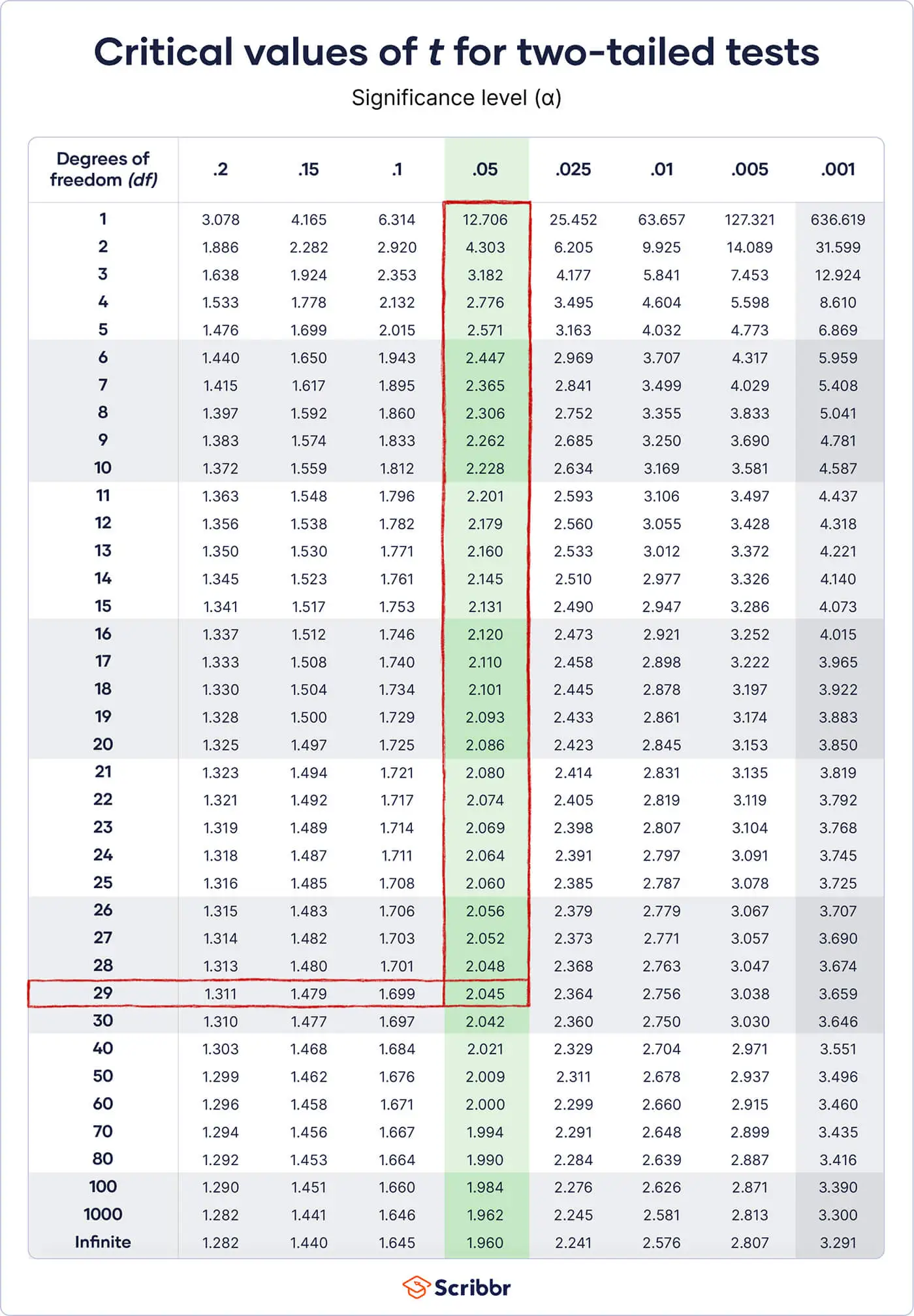
cat("T-Value:", t, "P-Value:", p)## T-Value: -8.538154 P-Value: 3.582097e-15We can see that our t-value makes our p-value very close to zero (as indicated by the scientific notation in R). To check if this is true yourself, consult the t-table linked here. Simply match the degrees of freedom, \(df = n_1 + n_2 – 2\), with the t-statistic we got. Note that I purposely picked sample sizes that do not typically show up on this table. Normally you won’t get an exact approximation with typical t-distribution tables online, so I wanted to make you aware of this. R will give an exact approximation, so normally you can simply count on R if you have entered everything in correctly (it is also why I showed you how to do this manually first). In any case, you can see that if our degrees of freedom are anywhere between 100 and 1000, anything above \(t=2\) would be statistically significant if \(a=.05\). Clearly we have surpassed that by a lot, hence our test is statistically significant.
That is obviously a lot of work, so normally you would just use
t.test. Lets run this function and compare it to our
results to see if they match up. Simply add the dependent variable on
the left side of the ~ and the grouping variable on the
right hand side. Set var.equal = T for now, as our
variances are indeed the same, and we want to look at the typical
version of this test first.
t.test(tib$Value ~ tib$Group, var.equal =T)The results are shown below.
##
##  Two Sample t-test
##
## data:  tib$Value by tib$Group
## t = -8.5382, df = 198, p-value = 3.582e-15
## alternative hypothesis: true difference in means between group Control and group Treatment is not equal to 0
## 95 percent confidence interval:
##  -20.96421 -13.09721
## sample estimates:
##   mean in group Control mean in group Treatment
##                71.35609                88.38680
Let’s give another rundown of this message, as it is slightly different from last time. First the message will tell you which test you used, here the two sample t-test. It will then tell you which data you modeled, along with the test statistics. You can see that our t value, degrees of freedom, and p-value all match what we expect. You can also see that it explicitly states the alternative hypothesis, along with confidence intervals and the actual means of each group.
Effect Size Calculation
Because our result is statistically significant, we can reject the null hypothesis that there is no effect. This does not say anything about the actual magnitude of our effect or even that the alternative hypothesis is true. Thus it is essential that we also obtain an effect size to quantify just how much of a difference our simulated intervention made. Again, we can manually calculate this ourselves just like we did last time. Recall that for mean comparisons, we use Cohen’s d, which for a one-sample test is calculated as:
\[ d = \frac{\bar{x}-\mu}{s} \]
This time we are just going to switch out \(\mu\), the population parameter, with another sample mean estimate (remember we are comparing two means here). So our formula will instead look like this, where \(s^2_p\) is our pooled variance from earlier:
\[ d = \frac{\bar{x_1}-\bar{x_2}}{s^2_p} \] Effectively, this formula works the same way, it is just more specific to our situation. The pooled variance estimate here is also defined a little differently, as the denominator actually includes \(s^2_p=\sqrt{\frac{(s^1_2+ s^2_2)}{2}}\). We can go ahead and calculate this ourselves.
d <- mean.diff/(sqrt((var(Control)+var(Treatment))/2))
d
## [1] -1.207477Of course a quicker way is to use a pre-made function for this.
Fortunately, the effectsize package already has a function
for this called cohens_d. Simply load the package and run
it like we did the t.test function. Remember to run
install.packages("effectsize") if you don’t already have
this package.
library(effectsize)
cohens_d(tib$Value ~ tib$Group)
## Cohen's d | 95% CI
## --------------------------
## -1.21 | [-1.51, -0.90]
##
## - Estimated using pooled SD.Now that we have all of our important statistics, we can simply add
all of this to our generated plot from earlier. We will now tack on all
of this information in the subtitle label, and add italic face using
theme.
p.stats <- plines+
  labs(subtitle = "t = -8.538, df = 198, p < .001, d = -1.21")+
  theme(plot.subtitle = element_text(face = "italic"))
p.stats
Our plot shows that the reading intervention makes an almost 1.5 SD difference in reading scores. Remember that the raw mean of the intervention group is higher and has the same fluctuation around the mean, so it is obvious that the intervention group in general benefited from this simulated study.
A More Realistic Scenario
Now that is all great, but we used a highly ideal example, which is unfortunately where many statistics books stop. The real world doesn’t really play nice, and our data will often be a lot messier. For starters, it is super rare for variances to be exactly the same between samples, and this is where our normal t-test simply won’t be that helpful.
Let’s take a real world dataset from R. We will use the
airquality dataset we used previously, but we will only
filter for the months of May and July. We will also convert month to a
factor variable so we can plot and test this data correctly.
#### Save Filtered and Mutated Data ####
air <- airquality %>%
  filter(Month == 5 | Month == 7) %>% # only May and July
  mutate(Month = factor(Month)) %>%
  as_tibble()

#### Inspect Data ####
air
## # A tibble: 62 × 6
## Ozone Solar.R Wind Temp Month Day
## <int> <int> <dbl> <int> <fct> <int>
## 1 41 190 7.4 67 5 1
## 2 36 118 8 72 5 2
## 3 12 149 12.6 74 5 3
## 4 18 313 11.5 62 5 4
## 5 NA NA 14.3 56 5 5
## 6 28 NA 14.9 66 5 6
## 7 23 299 8.6 65 5 7
## 8 19 99 13.8 59 5 8
## 9 8 19 20.1 61 5 9
## 10 NA 194 8.6 69 5 10
## # ℹ 52 more rowsOur data already hints at some issues, but lets save that thought
until we plot. We can do this in a similar way we did with our
simulation. First we need to get the means for each month by grouping
the data by month and getting the mean of each with
summarise (remembering to remove NA values like we have in
the past). We will also convert those to numeric vectors (alternatively
you can enter these means manually into the plot later).
#### Get Means ####
desc.air <- air %>%
  group_by(Month) %>%
  summarise(Mean.Temp = mean(Temp, na.rm = T),
            SD.Temp = sd(Temp, na.rm = T))

#### Save Means as Numeric Vectors ####
m1 <- as.numeric(desc.air[1,2])
m2 <- as.numeric(desc.air[2,2])

#### Inspect Means and SD ####
desc.air
## # A tibble: 2 × 3
## Month Mean.Temp SD.Temp
## <fct> <dbl> <dbl>
## 1 5 65.5 6.85
## 2 7 83.9 4.32We then just plot like we did before, using m1 and
m2 for our means for the intercept lines.
#### Create Plot ####
p.air <- air %>%
  ggplot(aes(x=Temp,
             fill=Month))+
  geom_density(alpha = .4,
               linewidth=1)+
  theme_bw()+
  labs(x="Temperature",
       y="Density",
       title = "Monthly Differences in Temperature")+
  scale_fill_manual(values = c("black","darkblue"),
                    label = c("May","July"))+
  geom_vline(xintercept = mean(m1),
             color="red",
             linewidth=1,
             linetype = "dashed")+
  geom_vline(xintercept = mean(m2),
             color="red",
             linewidth=1,
             linetype = "dashed")
#### Inspect Plot ####
p.air
Two things are immediately apparent. The means are quite different (this should be obvious given that July is generally hotter than May). But more importantly, we can see the distribution for May has a wider variance and is less kurtotic (aka tall) compared to July. This matches our standard deviations we got earlier when we summarized the data. Treating the standard deviations here as equal, we essentially will ignore the actual distribution’s shape if we simply run a vanilla t-test, so from here we will move on to the Welch t-test, which will do a much better job of capturing these differences.
Welch T-Test
As alluded to before, the Welch t-test is an alternative to the typical two-sample t-test, and R actually uses the Welch t-test by default. The statistic for the Welch t-test is derived with the same simplified formula I showed earlier:
\[ t = \frac{\bar{x}_1 - \bar{x}_2}{\sqrt{\frac{s^2_1}{n_1}+\frac{s^2_2}{n_2}}} \] Hence the actual t-statistic for the Welch t-test doesn’t change. The difference this time is that our degrees of freedom are calculated based off the unpooled variance estimates in order to disentangle the differences in variance each sample has. These degrees of freedom are calculated in the following way:
\[ df = \frac{\frac{s^2_1}{n_1}+\frac{s^2_2}{n_2}}{\frac{(\frac{s^2_1}{n_1})^2}{n_1-1}+\frac{(\frac{s^2_2}{n_2})^2}{n_2-1}} \]
This allows the t-statistic from this test to capture differences in both sample size and variance between groups. Simulations have shown that the Welch t-test performs much better than the typical t-test with departures in both variance equality and normality distributions, and some have even called for the Welch t-test to be the default test used by researchers.
In any case, like before, we can save our estimates and input them into a formula. I repeat some steps again here for clarity.
#### Save Sample Sizes, Means, and Variances ####
n1 <- length(Control)
n2 <- length(Treatment)
m1 <- mean(Control)
m2 <- mean(Treatment)
var1 <- var(Control)
var2 <- var(Treatment)

#### Calculate Mean Difference and Pooled Variance ####
mean.diff <- m1-m2
se1 <- var1/n1
se2 <- var2/n2
pooled.se <- sqrt(se1 + se2)

#### Welch Degrees of Freedom ####
top <- ((var1/n1) + (var2/n2))^2
bottom1 <- ((var1/n1)^2)/(n1-1)
bottom2 <- ((var2/n2)^2)/(n2-1)
bottom <- bottom1 + bottom2
df <- top/bottom

#### Get T and P Values ####
t <- mean.diff/pooled.se

p <- 2*pt(t,
          n1 + n2 - 2,
          lower.tail=T)

cat("T-Value:", t, "P-Value:", p, "Degrees of Freedom:",df)
## T-Value: -8.538154 P-Value: 3.582097e-15 Degrees of Freedom: 197.3456And to do this in R, we simply run the same t.test
function, setting var.equal=F this time. You will notice
the title in the produced summary change to “Welch Two Sample
T-Test”.
t.test(tib$Value ~ tib$Group, var.equal=F)##
## Welch Two Sample t-test
##
## data: tib$Value by tib$Group
## t = -8.5382, df = 197.35, p-value = 3.636e-15
## alternative hypothesis: true difference in means between group Control and group Treatment is not equal to 0
## 95 percent confidence interval:
## -20.96429 -13.09713
## sample estimates:
## mean in group Control mean in group Treatment
## 71.35609 88.38680Notice that with all of the steps we just went through, we get the exact same t and p values. You probably also noticed that the degrees of freedom were almost exactly the same as the uncorrected t-test. This is to show you that when the variance is the same for each group, there is no difference in the t-statistic or the resulting p-value, so it simplifies to the same Student \(t\) estimate. But what about samples that have different variances like our monthly temperature example? First the uncorrected test:
t.test(air$Temp ~ air$Month, var.equal = T)##
## Two Sample t-test
##
## data: air$Temp by air$Month
## t = -12.616, df = 60, p-value < 2.2e-16
## alternative hypothesis: true difference in means between group 5 and group 7 is not equal to 0
## 95 percent confidence interval:
## -21.26494 -15.44474
## sample estimates:
## mean in group 5 mean in group 7
## 65.54839 83.90323And then the corrected test. Note you do not have to set
var.equal = F and can simply run the test as
t.test(air$Temp ~ air$Month) if you want, as it is the
default:
t.test(air$Temp ~ air$Month, var.equal = F)##
## Welch Two Sample t-test
##
## data: air$Temp by air$Month
## t = -12.616, df = 50.552, p-value < 2.2e-16
## alternative hypothesis: true difference in means between group 5 and group 7 is not equal to 0
## 95 percent confidence interval:
## -21.27617 -15.43351
## sample estimates:
## mean in group 5 mean in group 7
## 65.54839 83.90323Notice now that in our corrected test we have lost nearly 10 degrees of freedom. Because we used degrees of freedom for deciding what p-value we obtain, this means our ability to reject the null hypothesis can actually fluctuate based off whether or not we account for sample-level comparisons of variance. This heterogeneity of variance, or unequal variance, is a common topic in statistics and should be remembered for later learning. The opposite, where variances are essentially equal, is termed homogeneity of variance.
However, you probably noticed that because our p-value is still incredibly low, we can’t actually see with precision in this example what happened. This is to show that in some cases the Welch t-test, even with fluctuations in variance, may not change the result if the p value is low enough. So we can simulate another intervention directly ourselves and see if we can get a t-test with different p-values with some adjustments in mean and variance.
#### Direct Example ####
set.seed(123)
new.ctrl <- rnorm(n=50,mean=40,sd=1)
new.trt <- rnorm(n=50,mean=52,sd=50)
tib2 <- tibble(new.ctrl = new.ctrl,
              new.trt = new.trt) %>%
  gather() %>%
  rename(group = key)
tib2
## # A tibble: 100 × 2
## group value
## <chr> <dbl>
## 1 new.ctrl 39.4
## 2 new.ctrl 39.8
## 3 new.ctrl 41.6
## 4 new.ctrl 40.1
## 5 new.ctrl 40.1
## 6 new.ctrl 41.7
## 7 new.ctrl 40.5
## 8 new.ctrl 38.7
## 9 new.ctrl 39.3
## 10 new.ctrl 39.6
## # ℹ 90 more rows#### T-Test Comparison ####
t.test(tib2$value ~ tib2$group, var.equal = T)##
## Two Sample t-test
##
## data: tib2$value by tib2$group
## t = -3.0116, df = 98, p-value = 0.003305
## alternative hypothesis: true difference in means between group new.ctrl and group new.trt is not equal to 0
## 95 percent confidence interval:
## -31.994177 -6.577843
## sample estimates:
## mean in group new.ctrl mean in group new.trt
## 40.03440 59.32041t.test(tib2$value ~ tib2$group)##
## Welch Two Sample t-test
##
## data: tib2$value by tib2$group
## t = -3.0116, df = 49.041, p-value = 0.0041
## alternative hypothesis: true difference in means between group new.ctrl and group new.trt is not equal to 0
## 95 percent confidence interval:
## -32.154691 -6.417329
## sample estimates:
## mean in group new.ctrl mean in group new.trt
## 40.03440 59.32041You can see now that the p-value for the Welch test is slightly higher than the uncorrected test. This may seem quite unremarkable given all the work we did, but remember that our decision criterion for p-values is usually based on an already small number: .05. Minor fluctuations around this number can mean the difference between a flagged test and an unflagged test. Keep in mind however that the alpha cutoffs for these tests are fairly arbitrary and have been criticized in recent years for this very reason. This is why we will also get an effect size before moving on, particularly an effect size which accounts for the variance issues we noted already.
An Alternative Effect Size
If we can assume that our t-statistic can be swayed by our sample variances being unequal, than naturally we may ask if the same is true for Cohen’s \(d\). The answer should be obvious given that the formulation for both includes pooled variance estimates. To circumvent this issue, we can use Hedge’s \(g\) instead, which isolates the variance estimates for a more realistic effect size. To do this, Hedge’s \(g\) is formulated as:
\[ g = \frac{ \bar{x}_1-\bar{x}_2 } { \sqrt{\frac{(n_1-1) \times s_1^2 + (n_2-1) \times s_2^2}{n_1+n_2-2}} } \] We know what all of this means already, we simply have to calculate it ourselves.
#### Obtain Numerator and Denominator for Hedges G ####
m1 <- mean(new.ctrl)
m2 <- mean(new.trt)
var1 <- var(new.ctrl)
var2 <- var(new.trt)
n1 <- length(new.ctrl)
n2 <- length(new.trt)

hedge.numer <- m1-m2

hedge.denom <- sqrt(
      (((n1-1)*var1) + ((n2-1)*var2))/(n1+n2-2)
    )

#### Calculate Hedges G ####
hedges.g <- round(hedge.numer/hedge.denom,3)
hedges.g
## [1] -0.602Extrema in NHST: The Reason Why P-Values Alone Say Nothing
You may have sensed in this tutorial and some in the past that I tend to have disregard for p-values and care more about things like raw estimates (means, SDs, etc.) as well as effect sizes. In the case of t-tests, you can often run into cases where differences are almost completely negligible, and yet they get flagged for statistical significance. Despite this, many researchers unfortunately fall prey to p-value mania and only report this value along with what is required for research papers. This is not a new issue with researchers, but I will illustrate why this is bad practice.
Let’s take an extreme but informative case. We will simulate two groups, each with \(n=1000\). They will have barely any difference in means, along with a very small standard deviation. Because of these aspects, any test on these groups will be statistically significant, as the standard error is affected by both the variance of each group, along with sample size. Large sample sizes in particular can often mask what are tiny differences because of this feature of t-tests.
#### Setup Data ####
Control <- rnorm(n=1000,mean=0,sd=.01)
Treatment <- rnorm(n=1000,mean=.0009,sd=.01)

df <- data.frame(Control,Treatment) %>%
  gather() %>%
  rename(Group = key,
         Value = value) %>%
  as_tibble()
df
## # A tibble: 2,000 × 2
## Group Value
## <chr> <dbl>
## 1 Control -0.00710
## 2 Control 0.00257
## 3 Control -0.00247
## 4 Control -0.00348
## 5 Control -0.00952
## 6 Control -0.000450
## 7 Control -0.00785
## 8 Control -0.0167
## 9 Control -0.00380
## 10 Control 0.00919
## # ℹ 1,990 more rows#### T-Test ####
t <- t.test(df$Value ~ df$Group)
t##
## Welch Two Sample t-test
##
## data: df$Value by df$Group
## t = -2.0022, df = 1997.8, p-value = 0.04539
## alternative hypothesis: true difference in means between group Control and group Treatment is not equal to 0
## 95 percent confidence interval:
## -1.772566e-03 -1.837441e-05
## sample estimates:
## mean in group Control mean in group Treatment
## 0.0001908133 0.0010862834We can see our usual estimates, and its quite clear we have a statistically significant result. If we want to observe how ridiculous this is, we can first see what our effect size is.
d <- cohens_d(df$Value ~ df$Group, pooled_sd = T)
d
## Cohen's d | 95% CI
## --------------------------
## -0.09 | [-0.18, 0.00]
##
## - Estimated using pooled SD.Our effect size is pretty weak. If we plot this, we will see why this is.
#### Plot ####
df %>%
  ggplot(aes(x=Value,
             fill=Group))+
  geom_density(linewidth=1,
               alpha = .4)+
  theme_minimal()+
  labs(x="Score",
       y="Density",
       title = "Experiment")+
  geom_vline(xintercept = mean(Control),
             linetype = "dashed",
             color="red")+
  geom_vline(xintercept = mean(Treatment),
             linetype = "dashed",
             color="red")
This means despite decimal differences in means, the t-statistic says really nothing about this difference. This is also why raw estimates matter here. A decimal difference may not matter in terms of educational scores (such as an ACT/SAT score) but may matter a lot for something else (such as a blood alcohol content level). So when reporting t-tests, it is essential that you report means, standard deviations, and effect sizes that accompany the normal estimates you get from t-tests.
Bonus: T-Tests and Linear Regression
This section isn’t mandatory reading, as we haven’t covered linear regression yet and details may be lost to those who haven’t already learned undergrad statistics (though I plan to write a tutorial on that subject in the future). Feel free to skip this section if you feel, though reading it won’t do you any harm. I will spend less time explaining the technical details of the code in this section and save that for the regression tutorial down the road.
Now I’m going to say something controversial: t-tests are actually just regression. Some psychologists reading this right now will probably think I’m crazy, and they would be supported by a large number of statistics books that seem to neglect this fact. It’s not clear if this is for historical reasons or simple ignorance, but this is a fact that is nonetheless important to know. Let me repeat: you can run a linear regression and get back the same estimates as a t-test. Even the formula in R is the same. If you don’t believe me, I will show you with a concrete example.
Using our previous simulation, let’s run a categorical regression.
You use the same ~ notation as before.
#### Fit Data to Regression ####
fit <- lm(tib$Value ~ tib$Group)

#### Summarize Fit ####
summary(fit)
The typical intercept in a Gaussian regression is the conditional mean, and additional parameters (aka slope values) are simply adjustments to this conditional mean. Look at our summary here.
##
## Call:
## lm(formula = tib$Value ~ tib$Group)
##
## Residuals:
##     Min      1Q  Median      3Q     Max
## -35.994  -9.554  -1.307   9.021  50.229
##
## Coefficients:
##                    Estimate Std. Error t value Pr(>|t|)
## (Intercept)          71.356      1.410  50.591  < 2e-16 ***
## tib$GroupTreatment   17.031      1.995   8.538 3.58e-15 ***
## ---
## Signif. codes:  0 '***' 0.001 '**' 0.01 '*' 0.05 '.' 0.1 ' ' 1
##
## Residual standard error: 14.1 on 198 degrees of freedom
## Multiple R-squared:  0.2691, Adjusted R-squared:  0.2654
## F-statistic:  72.9 on 1 and 198 DF,  p-value: 3.582e-15
With dummy-coded factors (categories represented as 0 and 1 for
example), a slope coefficient is simply a change in mean for each group.
Therefore, if we enter zero for our slope, we simply get the intercept.
If we enter 1 into our slope, we add the slope value to the intercept.
Curiously, what happens when we do this? We can use the
coef function to obtain the intercept and the slope, using
[1] and [2] to select each.
coef(fit)[1] + (coef(fit)[2]*0) # intercept only## (Intercept)
## 71.35609coef(fit)[1] + (coef(fit)[2]*1) # intercept and slope## (Intercept)
## 88.3868Interesting. Let’s get the means of our simulated data.
tib %>%
  group_by(Group) %>%
  summarise(Mean = mean(Value))
## # A tibble: 2 × 2
## Group Mean
## <chr> <dbl>
## 1 Control 71.4
## 2 Treatment 88.4Notice something? The intercept is equal to our control group’s mean, and the intercept plus the slope is equal to our treatment group’s mean. This is because the intercept uses the control group as the reference criterion and then uses dummy codes as comparisons against this reference. And what is the p-value here? It tests the difference between the reference and this comparison group. In other words, a t-test.
Still don’t believe me? Let’s visualize this. We can plot the dummy coded variable on a scatter plot, then run the regression line we just fit to the data. We expect that if our comparison group has a higher mean, than an adjustment from this mean will have a positive slope, and in turn a positive trending regression line towards this group. In order to make the plot less ugly, I have jittered the points here so they don’t look like solid lines (this is because they are just linear constant vectors, which draw a simple line of points).
tib %>%
  mutate(Group = ifelse(Group == "Control",0,1)) %>%
  ggplot(aes(x=Group,
             y=Value))+
  geom_jitter(width=.05)+
  geom_abline(intercept = fit$coefficients[1],
              slope = fit$coefficients[2],
              color="red",
              linewidth=1)+
  theme_bw()+
  labs(title = "Scatter Plot of Categorical Regression")
Would you look at that. We were right after all. The treatment group, or comparison group in this regression, has points that on average skew higher, and thus create a positive regression line. This is important to know because I have met a fair number of people who make fairly erroneous statements about control and factor variables based off misunderstandings here.
If all of that was lost to you, no need to worry. I will be covering regression in detail at another time, so just keep this in mind for later. The rest of the tutorial is sufficient for now and this is simply to preview a concept that will emerge when we return to it.
Conclusion
Thank you for reading this tutorial, and I hope you have taken something from today’s material. If you felt that any part of this tutorial was helpful, and you would like to support me, please consider buying me a cup of coffee.
Check out my other RPubs if you want to learn more about stats in R.
- Stats in R Part 1: The Basics.
- Stats in R Part 2: Measures of Central Tendency and Spread.
- Stats in R Part 3: Learning DPLYR.
- Stats in R Part 4: Learning GGPLOT.
- Stats in R Part 5: Standard Error and Z-Tests.
- Stats in R Part 6: One Sample T-Tests.
- Cohen’s D: Why Sample Size Matters.
We have covered a lot today. As mentioned previously, I advise playing around with this code with some other data to get in the habit of using t-tests in R. In the meantime, keep an eye out for some new tutorials here down the road, which will all be made available either here or my personal website. Take care and happy coding!