!pip install matplotlib seaborn pandasVisualizing Data with Seaborn
Seaborn refers to itself as “a Python data visualization library based on Matplotlib. It provides a high-level interface for drawing attractive and informative statistical graphics.”1
Seaborn provides a sensible means for creating matplotlib graphics, and the defaults tend to be more aesthetically pleasing with less effort. It can still be useful to directly access matplotlib features and styles, so in addition to Seaborn we will be importing parts of matplotlib.
It is possible for most Seaborn plotting functions to work with data that has been constructed or loaded using the Pandas or Numpy libraries (e.g. data frames and arrays), as well as built-in Python data structures (e.g. lists and dictionaries). In addition to Seaborn and matplotlib, we will also load in pandas to demonstrate this.
In case you don’t have them installed already, you’ll need to install the necessary libraries. You can do this several ways, but here is one of them from within a notebook environment:
From there, you should load those modules into your session.
import pandas as pd
import seaborn as sns
from matplotlib import pyplot as plt
import matplotlib.style as style
Creating our first figures
Let’s begin by loading in the tips dataset, which comes with seaborn.
tips = sns.load_dataset("tips") # tips is part of the seaborn package
tips
total_bill tip sex smoker day time size
0 16.99 1.01 Female No Sun Dinner 2
1 10.34 1.66 Male No Sun Dinner 3
2 21.01 3.50 Male No Sun Dinner 3
3 23.68 3.31 Male No Sun Dinner 2
4 24.59 3.61 Female No Sun Dinner 4
.. ... ... ... ... ... ... ...
239 29.03 5.92 Male No Sat Dinner 3
240 27.18 2.00 Female Yes Sat Dinner 2
241 22.67 2.00 Male Yes Sat Dinner 2
242 17.82 1.75 Male No Sat Dinner 2
243 18.78 3.00 Female No Thur Dinner 2
[244 rows x 7 columns]Next, we’ll set the default theme and make our first plot to show off several features of what seaborn can do.
sns.set_theme()
sns.relplot(
    data = tips,
    x = "total_bill",
    y = "tip",
    col = "time",
    hue = "smoker",
    style = "smoker",
    size = "size"
)
There are a few things to explain there, but we’ve just shown off five different dimensions of our data with just a few lines of code!
Let’s start off by just creating a relplot (more on that soon) with just our datset loaded in.
sns.relplot(
    data = tips
)
That actually does create a plot! It’s a bit nonsensical, but it’s there.
Adding in X and Y axes make things a little better. After that, let’s try adding in a few different features one-at-a-time to show off what they do.
sns.relplot(
    data = tips,
    x = "total_bill",
    y = "tip"
)
Next up, let’s try out col to facet our data by one of our variables.
sns.relplot(
    data = tips,
    x = "total_bill",
    y = "tip",
    col = "time"
)
Now we’ll add in hue, which sets color, and style, which sets the shape of our points.
sns.relplot(
    data = tips,
    x = "total_bill",
    y = "tip",
    col = "time",
    hue = "smoker",
    style = "smoker"
)
Finally, we’ll add in size.
sns.relplot(
    data = tips,
    x = "total_bill",
    y = "tip",
    col = "time",
    hue = "smoker",
    style = "smoker",
    size = "size"
)
This is an example of how to build a relplot, one of the types of plots available to us in seaborn. They allow us to view the relationships among variables.
Types of Plots in seaborn
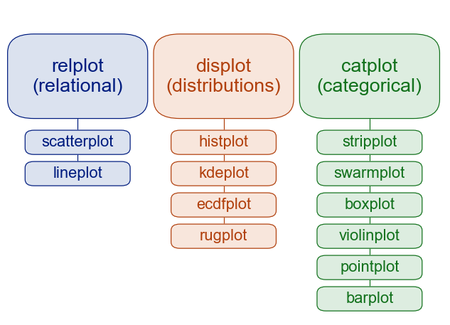
These are three of the primary “families” of plots available in seaborn.
relplotis used for showing relationships among variablesdisplotis used for showing distributions of datacatplotis used for plotting categorical data
The plot types that fall under each of these can be expected to share some underlying code and accept similar arguments. As the documentation puts it, “similar functions for similar tasks.” As an example, histplot and kdeplot, two of the functions used for visualizing distribution, use the same arguments (note multiple = "stack").
sns.set_theme() # setting the default seaborn theme - more on these later
penguins = sns.load_dataset("penguins")
sns.histplot(data=penguins, x="flipper_length_mm", hue="species", multiple="stack")
sns.kdeplot(data=penguins, x="flipper_length_mm", hue="species", multiple="stack")
You can also create one of these with displot by using the kind parameter.
sns.displot(data = penguins,
            x = "flipper_length_mm",
            hue = "species",
            kind = "hist",
            multiple = "stack")
Figure-level and axes-level plots
displot, relplot, and catplot are all “figure-level” plots, while the others listed under them are “axes-level.” You can read more about the differences in the documentation, but for now let’s take a quick look at one of the handiest features of figure-level plots. In seaborn (as in ggplot2 from R) they are called facets - the ability to make multiple charts that cut across a categorical variable.
You can facet across a variable by specifying the col parameter to a figure-level plot.
sns.displot(data=penguins, x="flipper_length_mm", hue="species", col="species")
Sometimes our facets won’t have axes that line up nicely, as with our dots dataset below.
dots = sns.load_dataset("dots")
sns.relplot(
    data = dots,
    kind = "line",
    x = "time",
    y = "firing_rate",
    col = "align",
    hue = "choice",
    size = "coherence"
)
In these cases, one solution might be to use the facet_kws to set the option sharex=False to let seaborn know that the plots do not have to use the same X axis.
sns.relplot(
    data = dots,
    kind = "line",
    x = "time",
    y = "firing_rate",
    col = "align",
    hue = "choice",
    size = "coherence",
    facet_kws = dict(sharex=False)
)
In general, the benefits of figure-level plots include:
- Easy faceting by data variables
- Legend outside of plot by default
- Easy figure-level customization
The authors of seaborn recommend the use of figure-level plots for most applications. Axes-level plots are better if you are familiar with matplotlib and know how to make complex graphics with it.
Multiple views of data
The two kinds of visualizations that don’t fit cleanly into the relplot / distplot / catplot scheme are complex graphics that use several kinds of visualizations at once, called using jointplot() or pairplot().
jointplot() is a visualization that shows the relationship between two variables while showing the distribution of each separately.
sns.jointplot(
    data=penguins,
    x="flipper_length_mm",
    y="bill_length_mm",
    hue="species"
    )
<seaborn.axisgrid.JointGrid object at 0x16e5750a0>pairplot() does something similar, but for every combination of variables.
sns.pairplot(data=penguins, hue="species")
Plot Aesthetics
There are a number of ways that we can adjust the individual aesthetic elements of our plots to make them more suitable for sharing and publication.
Earlier on, we used sns.set_theme() to set the default seaborn theme for our plots. Let’s return to our tips dataset to take a look at that again.
sns.set_theme()
sns.relplot(
    data = tips,
    x = "total_bill",
    y = "tip"
)
Let’s see how that looks with another plot style set. Let’s try out “whitegrid”
sns.set_style("whitegrid")

sns.relplot(
    data = tips,
    x = "total_bill",
    y = "tip"
)
These are the plot styles built into seaborn: * white * dark * whitegrid * darkgrid * ticks
We can also use some of the styles that come from matplotlib, as well. Let’s list those using this code:
style.available['Solarize_Light2', '_classic_test_patch', '_mpl-gallery', '_mpl-gallery-nogrid', 'bmh', 'classic', 'dark_background', 'fast', 'fivethirtyeight', 'ggplot', 'grayscale', 'seaborn-v0_8', 'seaborn-v0_8-bright', 'seaborn-v0_8-colorblind', 'seaborn-v0_8-dark', 'seaborn-v0_8-dark-palette', 'seaborn-v0_8-darkgrid', 'seaborn-v0_8-deep', 'seaborn-v0_8-muted', 'seaborn-v0_8-notebook', 'seaborn-v0_8-paper', 'seaborn-v0_8-pastel', 'seaborn-v0_8-poster', 'seaborn-v0_8-talk', 'seaborn-v0_8-ticks', 'seaborn-v0_8-white', 'seaborn-v0_8-whitegrid', 'tableau-colorblind10']Let’s go through a couple of these using our tips data just to check them out.
style.use("fivethirtyeight")
sns.relplot(
    data = tips,
    x = "total_bill",
    y = "tip"
)
style.use("ggplot")

sns.relplot(
    data = tips,
    x = "total_bill",
    y = "tip"
)
The Entire Process
Let’s try going through the entire visualization process now, from loading data to exporting an image.
We’ll be using a dataset adapted from Gapminder, which shows life expectancy, population, and GDP Per Capita for a number of countries over several decades. We can load this in as a pandas dataframe before passing it to seaborn.
gapminder = pd.read_csv("https://swcarpentry.github.io/r-novice-gapminder/data/gapminder_data.csv")
gapminder
country year pop continent lifeExp gdpPercap
0 Afghanistan 1952 8425333.0 Asia 28.801 779.445314
1 Afghanistan 1957 9240934.0 Asia 30.332 820.853030
2 Afghanistan 1962 10267083.0 Asia 31.997 853.100710
3 Afghanistan 1967 11537966.0 Asia 34.020 836.197138
4 Afghanistan 1972 13079460.0 Asia 36.088 739.981106
... ... ... ... ... ... ...
1699 Zimbabwe 1987 9216418.0 Africa 62.351 706.157306
1700 Zimbabwe 1992 10704340.0 Africa 60.377 693.420786
1701 Zimbabwe 1997 11404948.0 Africa 46.809 792.449960
1702 Zimbabwe 2002 11926563.0 Africa 39.989 672.038623
1703 Zimbabwe 2007 12311143.0 Africa 43.487 469.709298
[1704 rows x 6 columns]Now that it’s loaded in, let’s try looking at how GDP Per Capita is related to Life Expectancy.
gap = sns.relplot(
    data = gapminder,
    x = "gdpPercap",
    y = "lifeExp",
    hue = "continent",
    style = "continent"
)
/Users/jaa011/Library/CloudStorage/OneDrive-HarvardUniversity/projects/data_camp/renv/python/virtualenvs/renv-python-3.8/lib/python3.8/site-packages/seaborn/axisgrid.py:118: UserWarning: The figure layout has changed to tight
self._figure.tight_layout(*args, **kwargs)That’s interesting, but our data is very heavily clustered on the lower end of GDP Per Capita. Fortunately, we can set our X axis to be a logarithmic scale rather than a linear one.
Note: Just using gap will show us information about our plot object. We want to use gap.fig to show it within our notebooks.
gap.set(xscale="log")
gap.fig
Ok, that’s looking better!
Now let’s try adding some plot styling to make it more presentable.
sns.set_style("whitegrid")
gap = sns.relplot(
    data = gapminder,
    x = "gdpPercap",
    y = "lifeExp",
    size = "pop",
    hue = "continent",
    alpha = 0.8
)
/Users/jaa011/Library/CloudStorage/OneDrive-HarvardUniversity/projects/data_camp/renv/python/virtualenvs/renv-python-3.8/lib/python3.8/site-packages/seaborn/axisgrid.py:118: UserWarning: The figure layout has changed to tight
self._figure.tight_layout(*args, **kwargs)gap.set(xscale="log")
Next, let’s think about changing up our axis labels. We can do that with gap.set_axis_labels().
We can also add a title with gap.set_title()
sns.set_style("whitegrid")
gap = sns.relplot(
    data = gapminder,
    x = "gdpPercap",
    y = "lifeExp",
    size = "pop",
    hue = "continent",
    alpha = 0.8
)
/Users/jaa011/Library/CloudStorage/OneDrive-HarvardUniversity/projects/data_camp/renv/python/virtualenvs/renv-python-3.8/lib/python3.8/site-packages/seaborn/axisgrid.py:118: UserWarning: The figure layout has changed to tight
self._figure.tight_layout(*args, **kwargs)gap.set(xscale="log")
gap.set_axis_labels("GDP Per Capita (USD)", "Life Expectancy (Years)")
Finally, let’s look at how to change up our legend text.
This will be a bit tricky because we have two legends. We’ll go in and adjust the legend title of each directly. First, let’s list out the legend texts that are present so that we know which elements to change.
gap.legend.texts
Ok, that looks like the first and seventh elements are continent and pop, so we will change those directly by using set_text() on them.
gap.legend.texts[0].set_text("Continent")
gap.legend.texts[6].set_text("Population")
gap.fig
Putting it all together, we get:
gap = sns.relplot(
    data = gapminder,
    x = "gdpPercap",
    y = "lifeExp",
    size = "pop",
    hue = "continent",
    alpha = 0.8
)
/Users/jaa011/Library/CloudStorage/OneDrive-HarvardUniversity/projects/data_camp/renv/python/virtualenvs/renv-python-3.8/lib/python3.8/site-packages/seaborn/axisgrid.py:118: UserWarning: The figure layout has changed to tight
self._figure.tight_layout(*args, **kwargs)gap.set(xscale="log")
gap.set_axis_labels("GDP Per Capita (USD)", "Life Expectancy (Years)")
gap.legend.texts[0].set_text("Continent")
gap.legend.texts[6].set_text("Population")
Saving our plot
Now that we’ve got a decent-looking plot, let’s save it. You can save the image by calling the savefig() method (from matplotlib) on your figure. You can find documentation about savefig() here.
Note: You will have to change your path to save the image where you want. I also manually set the dpi to 300, because the default tends to be relatively low-resolution.
gap.fig.savefig("gapminder.png", dpi = 300)Other Resources
Footnotes
From seaborn’s home page. Most material in this lesson has been adapted from seaborn’s own excellent tutorials.↩︎