Assignment 2
Deconstruct, Reconstruct Web Report
Jerusha Lee (3935717)
Click on the Original, Code and Reconstruction tabs to read about the issues and how they were fixed.
Original

Objective
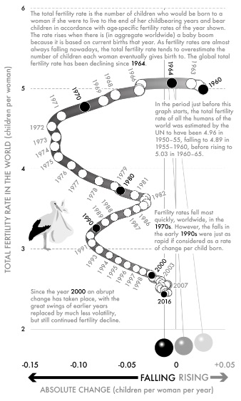
The main goal of this visualisation is to show how the global fertility rate (the number of children per woman) has changed over time from 1960 to 2016. Because the fertility rates may have an impact on societies’ economies and the general public who are interested in that area, the governments would be the major audience for this study in order for them to comprehend the situation and take appropriate action.
Three key problems with the selected visualisation are as follows:
Because the line moves in odd directions and makes the changes difficult to grasp, the aforementioned graph was unable to determine if the fertility rate increased or decreased in a certain year. The graph was tough to interpret, especially towards the end of the dataset (from 2000 to 2016).
X-axis zero is in the centre, and the words “FALLING RISING” are pointing to the right and left sides, which is a poor example of scaling! It becomes challenging to grasp and follow.
Perceptual or colour issues: Because the visualisation lacks a title, it can be challenging for readers to determine its subject matter just by looking at it. Another concern is that the graph includes a few little images that seem strange, such the bird and the three balls.Black and white makes the graph look less appealing and makes it more difficult to understand the display.
Reference
*Dorling, D., 2020. Data | SLOWDOWN. [online] Dannydorling.org. World - total fertility rate, 1960–2016. Available at: https://www.dannydorling.org/books/SLOWDOWN/Data.html [Accessed 22 April 2023].
*Dorling, D., 2020. Data | SLOWDOWN. [online] Dannydorling.org. World - total fertility rate, 1960–2016. Available at: https://www.dannydorling.org/books/SLOWDOWN/Images/Figs1/Fig%2032-World%20-%20total%20fertility%20rate,%201960%E2%80%932016.jpg [Accessed 22 April 2023].
Code
To address the problems noted in the original, the following code is utilised.
# Loading required packages
library(readxl)
library(ggplot2)
library(dplyr)

# Importing Data
setwd("~/Semester 3/Data Visualization and Communication/Assignment 2")
Fertilityrate<-as.data.frame (read_excel("World_fertility_rate.xlsx", sheet = "World", skip = 7))


#Preparing the data to use in the plot
year <- Fertilityrate$`Observation date`
children_per_women <- Fertilityrate$`Total (children per women)`

# Using ggplot for the visualisation
p1 <- ggplot( Fertilityrate, aes(x= year , y= children_per_women , color = children_per_women)) +geom_point() +geom_line(size = 1) +theme_bw() +labs(title = "World fertility rate, 1960–2016",x = "Years from  1960-2016",y = "Total ferility rate in the world") +theme(plot.title = element_text(hjust = 0.5)) + expand_limits(x=c(1960,2020), y=c(2, 5))
Data Reference
- Data.worldbank.org. 2020. Fertility rate, total (births per woman) | Data. [online] Available at: https://data.worldbank.org/indicator/SP.DYN.TFRT.IN?view=chart;%20April%202019 [Accessed 23 April 2023].
- Dorling, D., 2020. Data | SLOWDOWN. [online] Dannydorling.org. World - total fertility rate, 1960–2016. Available at: https://www.dannydorling.org/books/SLOWDOWN/Images/Excels/Fig%2032-World%20-%20total%20fertility%20rate,%201960%E2%80%932016.xlsx [Accessed 23 April 2023].
Reconstruction
The following plot fixes the main issues in the original.
