2023-04-04
A Little About Me…
Brad Wakefield
The Statistical Consulting Centre
- Aim - The service aims to improve the statistical content of research carried out by members of the University. Researchers from all disciplines may use the Centre. Priority is currently given to staff members and postgraduate students undertaking research for Doctor of Philosophy or Masters’ degrees.
- How we can help - Currently the Statistical Consulting Centre provides each post-graduate student with a free initial consultation. Up to ten hours per calendar year of consulting time is provided without charge if research funding is not available. When students require more consulting time, or receive external funding, a service charge may be necessary.
To book an appointment with me…
Discuss with one of your supervisors first about booking a consultation.
- One of your supervisors must attend your first consultation.
Go on to the Statistical Consulting Centre website and select
Make an Appointment.
Fill out the form with you and your chosen supervisor’s details.
We will then send you a link to book.
Need more info….
If you have any questions feel free to email me…
bradleyw@uow.edu.au
or check out the SCC website…
https://www.uow.edu.au/niasra/our-research/statistical-consulting-centre/
also have a look at the NIASRA website…
Principles of Good Visualisation
What is Data Visualisation?
Definition
Data Visualisation is the graphical representation and translation of abstract numerical and statistical information for the purposes of interpretation and communication of insights, trends, and patterns.
- We use data visualisations to simplify and explain relationships and features of data in a tractable and interpretative manner to inform complex decision making.
A picture is worth a thousand values….
Have you ever really looked at a digital image?
## X Y Red Green Blue ## 1 1 1 0.3882353 0.3882353 0.3882353 ## 2 2 1 0.3858633 0.3858633 0.3858633 ## 3 3 1 0.3849406 0.3849406 0.3849406 ## 4 4 1 0.3852481 0.3852481 0.3852481 ## 5 5 1 0.3860388 0.3860388 0.3860388 ## 6 6 1 0.3855557 0.3855557 0.3855557 ## 7 7 1 0.3860388 0.3860388 0.3860388 ## 8 8 1 0.3860388 0.3860388 0.3860388 ## 9 9 1 0.3857313 0.3857313 0.3857313 ## 10 10 1 0.3854237 0.3854237 0.3854237 ## 11 11 1 0.3852481 0.3852481 0.3852481 ## 12 12 1 0.3852481 0.3852481 0.3852481 ## 13 13 1 0.3849406 0.3849406 0.3849406 ## 14 14 1 0.3849406 0.3849406 0.3849406 ## 15 15 1 0.3849406 0.3849406 0.3849406
A picture is worth a thousand values….
Those values give us this plot…

Why Visualisation?
Humans perceive a lot more information, a lot quicker, with images.
What am I? ….
What am I?
_____ are large bulky fish that have a sharply pointed conical snout, large pectoral and dorsal fins, a strong crescent-shaped tail, and a whitish belly. They have a contrasting pattern of dark blue, gray, or brown on their back and sides and massive jaws which are armed with large sharply pointed, coarsely serrated teeth. Most weigh between 680 and 1,800 kg, but some weighing more than 2,270 kg have been documented.
_____ are large, gray aquatic mammals with bodies that taper to a flat, paddle-shaped tail. They have two forelimbs, called flippers, with three to four nails on each flipper. Their head and face are wrinkled with whiskers on the snout. The average adult is about 10 feet long and weighs as much as 590 kilograms.
I am a …


Compare that too….
What am I now?

Which way was quicker?
Why visualise your data?
Humans are visual creatures….
Visualisations are more easily interpreted by humans.
We are very good at identifying visual trends and patterns.
Can interpret a lot more information at once.
Can provide another avenue of explanation.
Principles of Data Visualisation
What makes a Good Data Visualisation?

The Science
Good data visualisations need to be correct!
Is my data correctly and unambiguously displayed in my visualisation?
- Is my data correct?
- Have I shown what I said I have shown?
- Are my visualisations labelled correctly?
- Are my scales correct and consistent?
- Have I presented my data in a way faithful to the truth?
Creating purposefully misleading visualisations is unethical.
The media is filled with good (bad) examples…
Somebody has clearly made a mistake in labelling this graph.

More media examples…
This is a map of flight paths, not patterns of documented spread. Pairing this graphic with that title gives a misleading impression about the extent of the spread.

More media examples…
The numbers on this graph make little sense, given the bar plot.

Ensuring the data is correctly displayed in a way faithful to the truth is the most important part of any data visualisation.
Point to Consider: The principle of proportional ink
The principle of proportional ink
“The principle of proportional ink: The sizes of shaded areas in a visualisation need to be proportional to the data values they represent.”
For example…
In the following graph, it looks like Japanese citizens had a much greater life expectancy than citizens of Israel in 2002.

In reality though…

A better plot ….

For example…
Consider the following graphic comparing the average life expectancy between different continents in 2007.

Graphic Source: Flaticon.com
A better plot ….

Point to Consider: Choose the correct graph type for your data.
For example…
Suppose we wished to show the difference in GDP per capita of different countries in 2007.

A better plot…

Point to Consider: Don’t omit data that is needed to give an accurate representation.
For example…

A better plot…

An even better plot…

Point to Consider: Scales should be present, consistent, correct, and logical.
For example…

A better plot…

An even better plot…

For example…

A better plot…

For example…

A better plot…

Point to Consider: Avoid suggesting spurious relationships with visualisation without justification!
Spurious Correlations
Humans are great at spotting patterns, mainly when those patterns are visual. We must be scientific in our choices of visualisation. Just because there is a pattern doesn’t mean there is a causal relationship between variables.
Check out https://www.tylervigen.com/spurious-correlations for some great examples!!!
The Story
What is the point I’m trying to communicate with this visualisation?
- Am I demonstrating a particular trend?
- Am I demonstrating a difference?
- Am I demonstrating a problem?
If your answer is … I don’t know, but it looks cool … then it is not a good visualisation.
Good visualisations allow the reader to understand immediately what point the author is trying to communicate.
For example…
What is the point of this visualisation?

A better plot…
What is the point of this visualisation now?

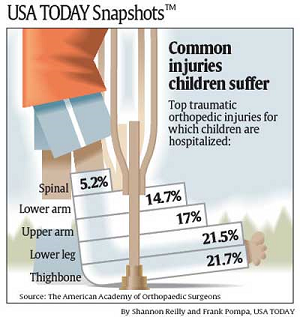
Point to Consider: Use titles, labels, and captions effectively.
Titles and captions
Titles, labels, and captions allow you to explicitly communicate to the reader specific points that may not be readily apparent in the graph alone. While “you need to label your graphs” may be a reasonably well-known mantra people are familiar with, adding a compelling title or caption is something with which many still struggle.
At a bare minimum, your title and caption must succinctly and accurately give the reader enough information to interpret the data visualisation. In addition, titles and text should indicate the purpose of the visualisation and support your overall research narrative.
But importantly, text in visualisations should be used sparingly. Adding too much text complicates and distracts from the visual point you are trying to make.
For example…
Take a look at this data visualisation that appeared in USA Today.

Source: https://www.statisticshowto.com/wp-content/uploads/2014/01/usa-today-1.png
A better plot…
A more effective example of titles and labels can be seen below.

Source: https://clauswilke.com/dataviz/figure-titles-captions.html
Another good plot…

Source: https://www.pewresearch.org/fact-tank/2022/02/03/what-the-data-says-about-gun-deaths-in-the-u-s/
Point to Consider: Don’t overload with data.
For example…
Consider the following graphic of 2013 major league soccer player salaries.

Source: \[View Source\]
Point to Consider: Match your visualisation with your context.
Exploratory vs. Explanatory
We use data visualisations in two ways: exploration and explanation.
What makes a good data visualisation can change based on our analysis and communication context.
Visualisations aimed at exploration should give a broad overview of the data and are aimed at making the reader more familiar with the data. Explanatory visualisations communicate the results of an analysis and are used to influence opinions.
The visualisation you create should match the broader context in which it will appear.
Exploratory Context

Explanatory Context

Point to Consider: Be consistent but not repetitive.
For example…

A better plot…

Point to Consider: Know when to (and when not to) plot.
For example…
Considering our synthetic NSW income data again, what actual benefit does the following graph have over the simple sentence, “the average weekly income of the NSW workers surveyed was $947.83 (95% CI $942.29,$953.36)”?

For example…

For example…
Tell me which product was the best selling?

Answer…
| Product | Percentage of Sales |
|---|---|
| A | 20% |
| B | 18% |
| C | 17% |
| D | 22% |
| E | 23% |
:::
The Visual
Good data visualisations are understandable and interesting.
Is my visualisation able to be interpreted?
Can people understand the graphic?
Do I have confusing auxiliary information?
Does it look interesting and engaging?
Is it simple and makes the point?
Good visualisations are simple, clear, and engaging.
For example…

A better plot…

Point to Consider: Choose aesthetics that humans are good at perceiving.
Perceiving Aesthetics
When creating visualisations of data, we can use a range of aesthetics to represent different data types.
Common examples include:
|
|
Perceptual Task 1
Which angle is a) biggest, b) smallest, c) are any the same size?

Show Answer
Humans are notoriously bad at seeing small differences in angles!

Perceptual Task 2

Show Labels

Perceptual Task 3
Which two areas are different?

Show Answer
B and C are different, but it is not obvious!

Perceptual Task 4
Which two bars are the same height?

Show Answer
It is much easier to see that B and C are the same!

Point to Consider: Be careful with colour.
For example…
Giving every country a different colour in this visualisation makes it indecipherable.

Colour can also be distracting…

A better plot…

Increasing Accessability with Redundant Aesthetics

Perceptual Task 5
Can you tell which area has the highest (and lowest) rate?

Adding a legend …

A better plot…
Monotonic colour scales give a natural sense of lowest to highest.

Another example…
The following graph looks more like a topography map or a weather map than a graph of the religiosity of the USA.

Source: https://vividmaps.com/faithland/
Another example…
When plotting the states Biden and Trump won in the 2020 election, we should use the colours associated with each of their respective parties, i.e. Blue for Democrats, Red for Republicans.

Remember, colour should also be accessible.
When selecting colour palettes, we must be aware that some readers may have impaired colour vision.
Approximately 8% of males and 0.5% of females suffer from some sort of colour-vision deficiency.
People with impaired colour vision typically have difficulty distinguishing certain types of colours, for example, red and green (red–green colour-vision deficiency) or blue and green (blue–yellow colour-vision deficiency).
By selecting specific colours, we can maximise accessibility.

Source: Claus O. Wilke. Fundamentals of Visualisation. O’Reilly Media, Inc., 2019.
Colour Vision Impairment
Examples of how an impaired colour looks for different colour-vision disorders.


Source: Claus O. Wilke. Fundamentals of Visualisation. O’Reilly Media, Inc., 2019.
Choose accessible colours…
Colourblind-friendly colour scale, Okabe and Ito (2008).
| Name | Hex code | Hue | C,M,Y,K (%) | R,G,B (255) | R,G,B (%) |
|---|---|---|---|---|---|
| orange | #E69F00 | 41° | 0,50,100,0 | 230,159,0 | 90,60,0 |
| sky blue | #56B4E9 | 202° | 80,0,0,0 | 86,180,233 | 35,70,90 |
| bluish green | #009E73 | 164° | 97,0,75,0 | 0,158,115 | 0,60,50 |
| yellow | #F0E442 | 56° | 10,5,90,0 | 240,228,66 | 95,90,25 |
| blue | #0072B2 | 202° | 100,50,0,0 | 0,114,178 | 0,45,70 |
| vermilion | #D55E00 | 27° | 0,80,100,0 | 213,94,0 | 80,40,0 |
| reddish purple | #CC79A7 | 326° | 10,70,0,0 | 204,121,167 | 80,60,70 |
| black | #000000 | - | 0,0,0,100 | 0,0,0 | 0,0,0 |
Source: Claus O. Wilke. Fundamentals of Visualisation. O’Reilly Media, Inc., 2019.
Point to Consider: Make comparisons as easy as possible.
For example…
A better plot…

An even better plot…

For example…

A better plot…

Use bold relavent colours

What about overlapping points?
Partial transparency and jittering…

Avoid stacking

A better plot

Point to Consider: Avoid chartjunk!
What is chartjunk?
Chartjunk is a term first used by Edward Tufte in his 1983 book The Visual Display of Quantitative Information that relates to any visual elements in the chart that are not required to understand the quantitative information being displayed and may distract attention away from the information.
“Every single pixel should testify directly to content”
-Edward Tufte
For example…
The use of logos instead of simple bars in this chart makes it so incomprehensible labels had to be introduced to communicate the data.

Source \[View Source\]
For example…

DO NOT GOT 3D!

Keep it simple!
Both examples of going overboard with pattern and colour.


Remove legends to keep it simple

No line drawings!

A better graph…
Point to Consider: Attract attention to important features.
Size
Users notice larger elements more easily.

Color
Bright colours typically attract more attention than muted ones.

Contrast
Dramatically contrasted colours are more eye-catching.

Alignment
Out-of-alignment elements stand out over aligned ones.

Repetition
Repeating styles can suggest content is related.

More ways to attract attention:
Proximity – Closely placed elements seem related.
Whitespace – More space around elements draws the eye towards them..
Texture and Style – Richer textures stand out over flat ones.
Consider how people scan

Summary
Always remember good data visualisations are:
correct and representative
not misleading
communicate a story
suited to the context where they appear
simple and easy to interpret
interesting and engaging
chartjunk free
not 3D
Which Plot Should I Use?
That depends on the data…
We will be looking a few key types of summaries that we tend to visualise:
Amounts
Proportions
Distributions
Associations and Correlations
Trends
Uncertainty
Amounts
Amounts relate to the magnitude, extent or frequency of categories of a particular variable or combination of variables. That is, amounts visualise a quantitative measure on some set of categories.
When visualising amounts common geometries used are:
- bar plots,
- grouped (clustered) bar plots,
- lollipop plots,
- dot plots,
- heatmaps.
Bar Graphs
Bar graph of the number of republican and democratic presidents since Eisenhower.

Bar Graphs
Bar graph of length of presidential terms.

Grouped Bar Graph
Grouped bar graph of customer satisfaction before and after a new staff training program.

Dot Chart
Dot chart of top 10 GDP per capita countries in 2007.

Lollipop Chart
Lollipop chart of top 10 life expectancy countries in 2007.

Heat Map
Heat map of the life expectancy in Asian countries 1952-2007.

Proportions
When plotting proportions people usually use:
- bar charts
- stacked bar charts,
- grouped (clustered) bar charts,
- pie charts,
- mosaic plots,
- stacked density plots.
Stacked Bar Chart
Proportion of males and females in each occupation of the NSW synthetic population.

Grouped Bar Chart
Occupation share of males and females in the NSW synthetic population.

Pie Chart
Pie charts should only be used to show simple proportions, majorities, or overwhelming portions.

Mosaic Plot
The proportions of people in each job classification and education level in the ISLR mid-Atlantic wages data.

Stacked Density Plot
Employed persons rate in Australia 2020-2022.

Distributions
When plotting the distribution of numeric variables, people tend to use:
- histograms,
- density plots,
- boxplots,
- violin plots,
- strip charts,
- ridgeline plots,
- contour and 2D binned plots,
- cumulative density and q-q plots.
Histogram
Wage distribution of mid-Atlantic workers (2003-2009) in the Wage (ISLR package) data set.

Density Plot
Wage distribution of mid-Atlantic workers (2003-2009) in the Wage (ISLR package) data set split by job classification.

Boxplot
Wage distribution of mid-Atlantic workers (2003-2009) in the Wage (ISLR package) data set split by education level.

Strip and Violin Chart
Wage distribution of mid-Atlantic workers (2003-2009) in the Wage (ISLR package) data set split by education level (more detail about shape).

Ridgeline Plot
Synthetic NSW Income Data (2016) wage distribution by occupation.

Contour Plot
Joint wage and age distribution of mid-Atlantic workers (2003-2009) in the Wage (ISLR package) data set.

2d Binned Plot
Joint wage and age distribution of mid-Atlantic workers (2003-2009) in the Wage (ISLR package) data set - but with bins.

Q-Q Plot
Assessing the normality of the wage distribution of mid-Atlantic workers (2003-2009) in the Wage (ISLR package) data set.

Associations and Correlations
When dealing with two or more quantitative variables, associations are usually best visualised with scatter plots although other plot types do exist for various purposes.
Common plots for visualising associations and correlations include:
- scatterplots,
- bubble charts,
- slope graphs,
- correlograms,
- contour and 2D binned plots.
Your dependent (or outcome) variable should always take the y position, whereas an independent variable should be given the x position.
Scatterplot
The relationship between speed and stopping distance of cars.

Bubble Chart
Bubble chart of the evolution of GDP per capita and life expectancy of countries between 1952-2007.

Slope Graph
Changes in GDP per Capita for various nations between 1957 and 2007.

Correlogram
Correlogram of car properties of 1974 US Motor Trend magazine cars.

Another Correlogram
Correlogram of car properties of 1974 US Motor Trend magazine cars (with sized circles).

Trends
There are many ways trends and patterns can appear and be visualised in data, so this is by no means an exhaustive list of ways to visualise trends. However, the most common way we visualise trends are with,
line graphs,
area graphs,
polygons / clusters.
Trend Line
Relationship between the height and weight of athletes in the Australia Institute of Sport data.

Trend Line (Temporal)
GDP per capita over time of Australia and New Zealand.

Area Chart
Number of unemployed persons in the US from 1967-2015.

Clusters
Differences in the sex of athletes across the principal components of their physical and hematological characterisitics in the Australian Institute of Sports data.

Uncertainty
When demonstrating uncertainty in statistical estimates the following can be used:
- error bars (for 1D points),
- staggered bars (for 1D points)
- ribbons (for lines),
- polygons (for 2D points).
Standard Error Bars
Average weekly income by occupation in the synthetic NSW 2016 data with standard errors displayed.

Confidence Interval Bars
Average weekly income by occupation in the synthetic NSW 2016 data with 95% confidence intervals displayed.

Staggered Bars
Mid-Atlantic workers’ average wage by ethnicity with staggered confidence intervals.

Ribbons
Relationship between the height and weight of athletes in the Australia Institute of Sport data with 90% and 99% fitted confidence intervals.

Any more?
Yes
But I’ve probably gone too far for one day anyway…
THANKS FOR LISTENING TO ME
We are also running three short courses on using stats programs.
- Introduction to SPSS: Monday 24th April
- Effective Data Visualisation with ggplot2 for Beginners: 1st and 2nd May.
- Introduction to R/Rstudio: Monday and Tuesday 5th and 6th June
Advertised in Universe $110 (or $100) and on our website https://www.uow.edu.au/niasra/
Chat with your supervisor if you’re interested…
More seminars..
- Prof. Marijka Batterham (Director of NIASRA and SCC) will be giving a HDR seminar on Reproducible Research on the 30th May. Please register and check it out!
THANKS FOR LISTENING TO ME
REMEMBER
- You are more than welcome to book an appointment with me to discuss any of your statistics, data science, and data visualisation questions!
If you have any questions feel free to email me…
bradleyw@uow.edu.au
or check out the SCC website…
<https://www.uow.edu.au/niasra/our-research/statistical-consulting-centre/>
also have a look at the NIASRA website…