非階層的クラスタリング
東京国際大学 データサイエンス教育研究所 竹田 恒
2023-10-08
データ
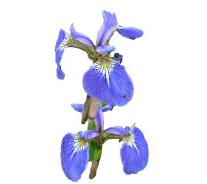
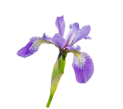
アヤメ(iris)の3品種( Setosa, Versicolor, Virginica )の萼(がく)と花弁それぞの長さと幅のデータ
| 変数 | 内容 |
|---|---|
| Sepal.Length | 萼片(がくへん)の長さ(cm) |
| Sepal.Width | 萼片(がくへん)の幅(cm) |
| Petal.Length | 花弁の長さ(cm) |
| Petal.Width | 花弁の幅(cm) |

萼片(sepal)と花弁(petal)
写真出典: Data analysis with the tidyverse
n <- 150
ii <- sample(1:nrow(iris), n)
d <- iris[ii, ]
group <- d[, 5]
rownames(d) <- paste(d$Species, 1:nrow(d))

head(d)
## Sepal.Length Sepal.Width Petal.Length Petal.Width Species
## versicolor 1 5.5 2.6 4.4 1.2 versicolor
## setosa 2 5.1 3.3 1.7 0.5 setosa
## setosa 3 4.3 3.0 1.1 0.1 setosa
## setosa 4 4.7 3.2 1.6 0.2 setosa
## setosa 5 4.6 3.6 1.0 0.2 setosa
## versicolor 6 5.9 3.2 4.8 1.8 versicolorlibrary(DT)
datatable(d, options = list(pageLength = 5))グラフ
# カラーパレット
COL <- c(rgb(255, 0, 0, 205, max = 255), # 赤
rgb( 0, 155, 0, 205, max = 255), # 緑
rgb( 0, 0, 255, 205, max = 255), # 青
rgb(100, 100, 100, 55, max = 255)) # 灰k-means
【フリーソフトによるデータ解析・マイニング 第29回】Rとクラスター分析(2)
クラスタリングは多変量で行われるが,可視化のためSepalの幅と長さの2次元でグラフを作成する。
NGROUPS <- 3 # グループ数
km <- kmeans(d[, -5], centers = NGROUPS, nstart = 25)
#nstart:初期設定の数
#オプション機能は指定された数の初期設定を生成し最も良いものを提示する。
c <- vector('list', NGROUPS)
name.group <- rep(NA, NGROUPS)
matplot(x = d$Sepal.Width, y = d$Sepal.Length, type = 'n')
grid()
for (i in 1:NGROUPS)
{
c[[i]] <- d[km$cluster == i, ]
matpoints(x = c[[i]]$Sepal.Width,
y = c[[i]]$Sepal.Length,
pch = 16,
col = COL[i])
# 正解のラベル(教師無し学習では本来存在しない)
text(x = c[[i]]$Sepal.Width,
y = c[[i]]$Sepal.Length + 0.1,
labels = rownames(c[[i]]),
col = gray(0.5), cex = 0.5)
# クラスター内で最も数の多い種類をグループ名にする。
name.group[i] <- names(which.max(table(c[[i]]$Species)))
}
legend('topright', pch = 16, col = COL[1:NGROUPS],
title = 'Guess', legend = name.group)
第2主成分まで次元削減し作成したクラスター図
主成分分析は多変量のクラスター分析を分かり易くする点で適している。 Sepalの幅と長さだけの散布図と比べて,すべての変量を考慮したグラフとなる。
library(factoextra)
fviz_cluster(km, data = d[, -5])
PAM(Partitioning Around Medoids)
k-meansのロバスト版(外れ値に強い手法)だが計算速度が遅い。 シルエット図(silhouette plot)の見方は講義資料を参照すること。
library(cluster)
pm <- pam(d[, -5], k = NGROUPS)
plot(pm)

CLARA(Clustering LARge Applications)
標本サイズが大きくPAMの計算速度が遅いときはCLARAやCLARANSの利用を検討する。
cl <- clara(d[, -5], k = NGROUPS, pamLike = T, samples = 1)
plot(cl)

CLARANS(Clustering Large Applications based on RANdomized Search)
CLARANSを使用するには,pamLike = F,samples = n (>1)とする。
cl2 <- clara(d[, -5], k = NGROUPS, pamLike = F, samples = 50)
plot(cl2)

Python
import numpy as np
import pandas as pd
import matplotlib.pyplot as plt
from sklearn.cluster import KMeans
from collections import Counter
d0 = r.d # Use R data
d0.head()## Sepal.Length Sepal.Width Petal.Length Petal.Width Species
## versicolor 1 5.5 2.6 4.4 1.2 versicolor
## setosa 2 5.1 3.3 1.7 0.5 setosa
## setosa 3 4.3 3.0 1.1 0.1 setosa
## setosa 4 4.7 3.2 1.6 0.2 setosa
## setosa 5 4.6 3.6 1.0 0.2 setosaNGROUPS = 3
model = KMeans(n_clusters = NGROUPS, n_init = 'auto')
d = d0.iloc[:, :4].values # pandas -> numpy object
fit = model.fit(d)
colors = np.array(['r', 'g', 'b', 'c'])
for i in range(NGROUPS):
label = Counter(d0.iloc[fit.labels_ == i, 4]).most_common()[0][0]
name = d0.iloc[fit.labels_ == i, 4]
plt.scatter(x = d0.iloc[fit.labels_ == i, 1],
y = d0.iloc[fit.labels_ == i, 0],
color = colors[i],
label = label)
# 正解のラベル(教師無し学習では本来存在しない)
for i in range(len(d0)):
plt.text(d0.iloc[i, 1], d0.iloc[i, 0] + 0.1, d0.iloc[i, 4], size = 6, color = 'gray')
plt.grid(linestyle = 'dotted')
plt.title('クラスター図')
plt.xlabel('Sepal Width')
plt.ylabel('Sepal Length')
plt.legend(title = 'Guess')
plt.show()
演習課題
ショッピングモールの顧客データをクラスタリングせよ。 このデータ・セットには顧客番号,性別,年齢,年収,支出スコアの情報が記録されている。
データ
d <- read.csv('https://stats.dip.jp/01_ds/data/Mall_Customers.csv')
colnames(d) <- c('id', 'gender', 'age', 'income', 'score')
library(DT)
datatable(d, options = list(pageLength = 5))NGROUPS <- 2グラフ
# カラーパレット
COL <- rainbow(NGROUPS)

matplot(x = d$income, y = d$score, pch = 16, type = 'p', col = COL[1])
grid()